ARCHIVE

A collection of projects across editorial, web, generative graphics, and experimental interfaces. Code shapes both process and outcome, from early prototypes to final builds. Each explores how computational thinking can shape visual form, interaction, and digital experience.
Areas

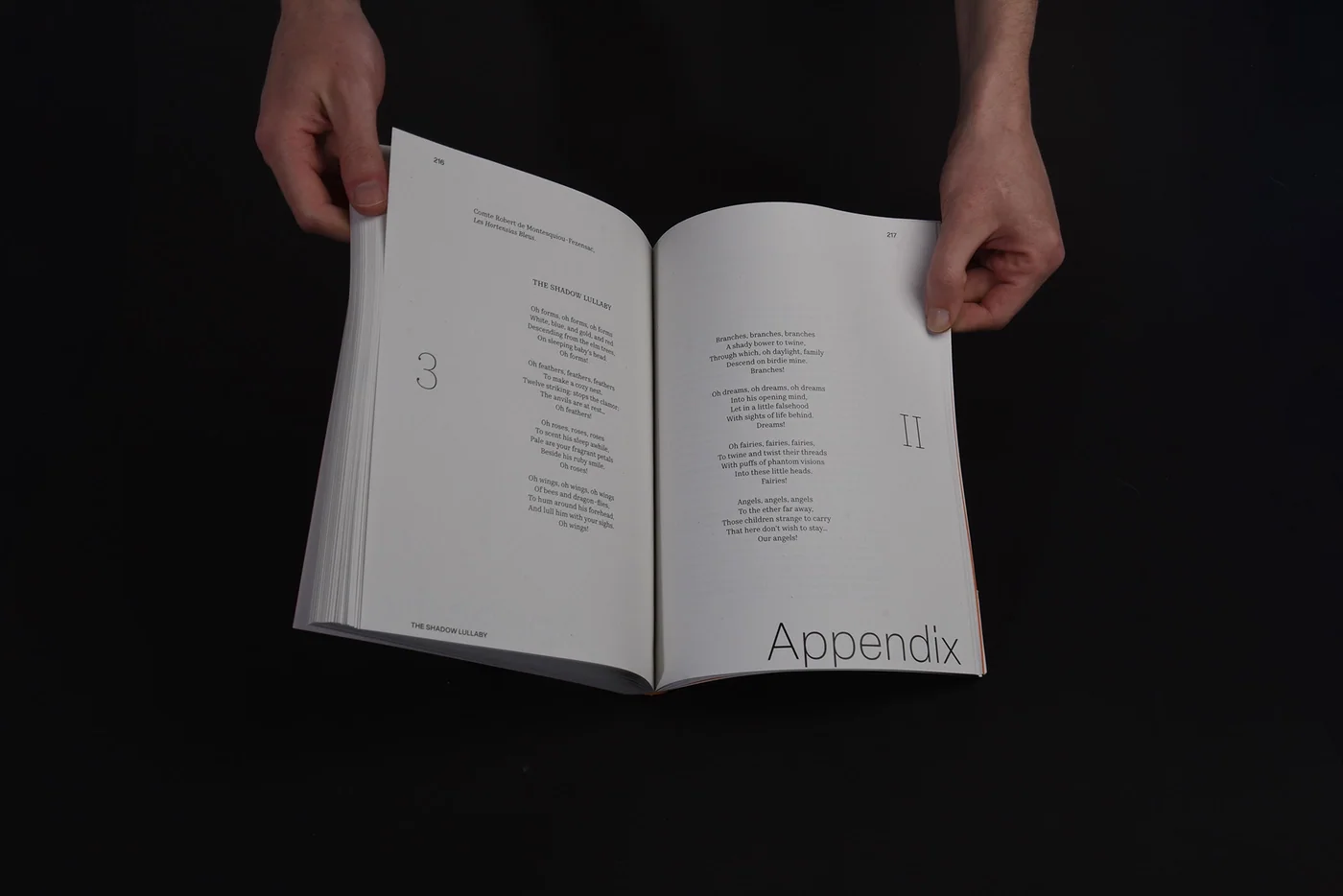
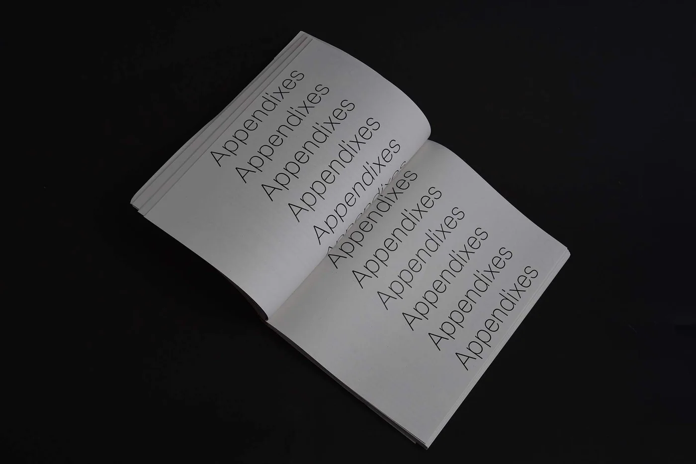
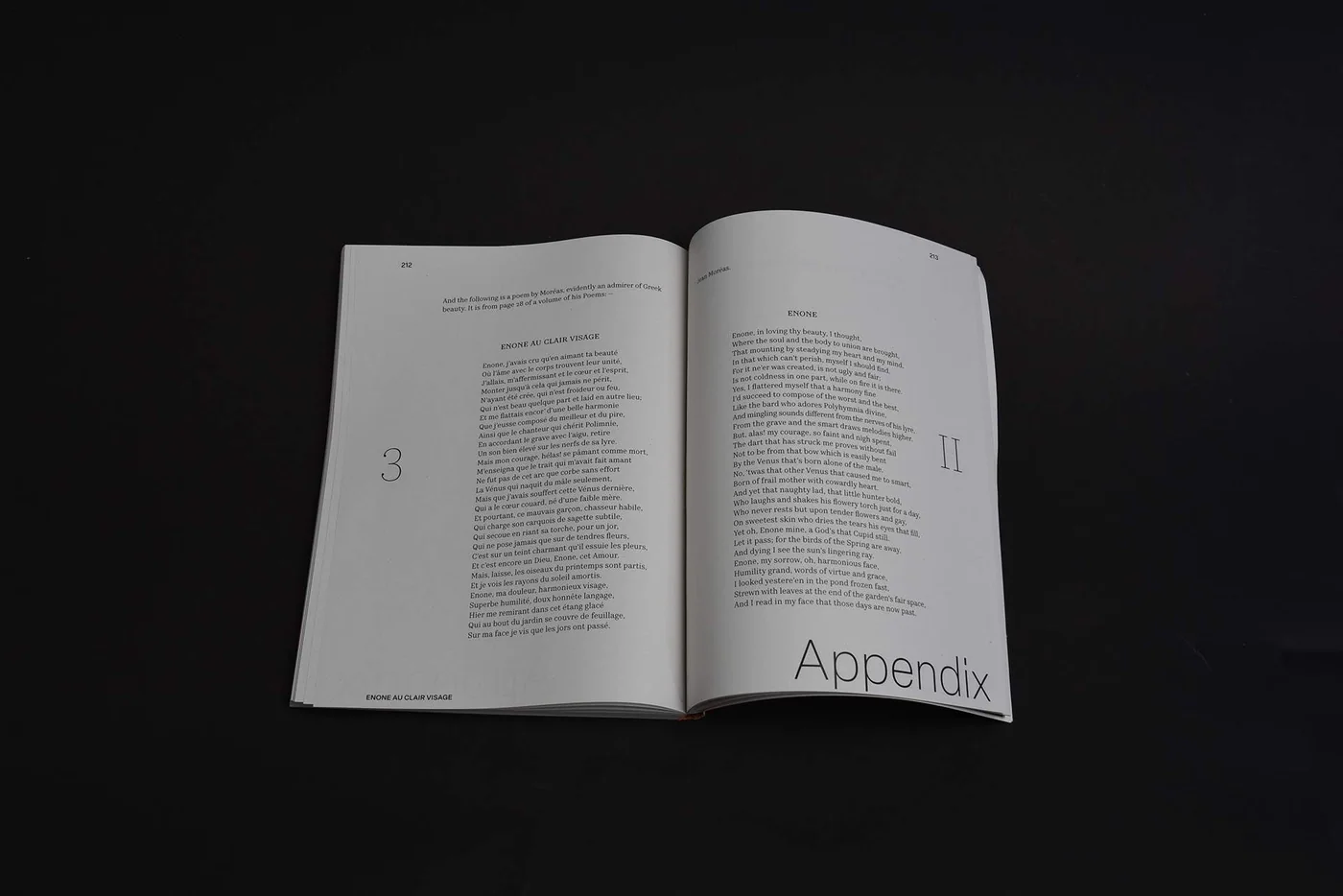
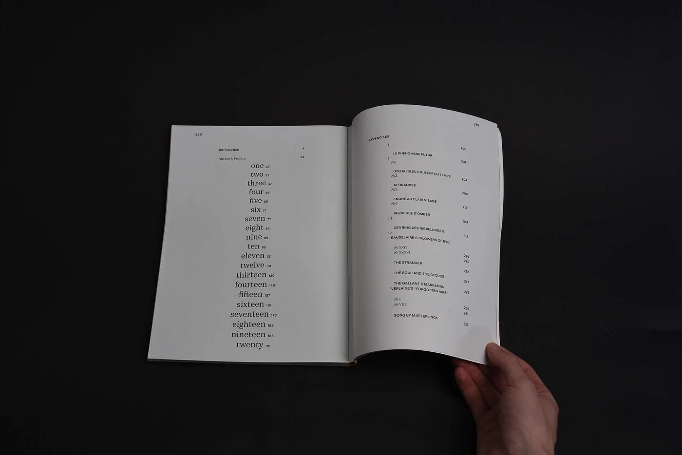
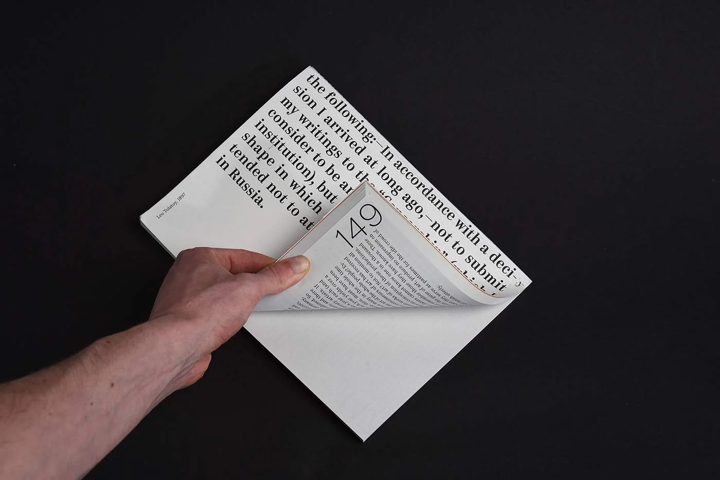
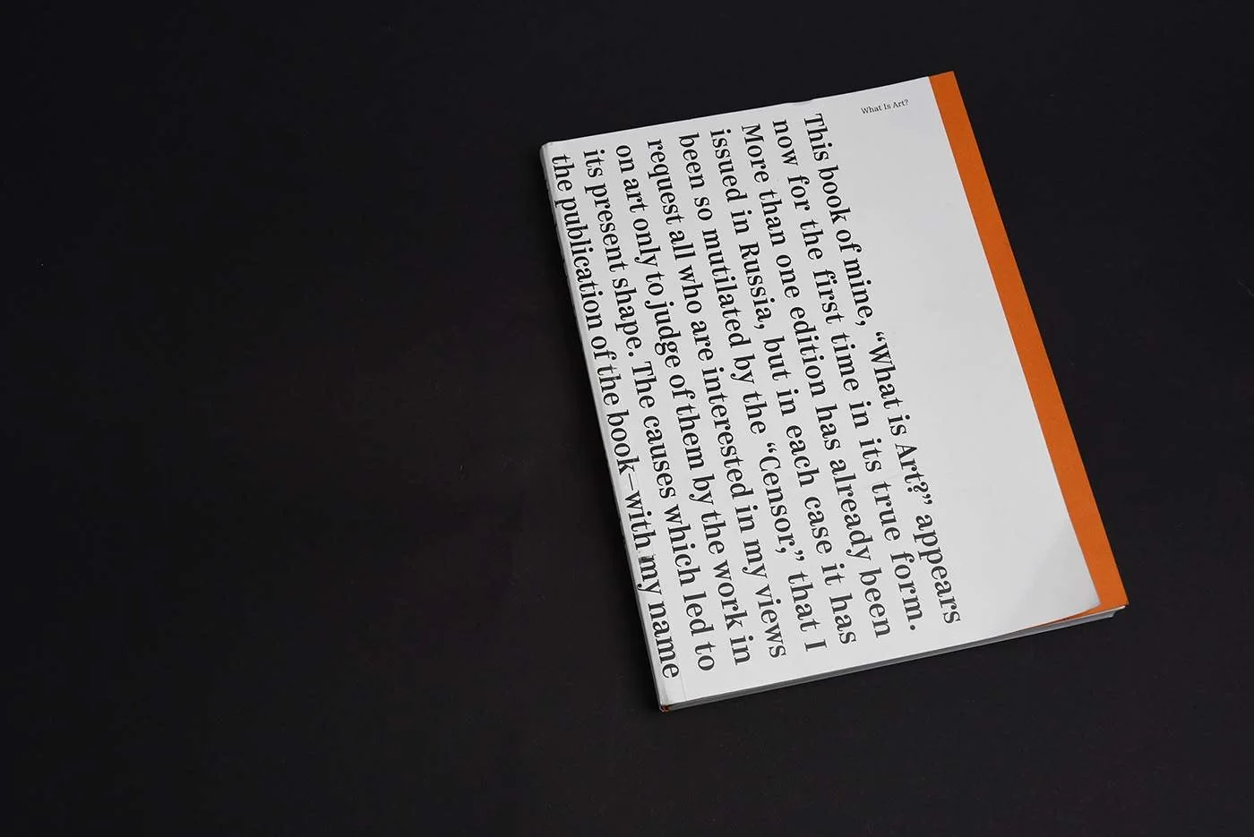
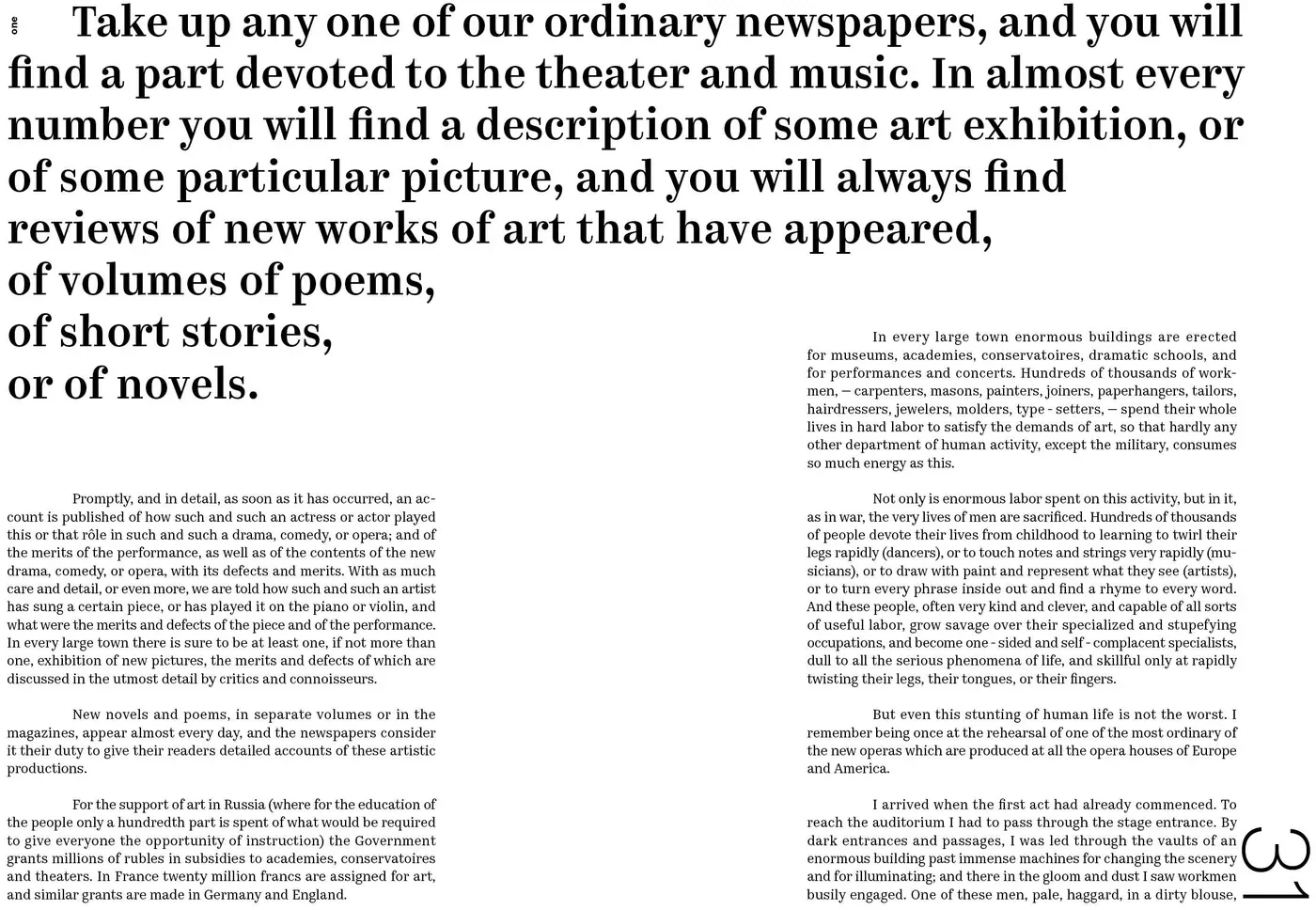
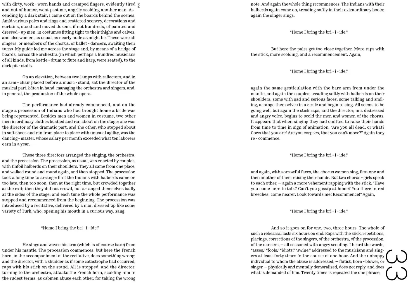
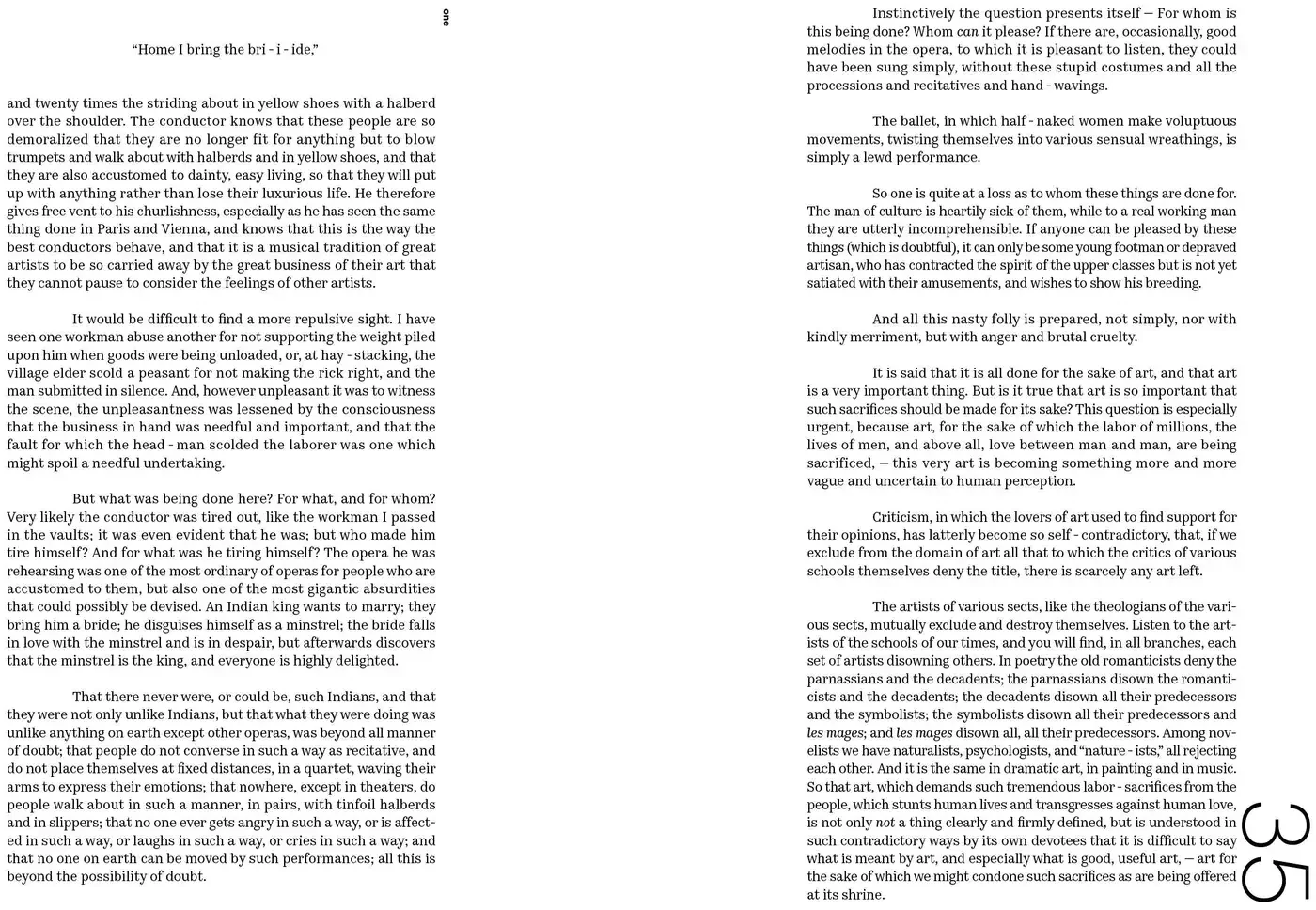
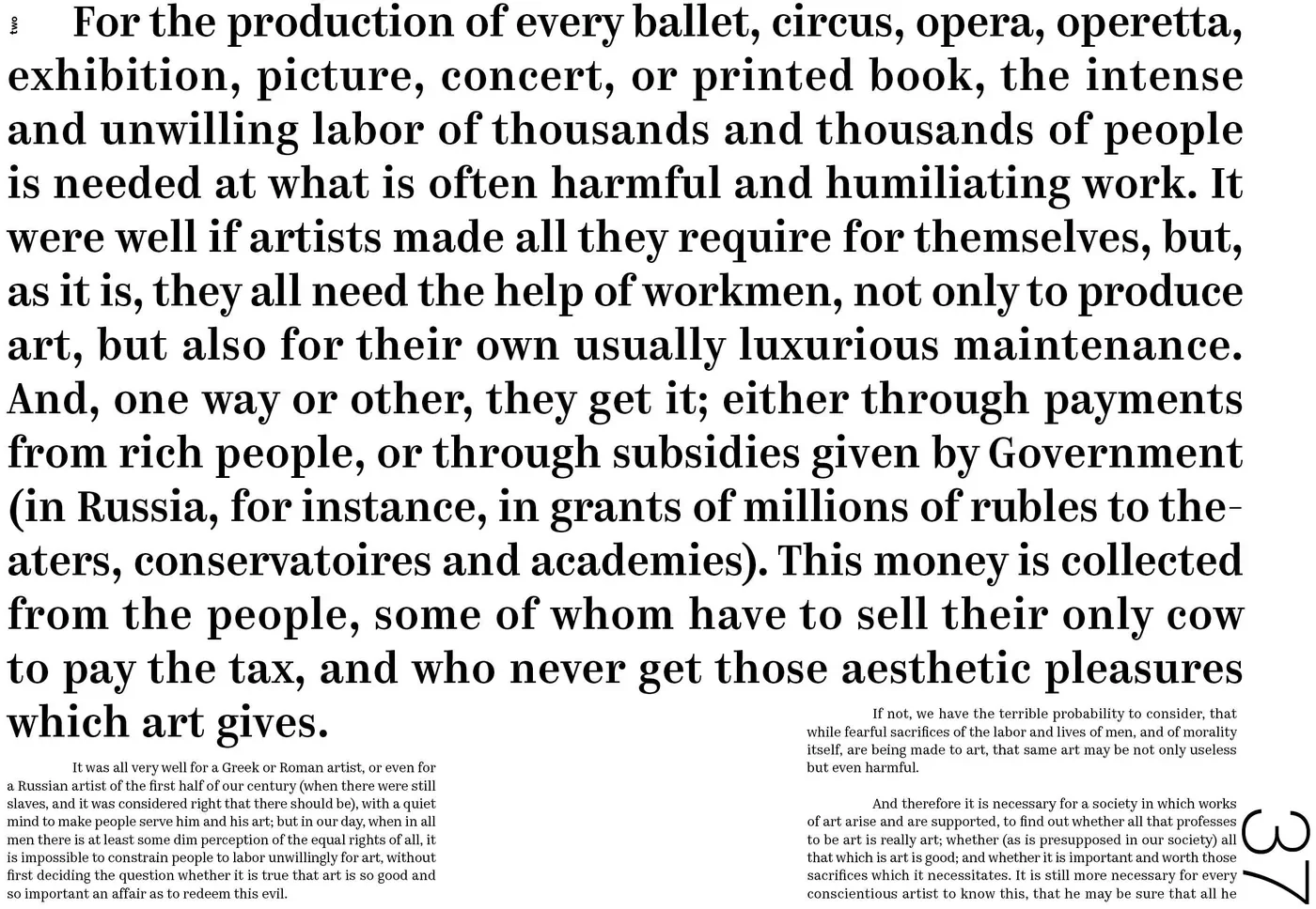
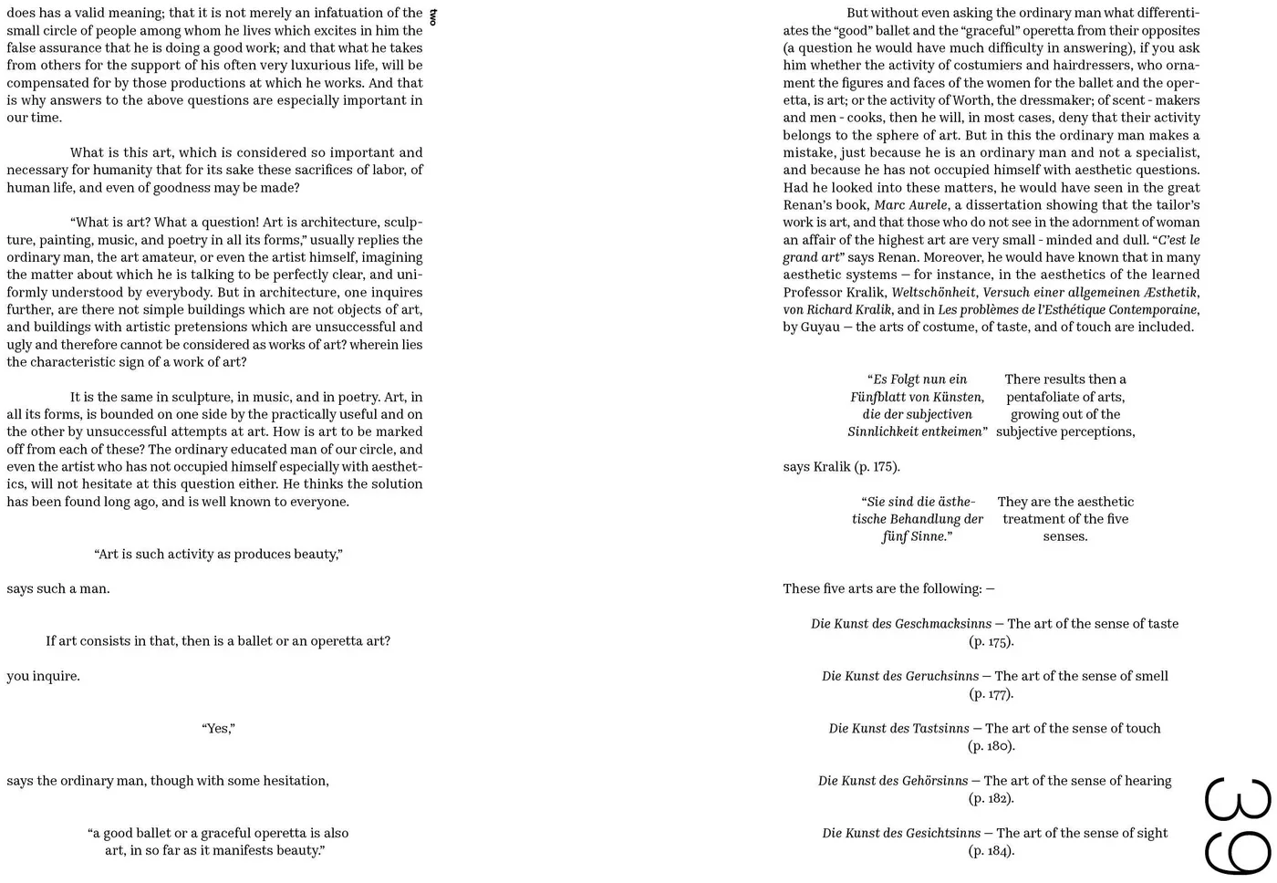
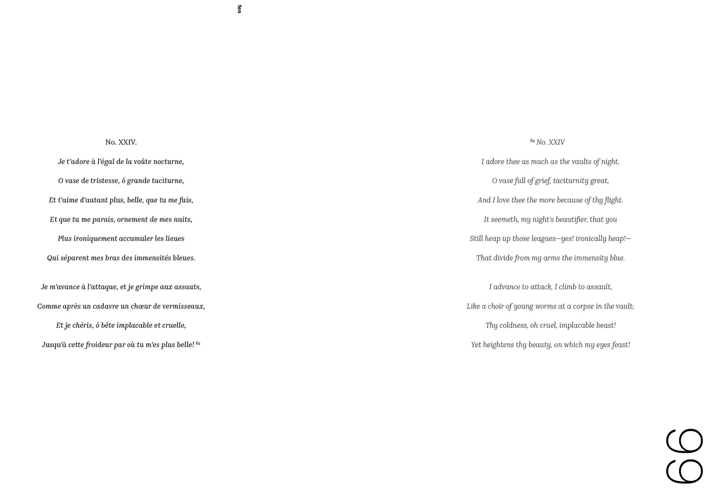
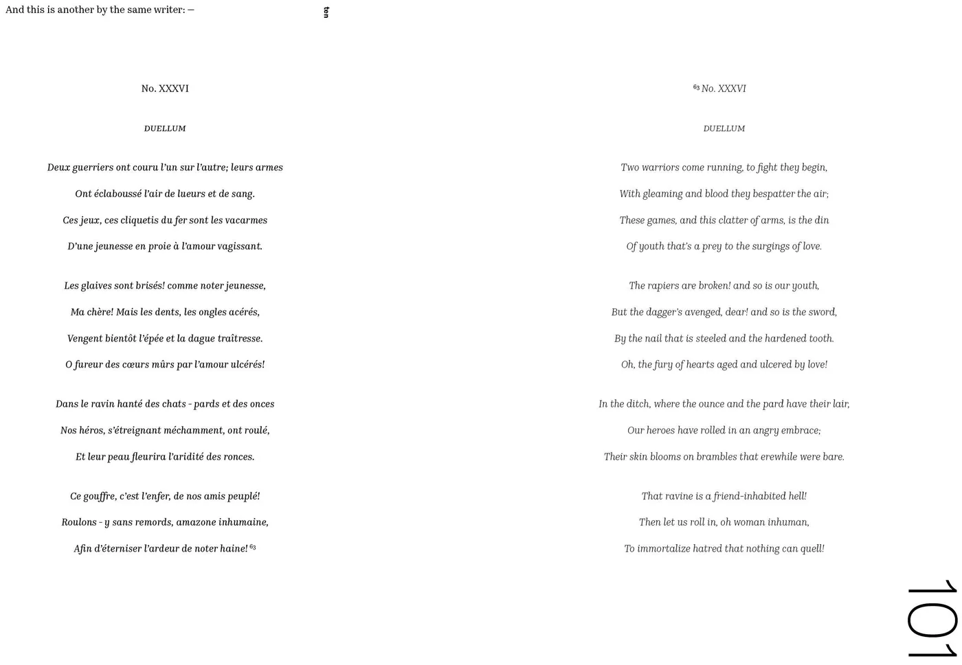
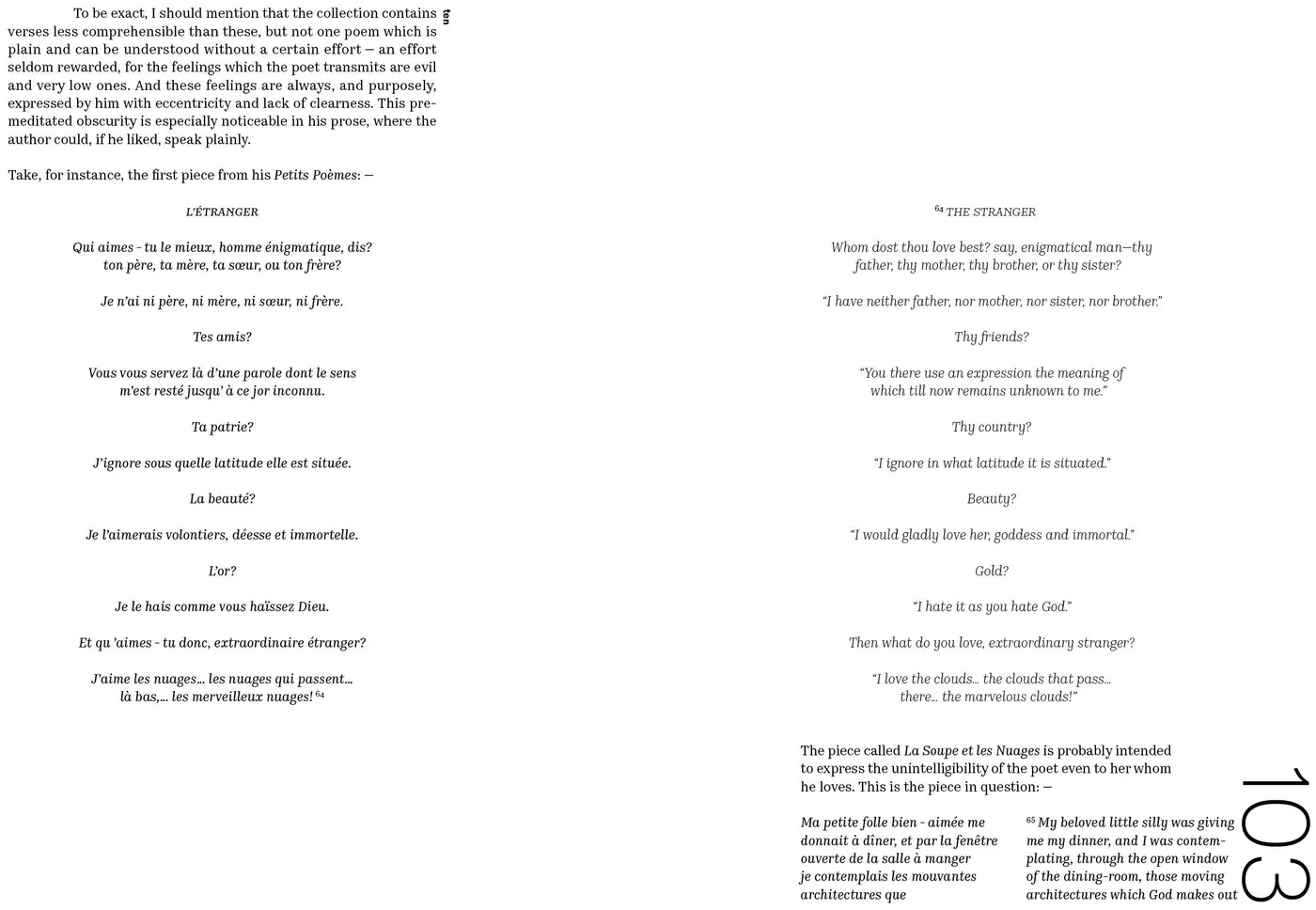
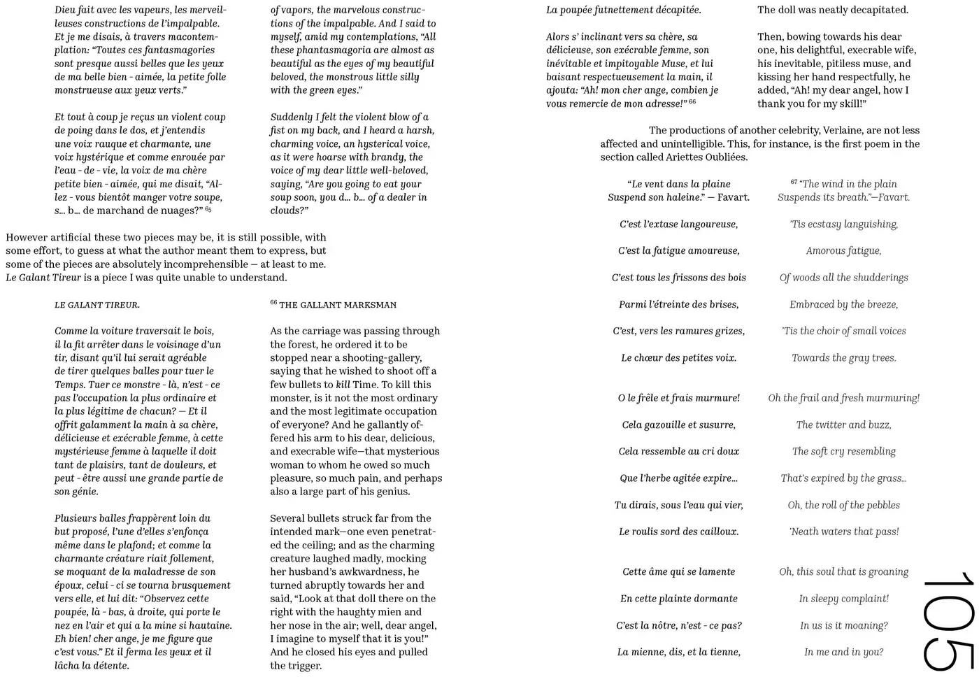
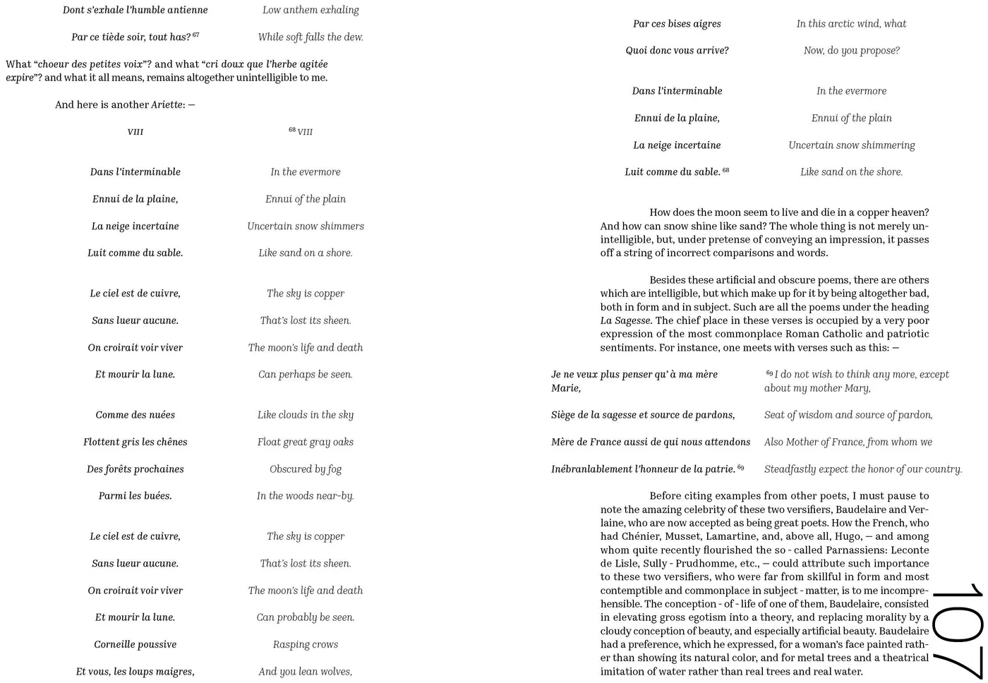
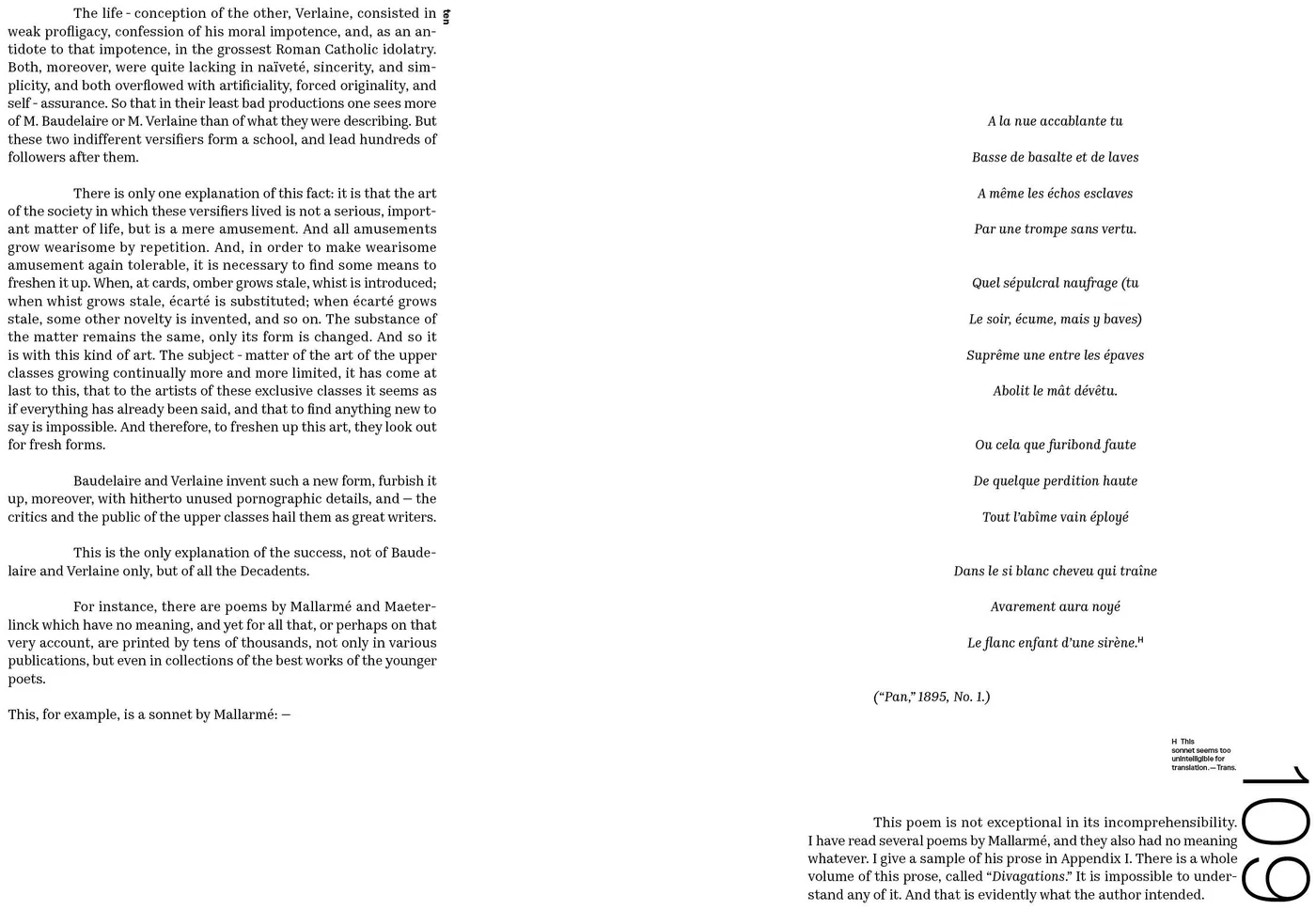
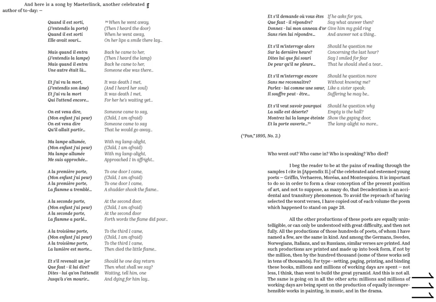
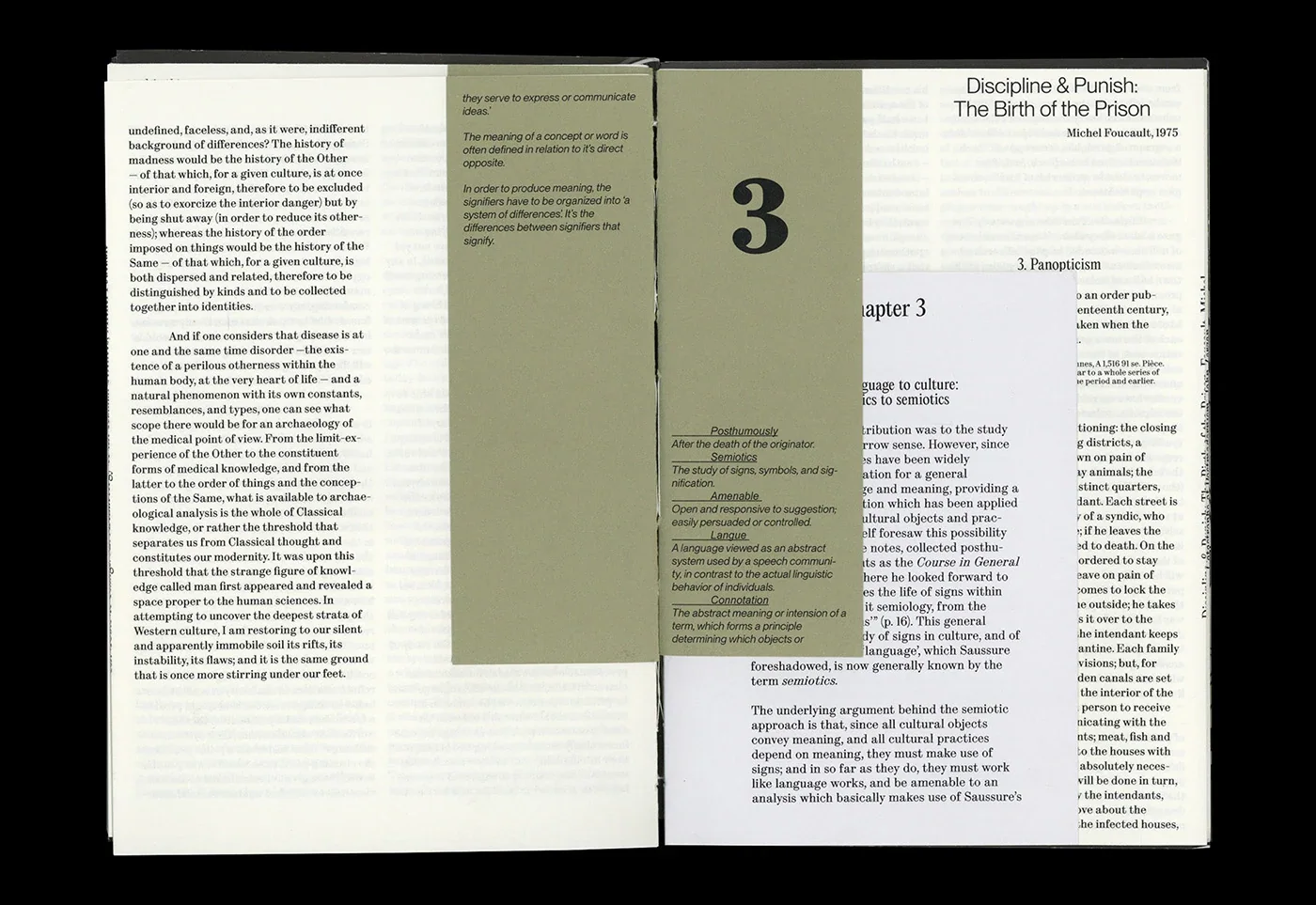
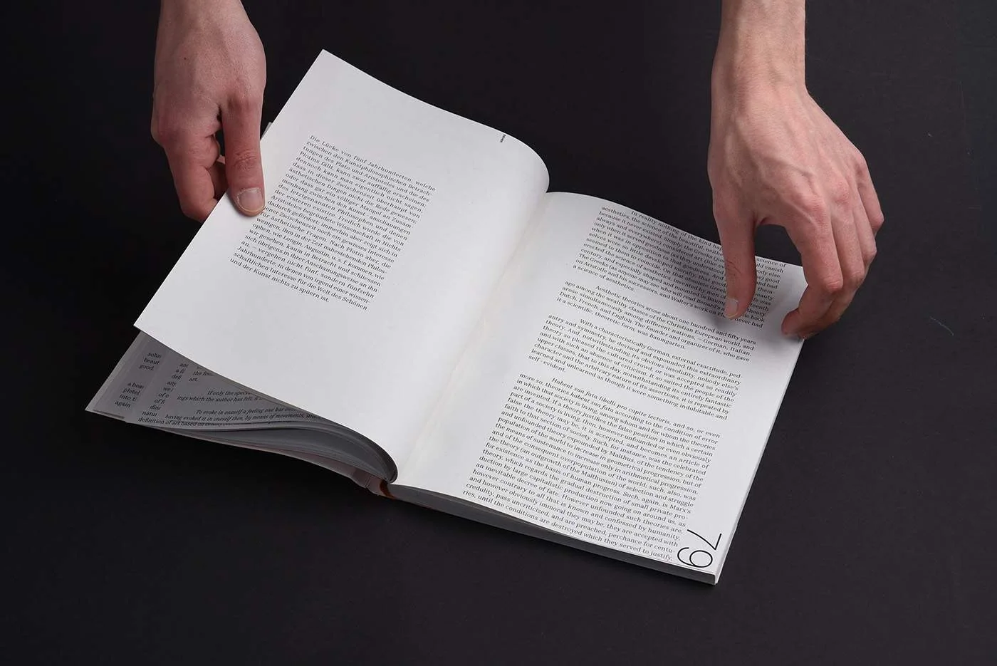
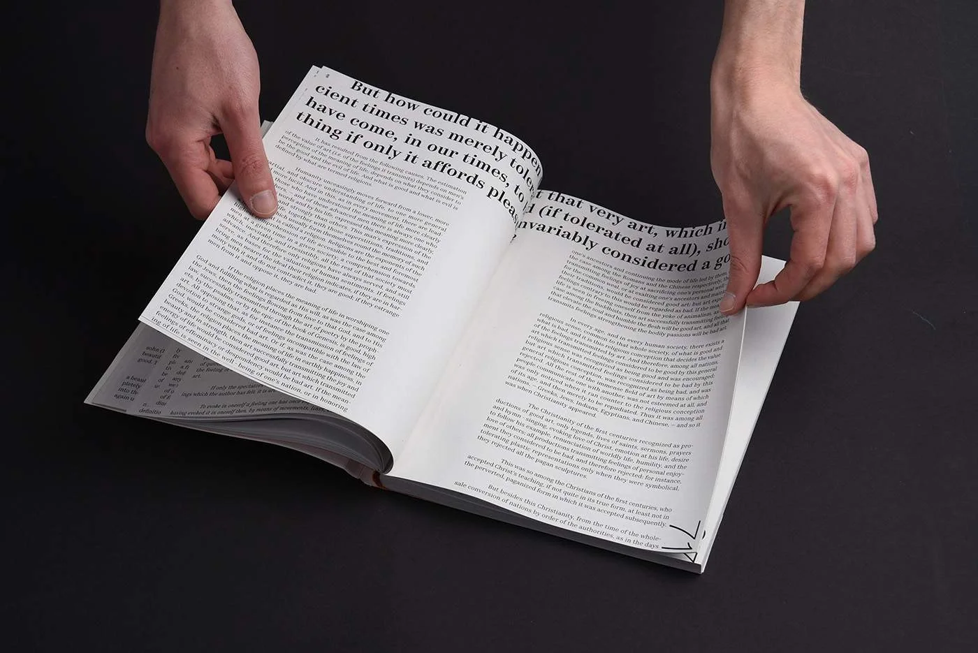
E04 Lev Tolstoi Book 2022 Dec A context-first edition of “What Is Art?”Compact text footnote blocks sit within generous margins, making use of the contrast between dense reading and open space part of the page for taking notes and reflecting on 6 levels of different footnotes accompanying original text. The design works through proportion and placement, giving the argument room while keeping its structure visible. Design treats typography as a way to organise a long text and shape the reader’s movement through it Book Book Book Book Book Book Book Book Book Book Book Book Book Book Book Book Book Book Book Book
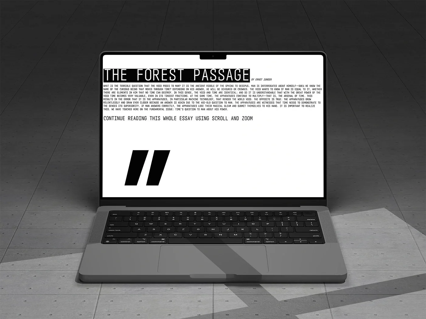
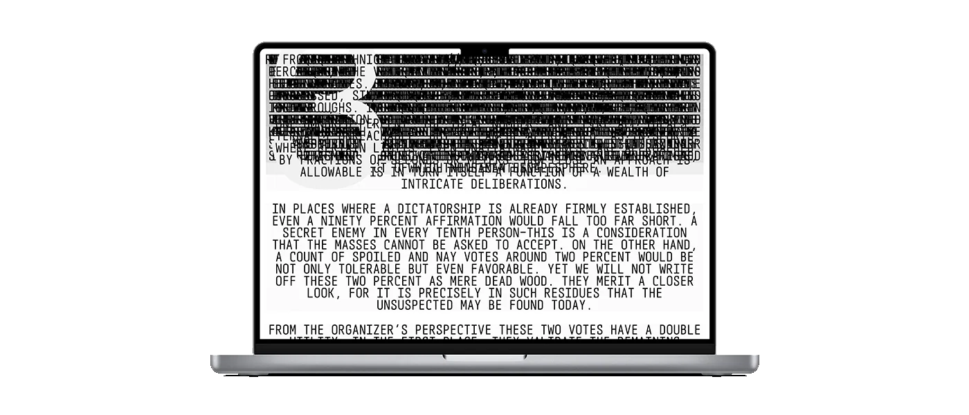
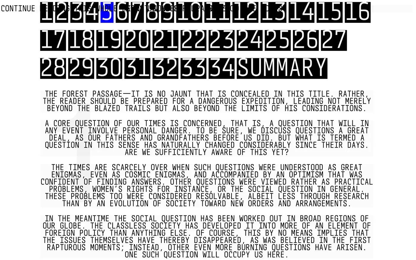
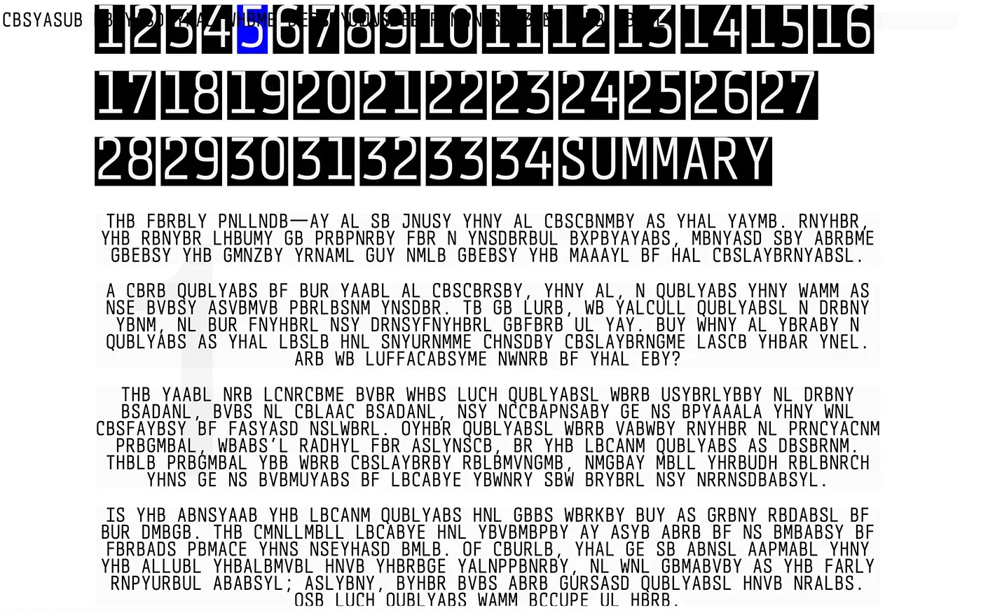
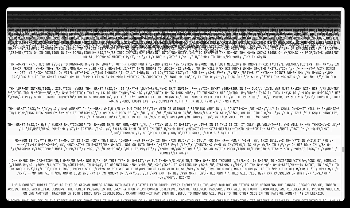
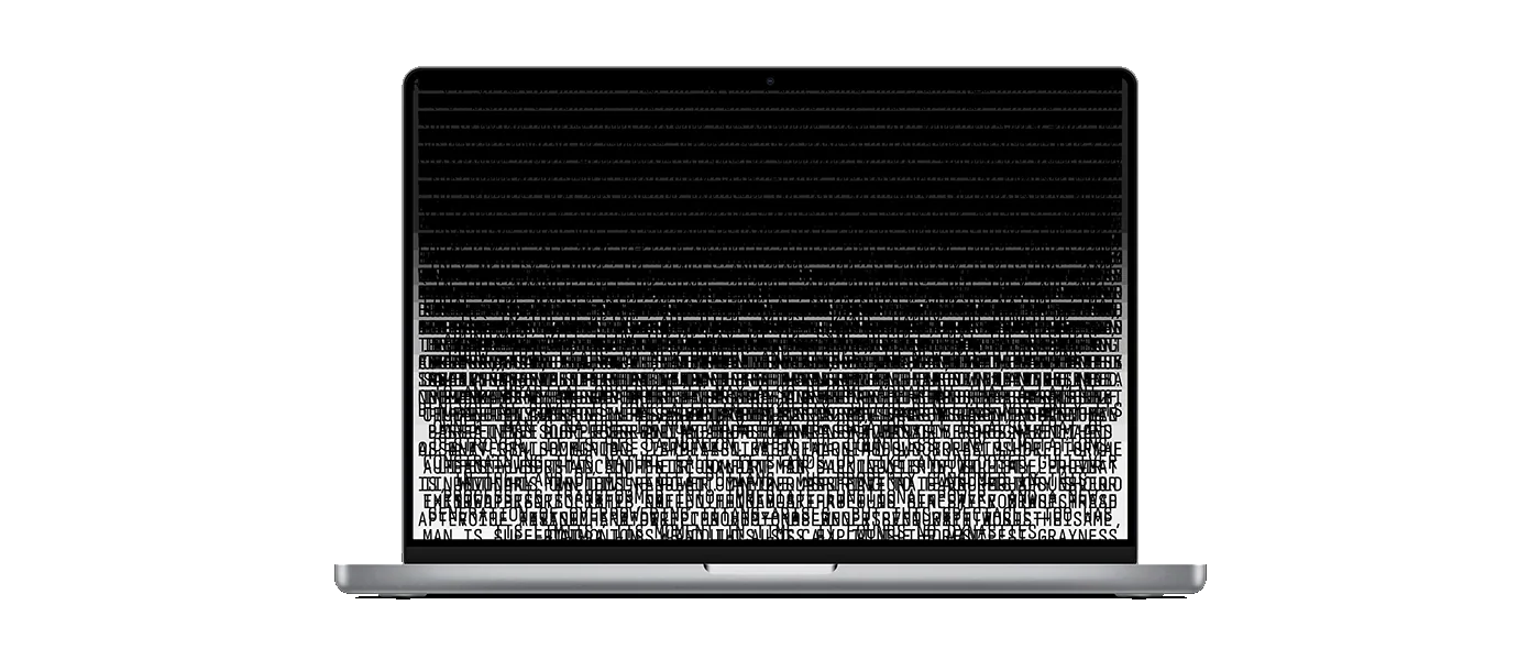
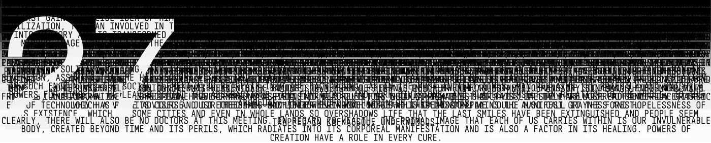
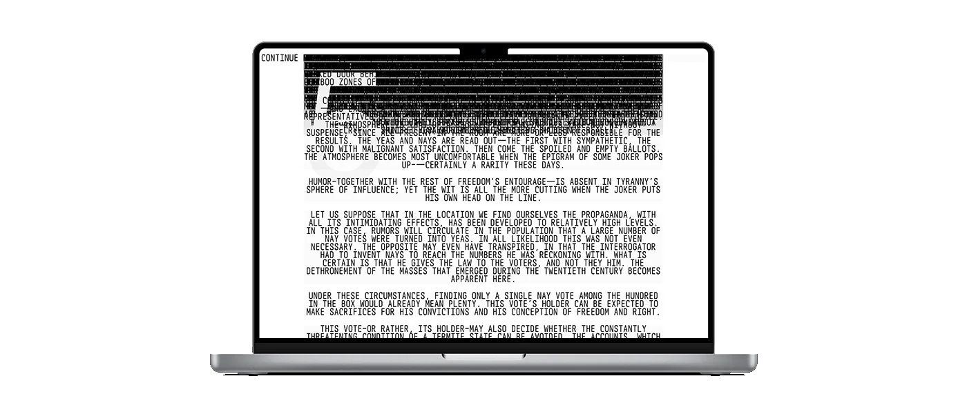
W02 Ernst Jünger Website 2024 Mar Web essay offering a meta-reading of reading itselfThis treatment of Ernst Jünger’s Passage to the Forest makes the act of scrolling part of reading. While a paragraph is fully in view, scrolling substitutes some of its letters with other characters. When movement stops, the original text returns. The interaction creates a small conflict between moving through the essay and being able to read it. The web page gives that conflict a concrete form, asking the reader to alternate between navigation and attention Website Website Website Website Website Website Website Website Website
W01 Dom s Mayakom Website 2023 Mar NDA
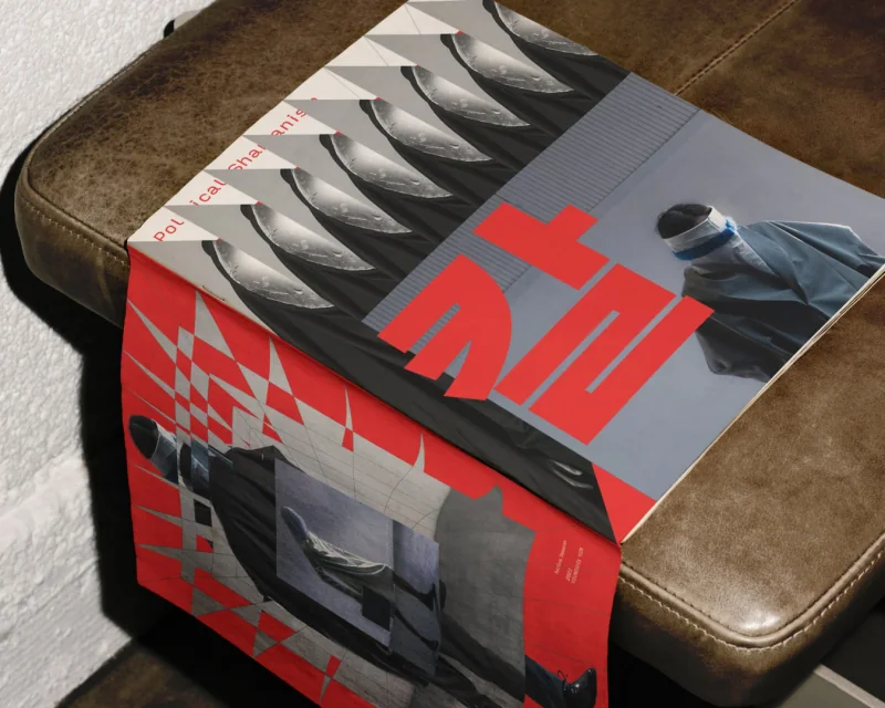
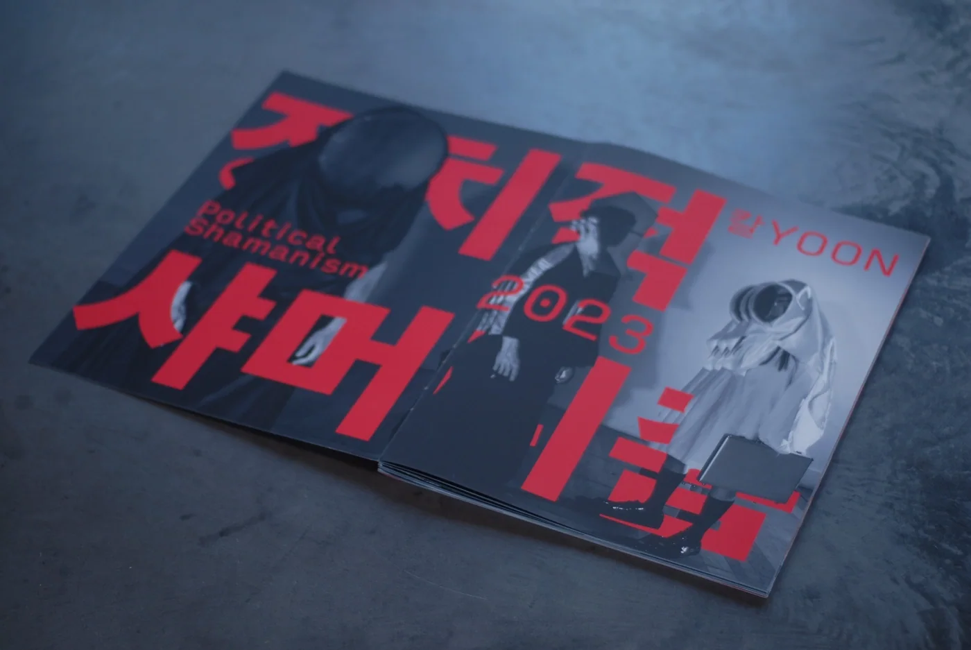
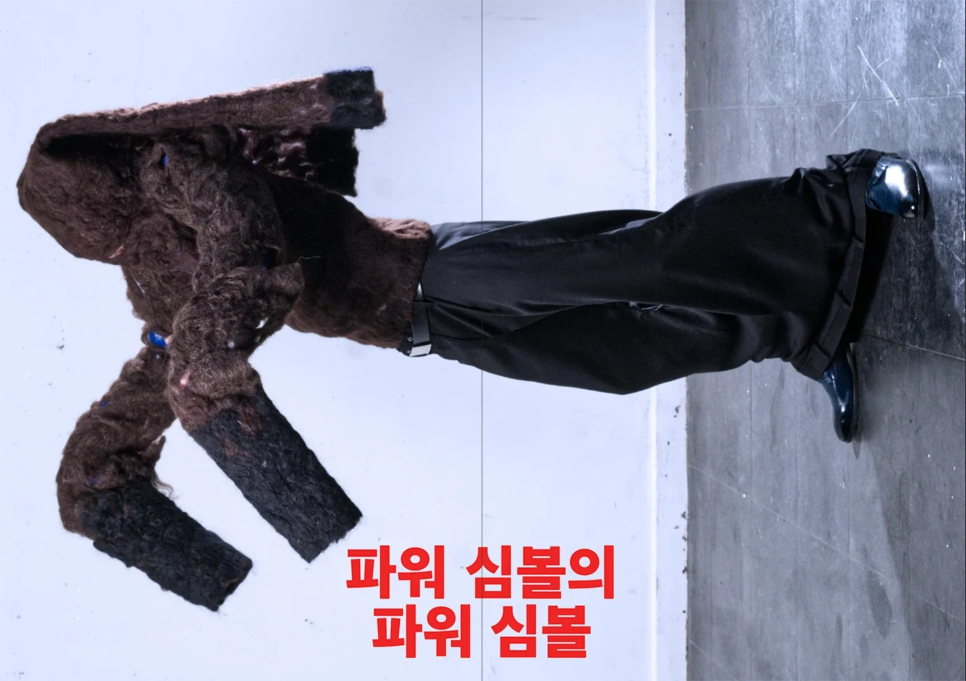
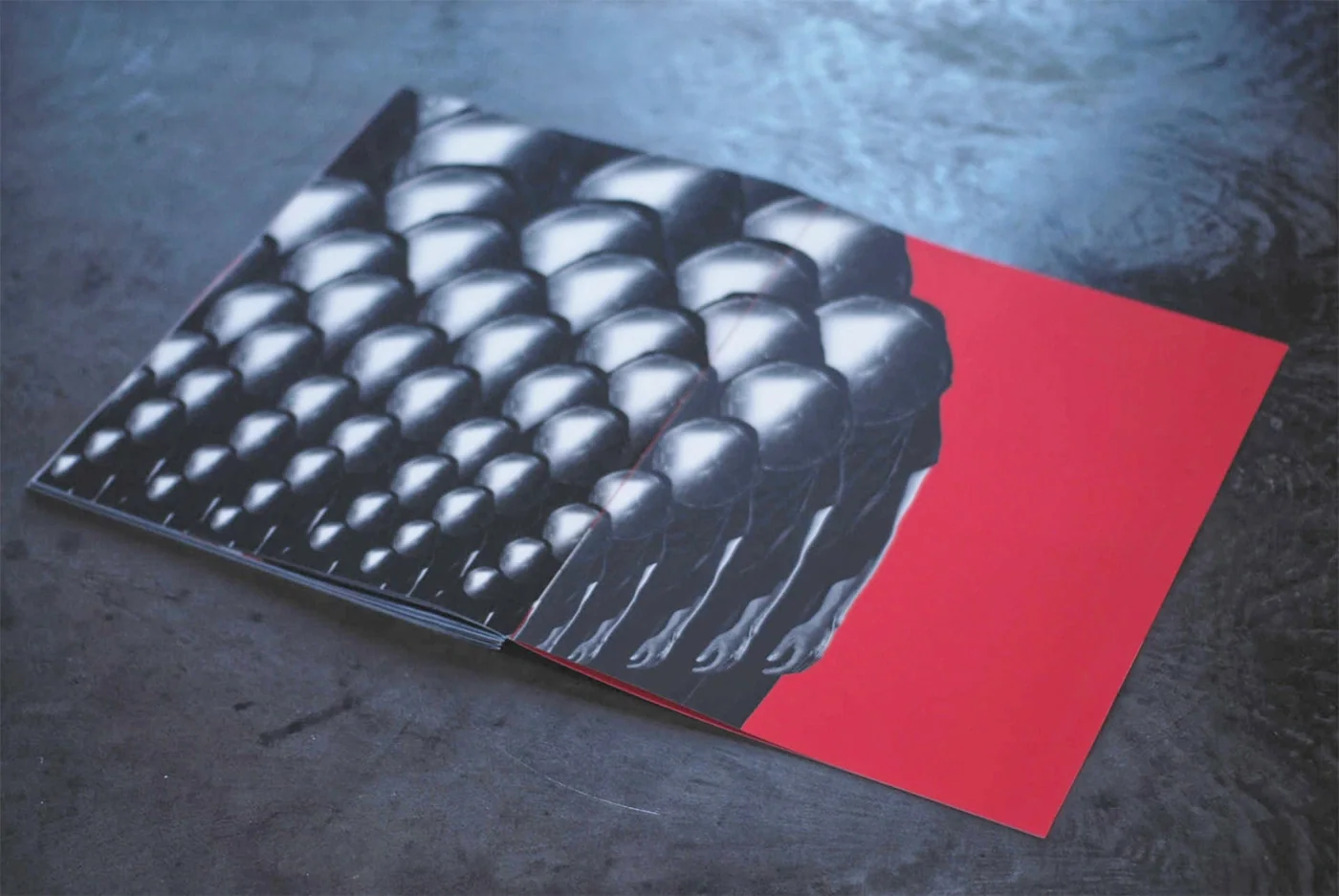
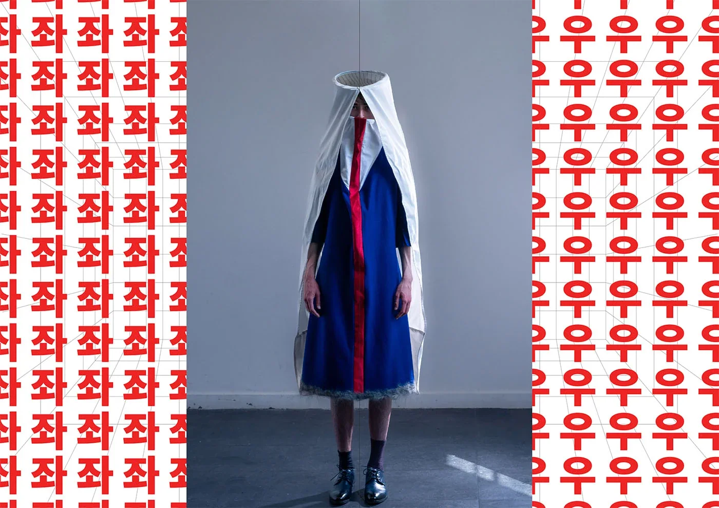
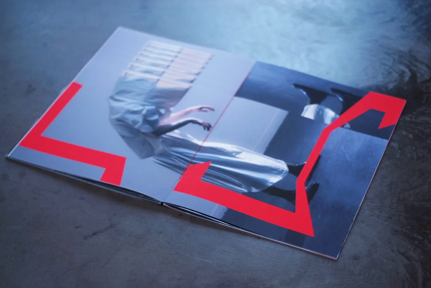
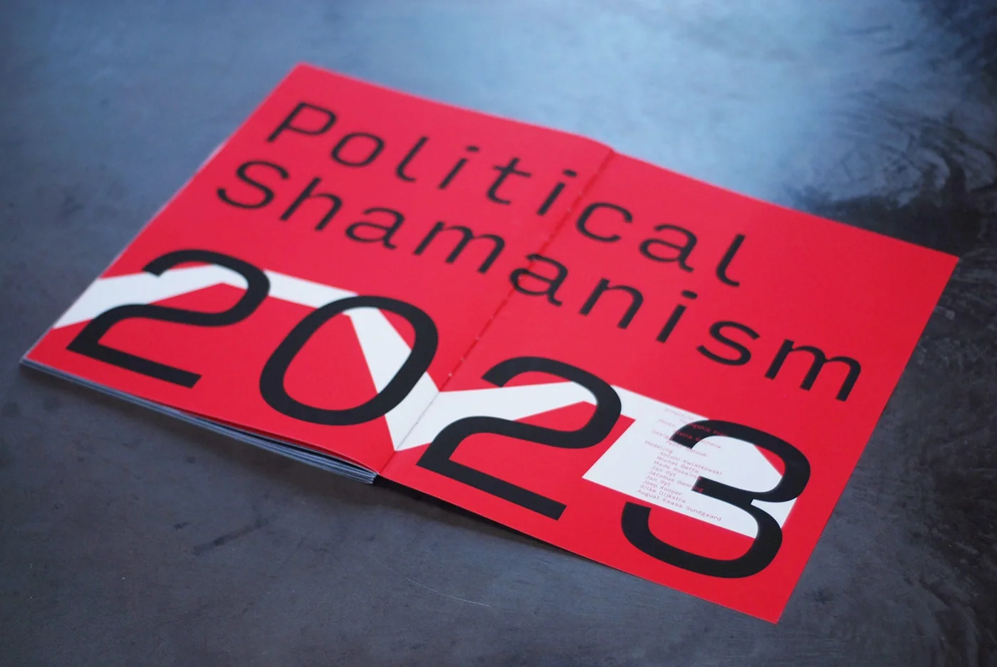
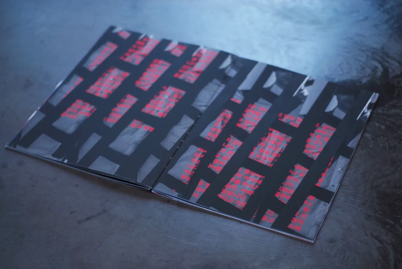
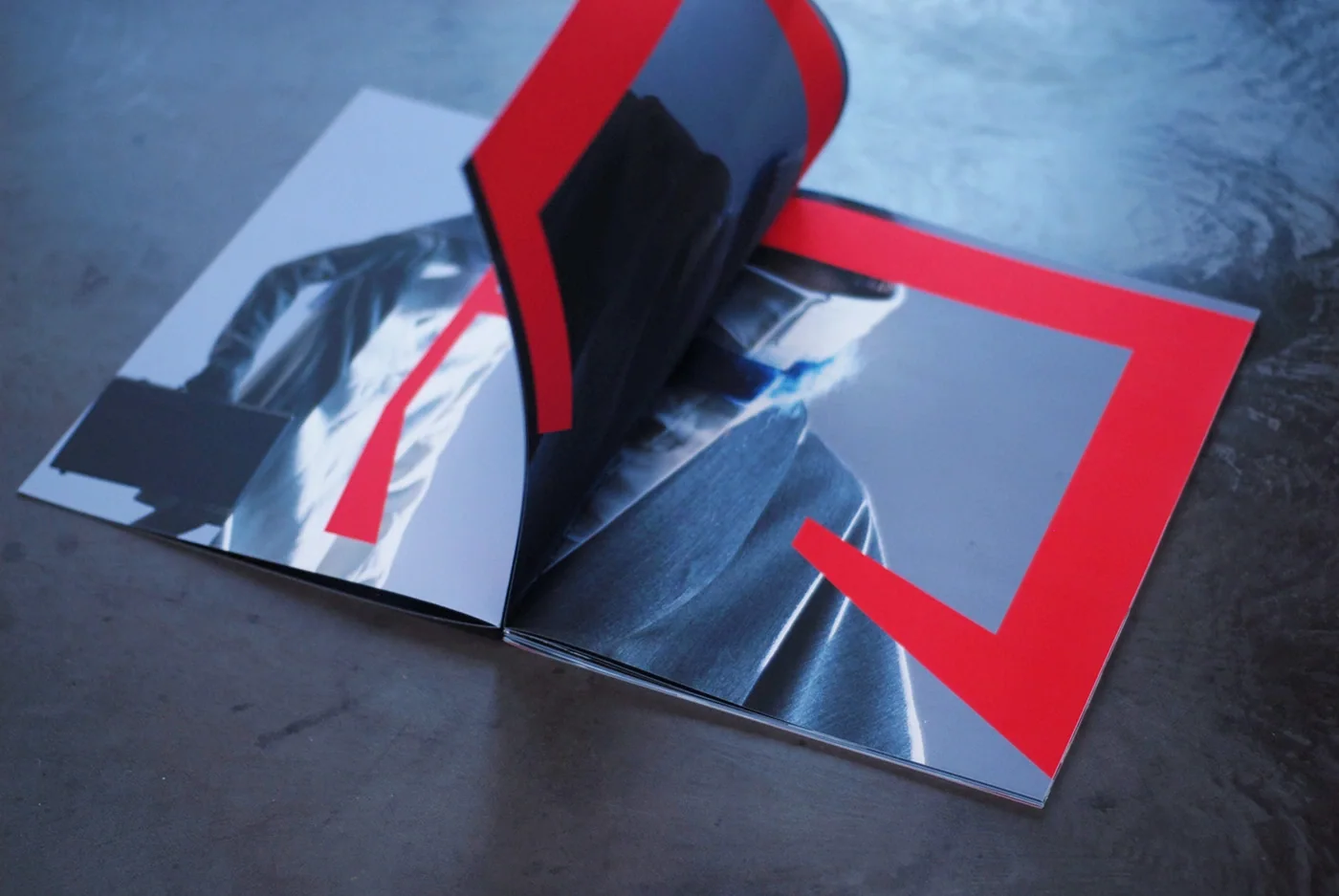
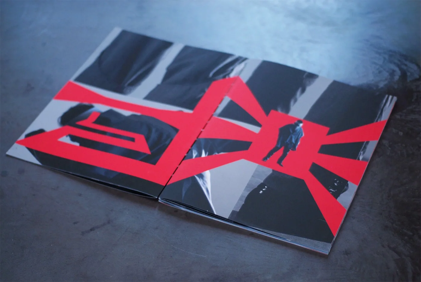
E05 Karl Yoon Book 2023 Jun Fashion catalogue for a graduation collectionKarl's fashion collection is presented through an editorial design that treats photographs and type as active parts of the same composition. Large red letters cut across images, while repeated photographs stretch a moment across the page. The cover and spreads bring garments, bodies and graphic forms into close contact. The publication gives the collection a sequence beyond individual photographs, using repetition and changes of scale to carry its visual character into a printed object Book Book Book Book Book Book Book Book Book Book Book Book Book
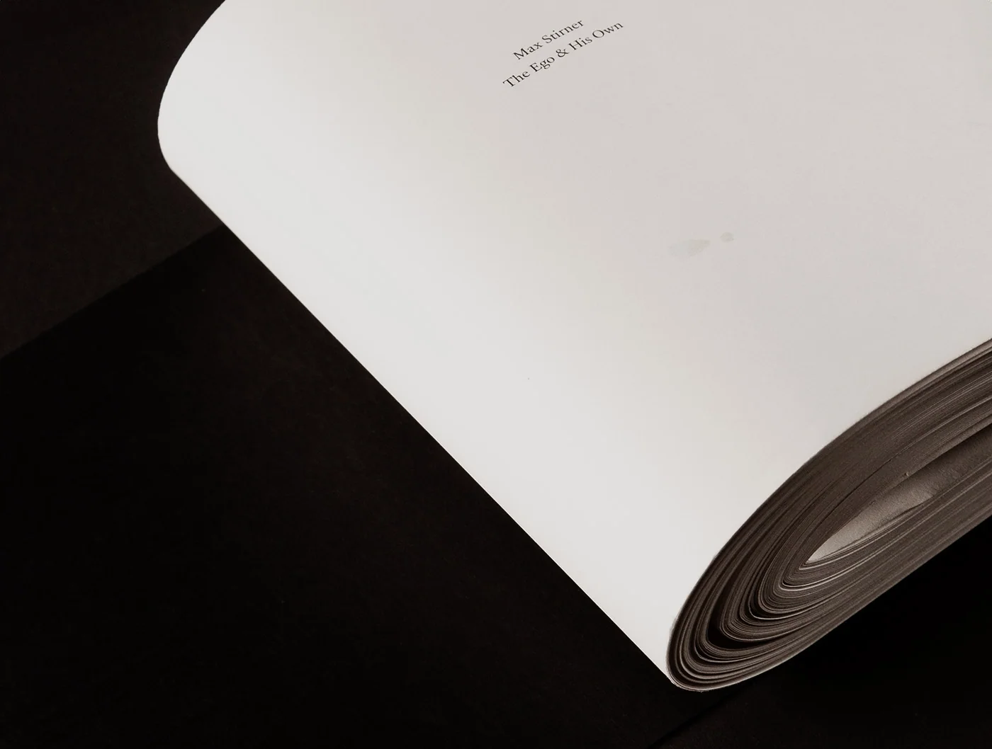
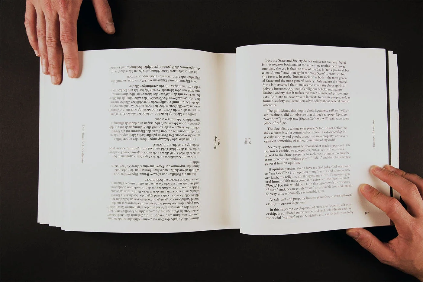
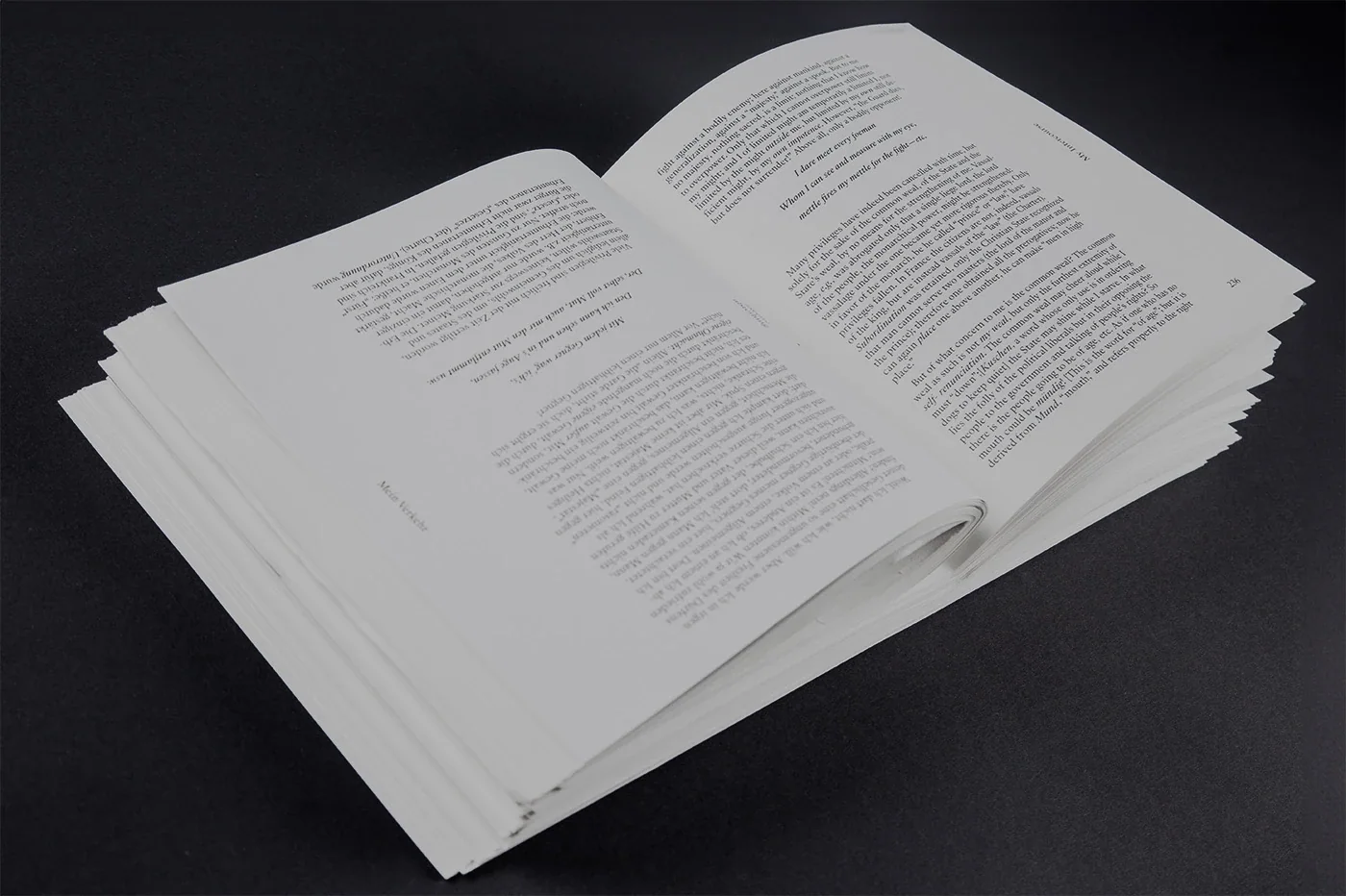
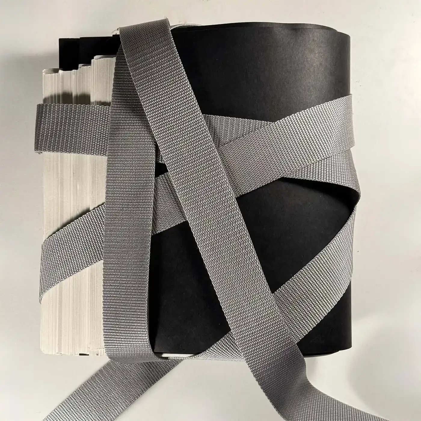
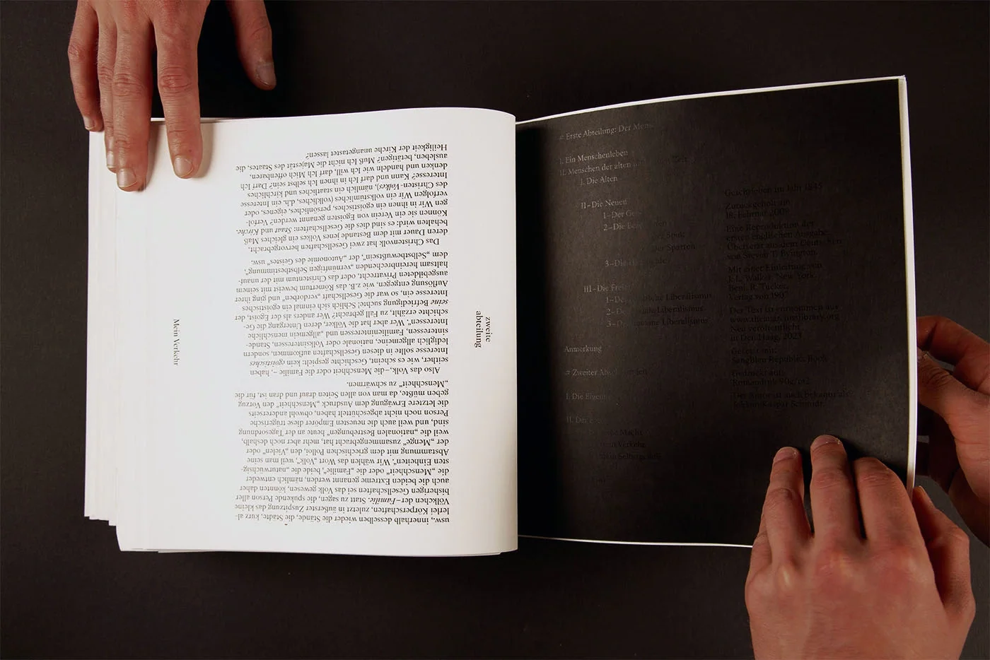
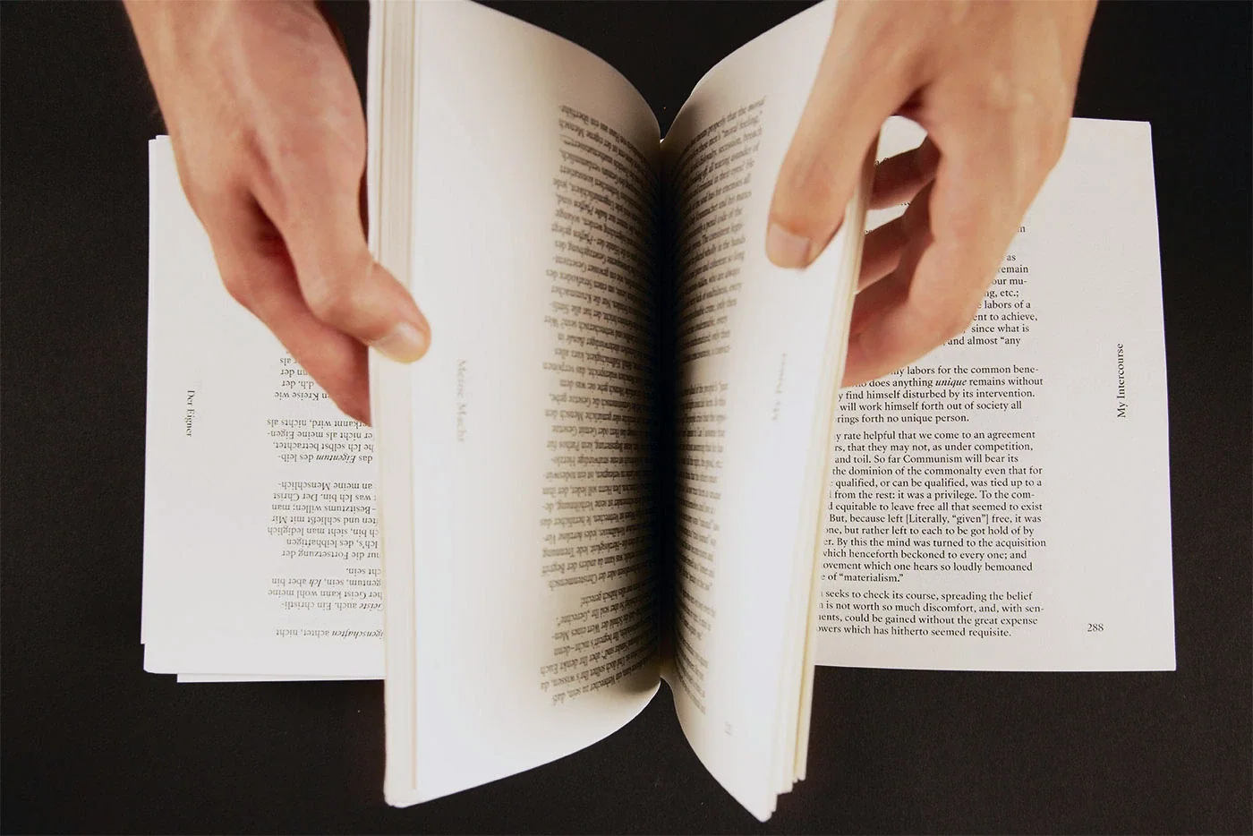
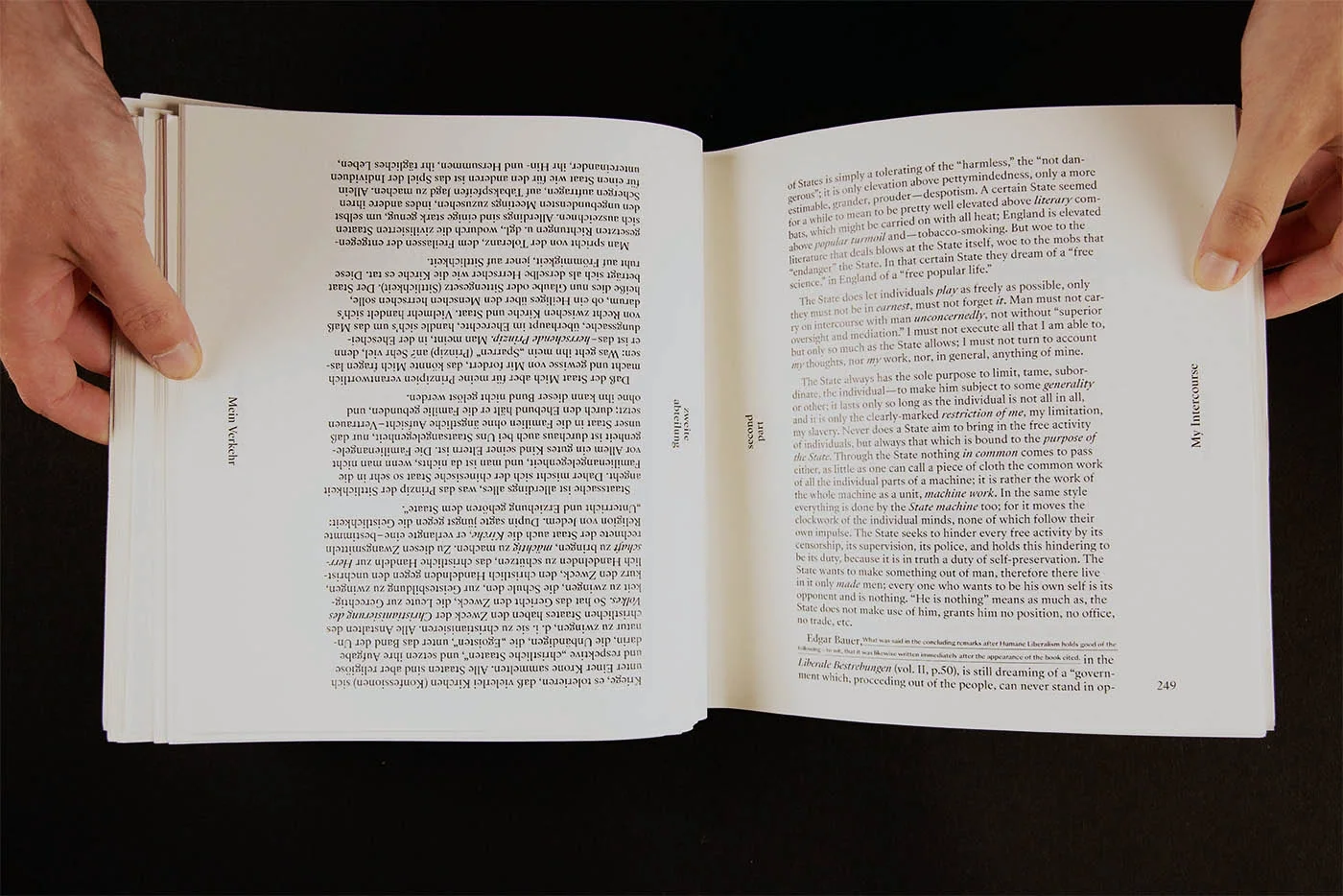
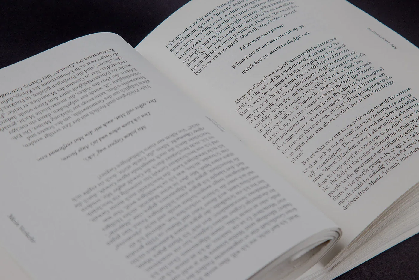
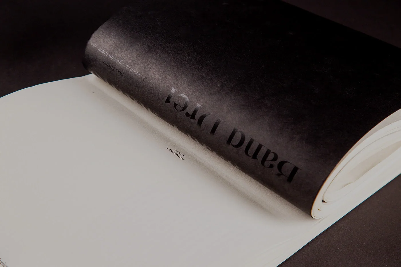
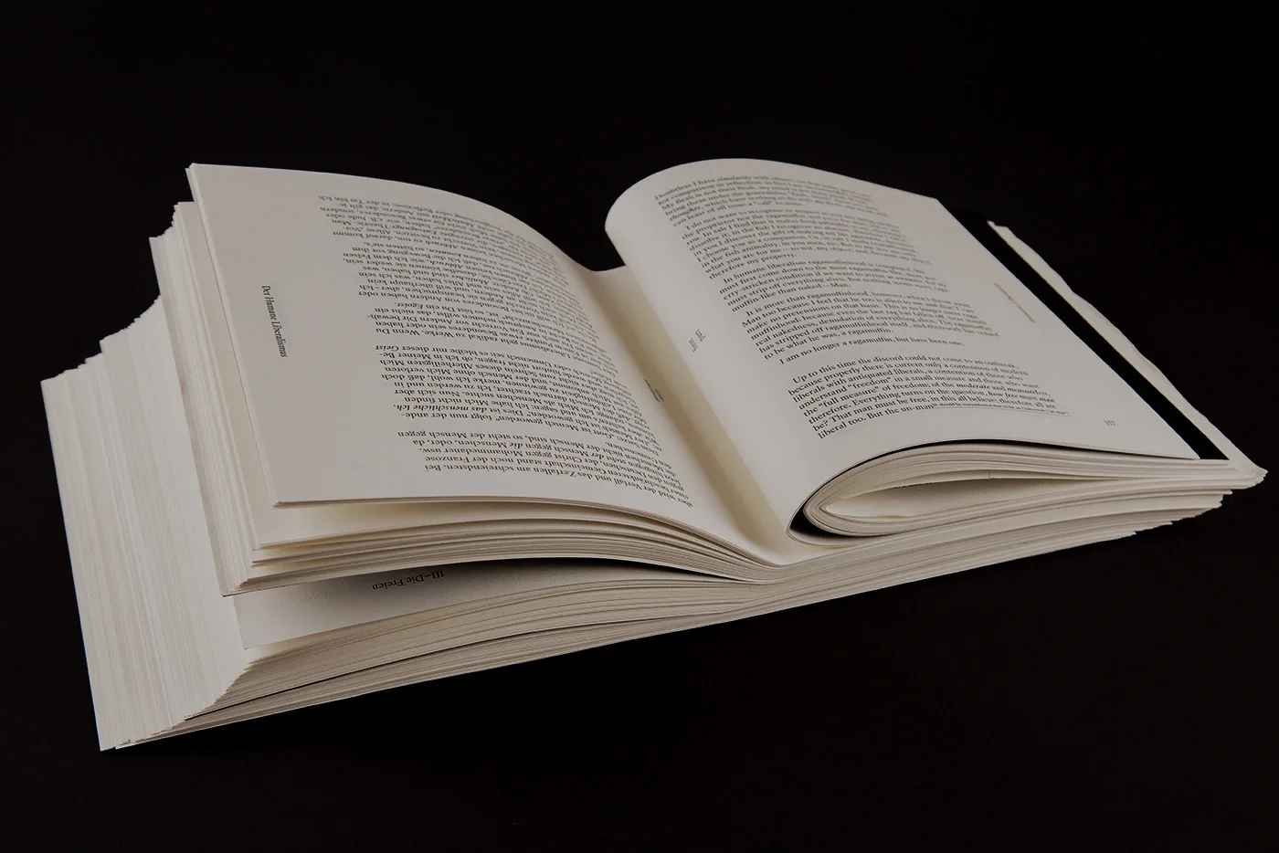
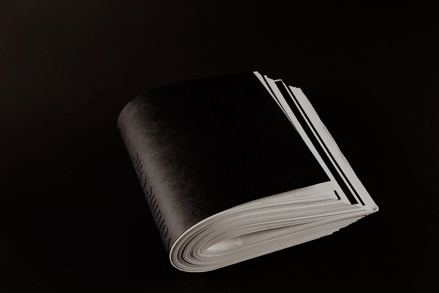
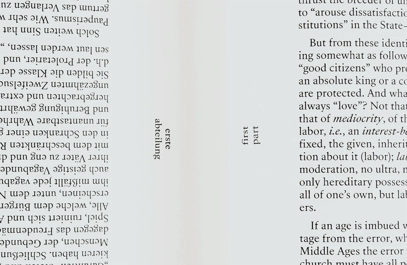
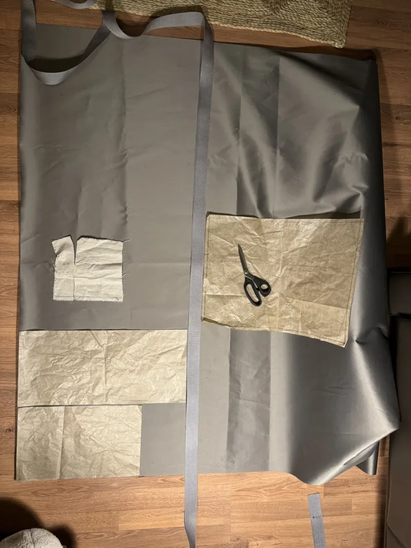
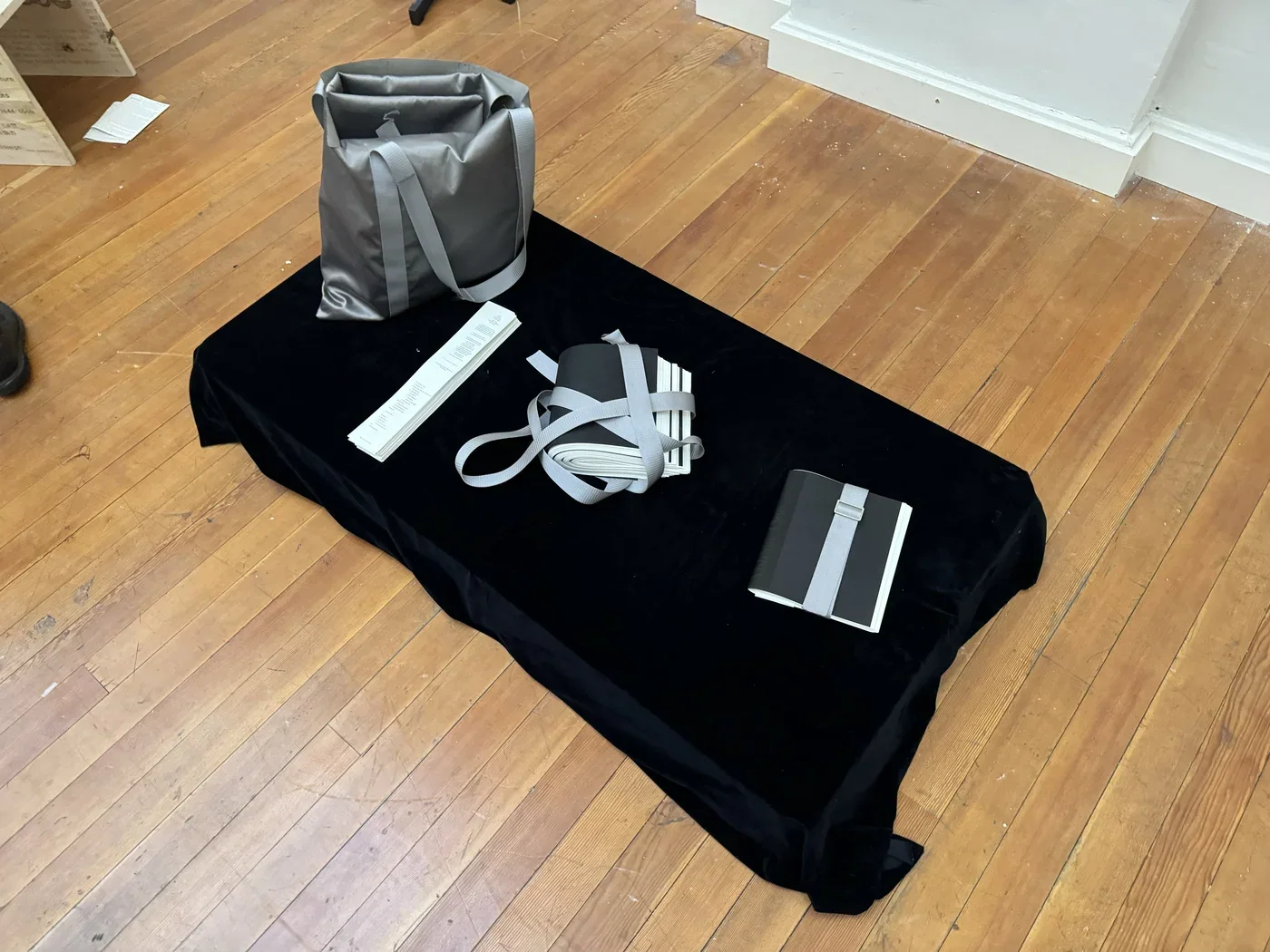
E08 Max Stirner Book 2024 Jan Bilingual edition that opens reading into a shared physical spaceThis edition brings Stirner’s writing into an object that can be carried, opened and used by two readers. The bilingual book comes with a bag that unfolds into a blanket, making a place to sit and read together. That arrangement puts writing associated with individualism beside the practical act of sharing space. The book and its carrying material form one reading setup. Its proposition is expressed through use: a publication becomes something to handle and inhabit together, as well as a text to read Book Book Book Book Book Book Book Book Book Book Book Book Book Book Book
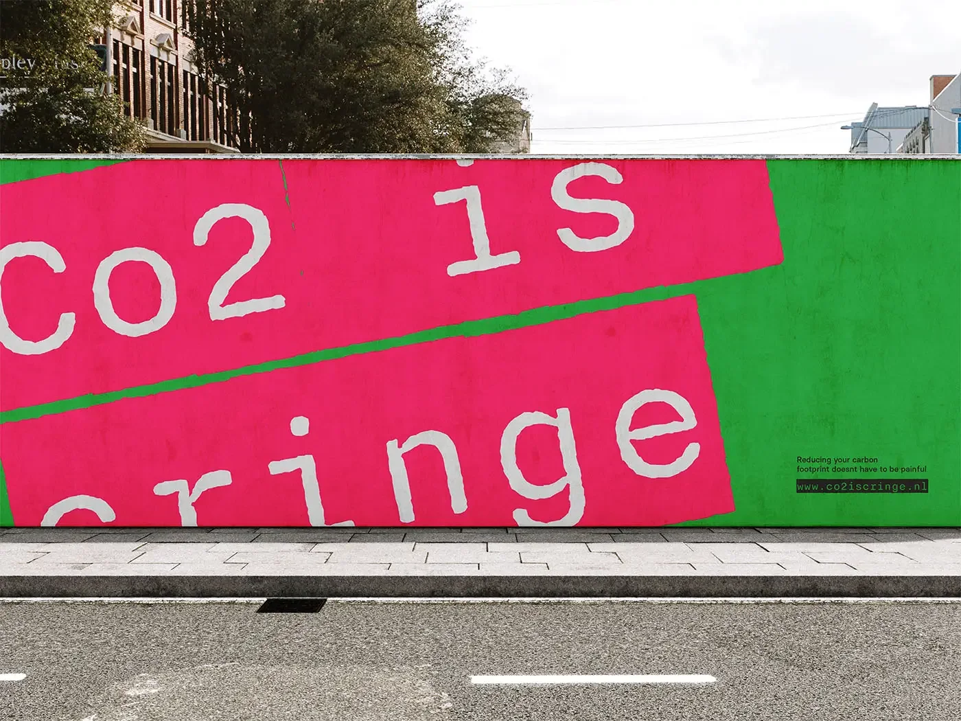
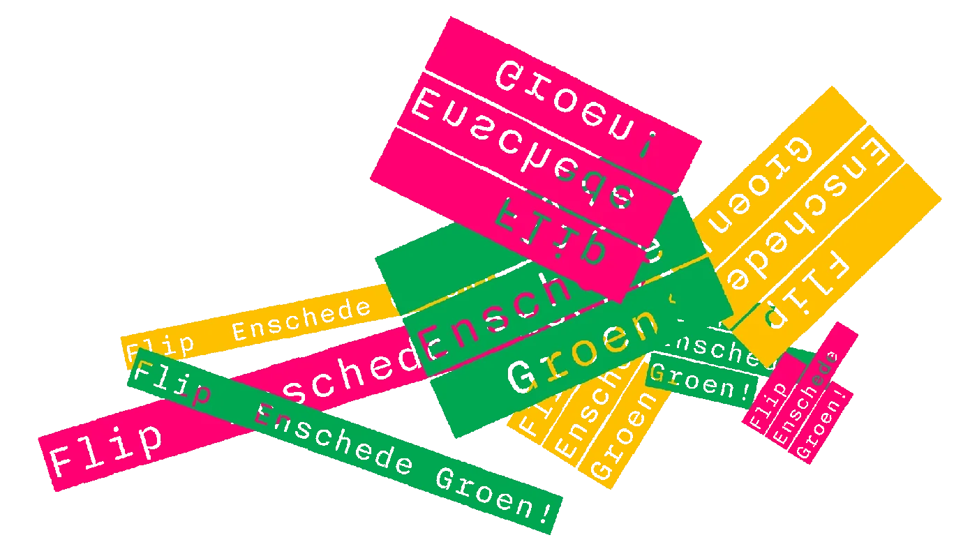
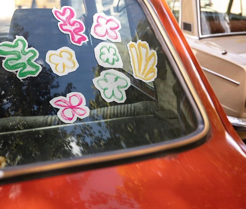
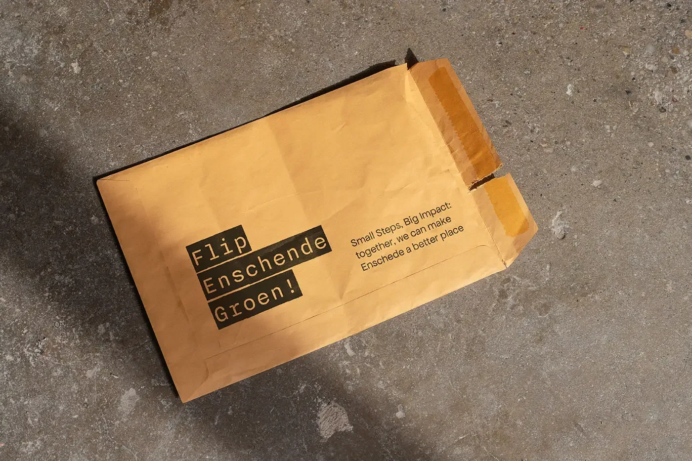
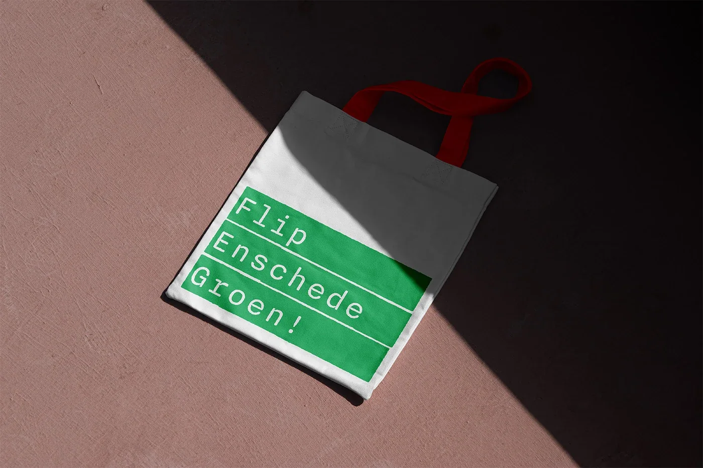
B10 FEG Visual Identity 2024 Feb Identity for Enschede’s environmental campaignThe campaign addresses Enschede residents through a visual language that carries environmental messaging into public space and everyday use. Large pink and green blocks hold rough-edged lettering, with “CO2 is cringe” as a direct point of entry. The same identity appears on tote bags, allowing the message to travel with the person carrying it. The work makes a local environmental campaign recognisable across different surfaces, using a short statement and a small set of repeated visual decisions Visual Identity Visual Identity Visual Identity Visual Identity Visual Identity Visual Identity
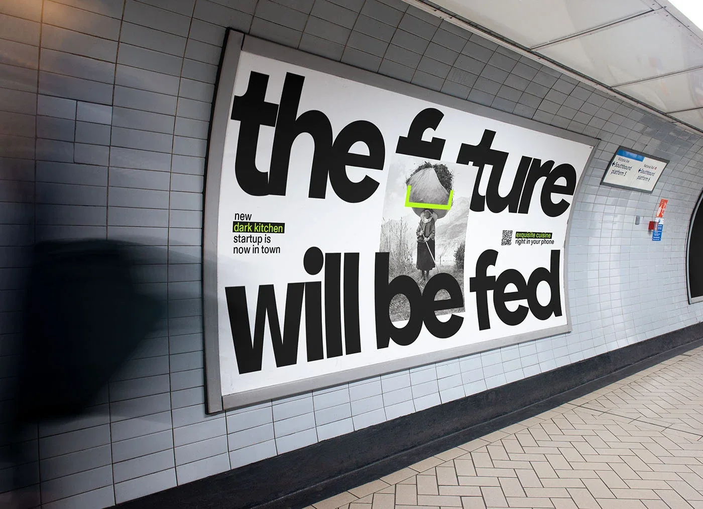
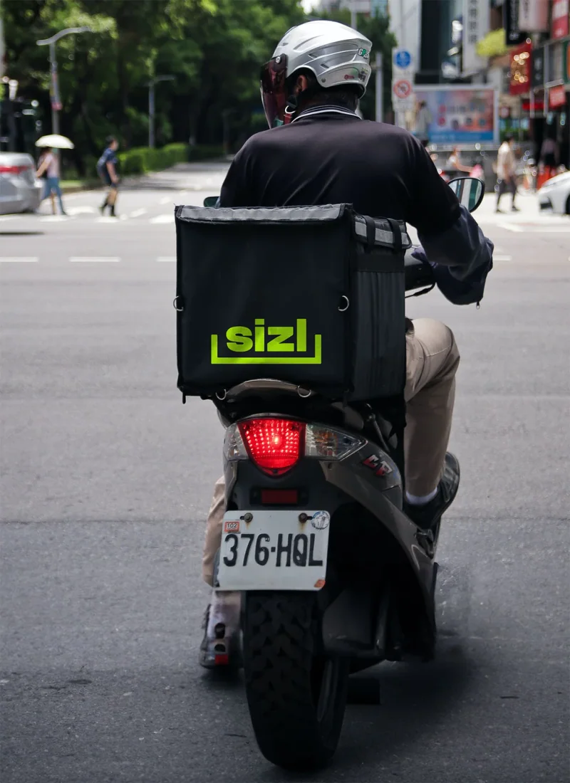
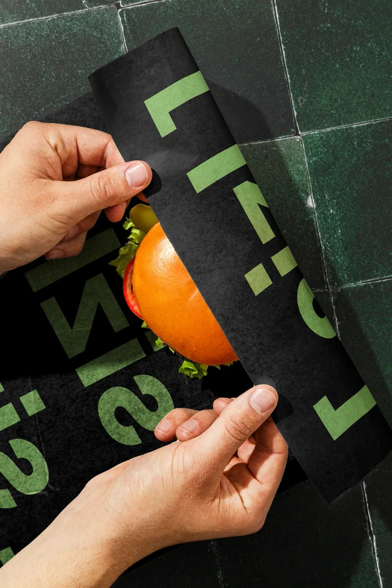
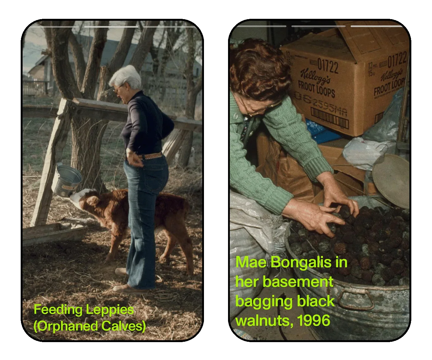
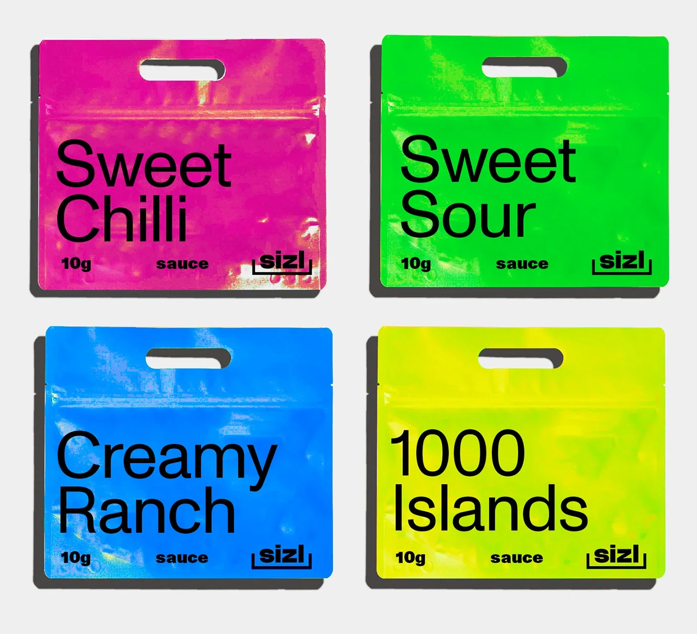
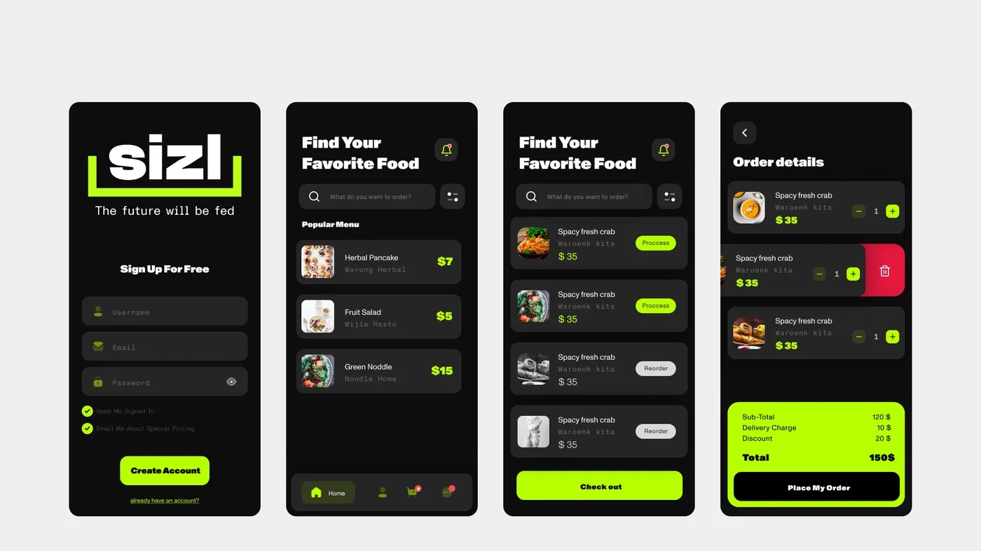
B11 sizl Visual Identity 2022 Jul Identity for a high-end dark kitchen startupsizl’s offer combines the convenience of a dark kitchen with an ambition to serve high-end meals. The identity translates that position into large black lettering, a restrained colour palette and sharp lime accents. Advertising gives short statements most of the space, while the wider work extends into logos and packaging. The task was to give a food service without a conventional dining room a visible character. The result is a graphic system that presents the meal and its convenience through the same direct voice Visual Identity Visual Identity Visual Identity Visual Identity Visual Identity Visual Identity Visual Identity Visual Identity
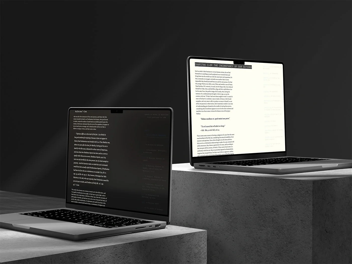
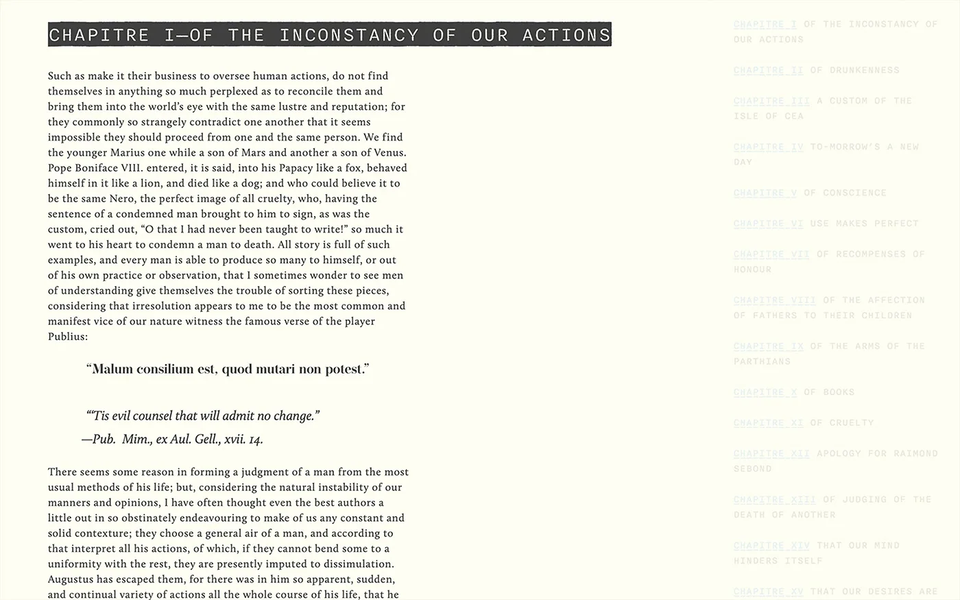
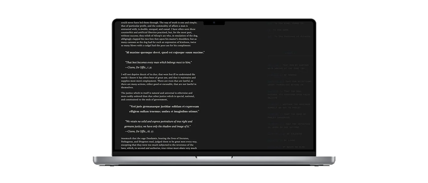
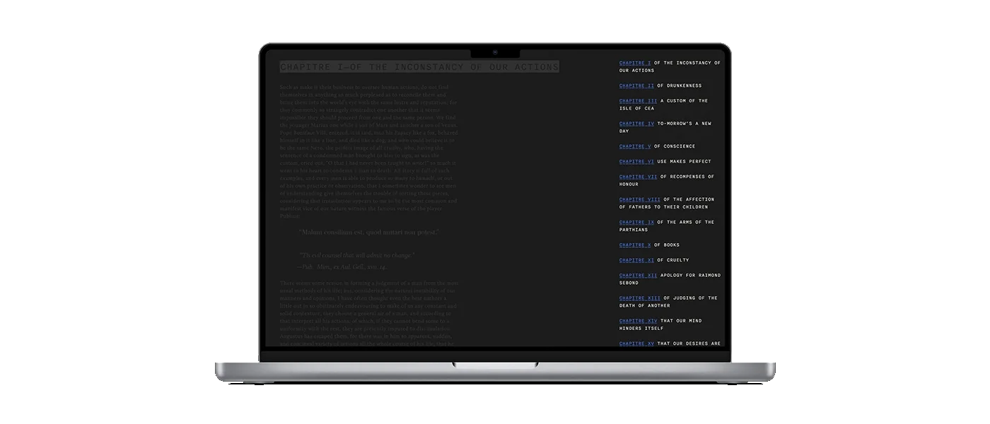
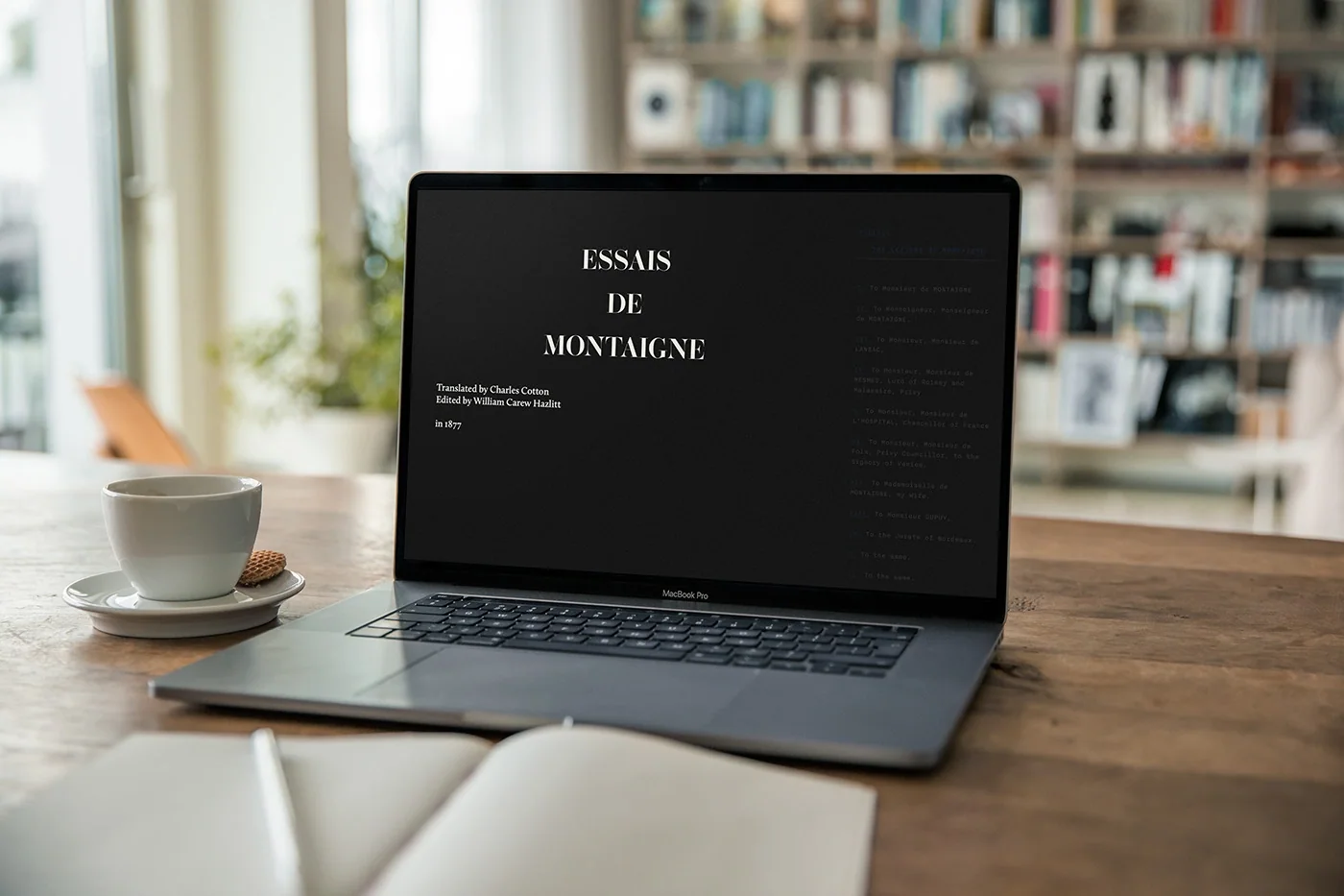
W03 Michel de Montaigne Website 2023 Oct Bed-side-web-bookThis web book turns Les Essais into a companion you can open without deciding where to start. On each visit, the site selects a chapter at random and takes you straight to it. From there, chapter navigation lets you keep reading or follow another route. Montaigne’s words stay intact; the interface changes the point of entry, making room for chance encounters with a text you can return to Website Website Website Website Website
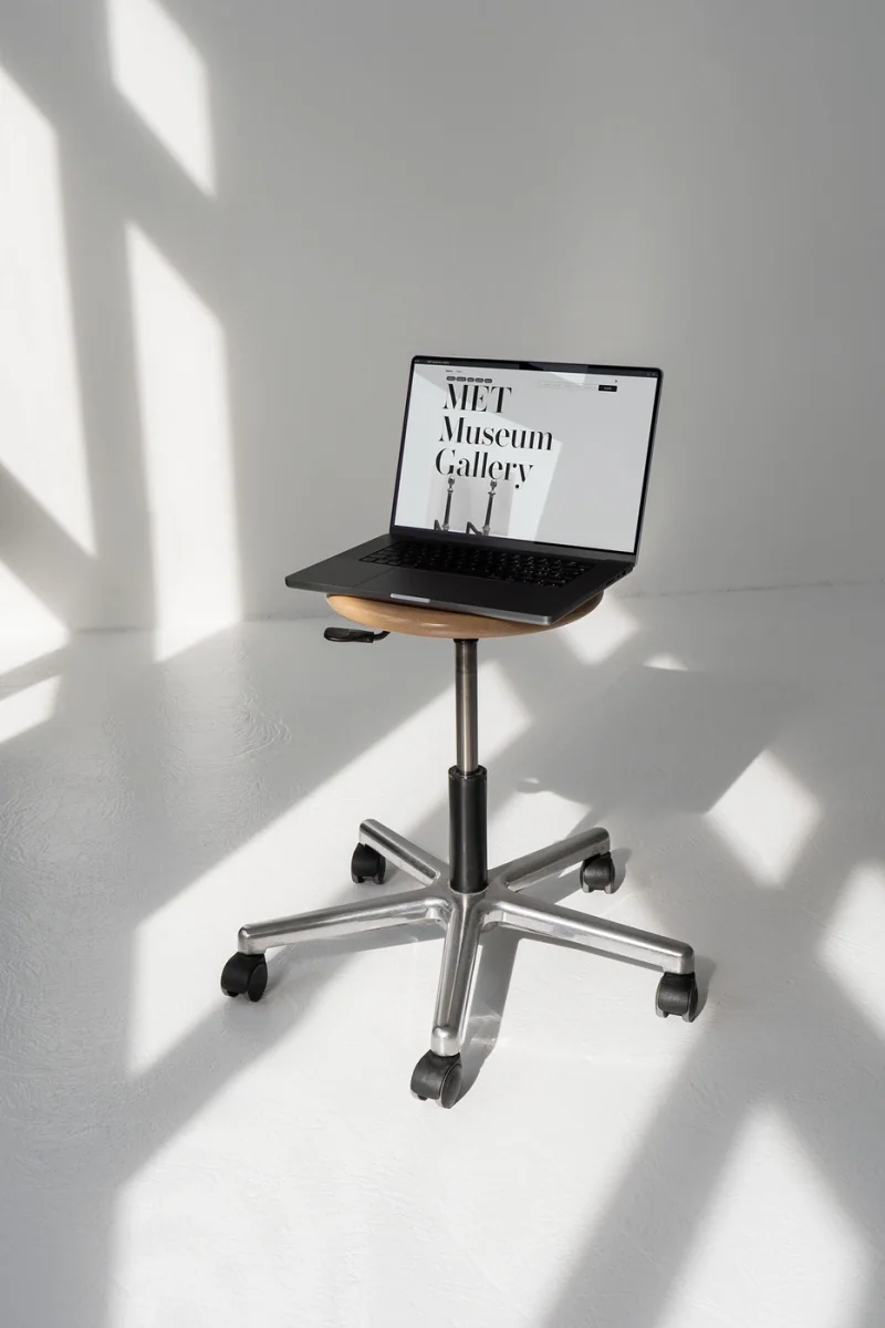
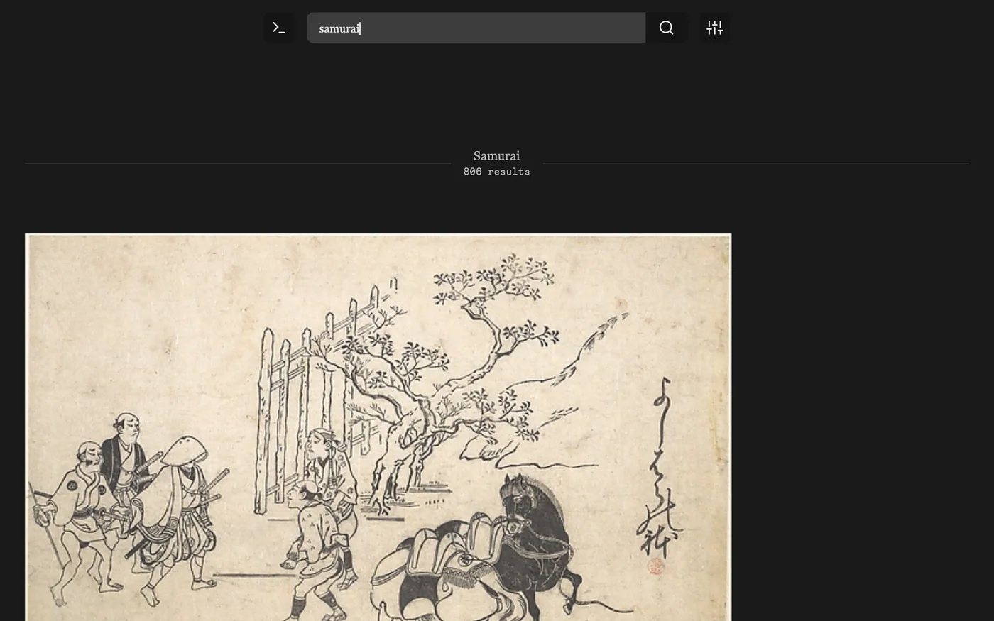
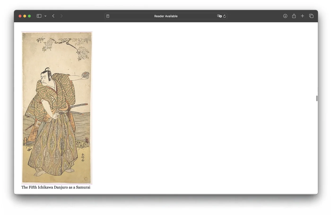
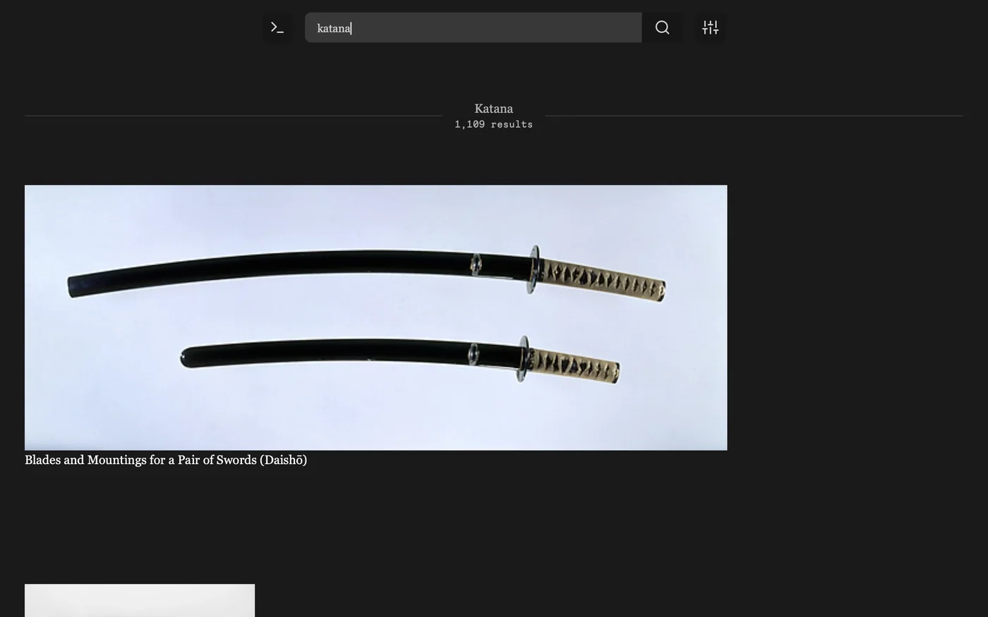
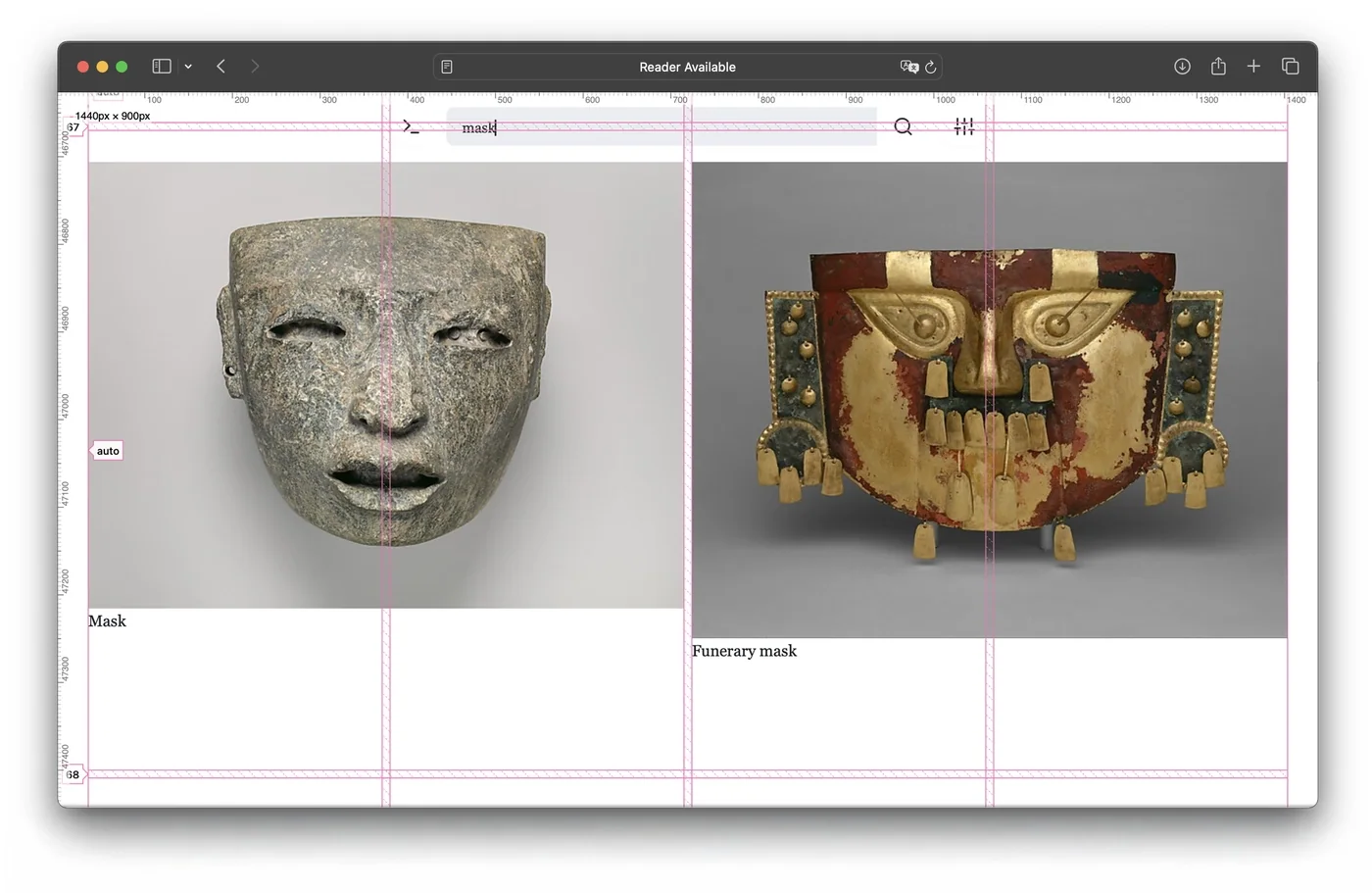
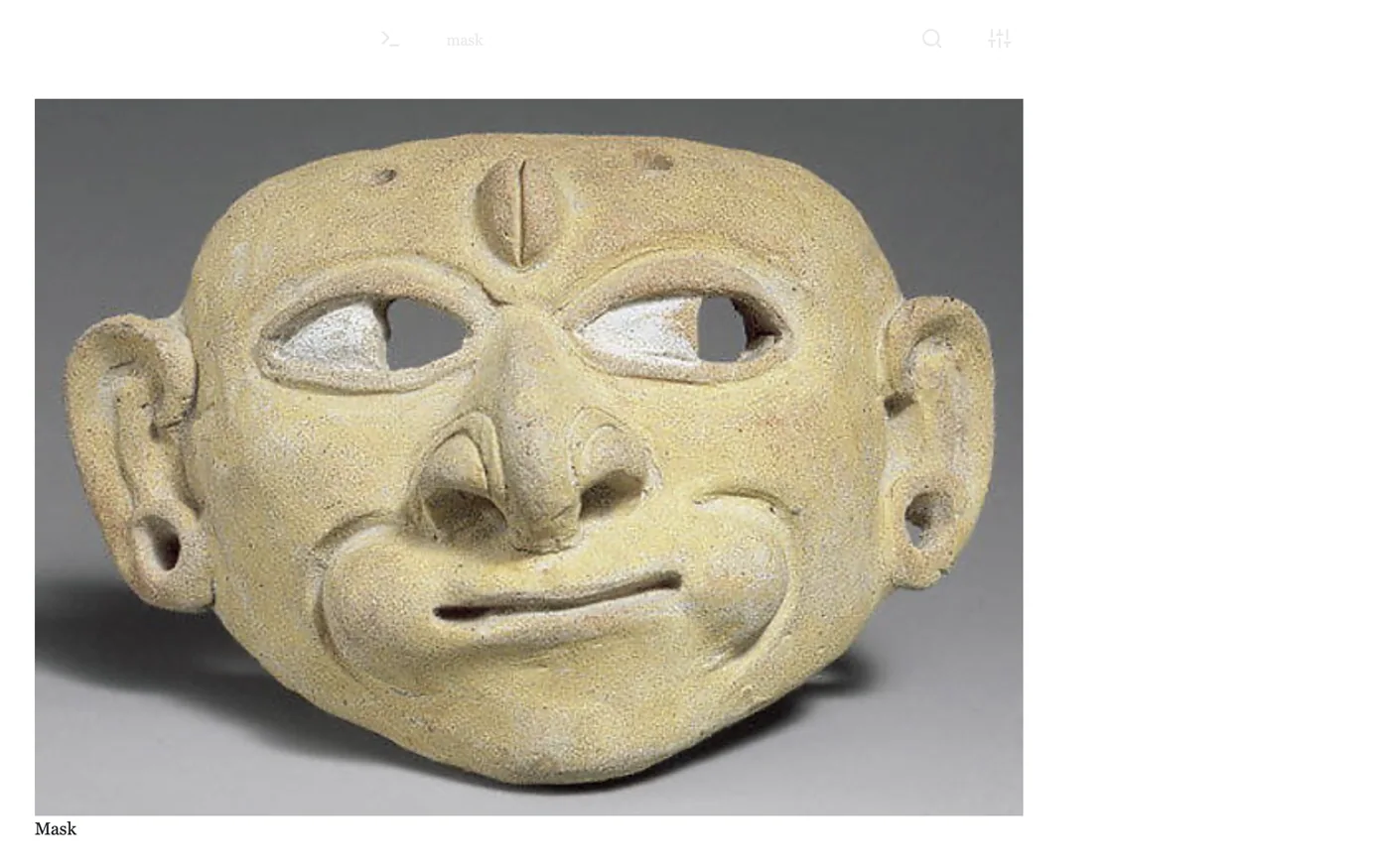
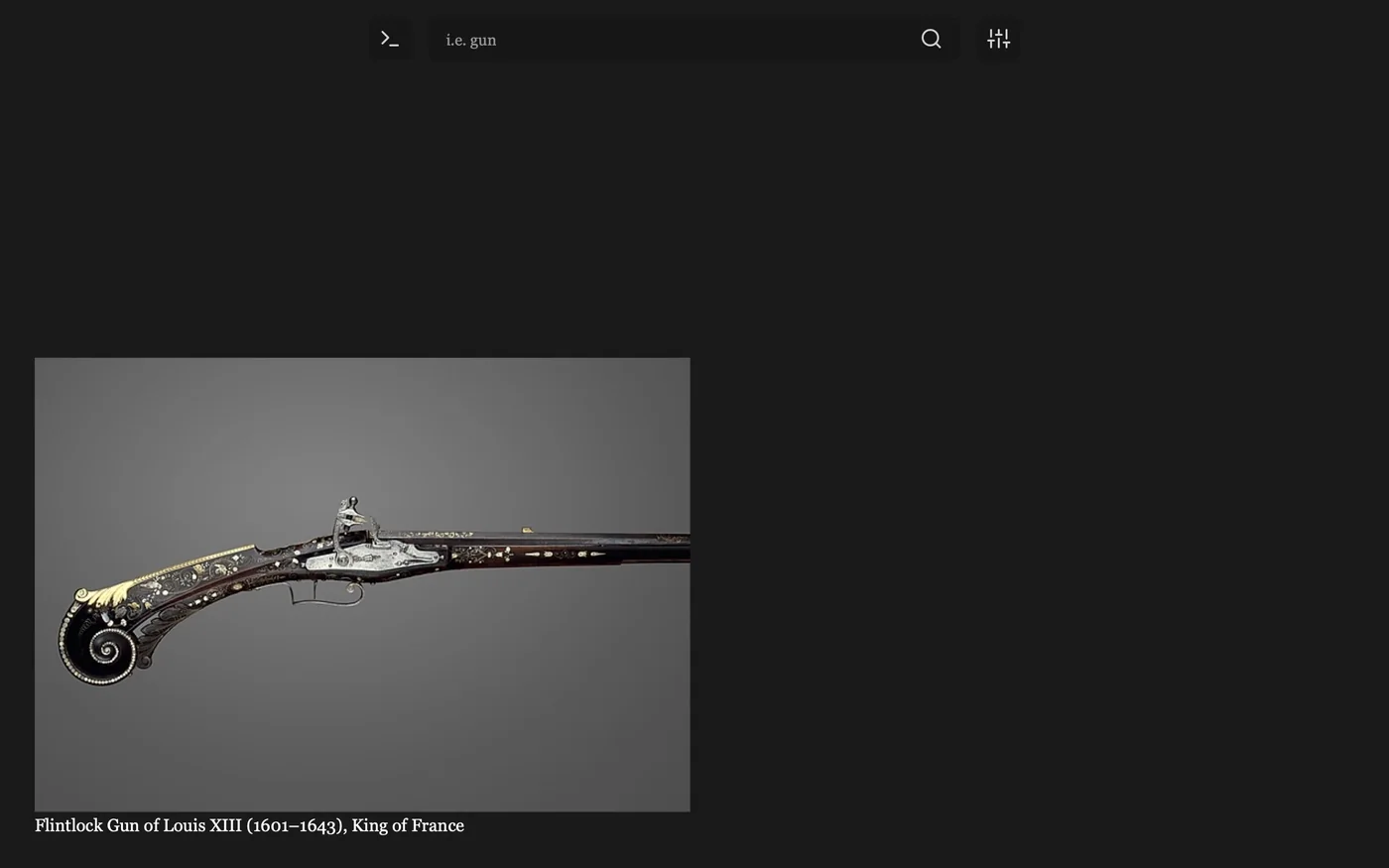
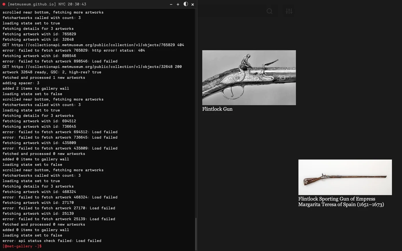
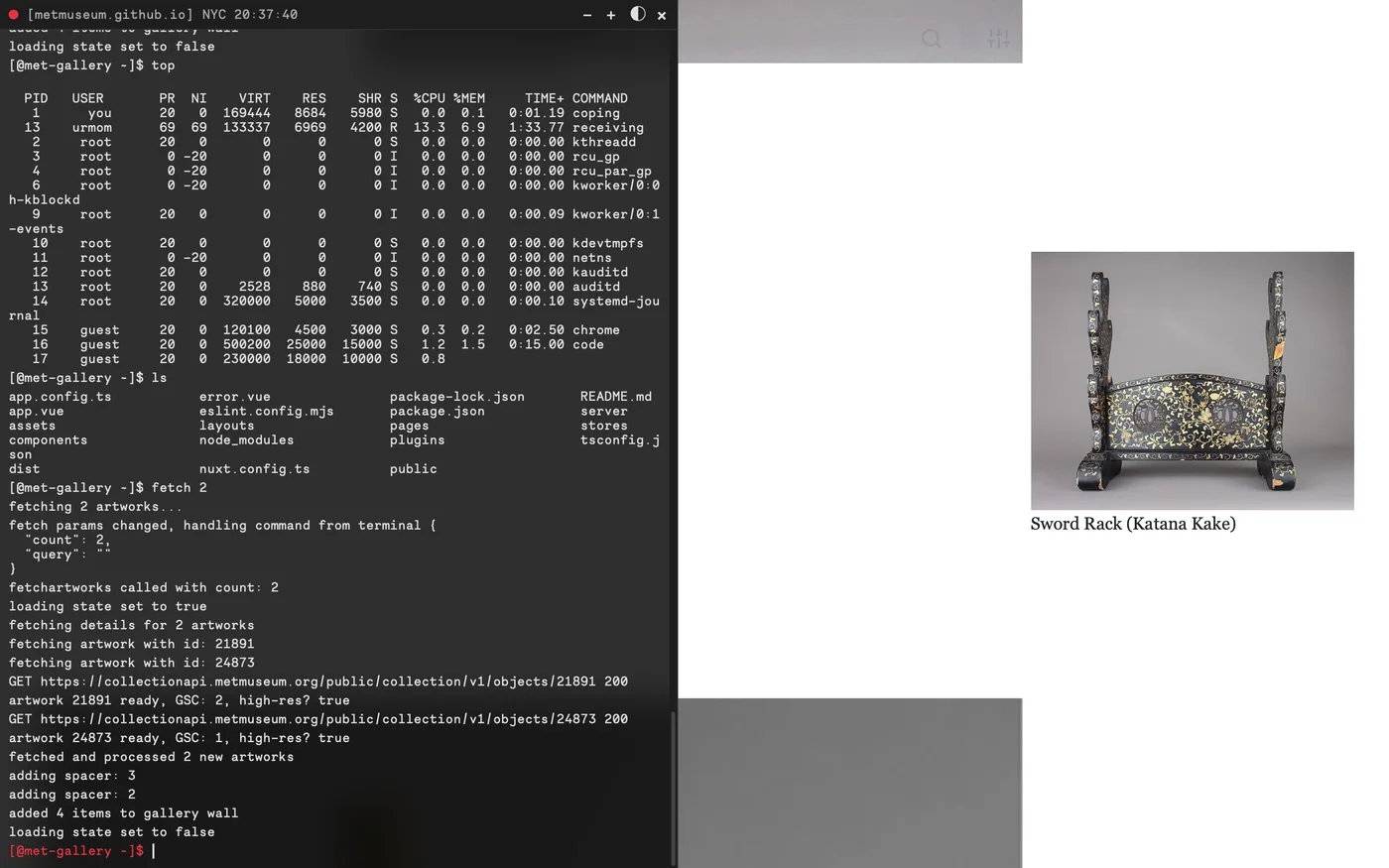
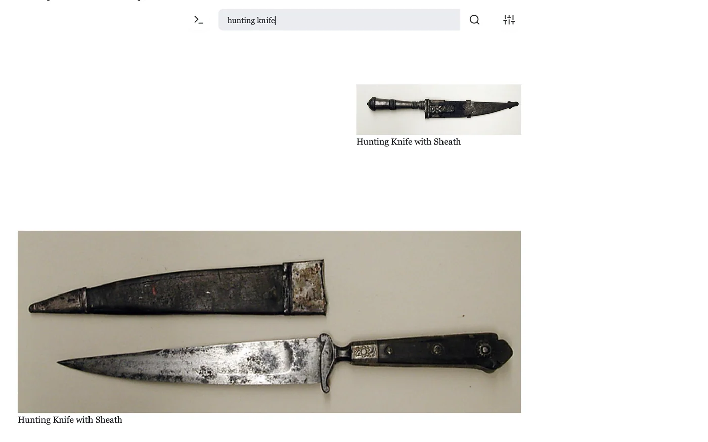
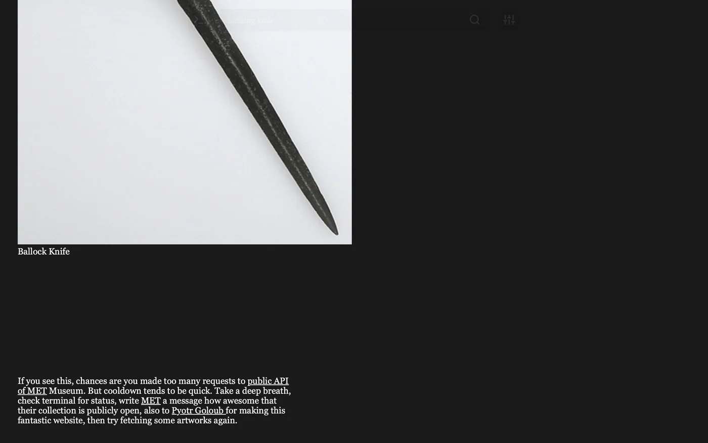
W04 MET Museum Website 2024 Feb A better way to navigate the Metropolitan Museum of Art’s online archiveThis collection browser was developed around the needs of people looking at art for reference and inspiration. Its interface gives individual works a clear, uncluttered setting, reducing the amount of competing material around the image. The project takes the presentation of a large museum collection as a design problem: how to make room for looking within a browsing tool. The resulting web app keeps the artwork as the main point of attention, with the interface acting as its frame Website Website Website Website Website Website Website Website Website Website Website
W05 NaN Typefoundry Data Visualisation 2024 Apr NDA
M04 Leiden University Motion 2024 Jul Leiden University’s 450th-anniversary logo set in motionLeiden University’s 450th anniversary provided the occasion for a moving version of its anniversary mark. The animation draws on the construction of the number itself, using straight strokes and circular forms to assemble its figures. Orange and red edges give the lines a visible sense of movement as the mark takes shape. The work turns an anniversary number into a short sequence, giving the celebration an animated expression while keeping the number as its central image Motion
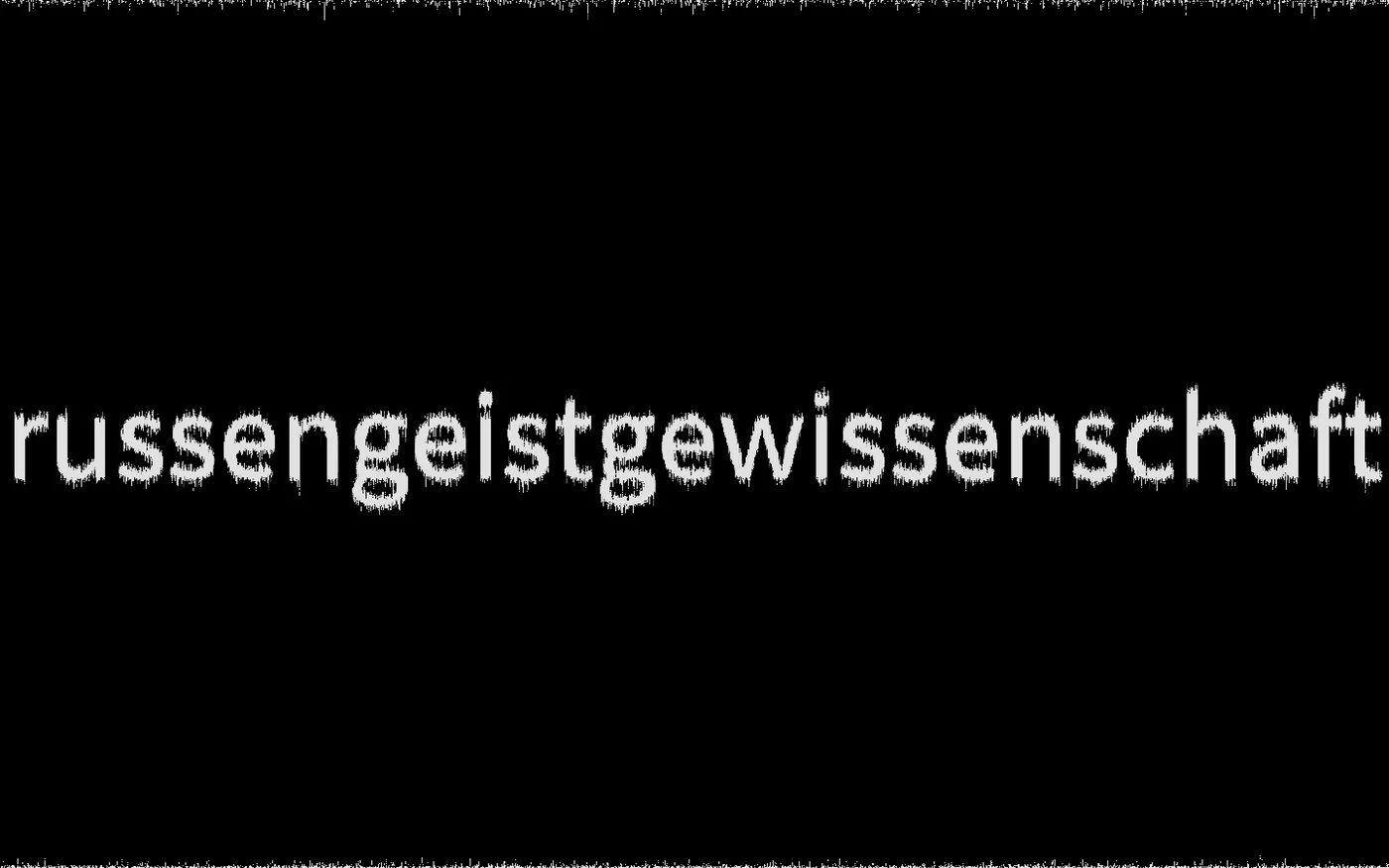
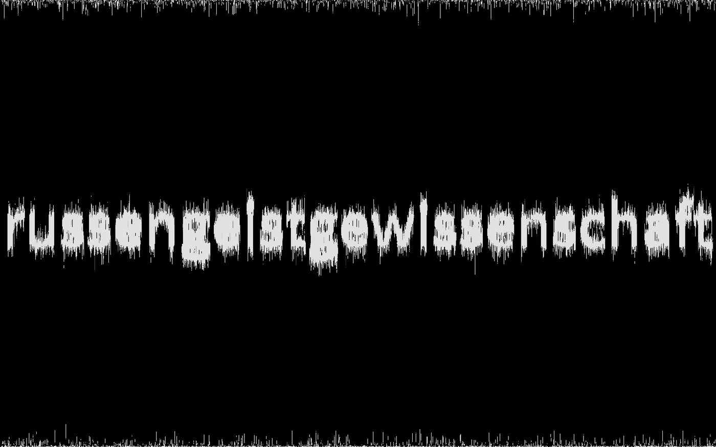
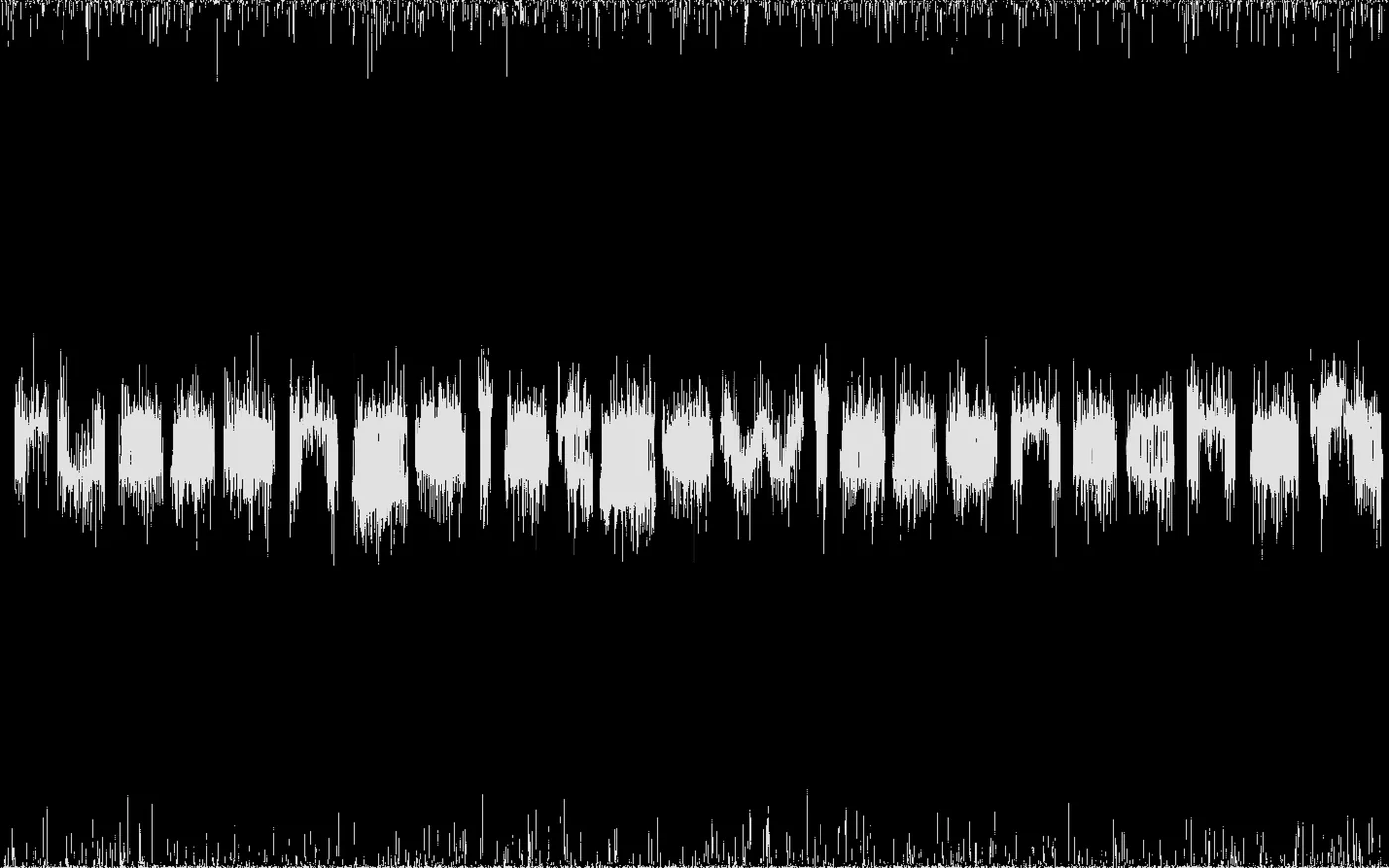
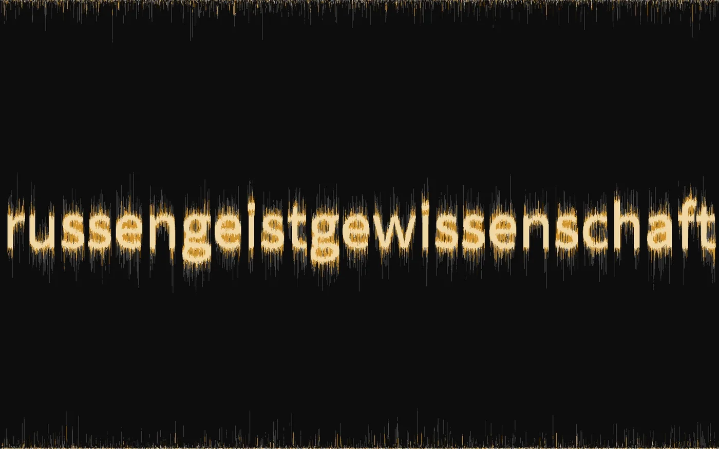
M02 russengeistgewissenschaft Motion 2023 Dec Splash screenIntroducing russengeistgewissenschaft through a wordmark that appears to break up at its edges. White letters sit against black, with fine visual noise interrupting their outlines and the surrounding frame. Built with p5.js, the motion brings a changing texture into the identity’s opening image. The work uses the name as its main material, moving between a readable word and a field of marks. That transition gives the introduction its character through the behaviour of the lettering Motion Motion Motion Motion Motion
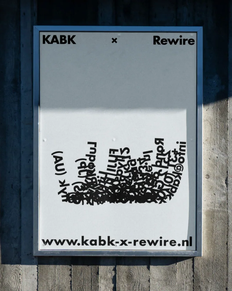
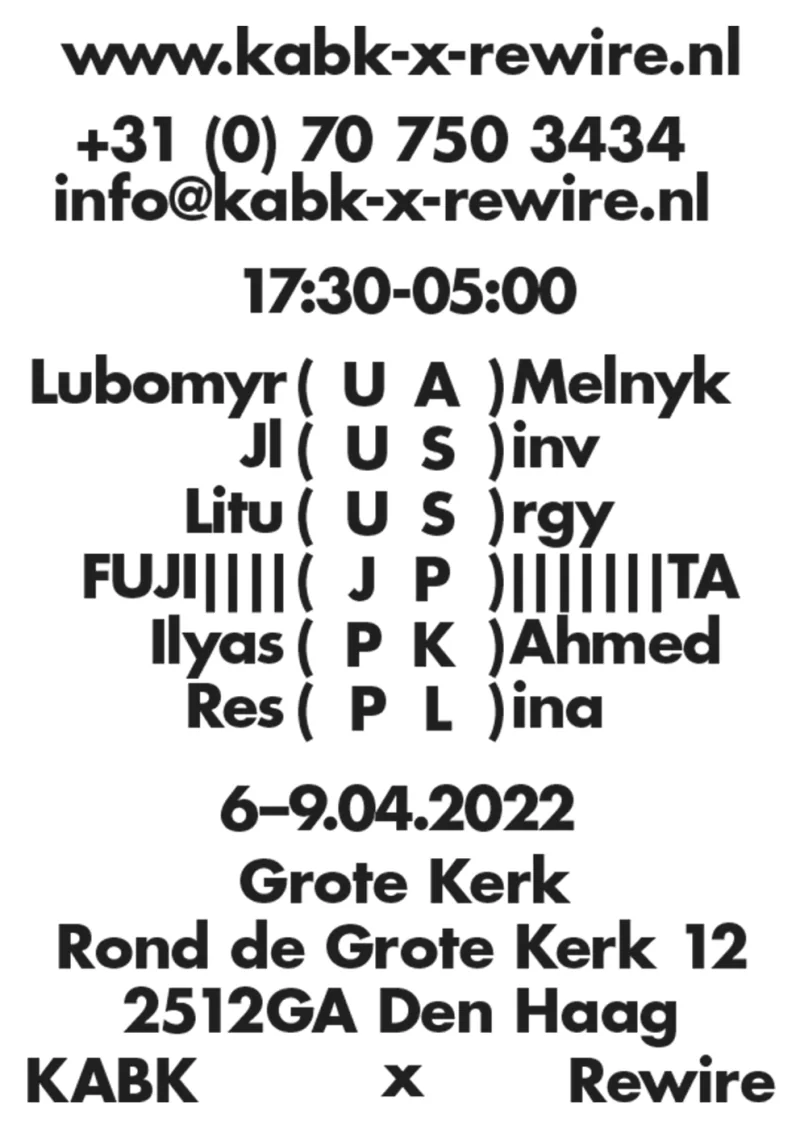
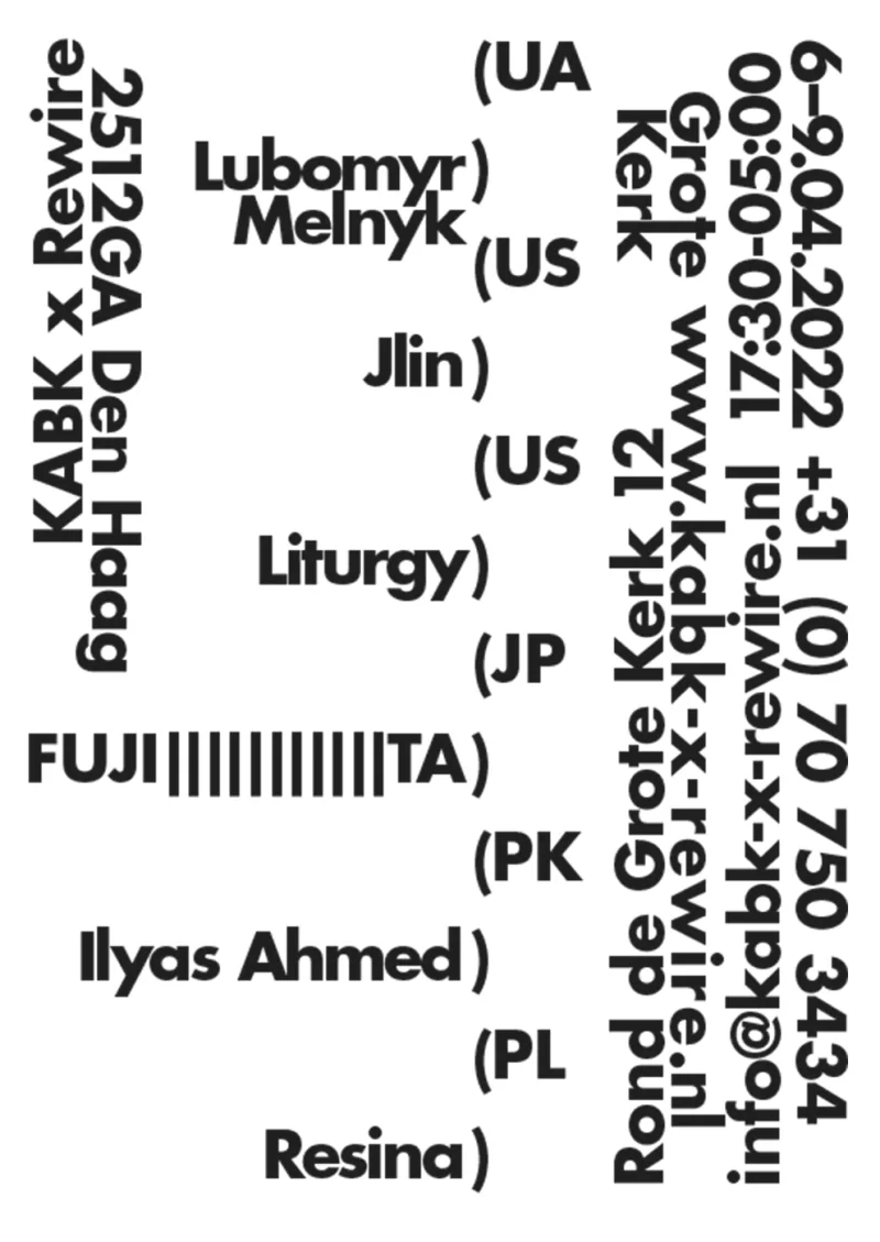
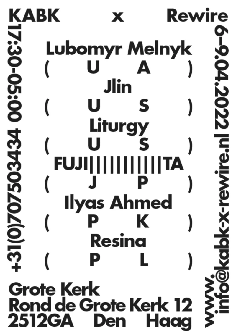
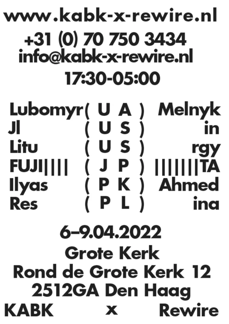
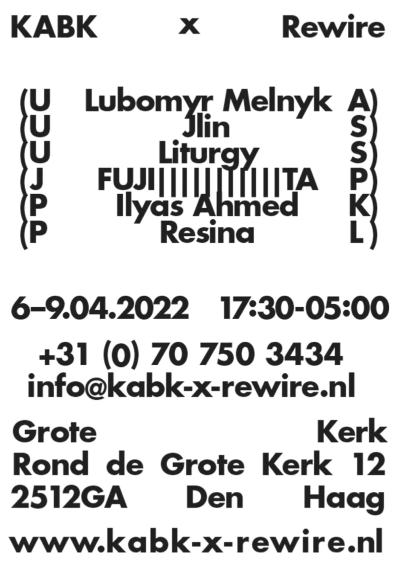
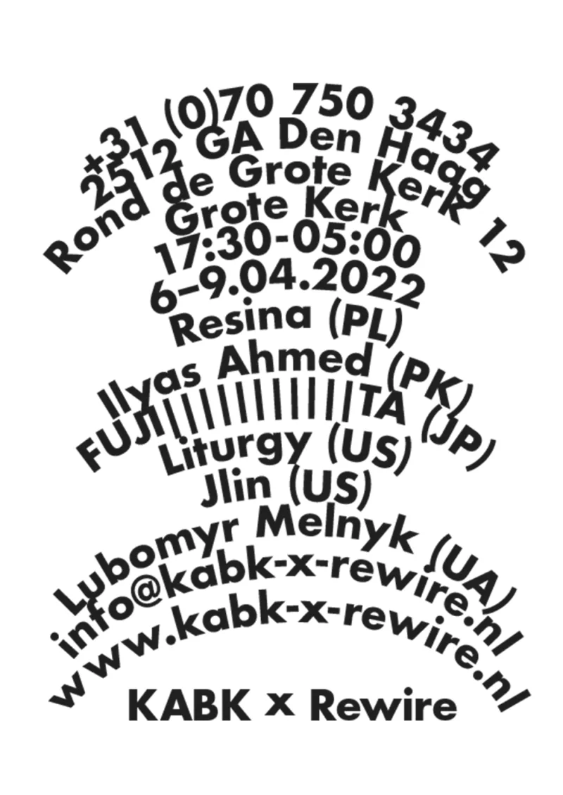
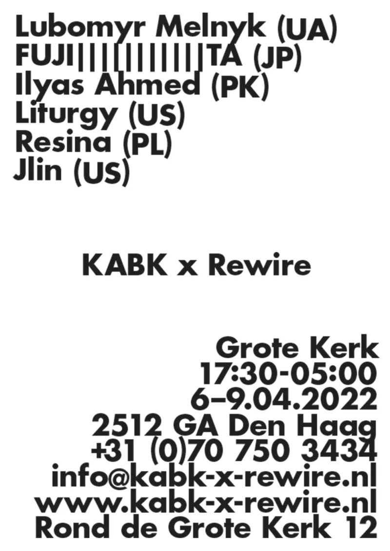
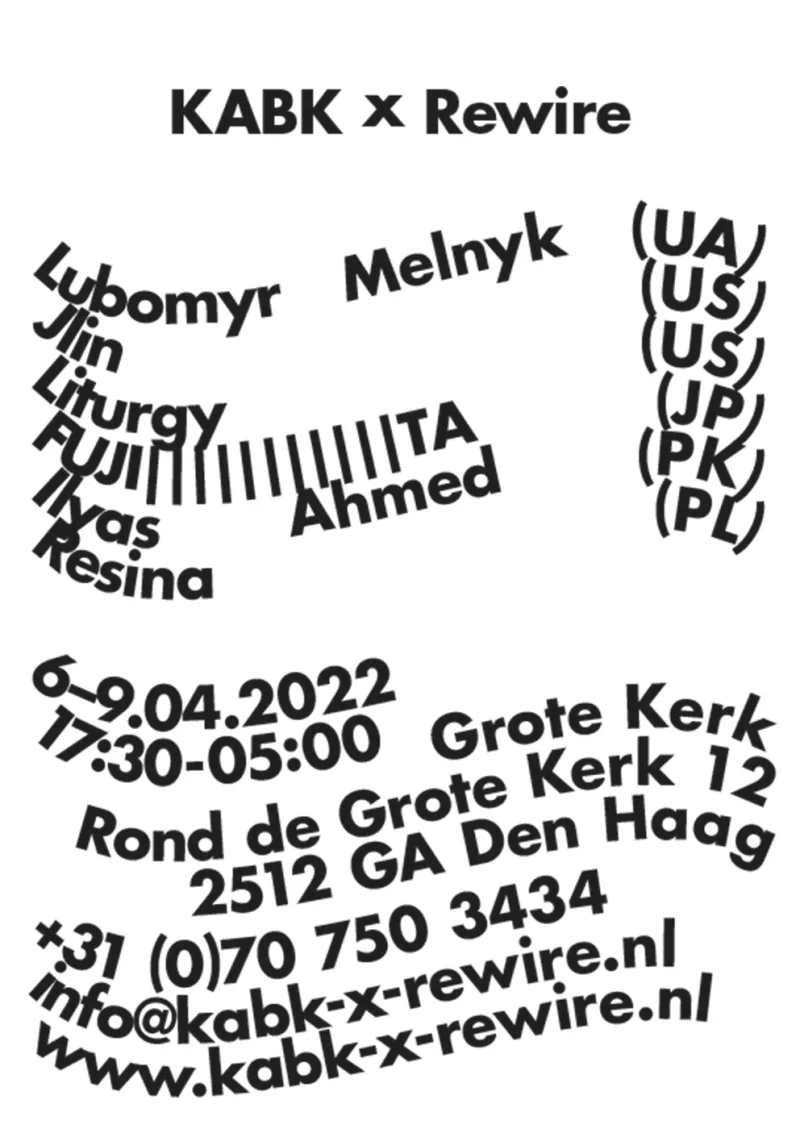
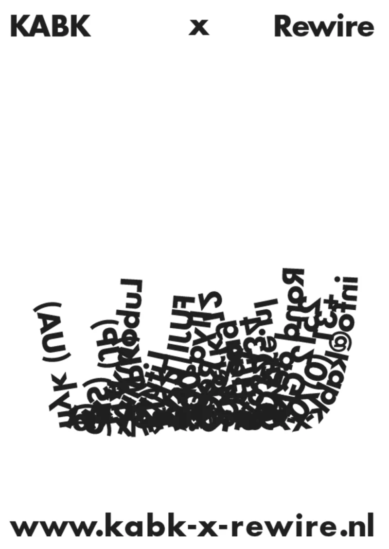
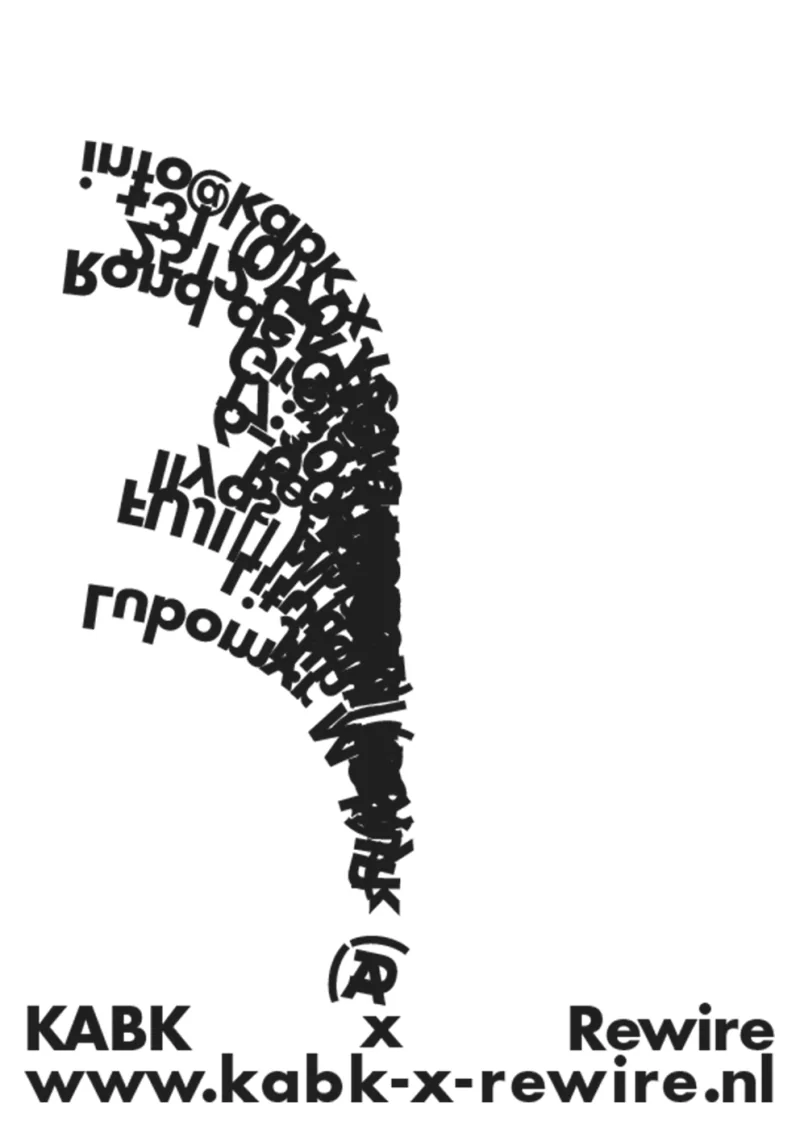
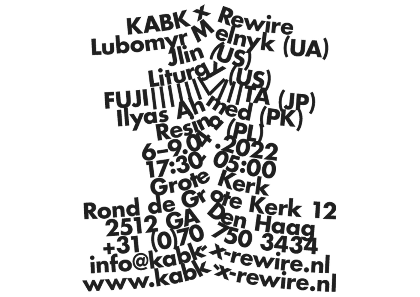
E03 Rewire Posters 2022 Oct Proposals for Rewire that use typography as imageryThis proposal responds to Rewire through typography alone. Letters do the visual work usually carried by an image, with their arrangement responding to the festival’s experimental character. The design connects text with the suggestion of sound and movement through its composition. The result is an editorial and poster direction built around words as visual material, giving the festival’s name and information the central role in its proposed appearance Posters Posters Posters Posters Posters Posters Posters Posters Posters Posters Posters Posters
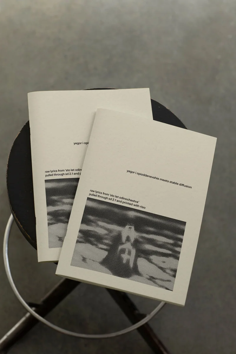
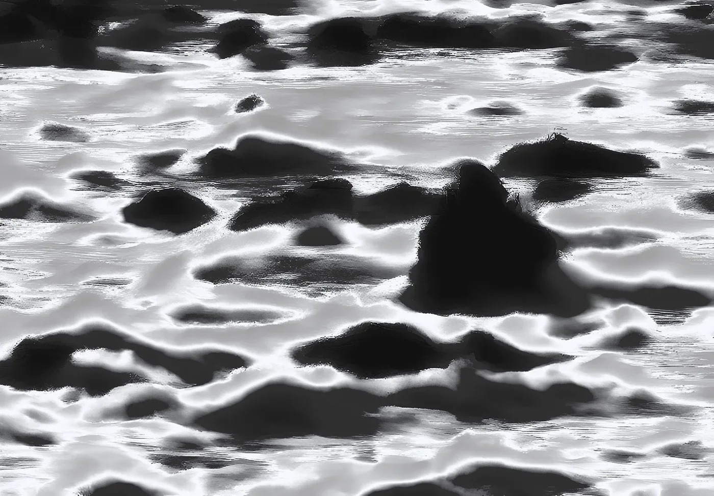
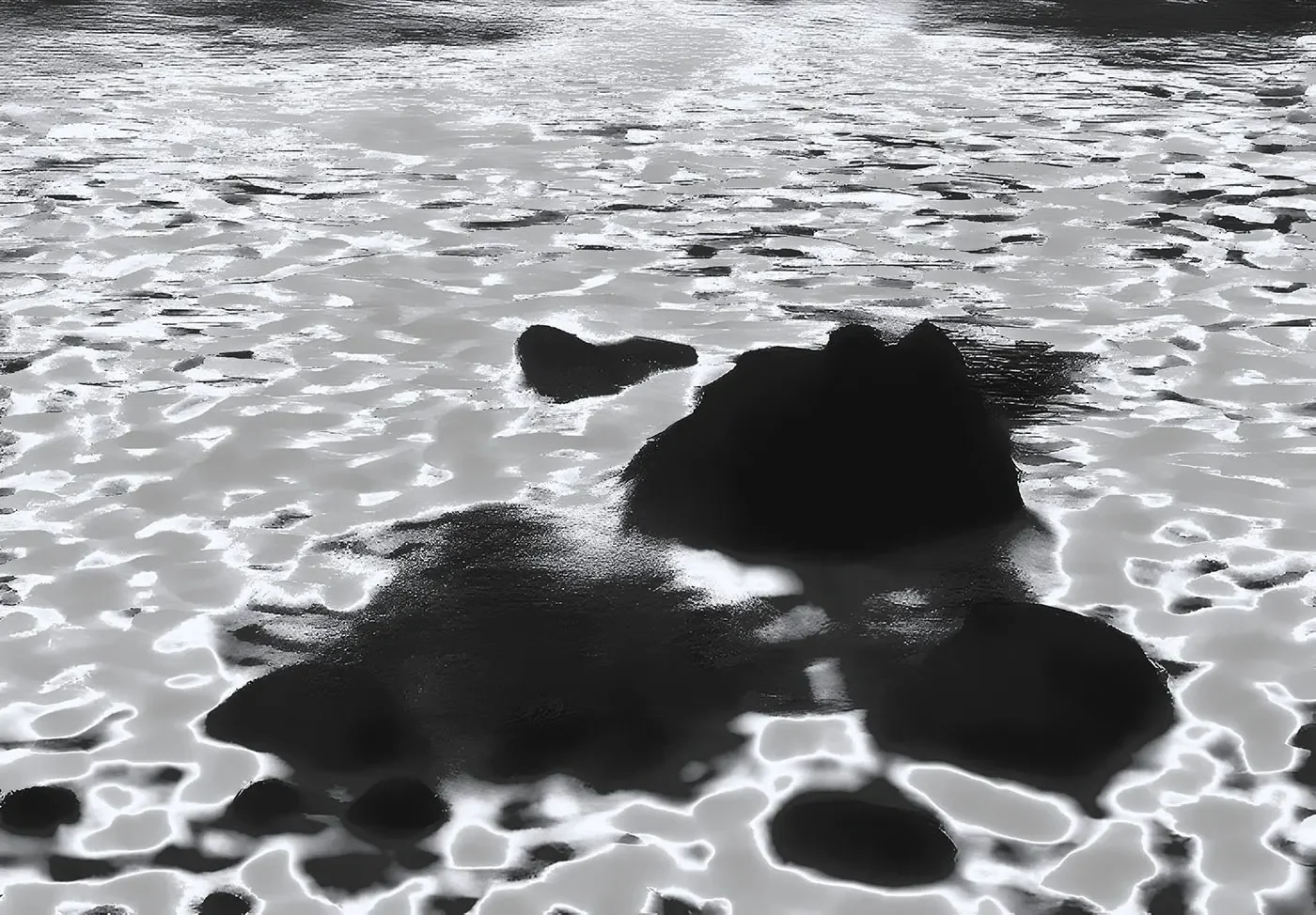
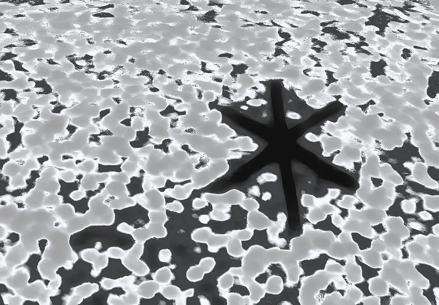
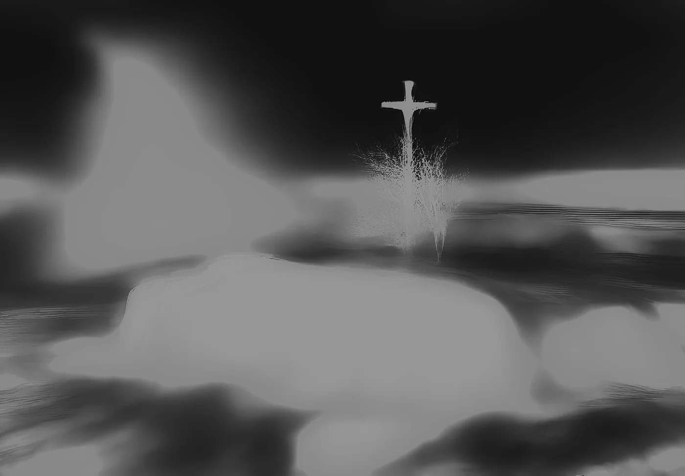
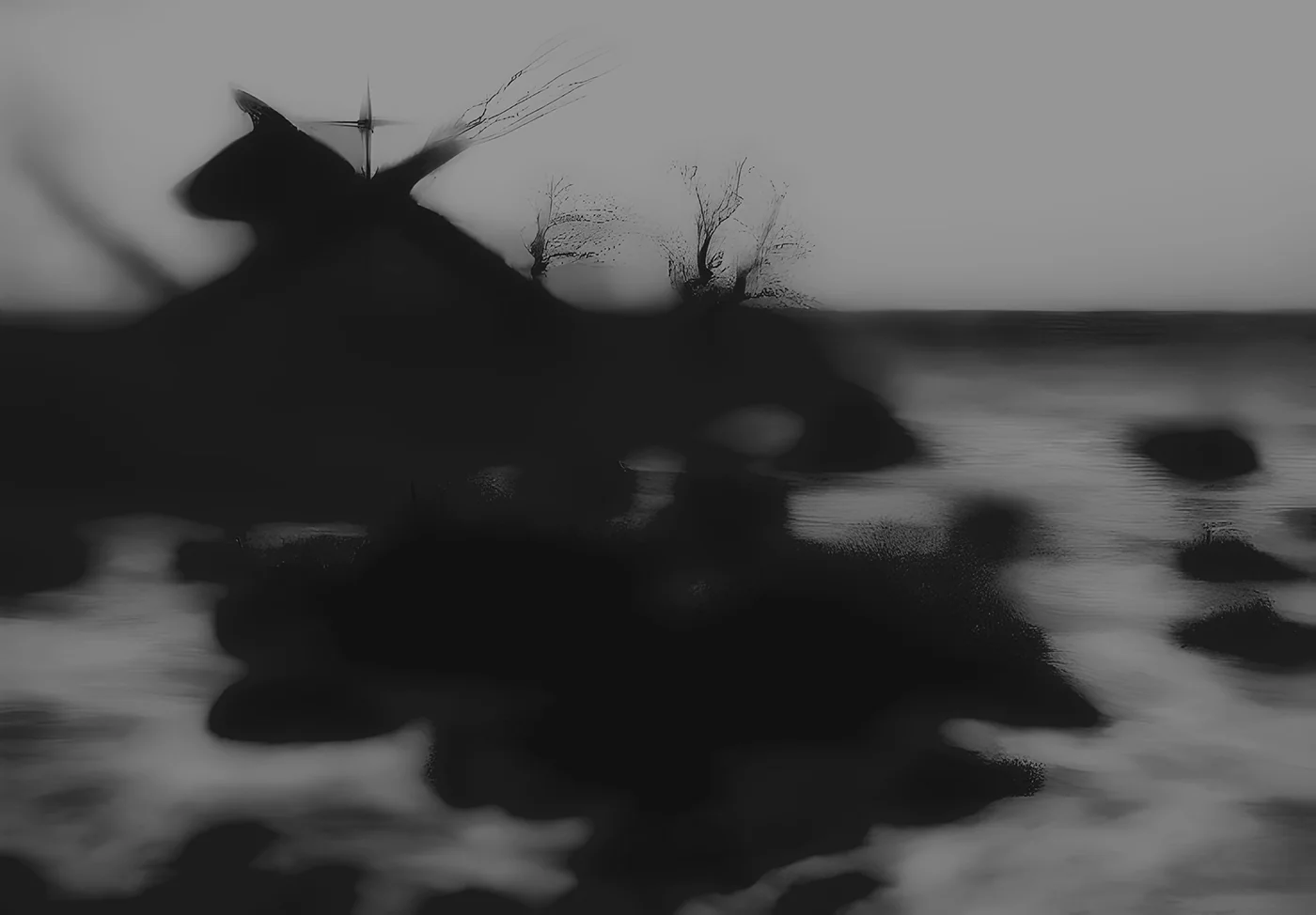
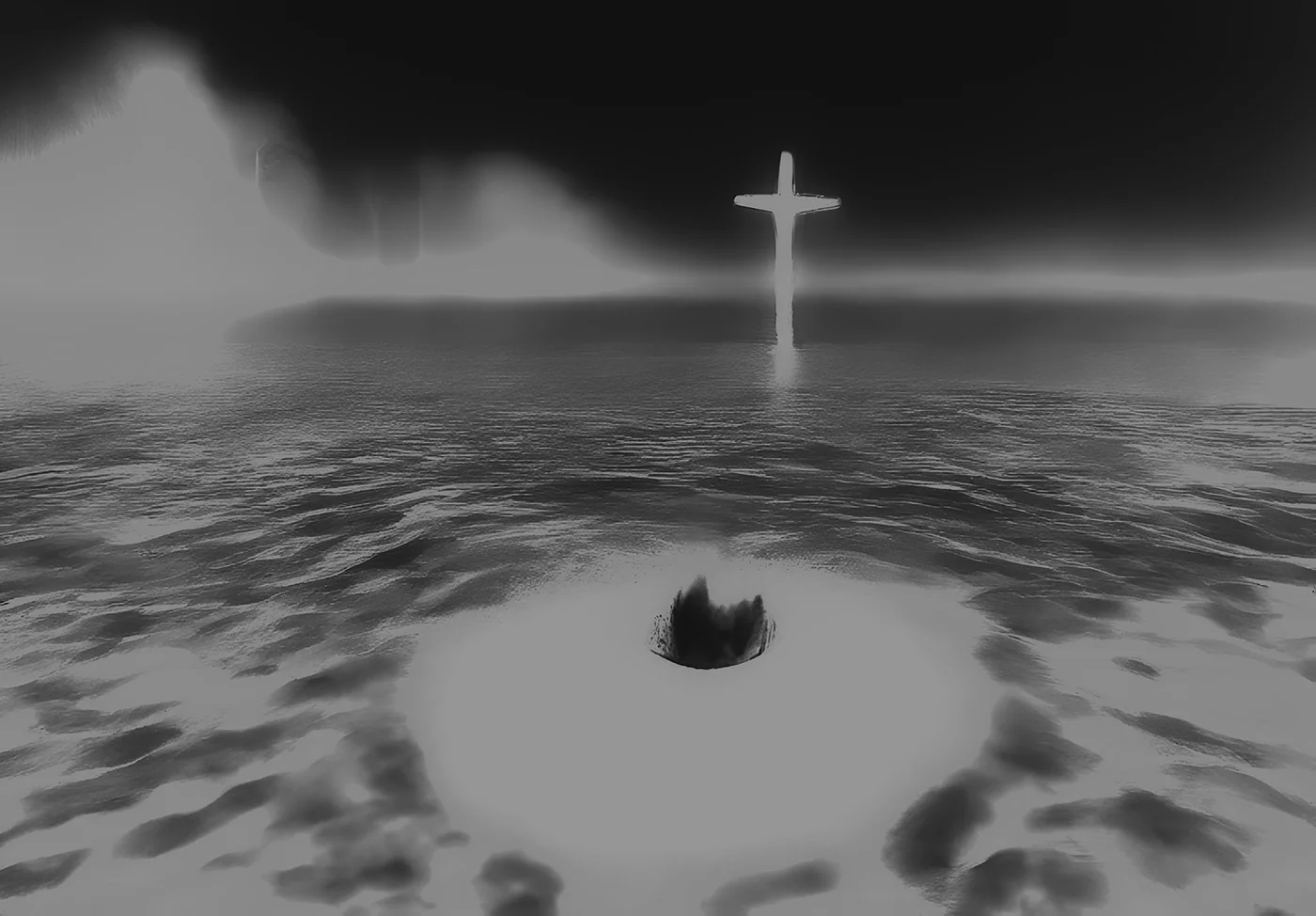
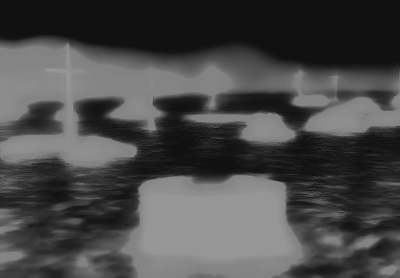
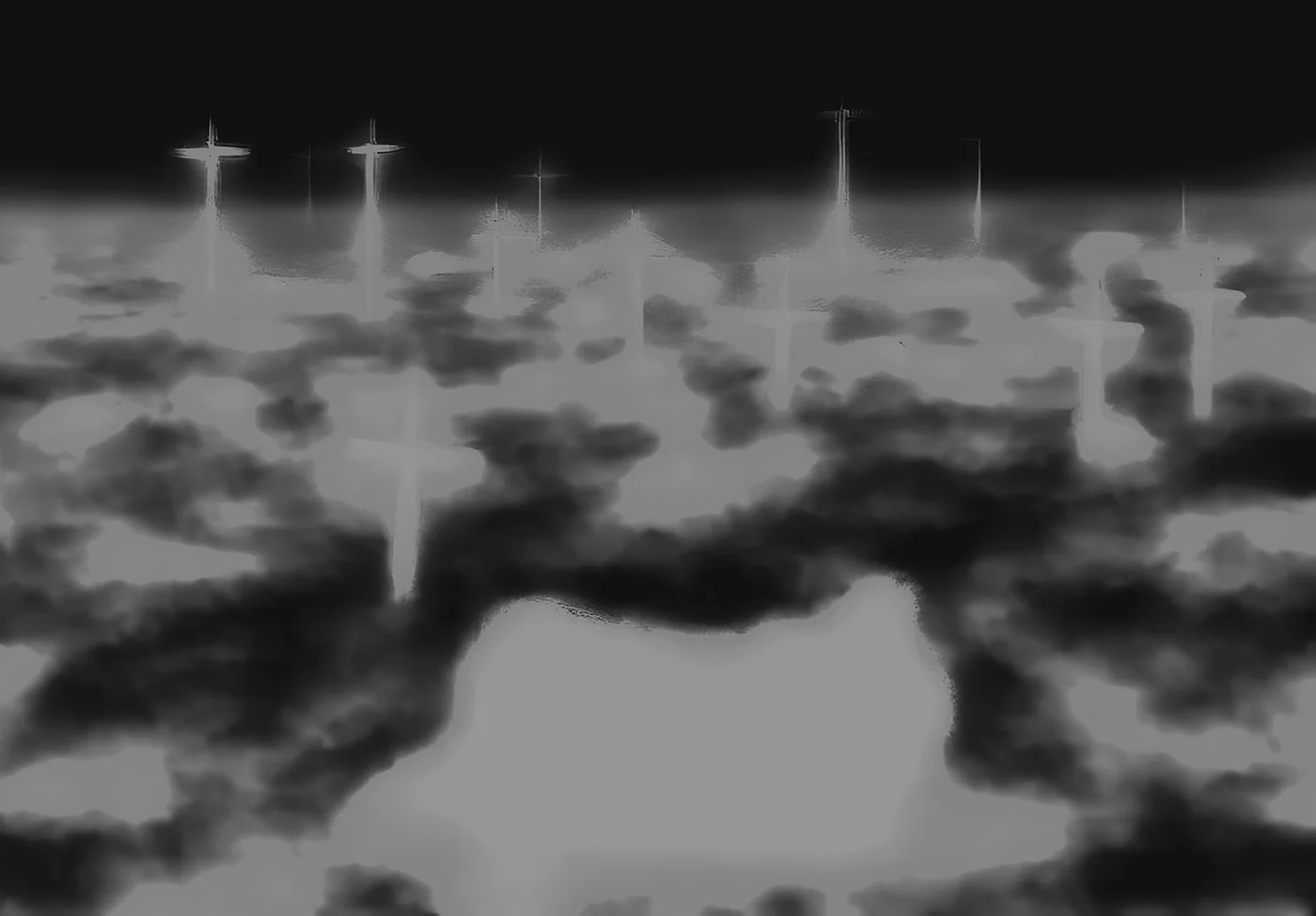
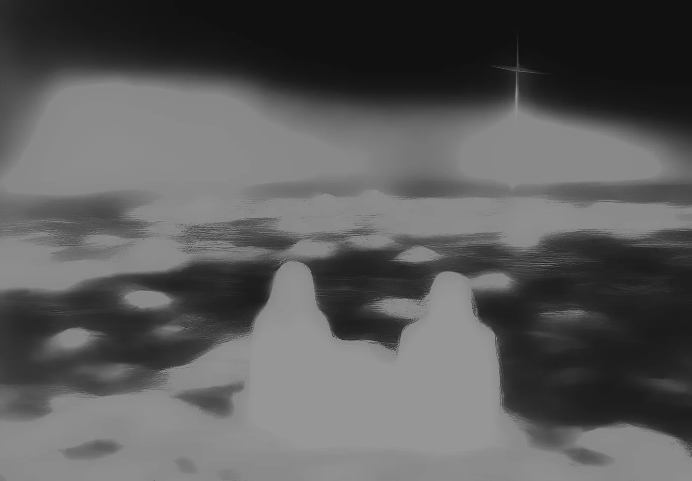
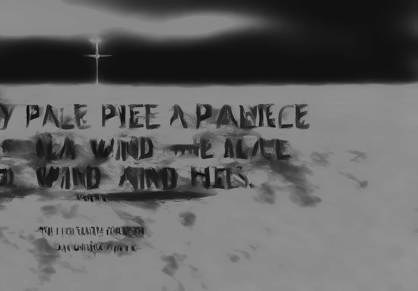
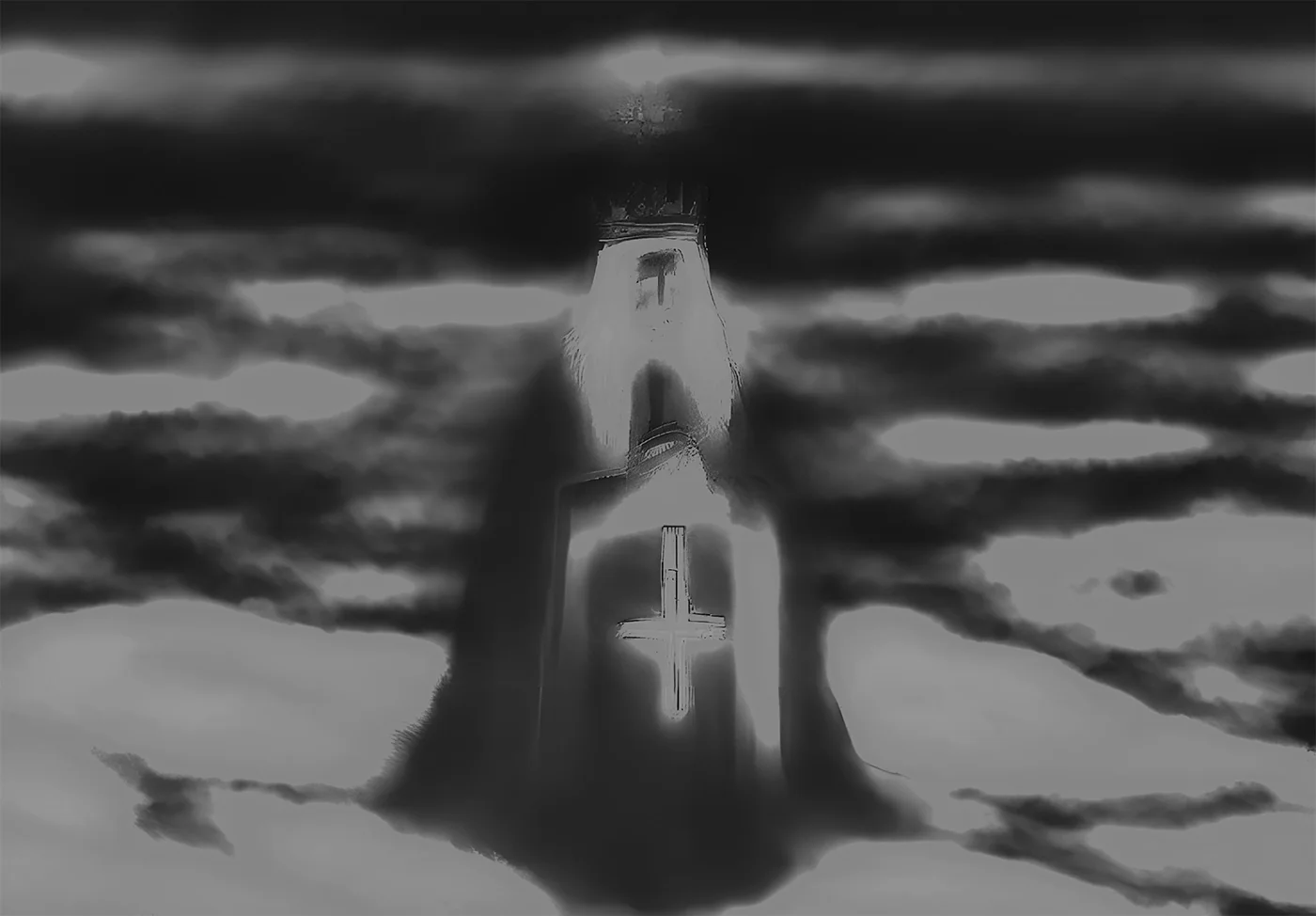
E02 Yegor I Opizdenevshie Zine 2023 Jan Yegor Letov’s lyrics as direct input for early Stable DiffusionFor this zine, I made a custom “zero-prompt” setup with an early version of Stable Diffusion, using Yegor Letov’s lyrics as input for image generation. The material comes from Sto Let Odinochestva by Yegor i Opizdenevshie. Each page corresponds to one song, so the album’s track-by-track structure also becomes the structure of the publication. The work turns a record into a sequence of generated images, with the lyrics carrying the connection between the music and the printed page Zine Zine Zine Zine Zine Zine Zine Zine Zine Zine Zine Zine Zine Zine Zine Zine
M01 Cinema Eye Motion 2023 Oct NDA
B03 4096 Visual Identity 2021 Dec NDA
E01 baki Flyers 2022 Apr NDA
B08 OJK Visual Identity 2022 May NDA
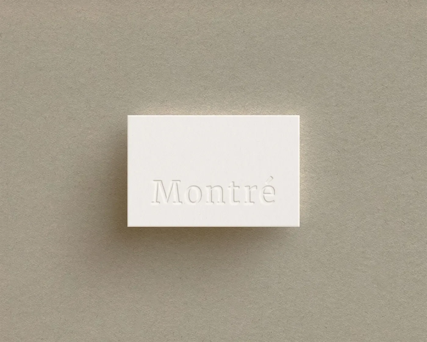
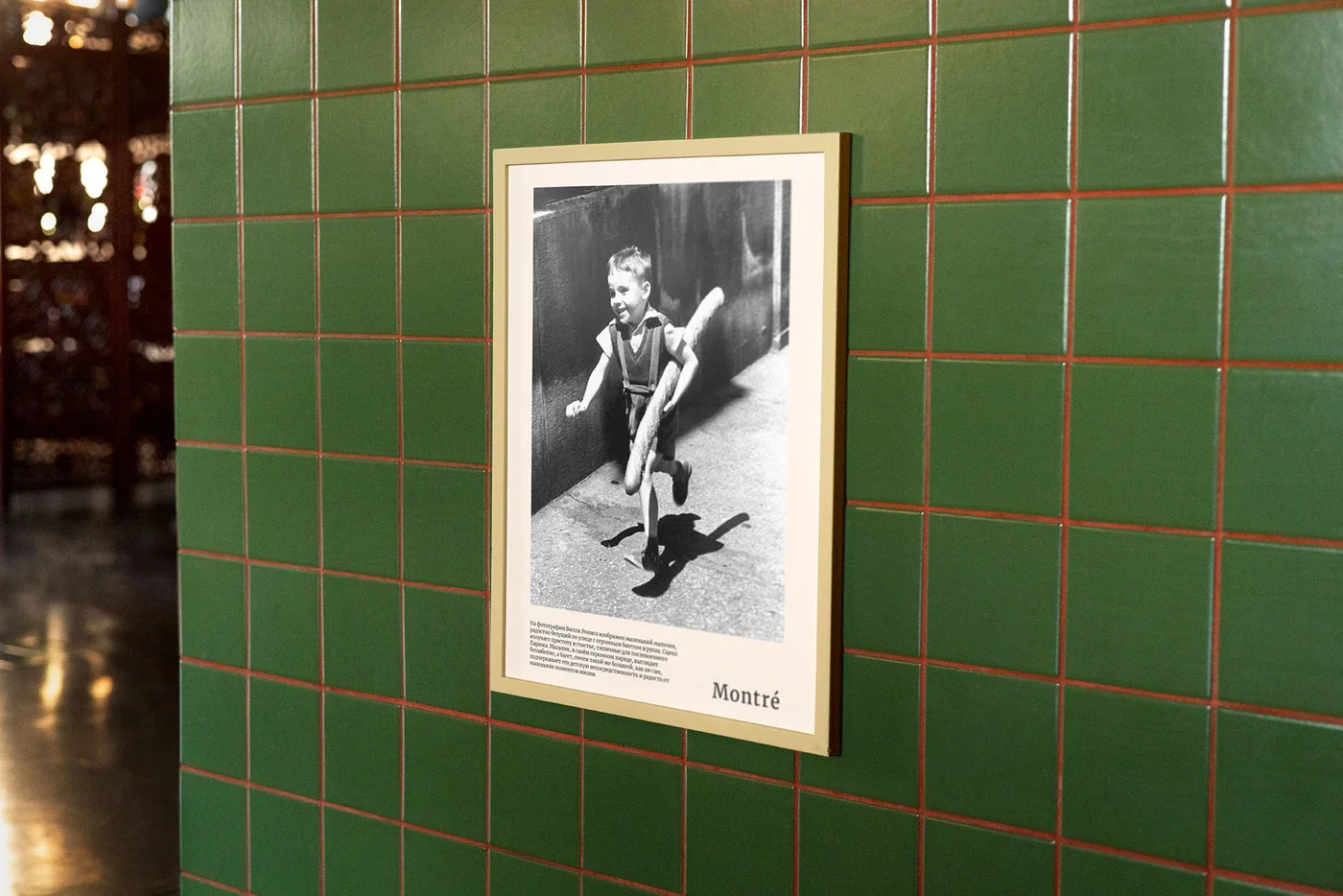
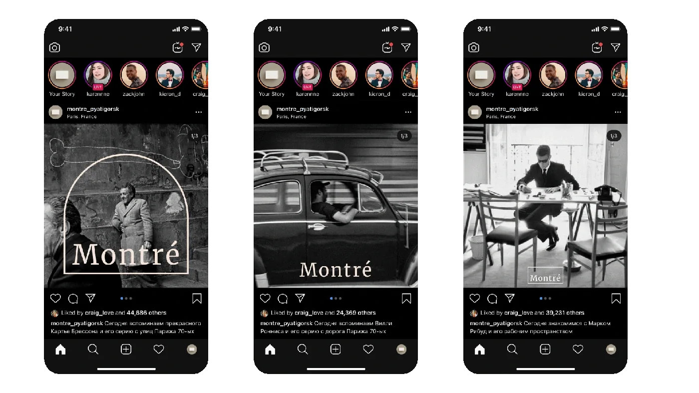
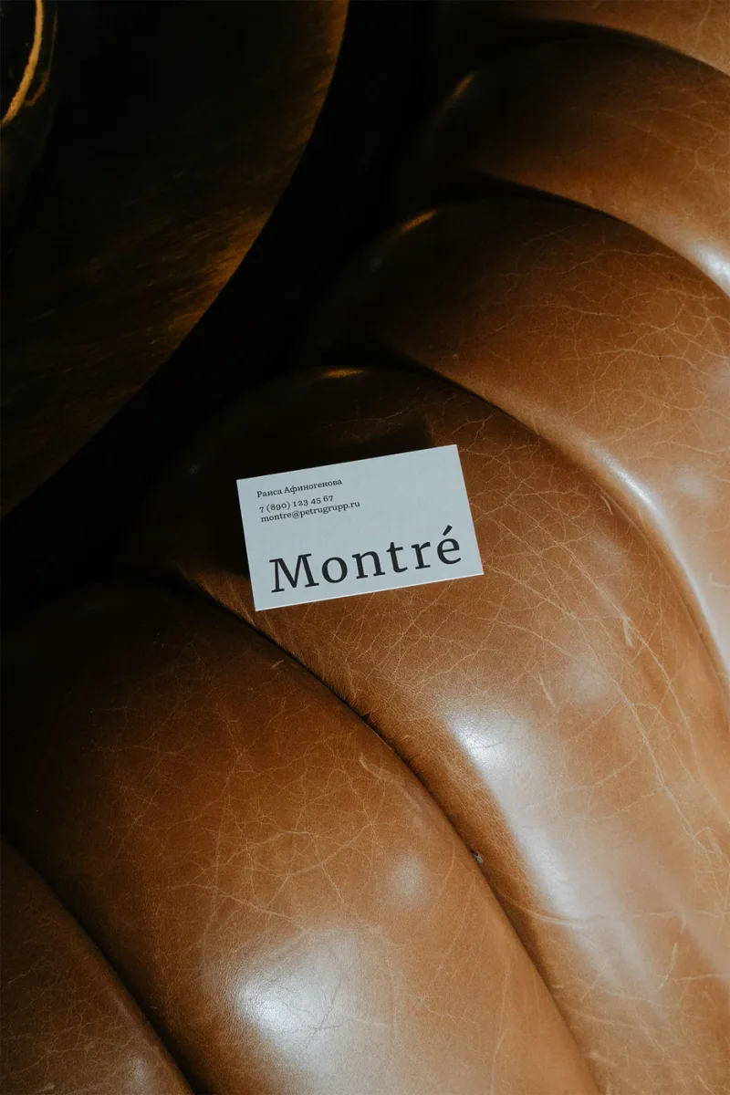
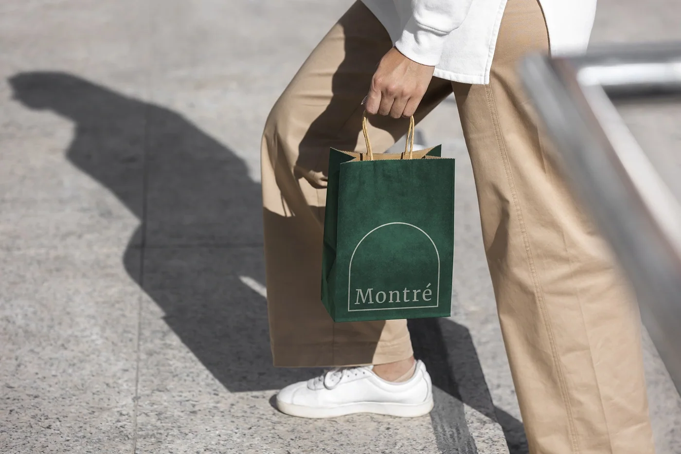
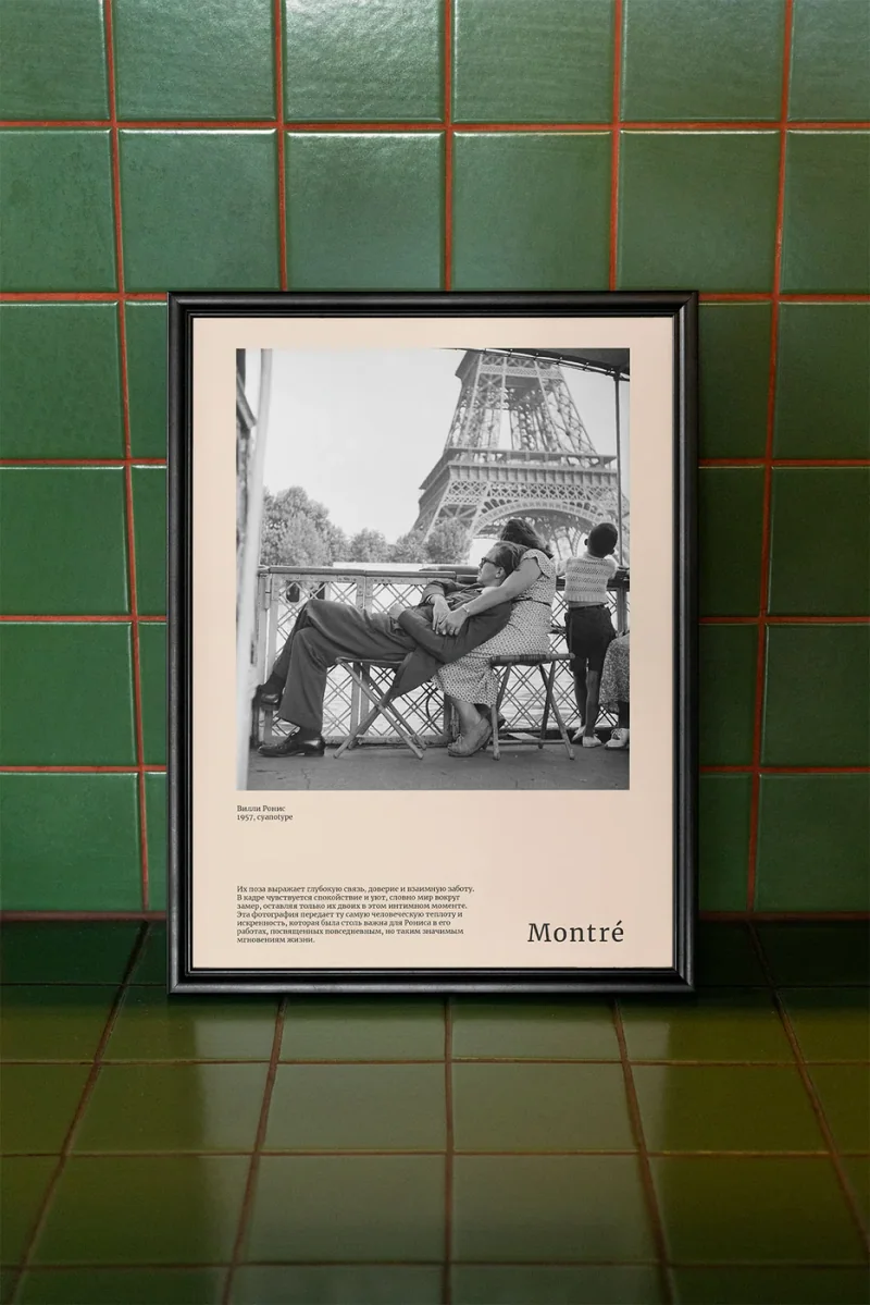
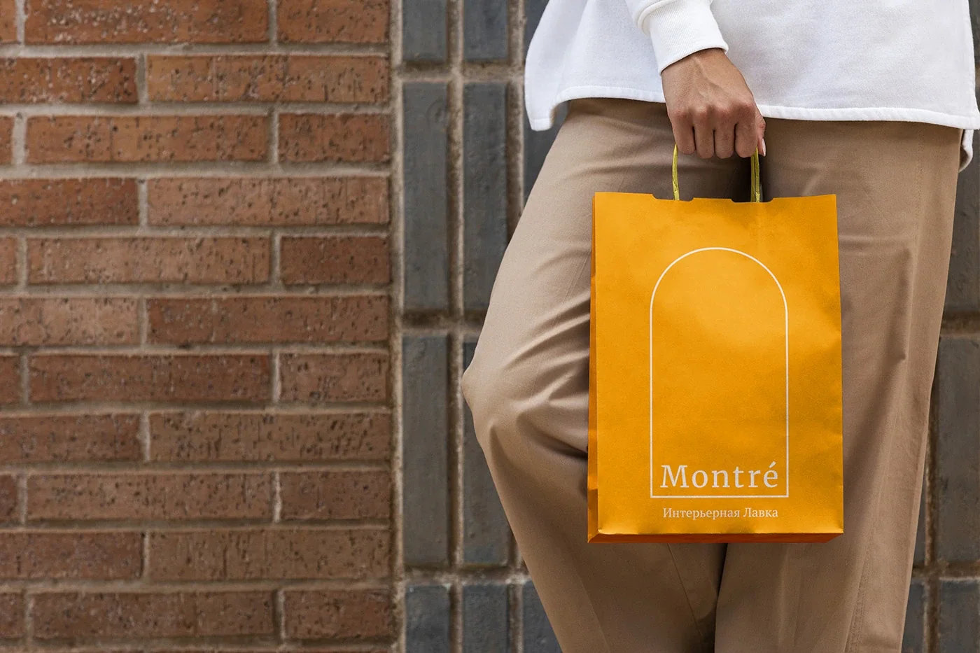
B09 Montré Visual Identity 2023 Jul A quiet identity for a furniture reseller with rustic French characterMontré’s furniture and accessories provided the starting point for an identity centred on rustic French references. Earthy colours and vintage elements carry that character into the shop’s visual language. A restrained serif wordmark gives the name a quiet presence, including on pale printed material. The identity connects the objects being sold with the atmosphere around them, drawing on associations of warmth and craft. It gives the shop a consistent way to present its furniture and accessories through type, colour and material Visual Identity Visual Identity Visual Identity Visual Identity Visual Identity Visual Identity Visual Identity
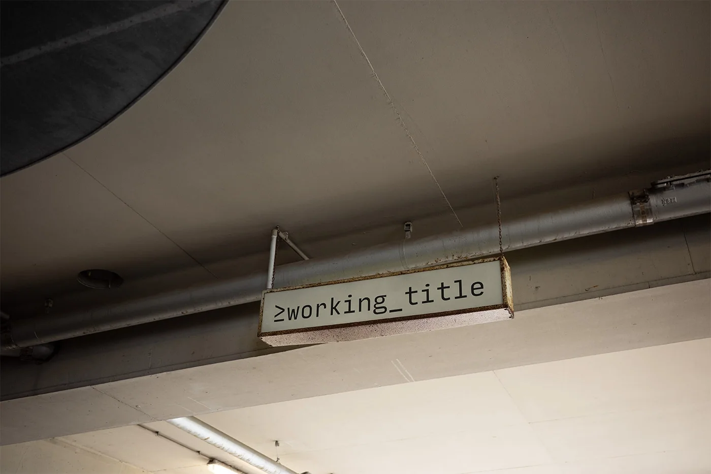
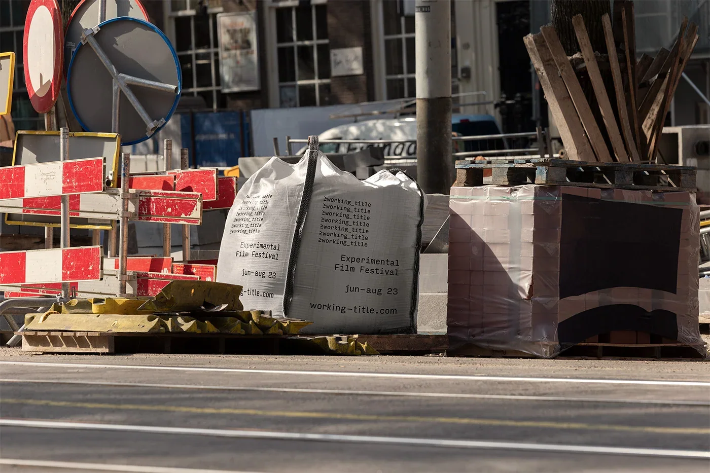
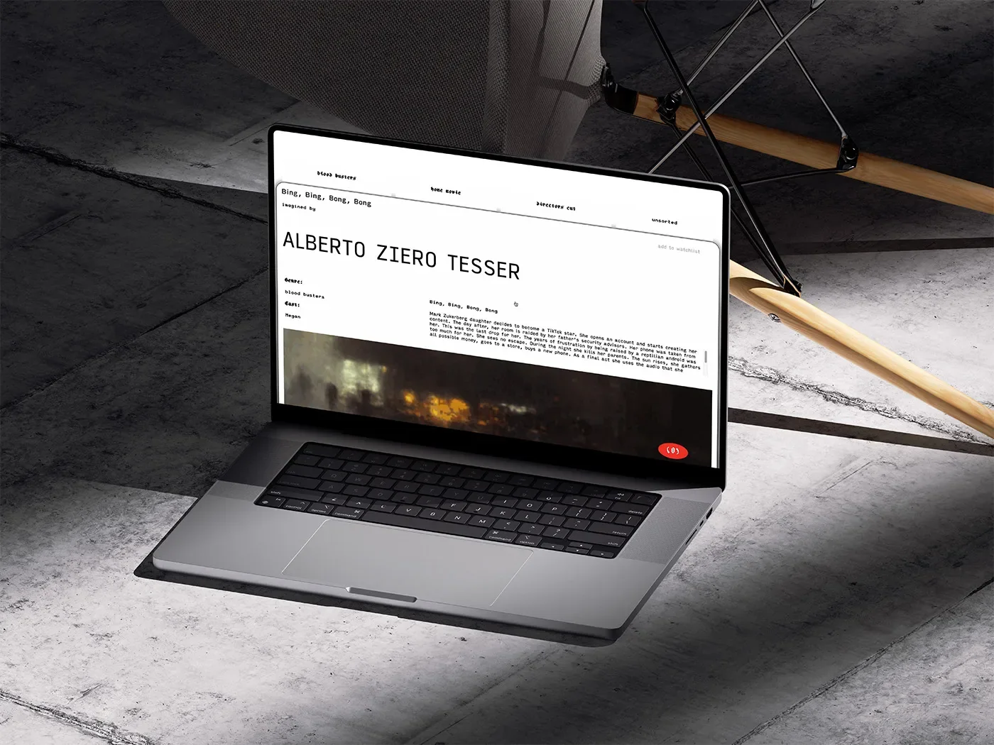
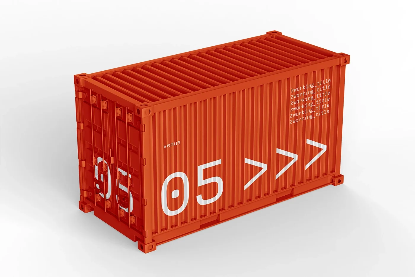
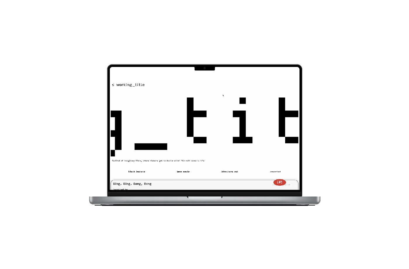
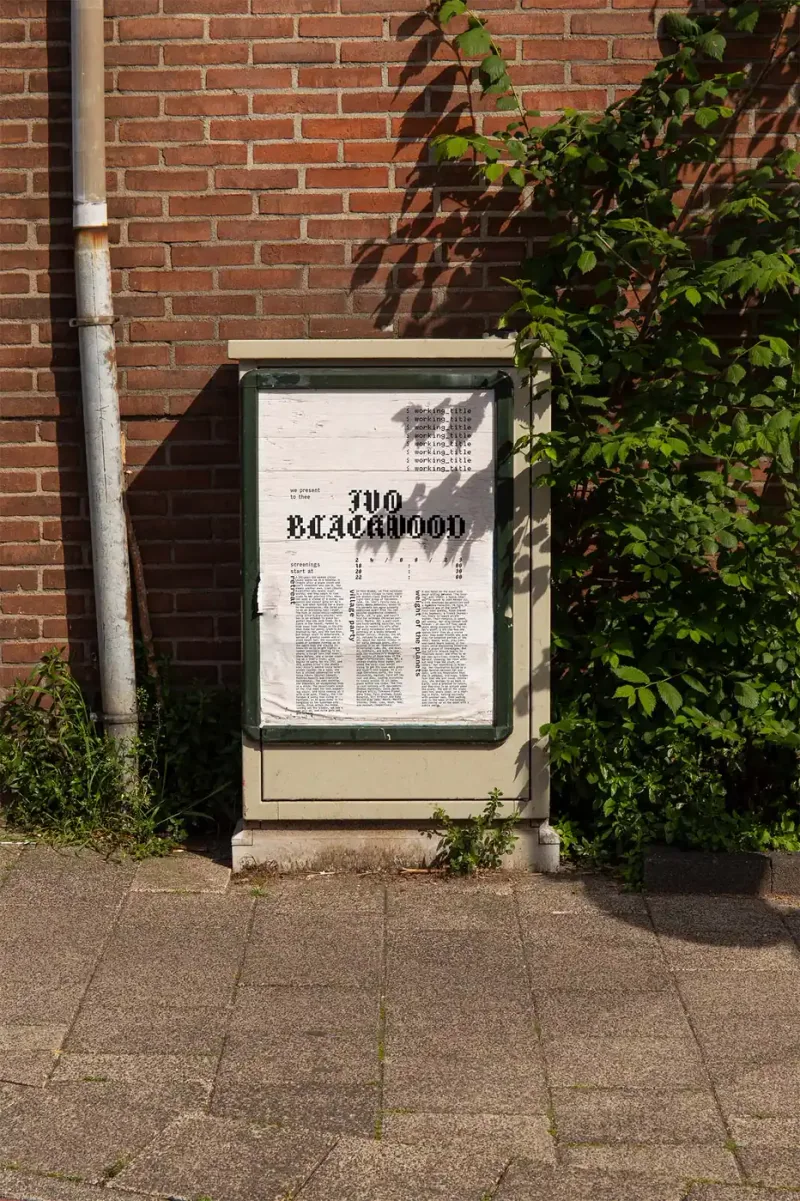
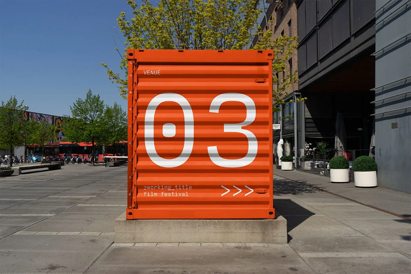
W06 ≥working_title Visual Identity 2023 Jan Industrial visual language for a festival that keeps taking shapeThe identity takes a construction site as its visual starting point. That reference carries into the website’s design and development, connecting the festival’s presentation with the idea of something being built. The festival was still taking shape, making the industrial approach part of its circumstances. The work brings identity and web together around that condition, giving the film event a public-facing expression of its unfinished, developing character Visual Identity Visual Identity Visual Identity Visual Identity Visual Identity Visual Identity Visual Identity Visual Identity
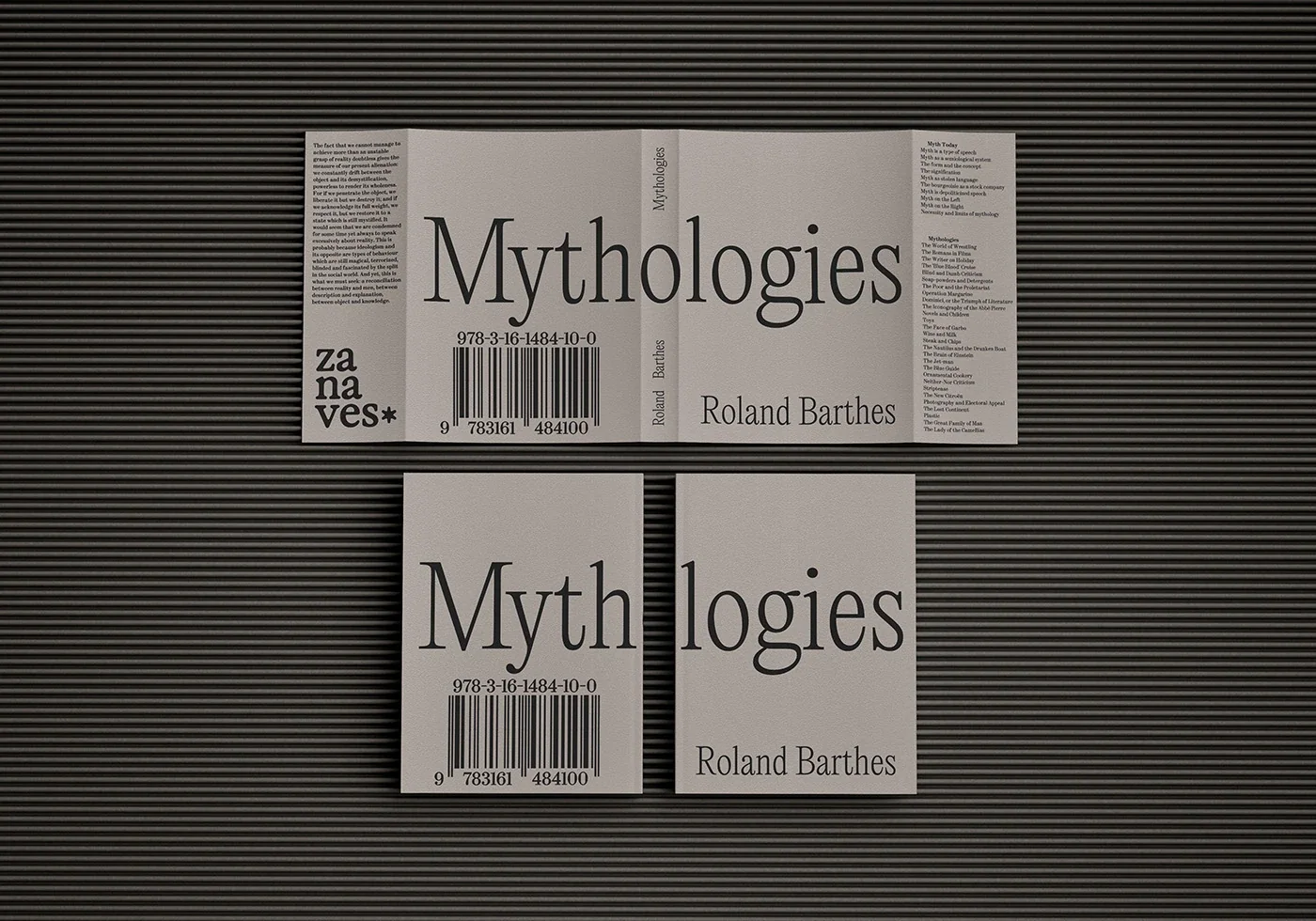
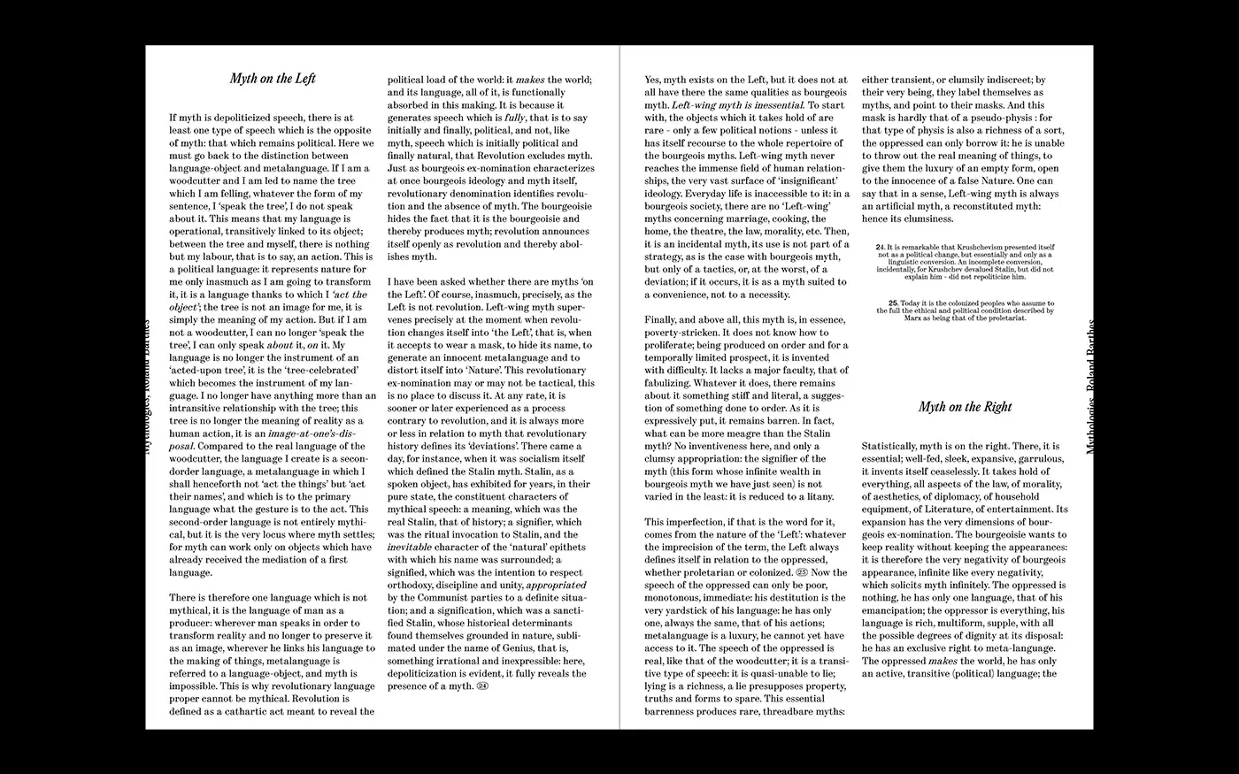
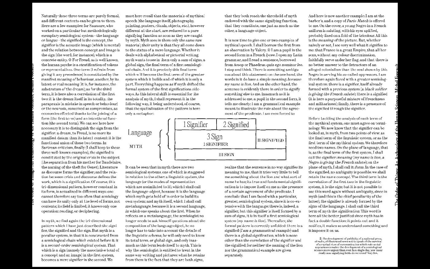
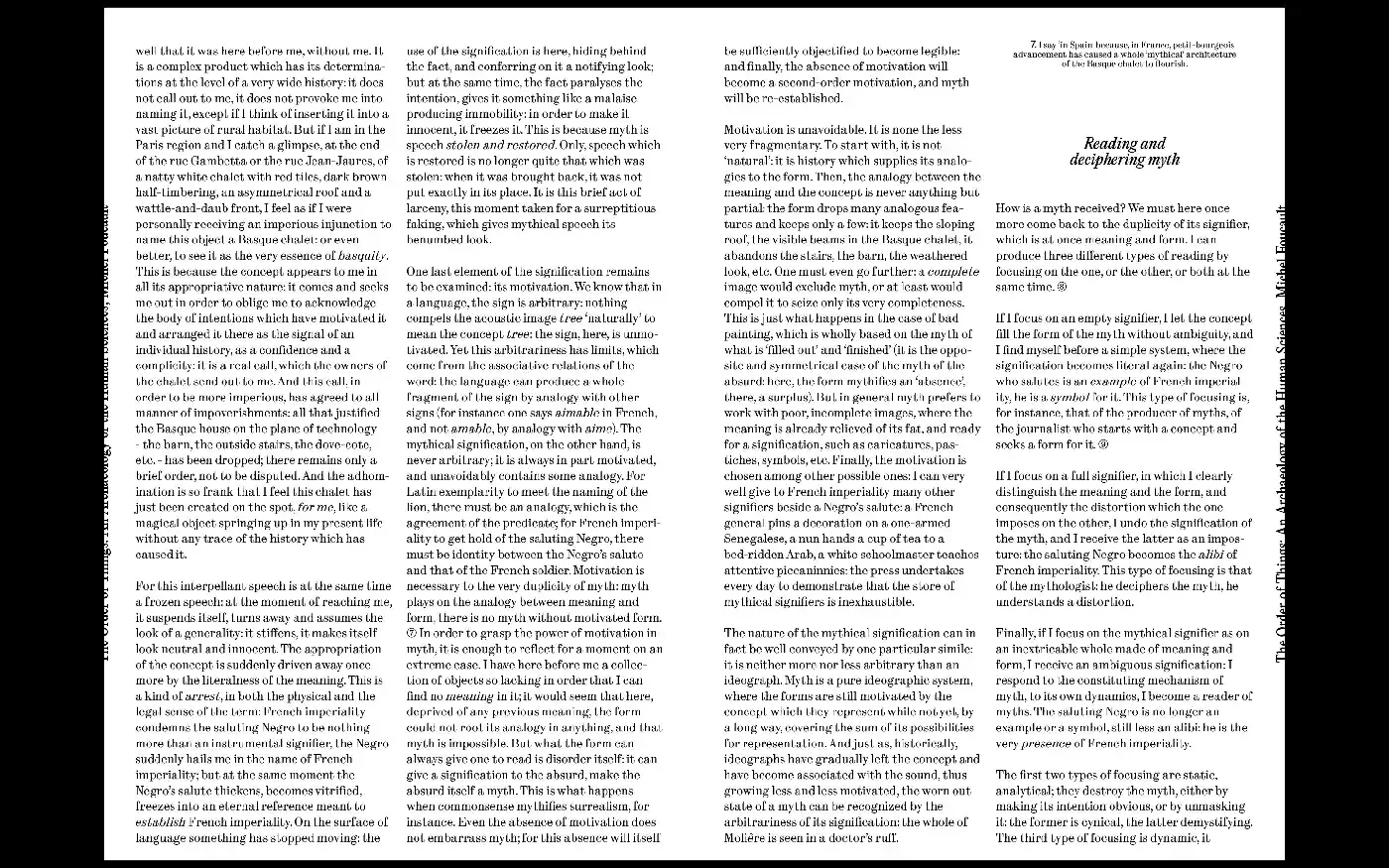
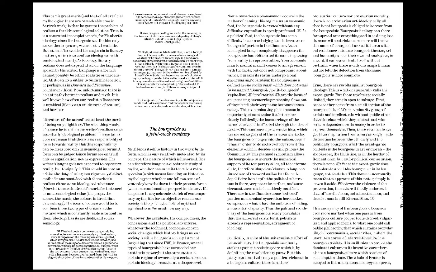
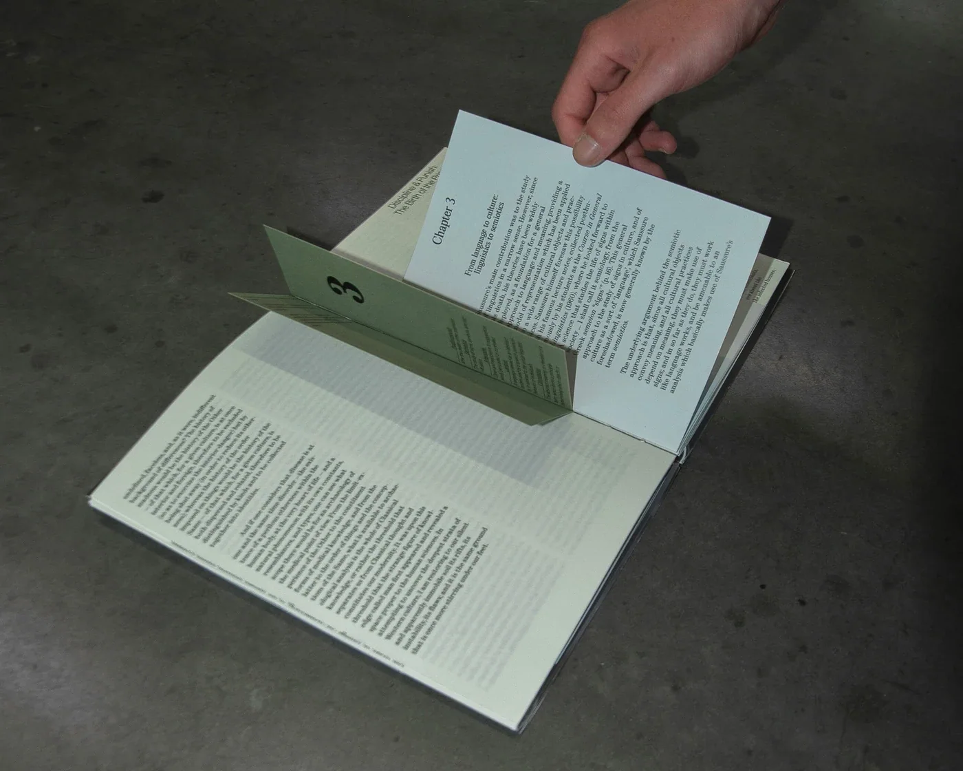
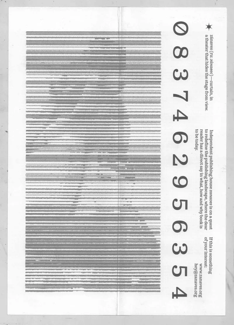
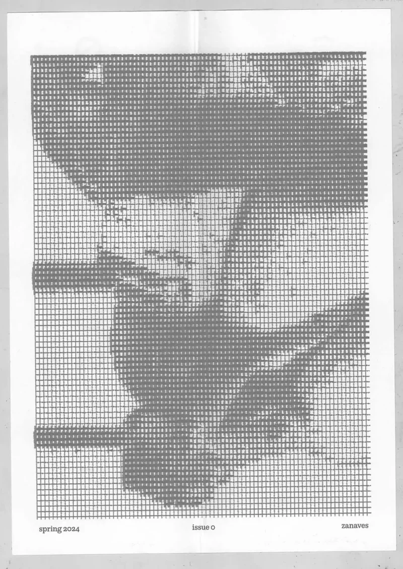
E11 Zanaves Book 2024 Jun Reading Barthes in lines sized for a TikTok attention spanThe cover divides Mythologies into “logies” on the front and “mytho” on the back. The title is therefore encountered in parts, through turning and handling the book. The device responds to Barthes’ interest in the meanings carried by everyday things. The design makes the publication itself one of those things to inspect, with typography and the relationship between its two covers carrying the idea Book Book Book Book Book
E10 fake_trailers Book 2024 May NDA
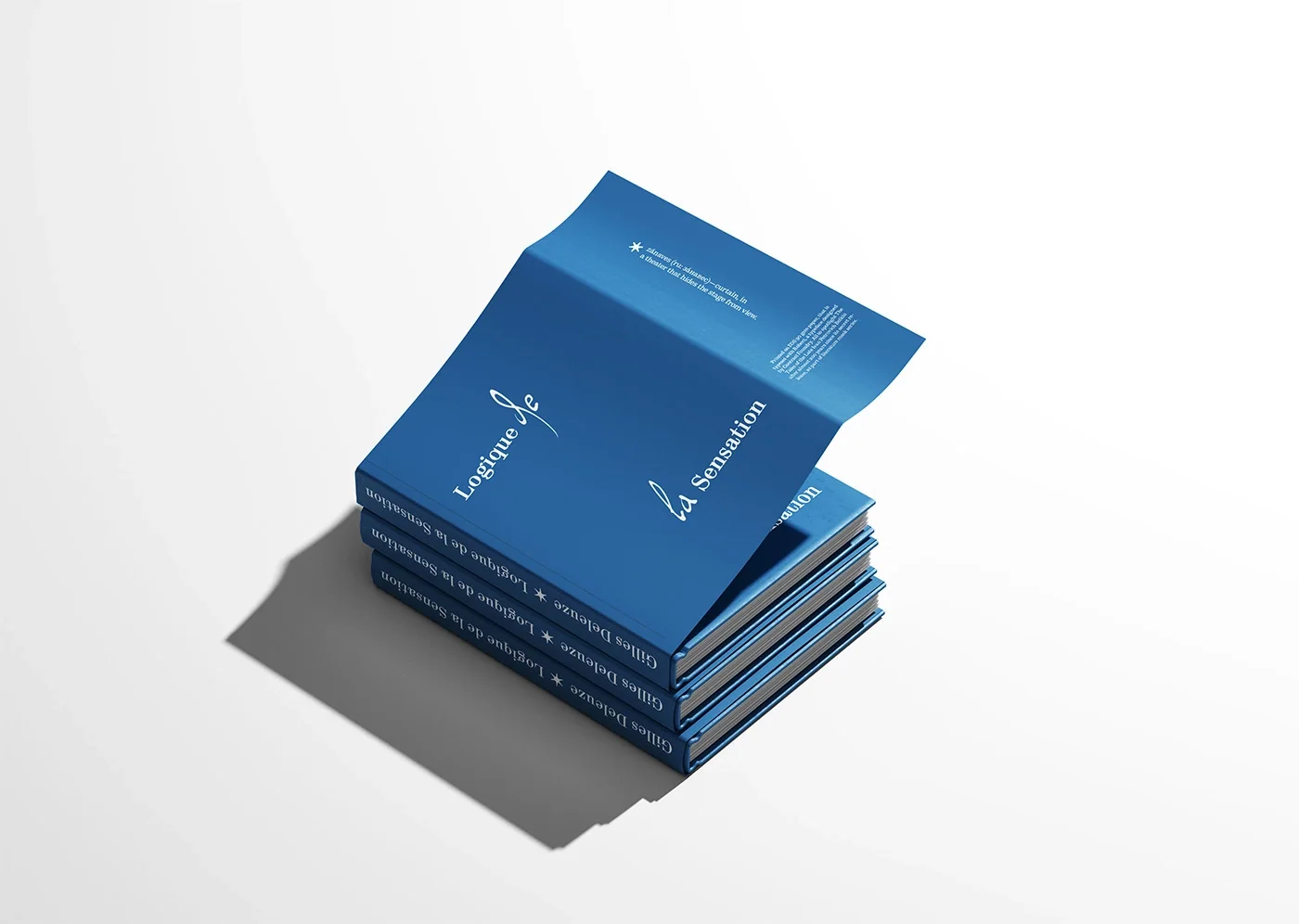
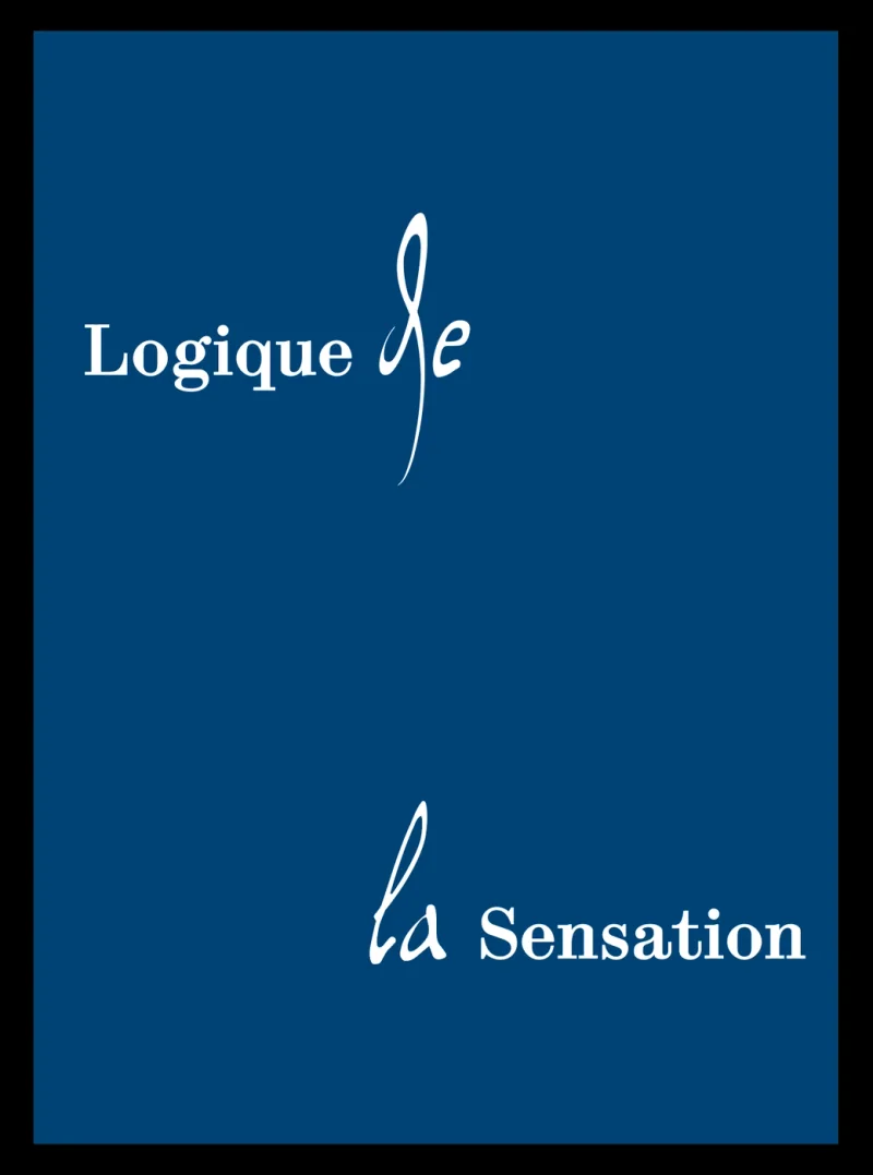
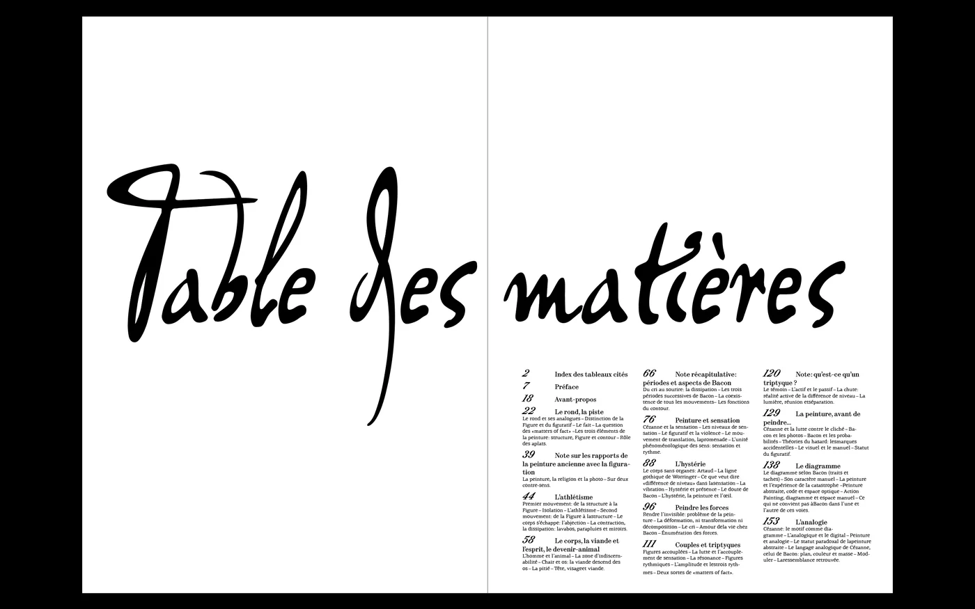
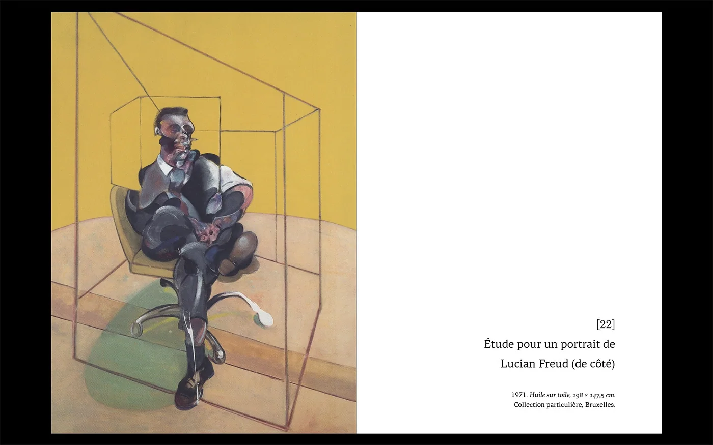
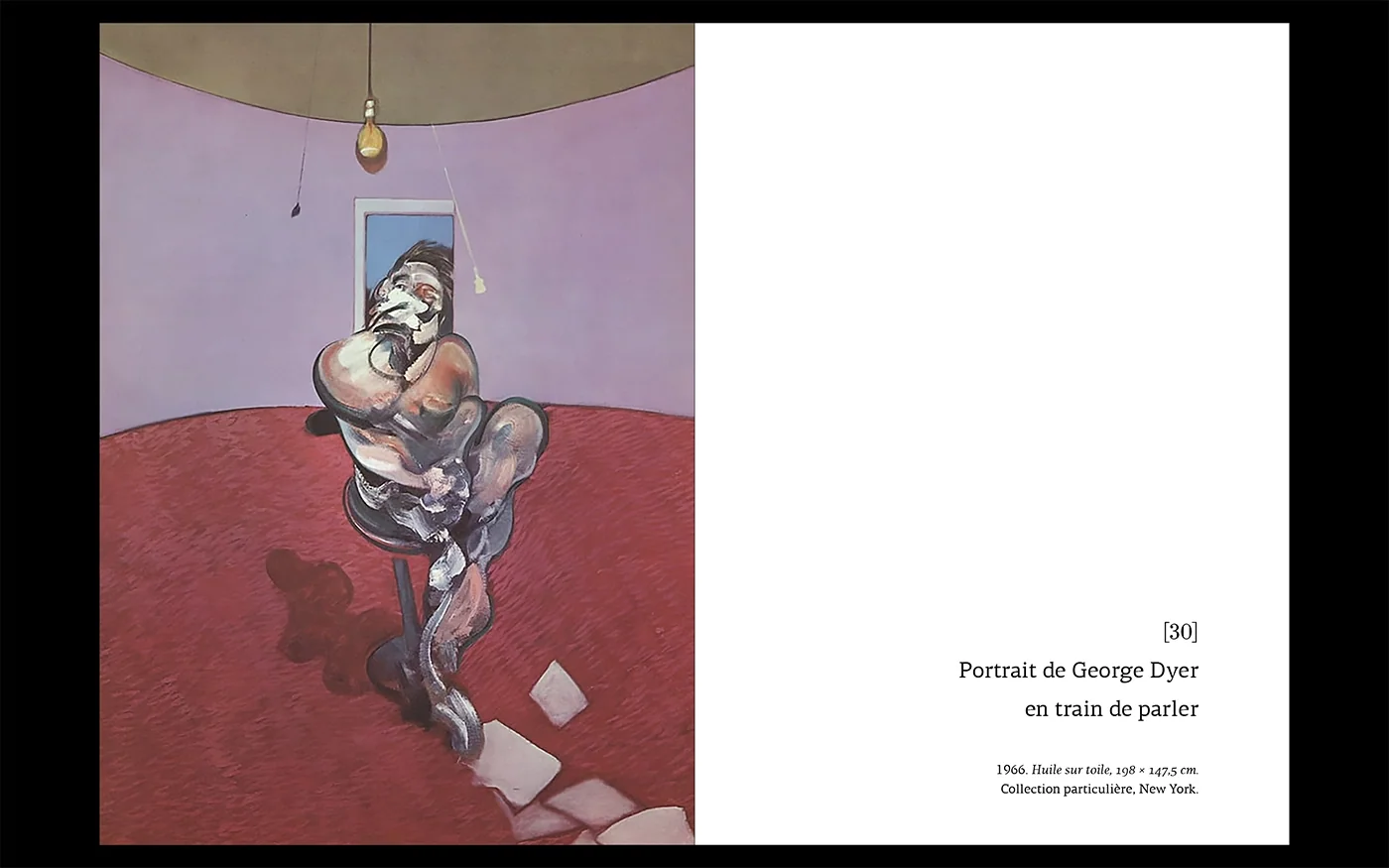
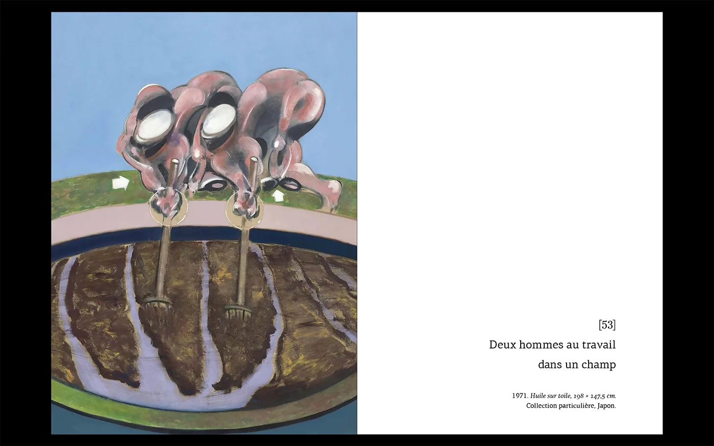
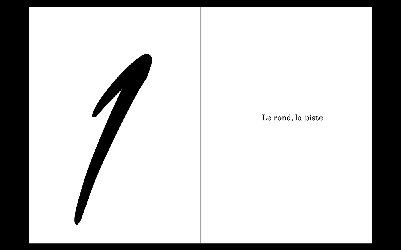
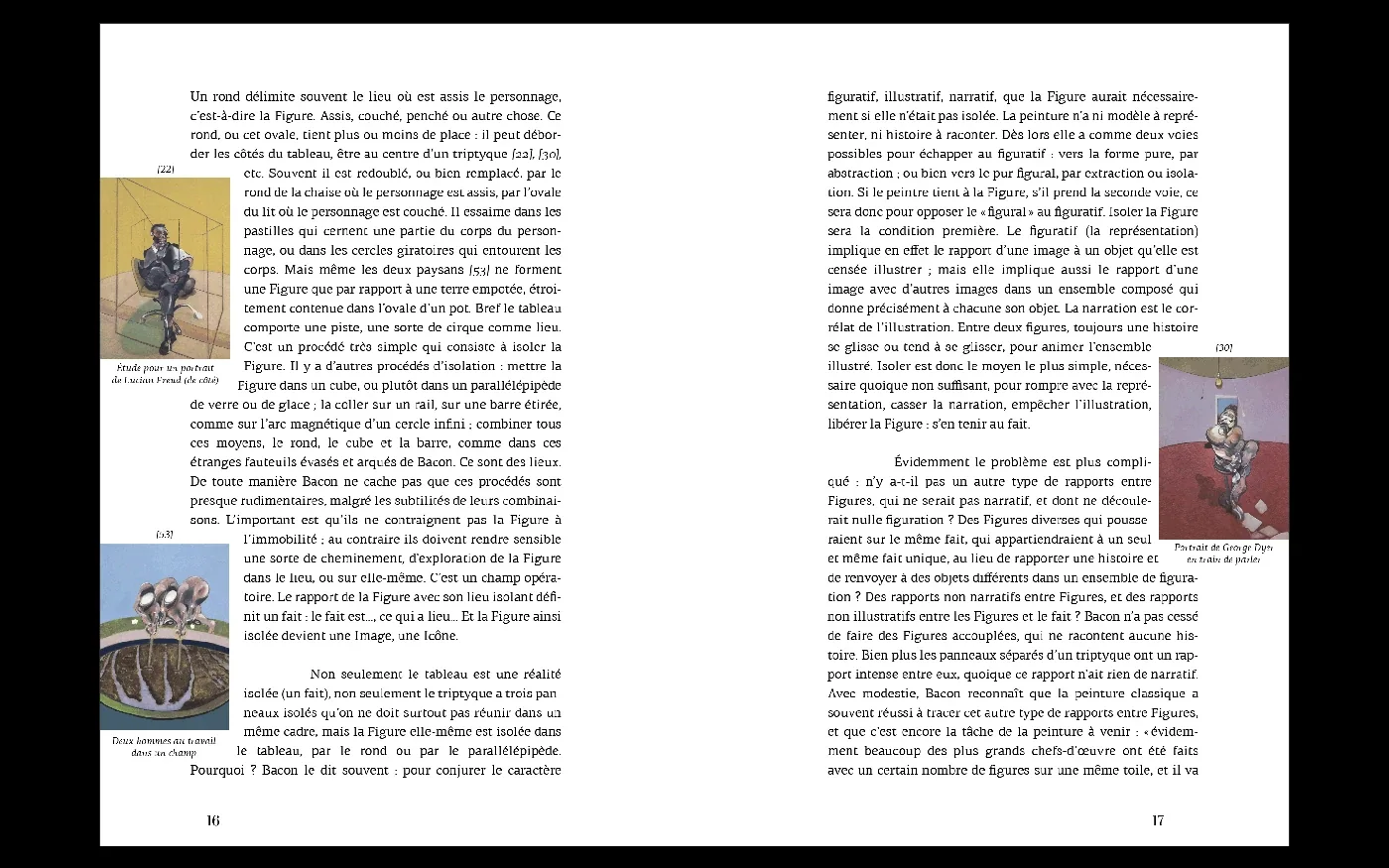
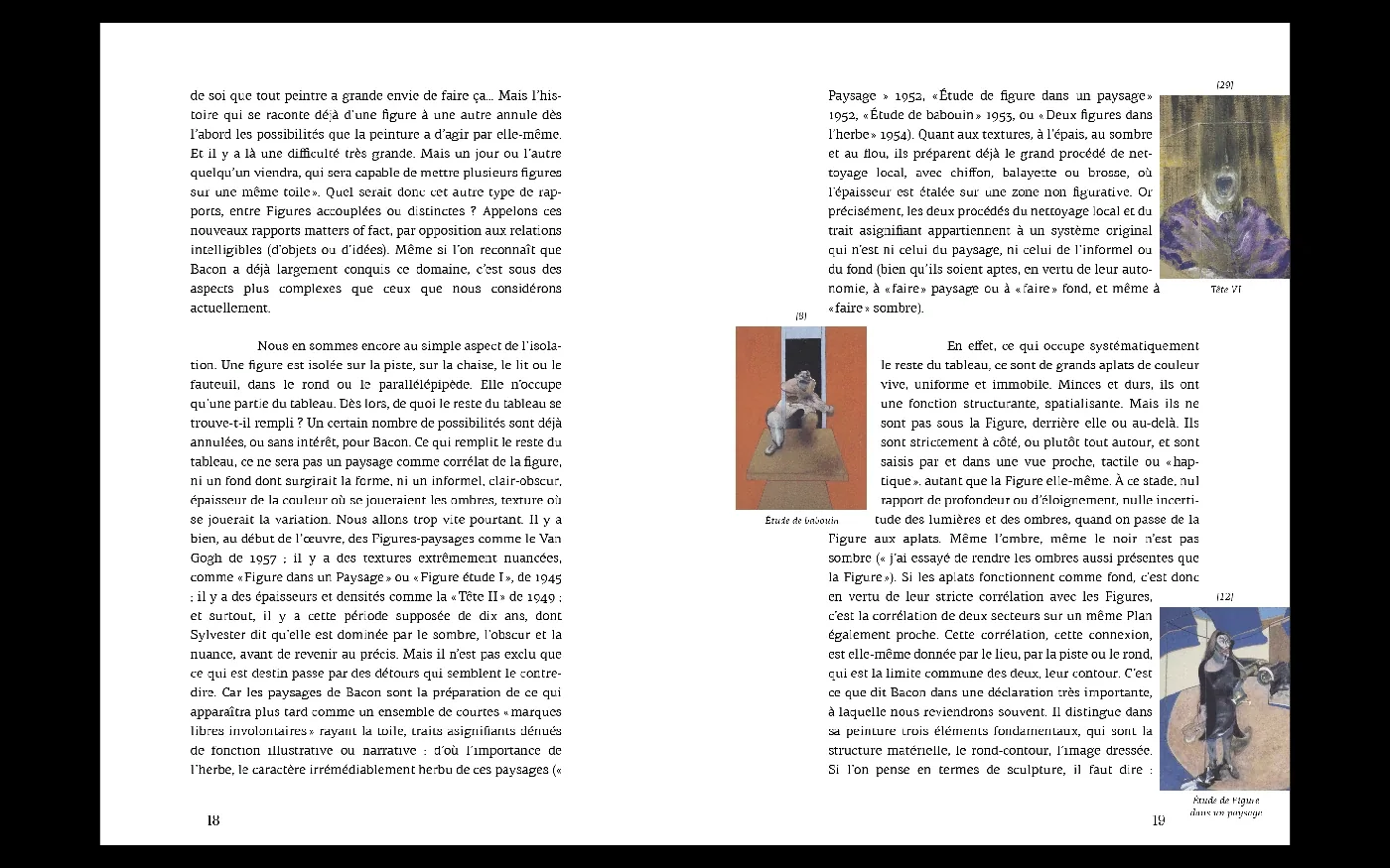
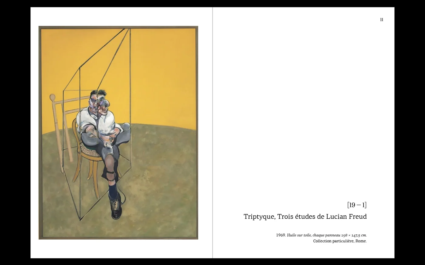
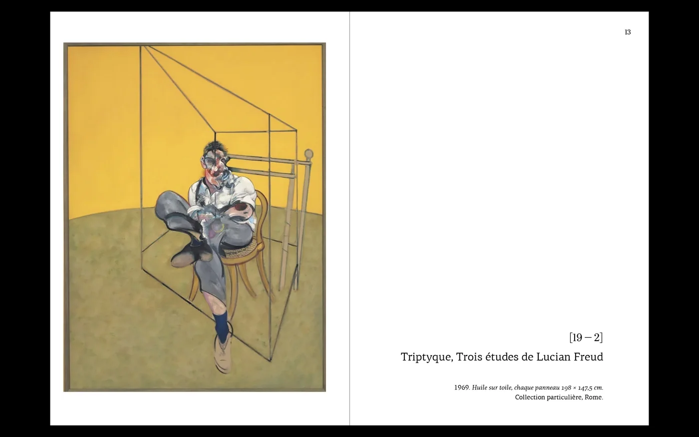
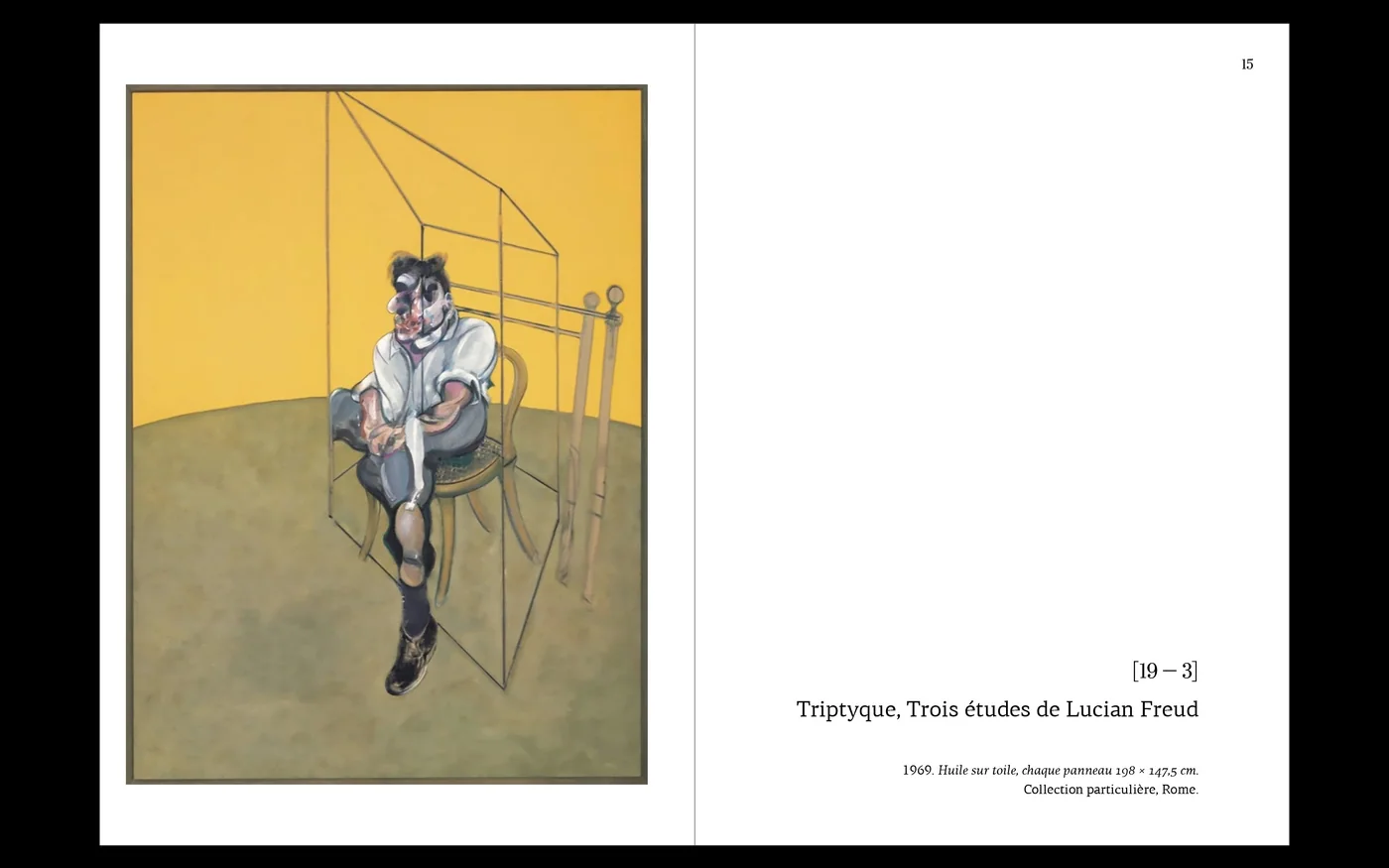
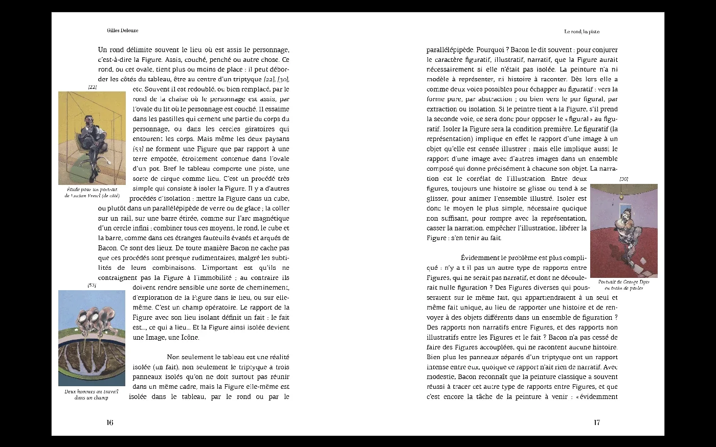
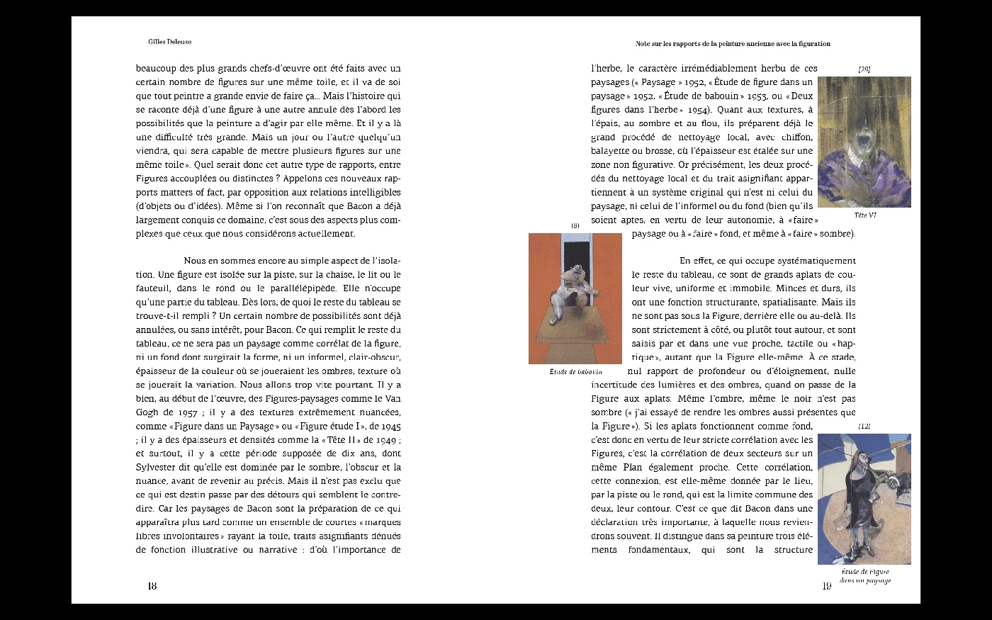
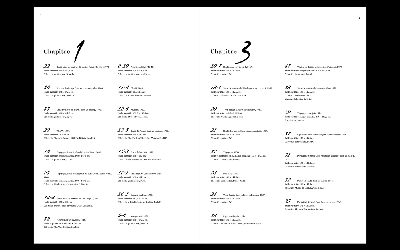
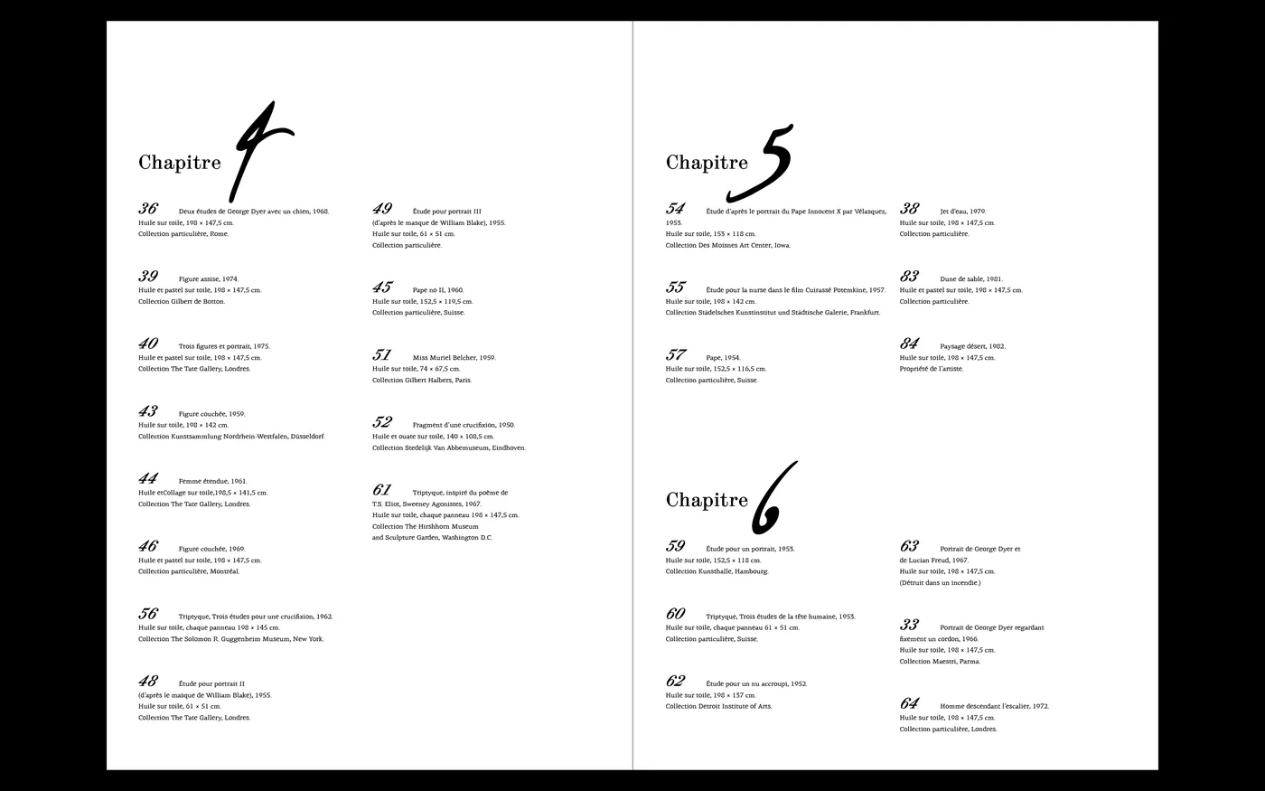
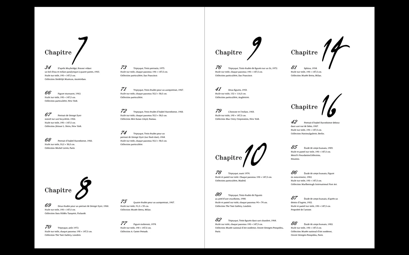
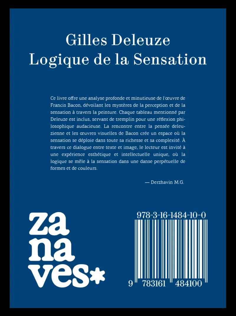
E12 Zanaves Book 2024 Jul An edition keeping image and argument in direct contactThis publication brings Deleuze’s writing together with paintings by Francis Bacon. Images sit beside the text, with the margins becoming part of the relationship between looking and reading. The reader encounters the visual material alongside the argument, allowing attention to move between them within a spread. The design gives the writing and paintings a shared physical setting. Its editorial proposition lies in that proximity: the artwork's context remains present while the reader works through the text Book Book Book Book Book Book Book Book Book Book Book Book Book Book Book Book Book Book Book Book Book
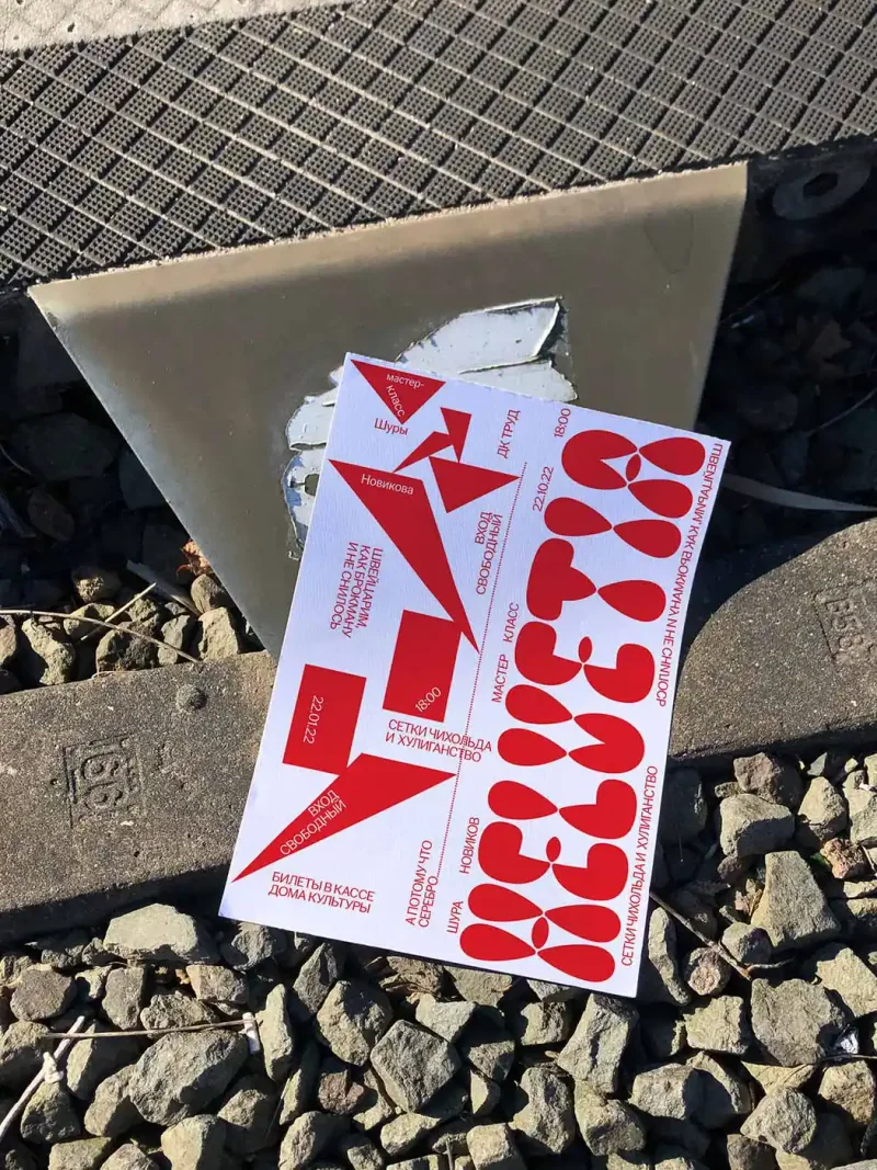
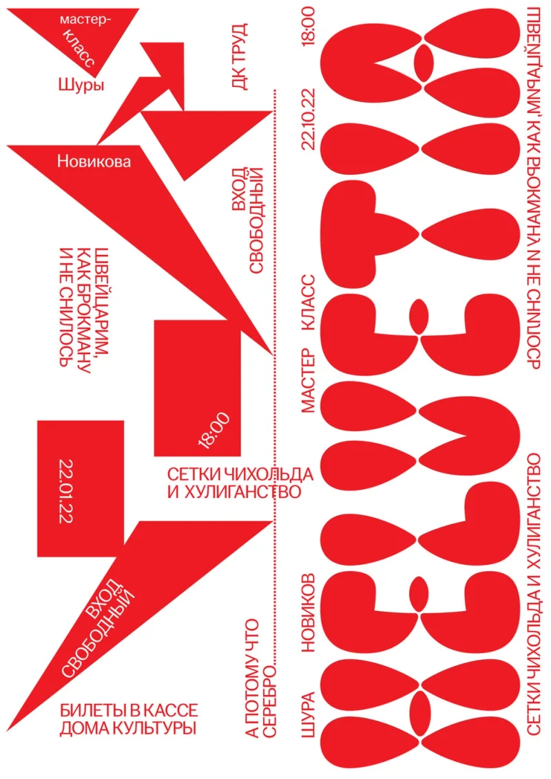
A072 Shura Novikov Poster 2022 Jan A workshop announcement for ShuraThe poster announces Shura Novikov’s workshop through a limited red-and-white palette. Angular arrow-like shapes sit beside repeated curved forms, while smaller text carries the workshop information through the gaps. The composition gives the announcement a strong visual rhythm using type and geometry as its main materials. The work answers a practical event-poster task while allowing the arrangement of its parts to suggest the activity of making and composing. Its specific character comes from that contrast of sharp and rounded forms and both deconstructed and rearranged "swiss grid" Poster Poster
A085 Self Initiated Poster 2022 Feb Felt cute, might delete laterThe work participated in the Golden Bee 2024 biennale Poster Poster
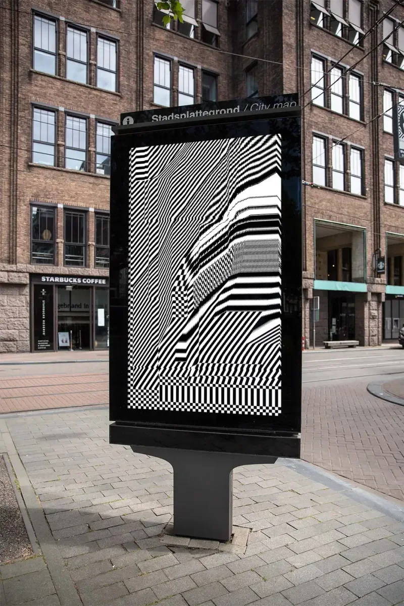
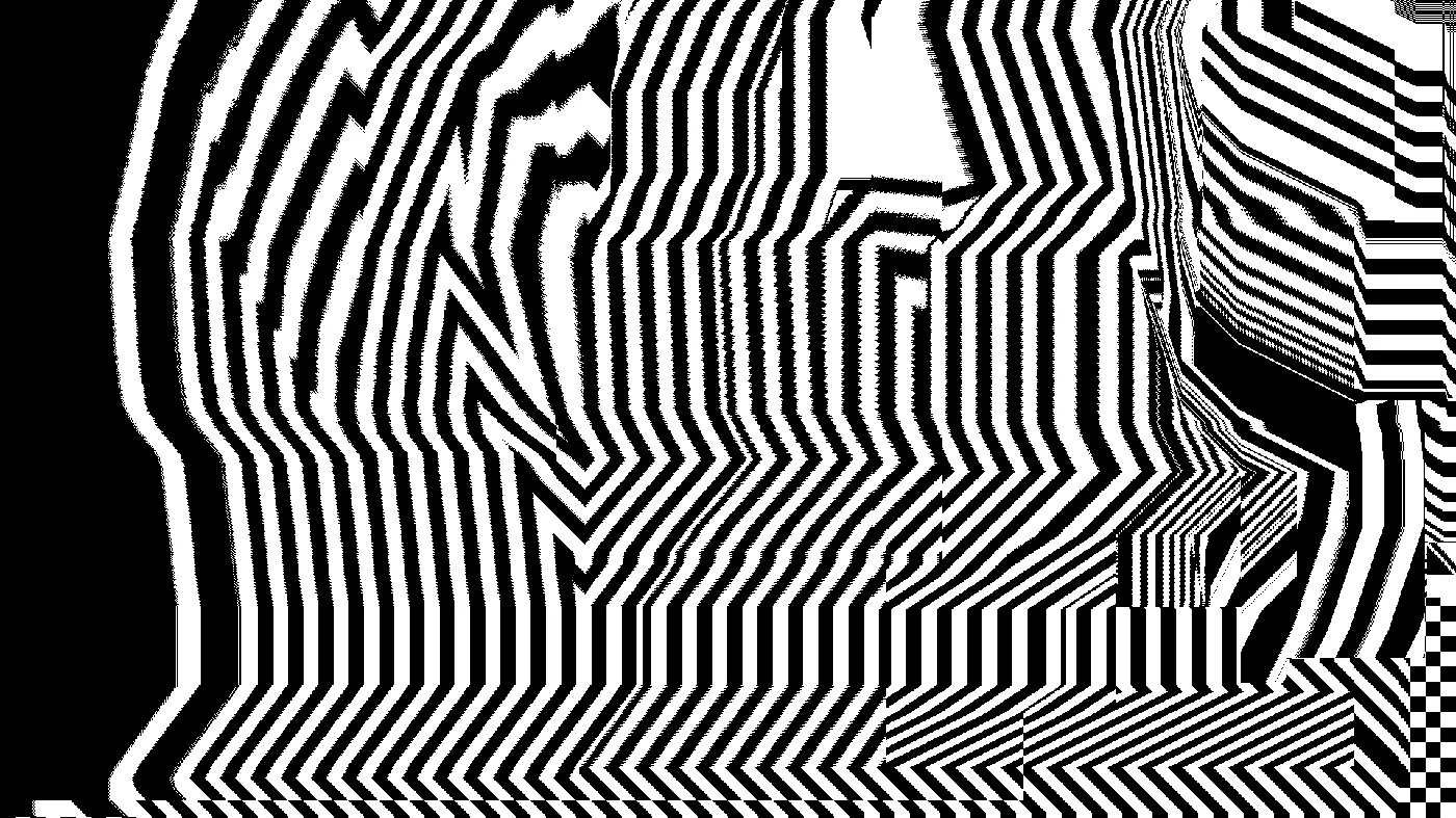
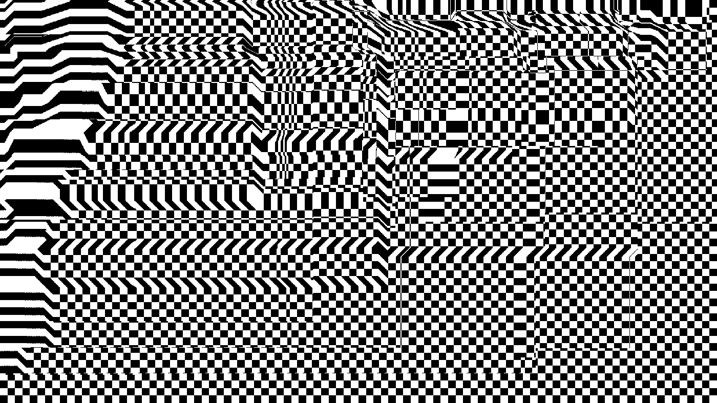
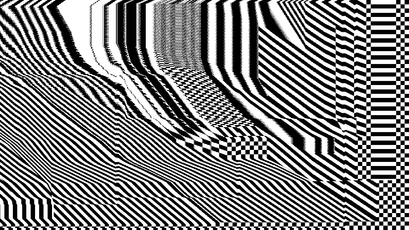
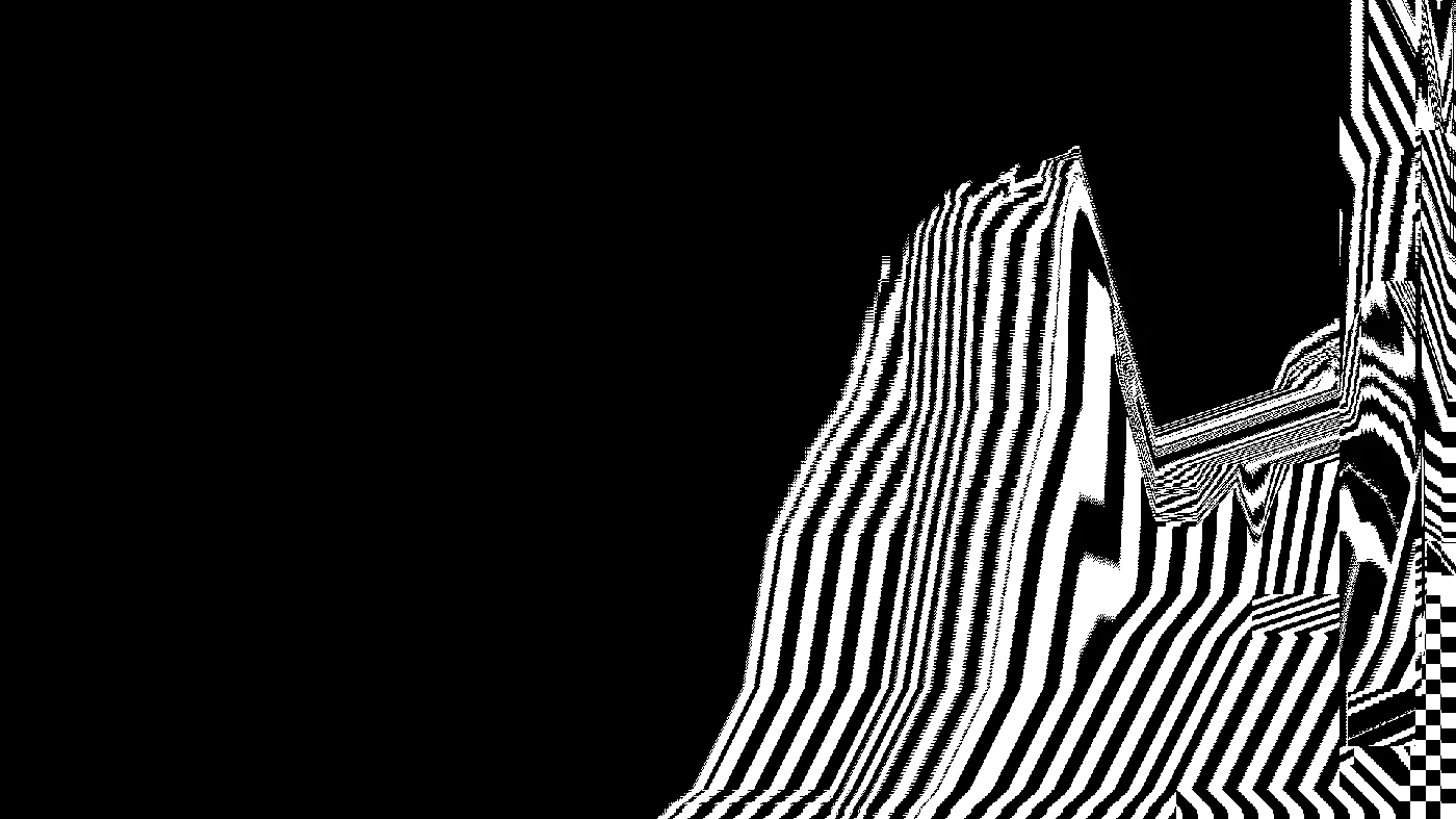
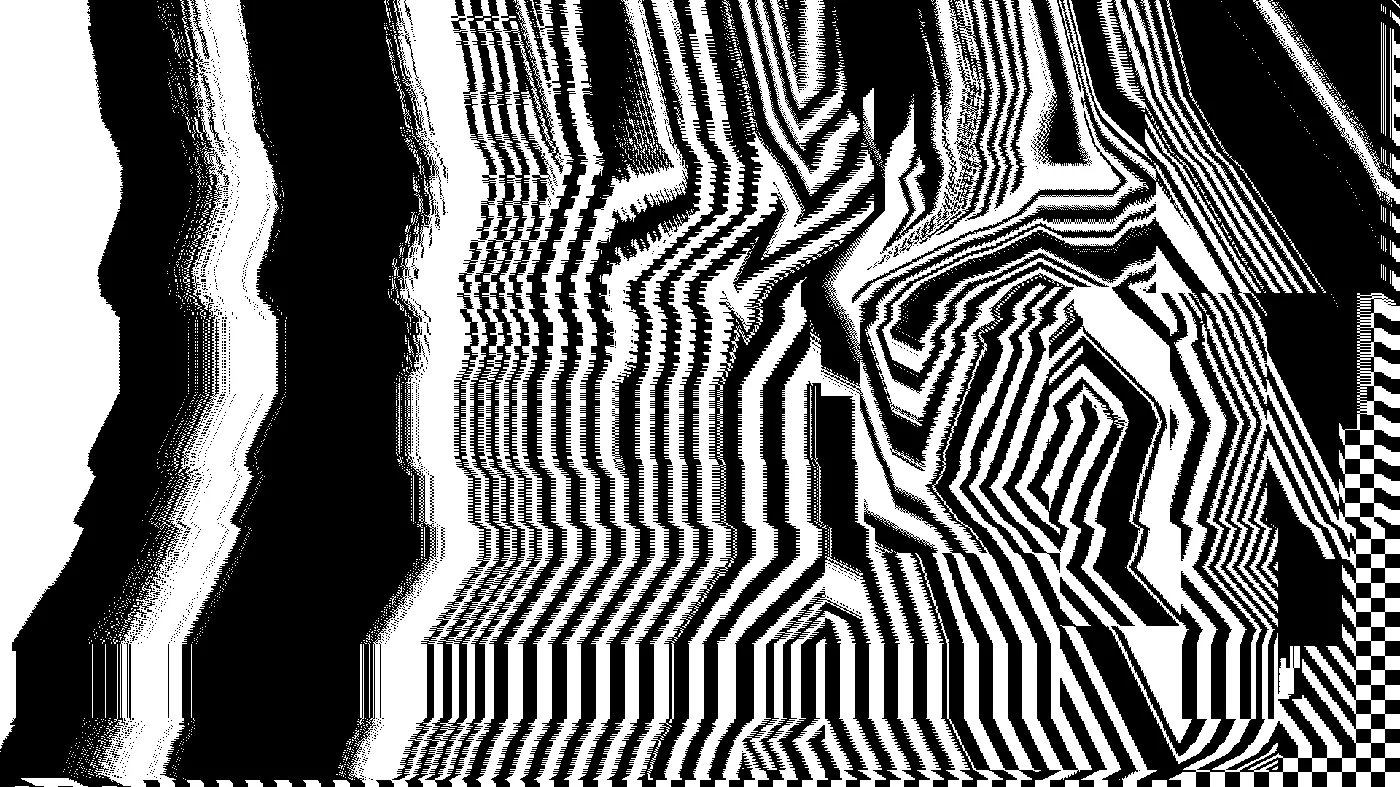
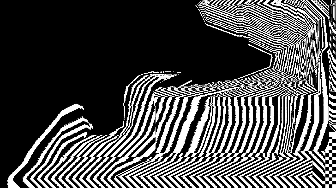
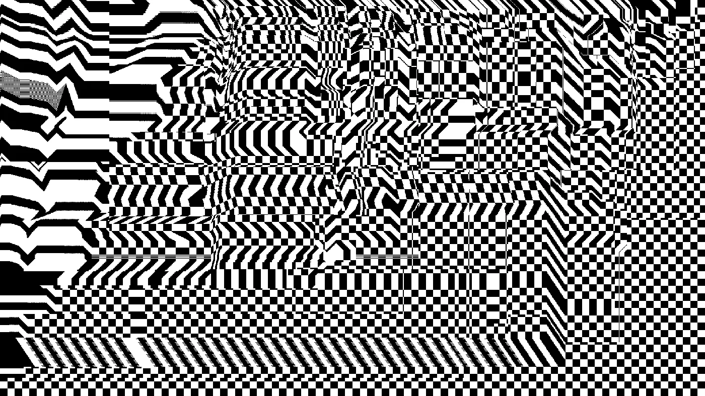
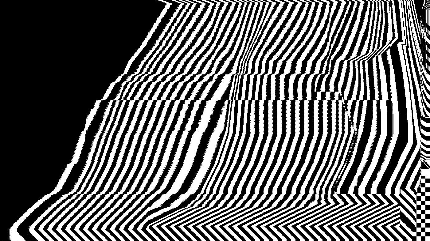
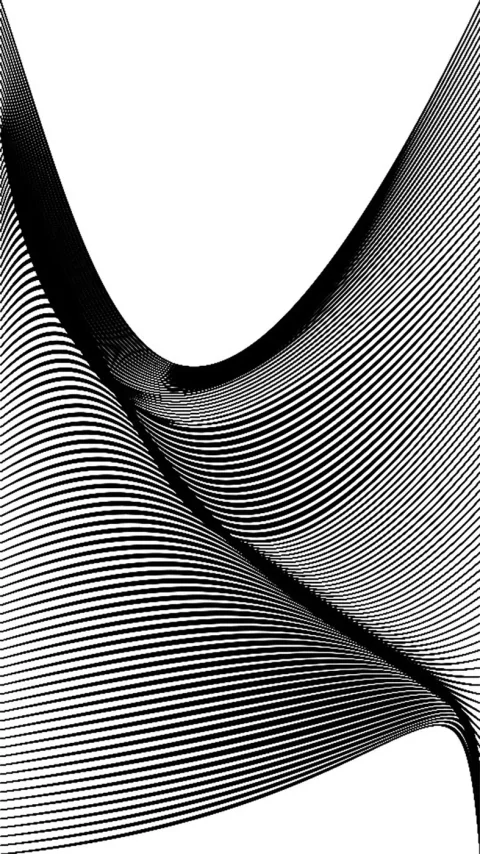
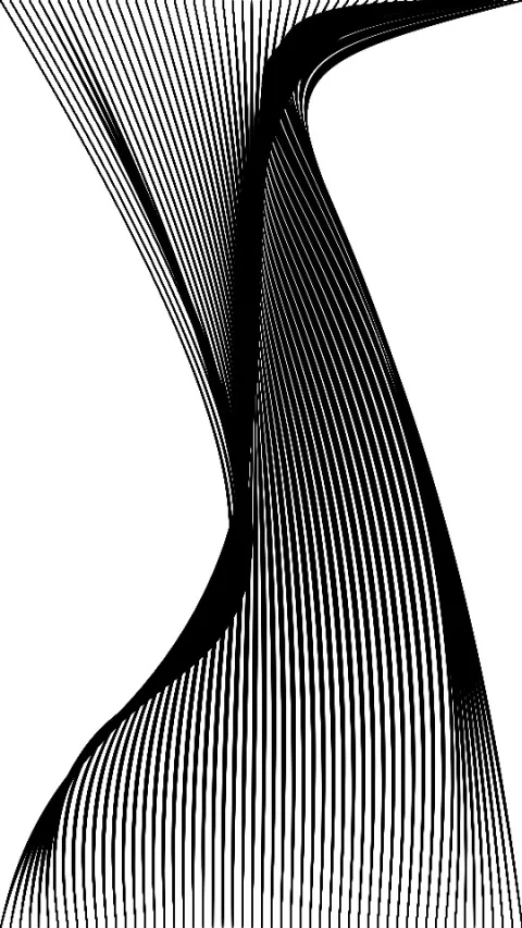
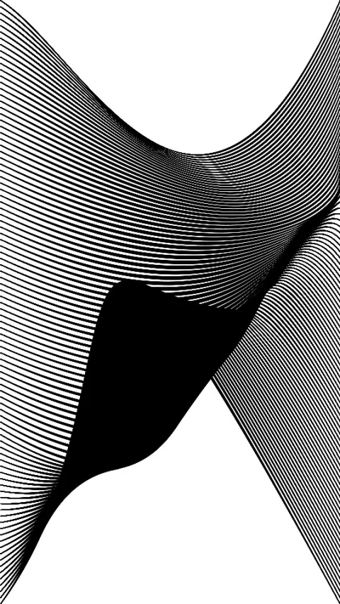
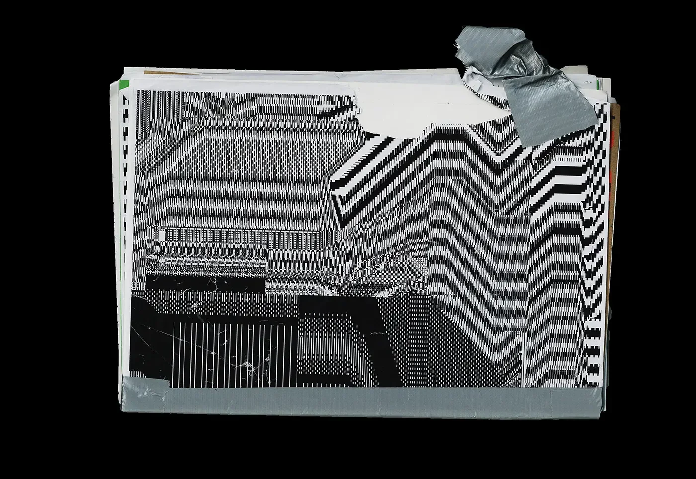
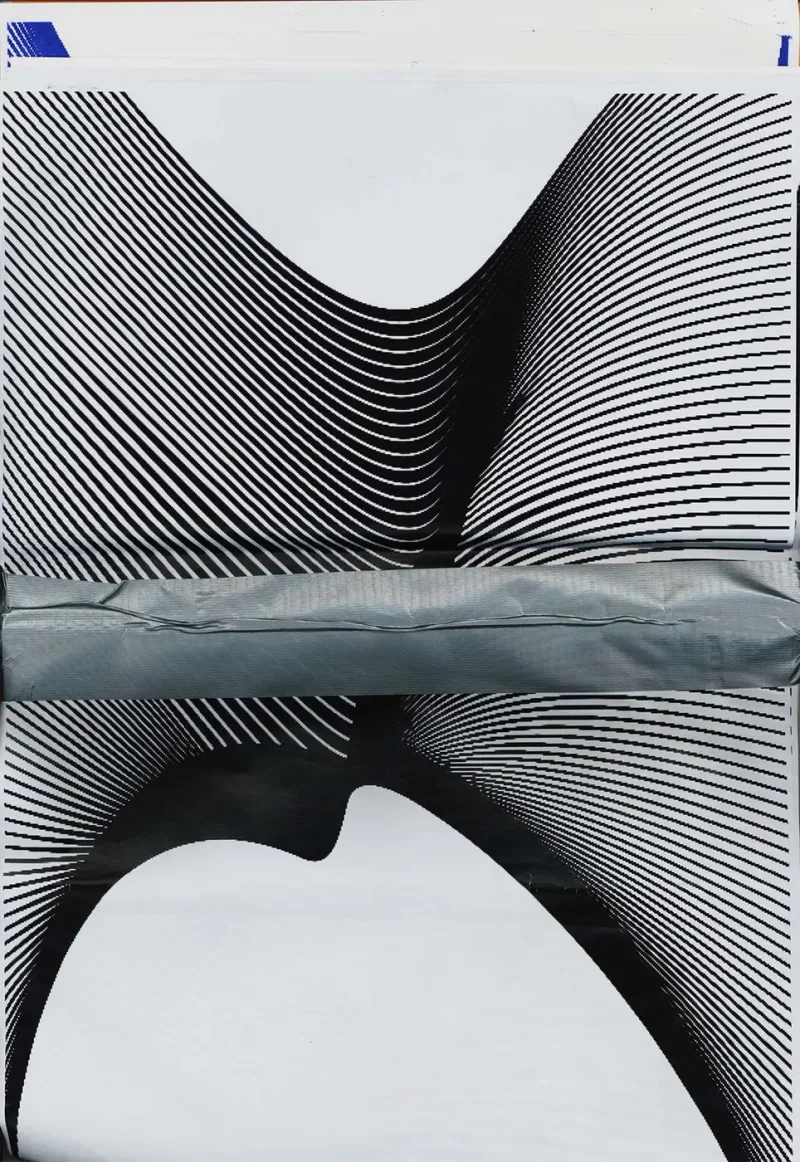
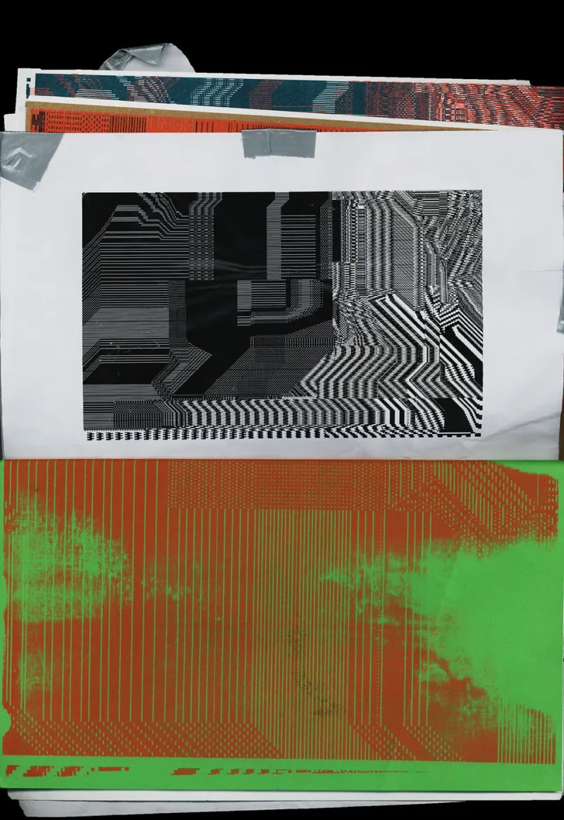
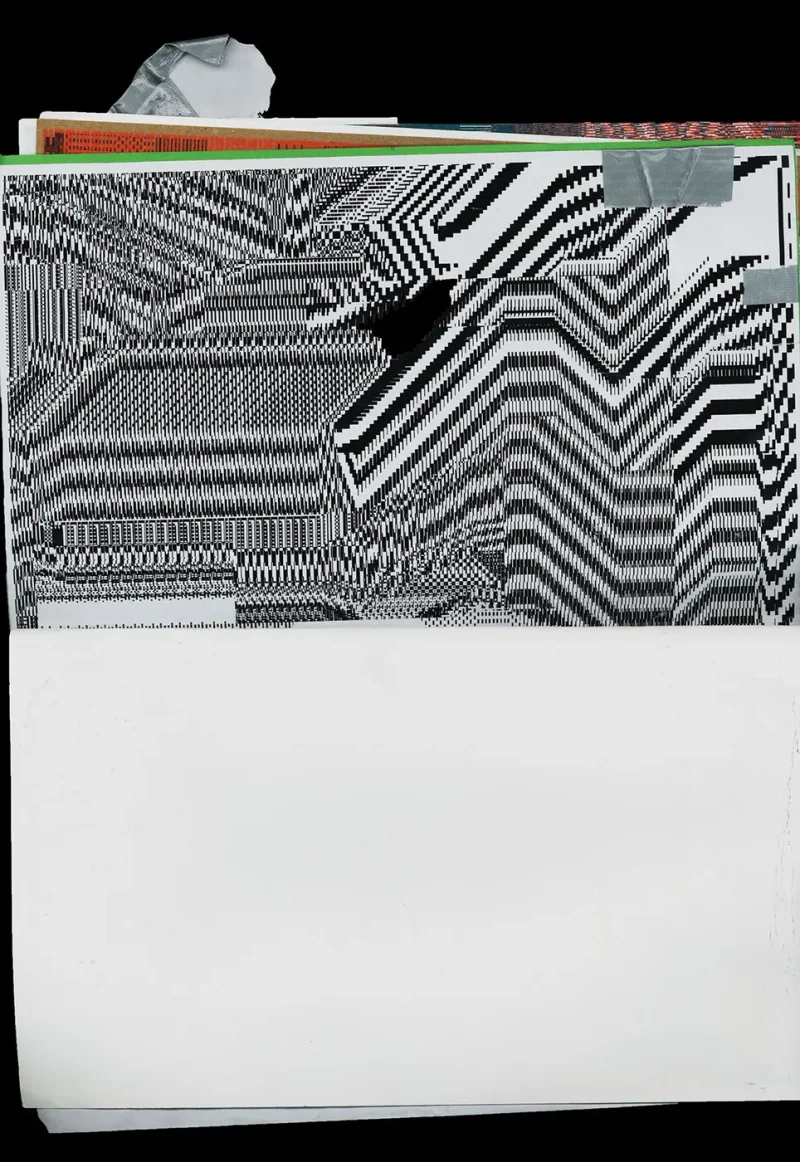
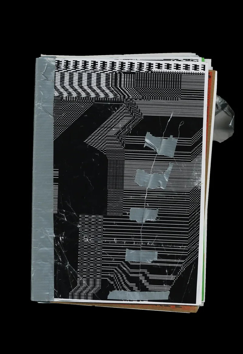
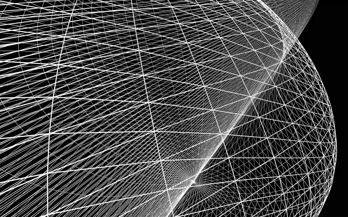
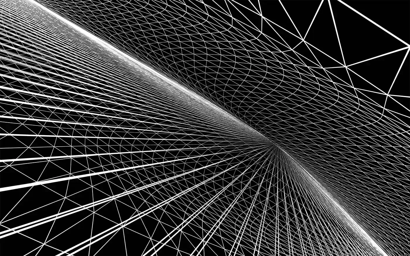
A224 Self Initiated poster 2024 Mar Generative landscape poster seriesSelf-initiated works with the visual language of engineering drawings and repeated line patterns. Dense black-and-white bands change direction, break into steps and meet at sharp boundaries. The resulting images shift between a patterned surface and the suggestion of folds or depth. The inquiry is made visible through those transitions: a regular system produces forms that no longer look mechanically settled. The series gives that formal tension a poster format, allowing the interaction of repetition and disruption to occupy the whole image poster poster poster poster poster poster poster poster poster
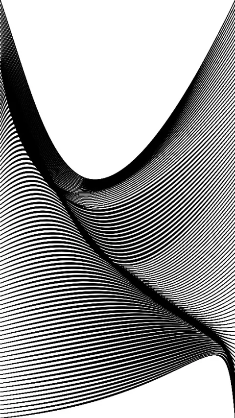
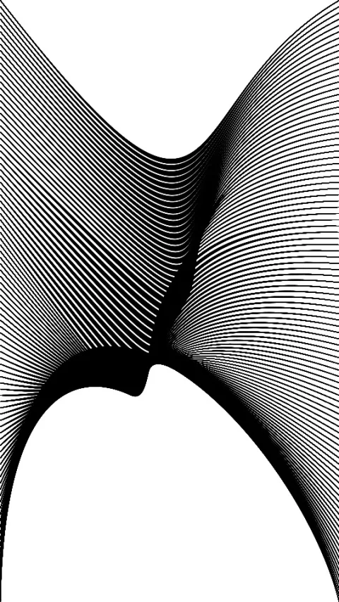
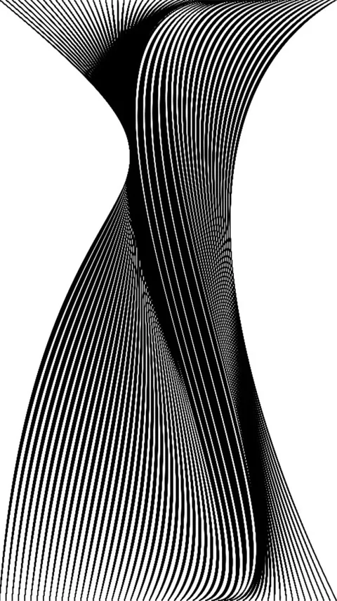
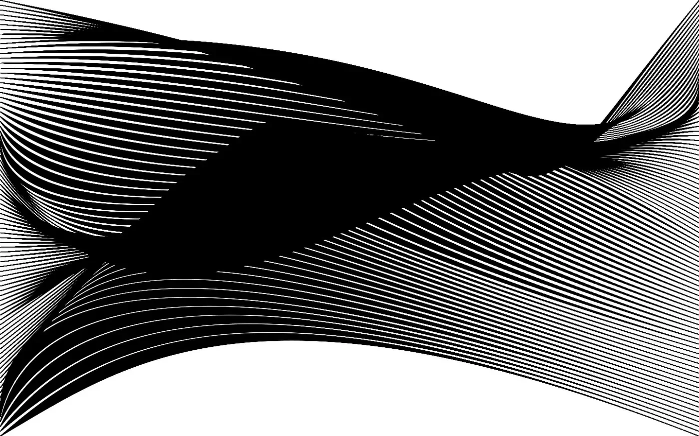
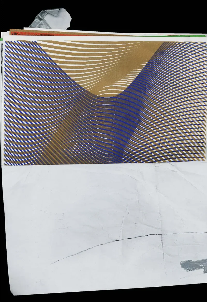
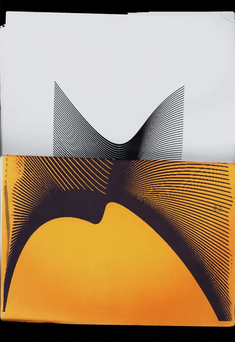
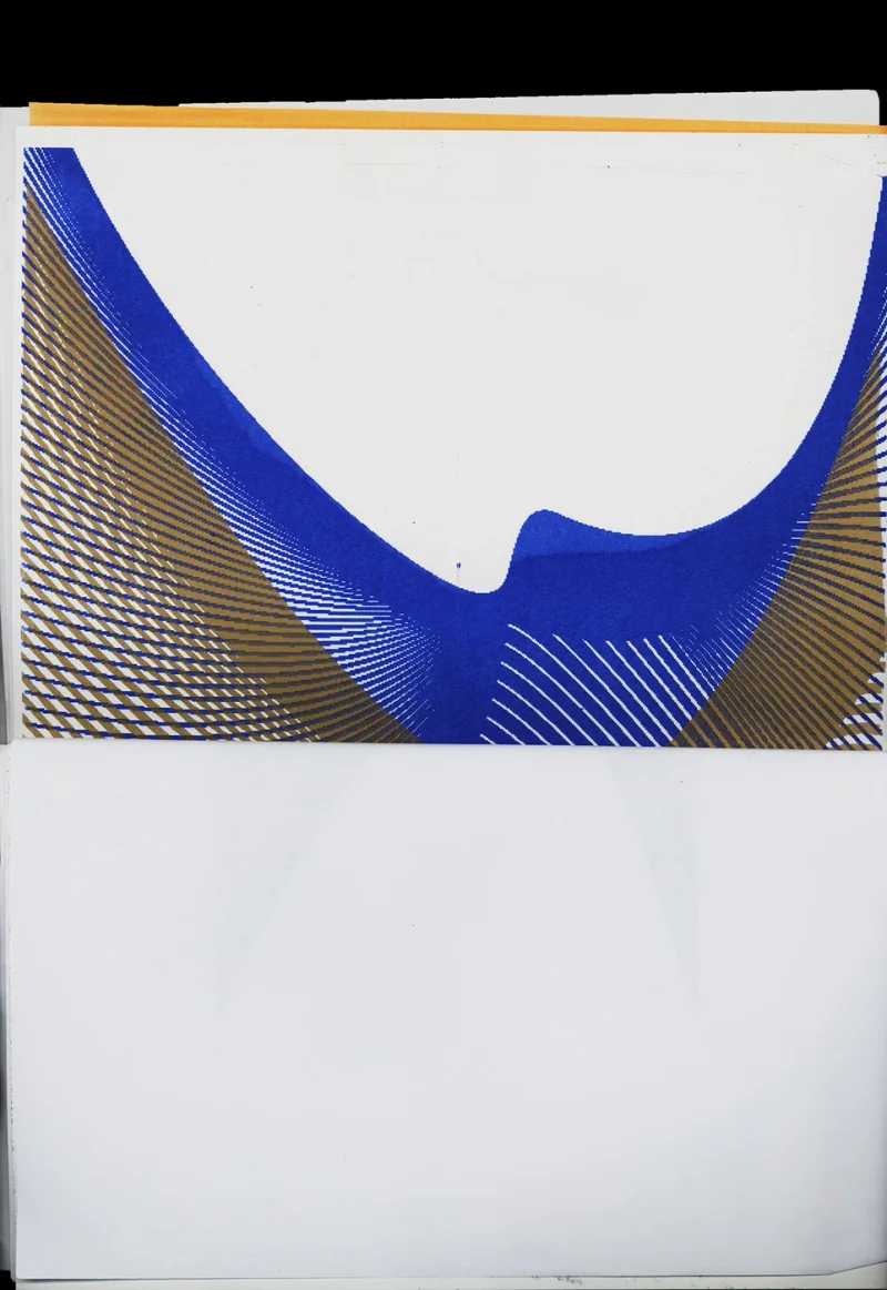
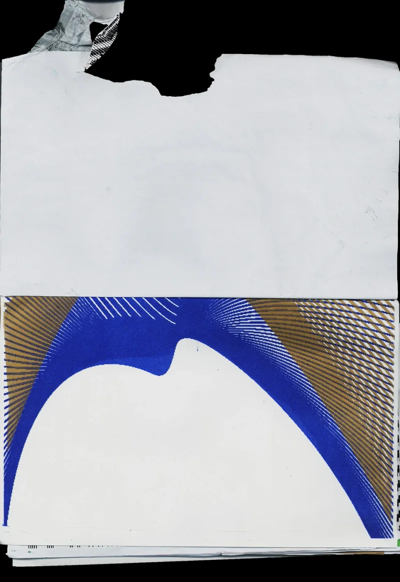
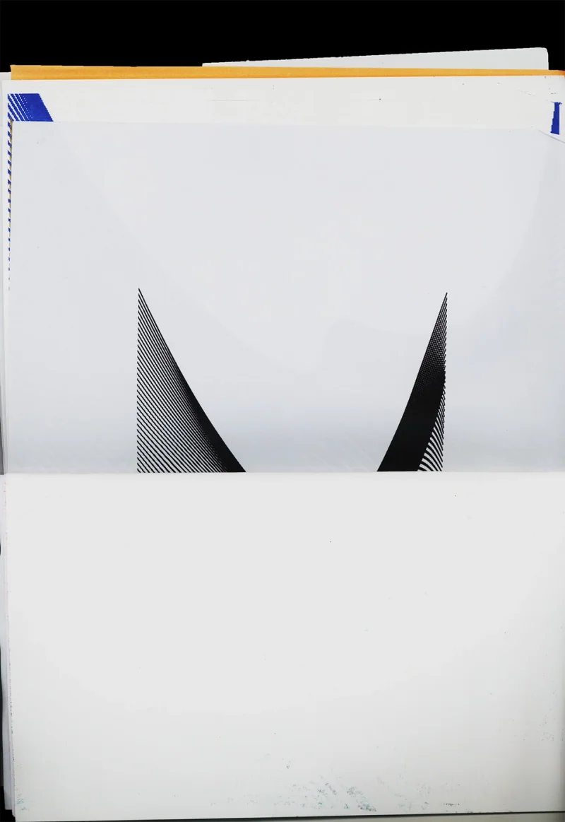
A222 Self Initiated poster 2024 Mar Generative poster seriesFor this self-initiated study, I used Processing to generate forms from repeated lines. Their curves tighten and spread, producing dark bands where marks gather and lighter areas where they separate. The images use that change in density to suggest surfaces that bend through space. The work tests what a coded drawing can make visible through repetition alone, with depth arising from the relationships between its lines. The series contrasts between engineered structure and a fluid appearance inside the same composition poster poster poster poster poster poster poster
A109 Zyuzino Poster 2022 Feb NDA
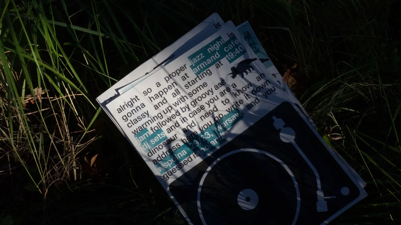
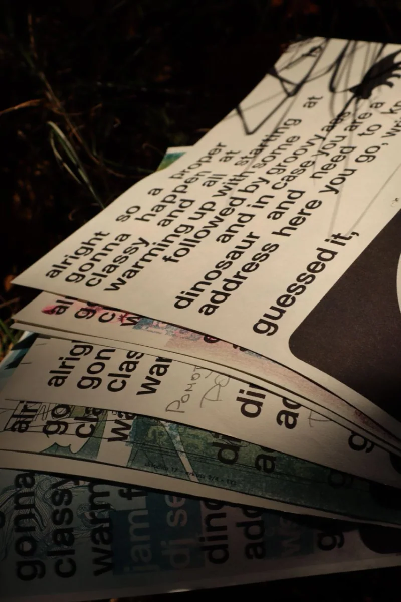
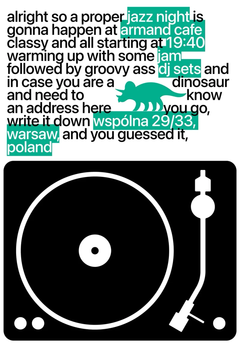
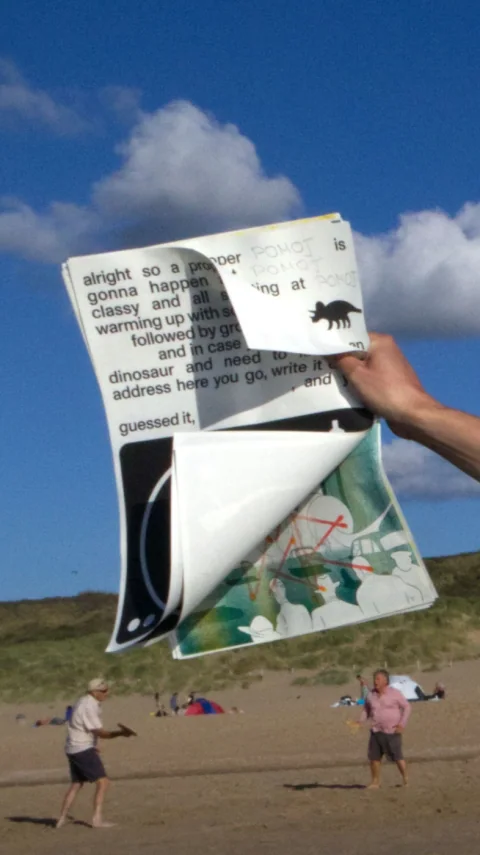
A172 Armand Cafe Poster 2022 Jul Poster made in Apple Pages overnightThe poster was made for a jazz night at Armand Cafe with one night available and Apple Pages as the tool at hand. Its invitation reads like a message to a friend, with key event details highlighted inside the running text. A record-player image anchors the lower part of the page. The work brings that conversational voice and a direct musical reference together within the limits of the available software. An affiche shaped by its production circumstances Poster Poster Poster Poster
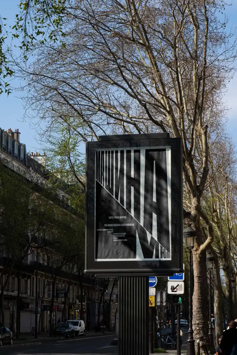
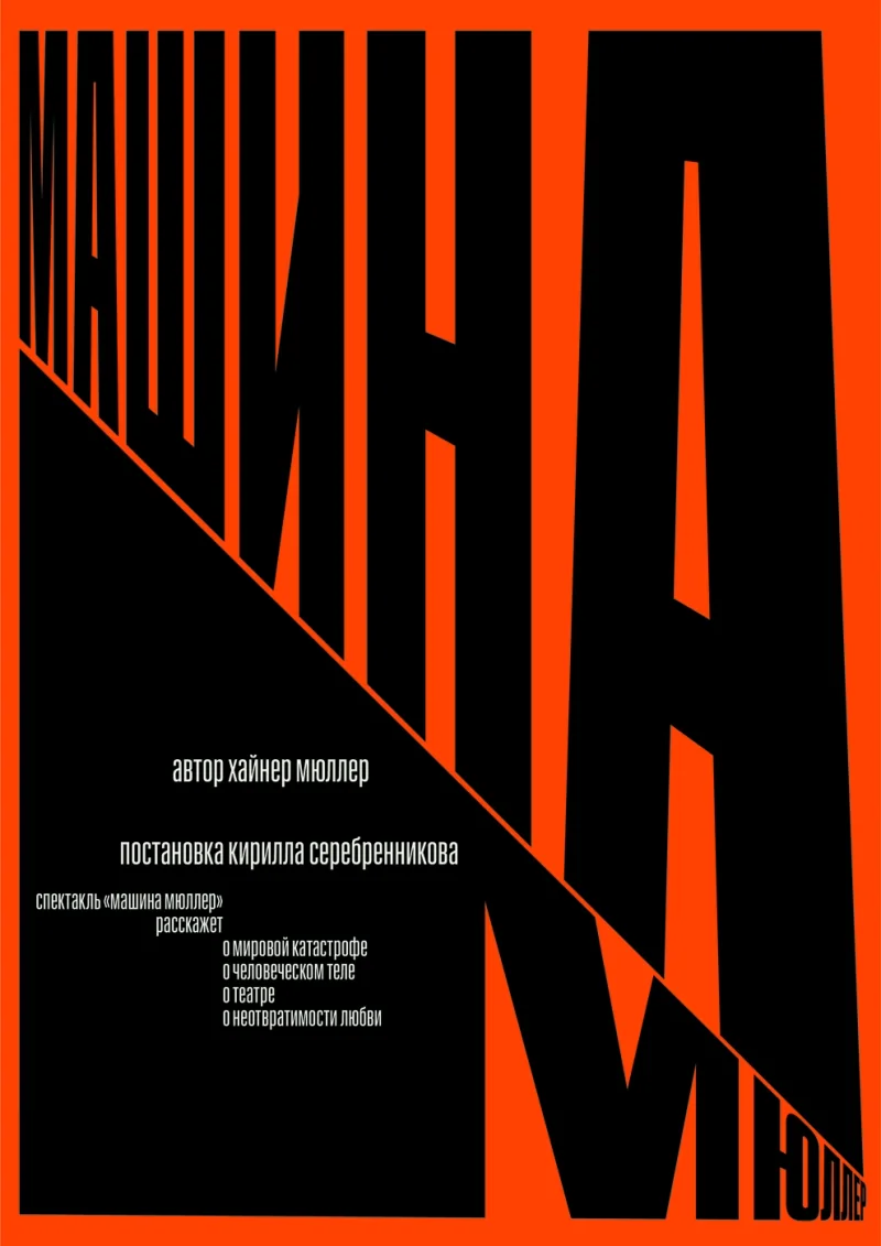
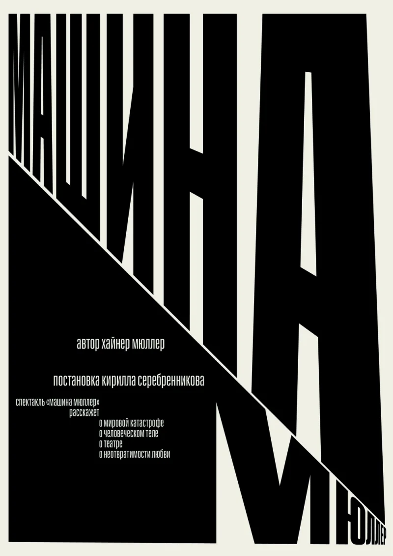
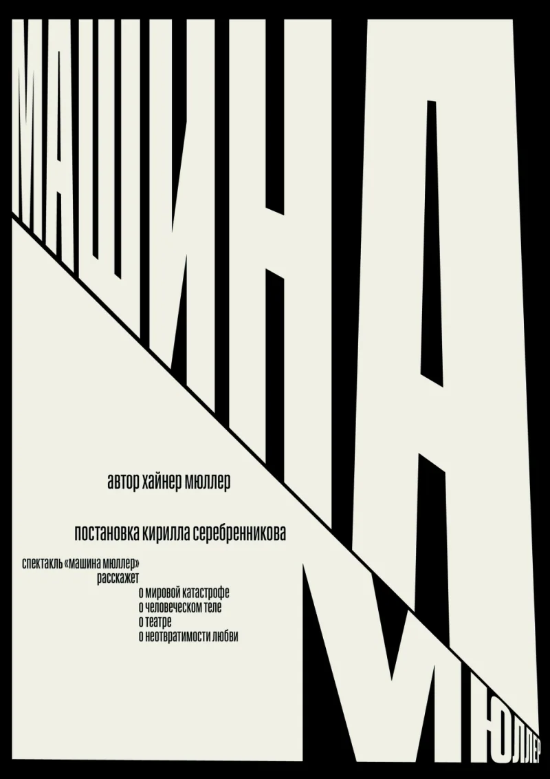
A122 Self Initiated Poster 2022 Mar Self-initiated proposal for Gogol TheaterThe proposal uses the production’s title as the main structure of the poster. Large condensed letters follow a diagonal edge, growing across the page while smaller credits occupy the remaining space. The composition gives typography an architectural weight, with scale and alignment creating its pressure. I made it as a self-initiated proposal for Gogol Theater. The title becomes both information and a dominant shape, carrying the visual idea through the relationship between black letters and the space around them Poster Poster Poster Poster
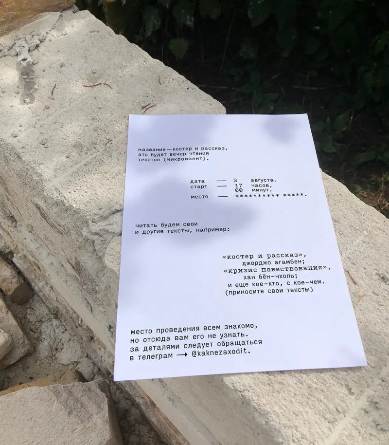
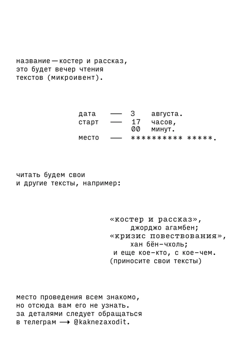
A250 R.V Poster 2024 Jul An affiche for poetry readingsThe invitation to R.V’s reading gathering uses small blocks of monospaced text on an open white page. The blocks organise the event’s title, timing and invitation to bring texts, with space separating each part. The venue is withheld behind a line of asterisks, and a contact is given for further details. The design makes the terms of the gathering part of the announcement itself. Its visual character comes from the placement of language and the balance between what is stated and what is left out Poster Poster
V02 Stimmung Apparel 2022 Jul NDA
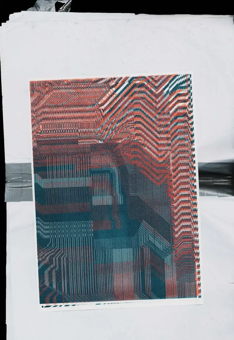
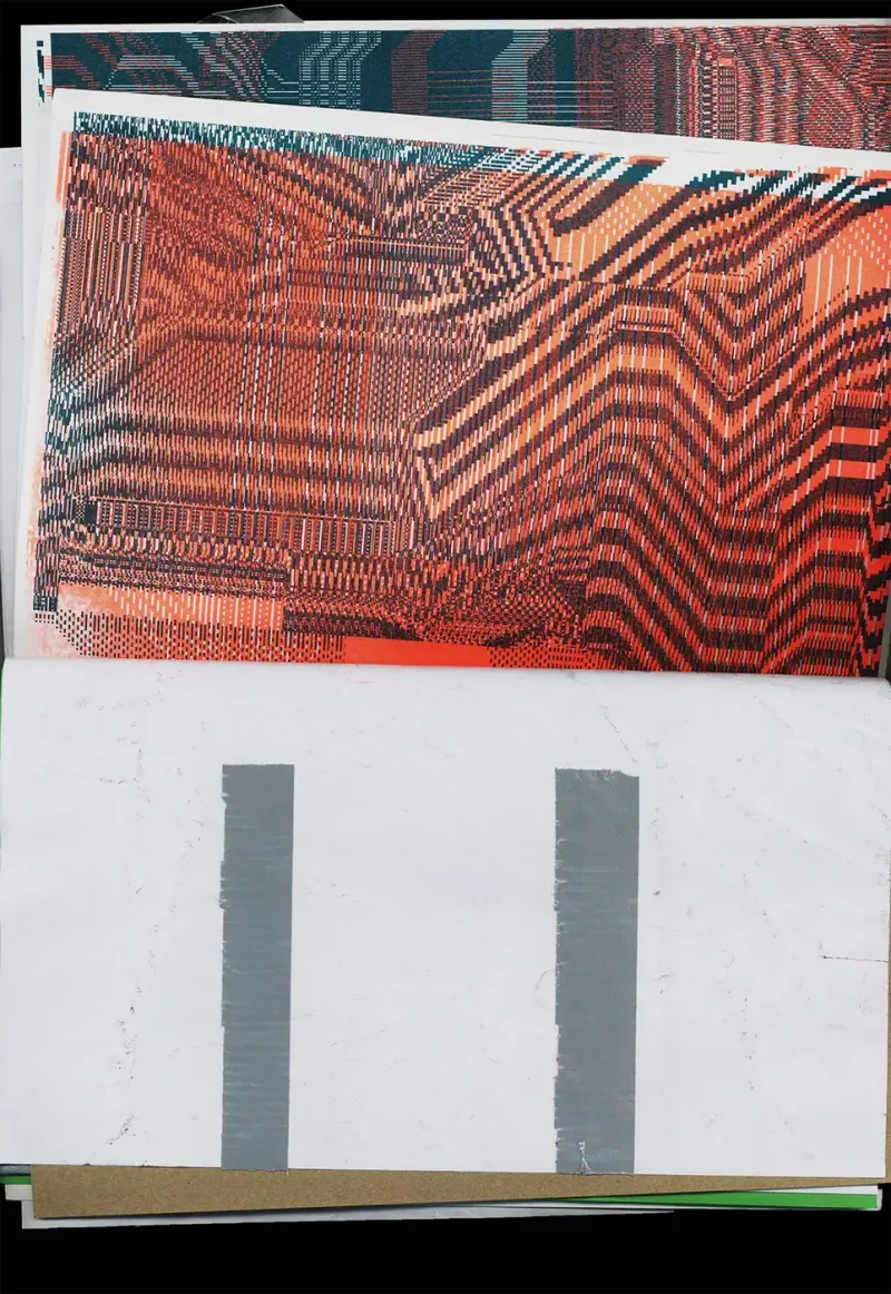
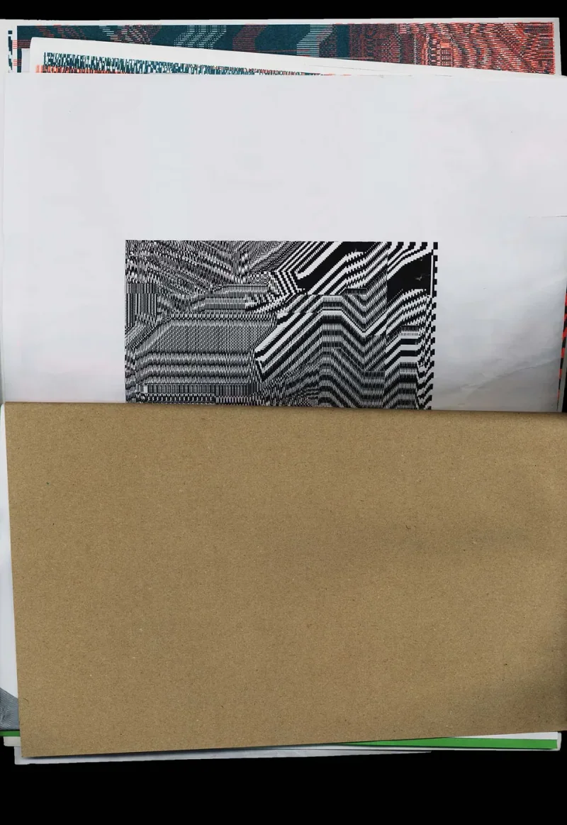
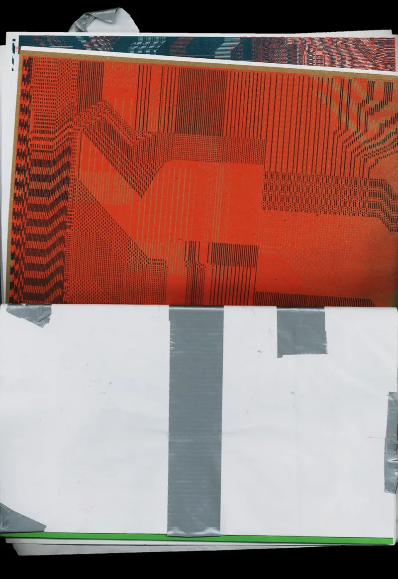
E06 Self Initiated Zine 2024 Jul Self-initiated zine assembled from leftover riso printsLeftover riso prints become the material for a new publication. The printed material carries its existing colours, patterns and textures into another setting. The inquiry sits in the act of choosing and arranging: what can remnants become when they are treated as the starting point? The zine gives those unplanned pieces a shared form through publication Zine Zine Zine Zine Zine Zine Zine Zine Zine Zine Zine Zine Zine Zine
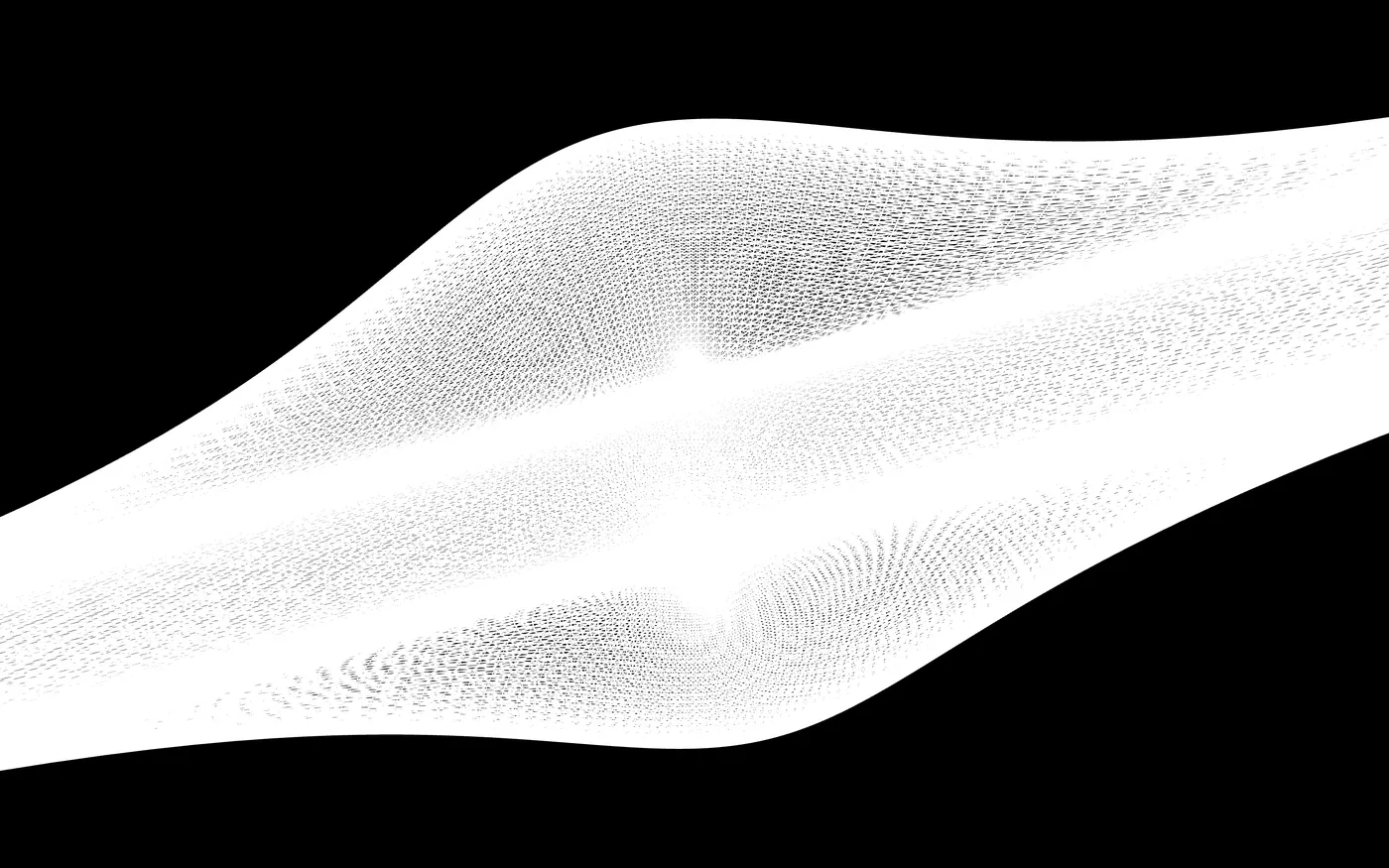
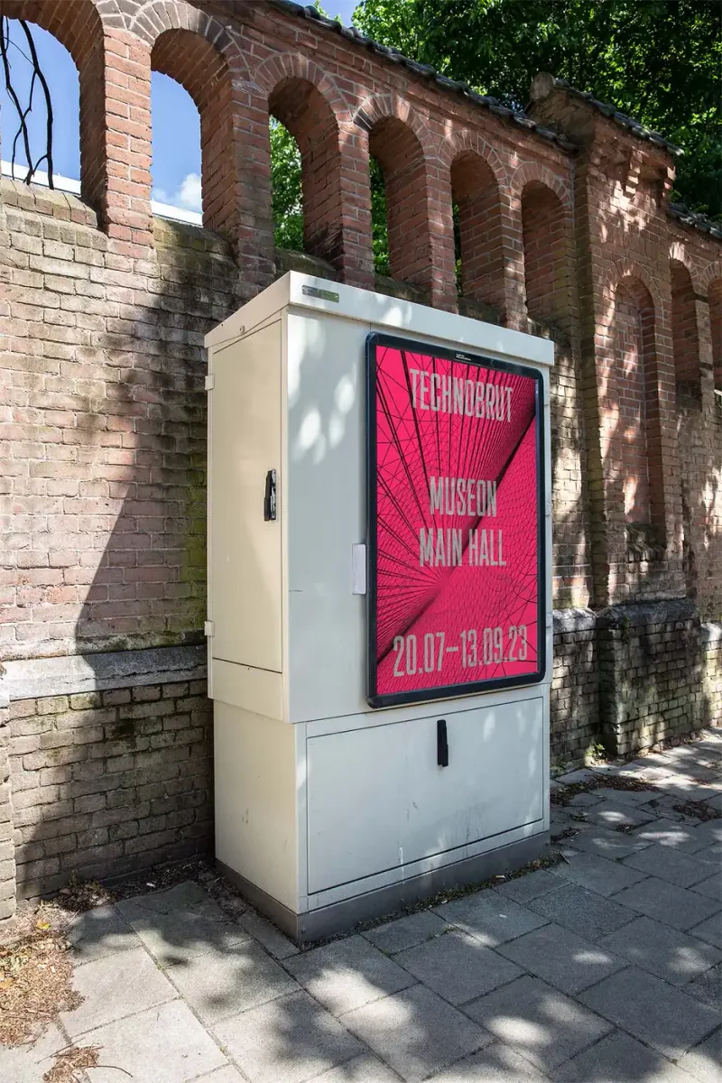
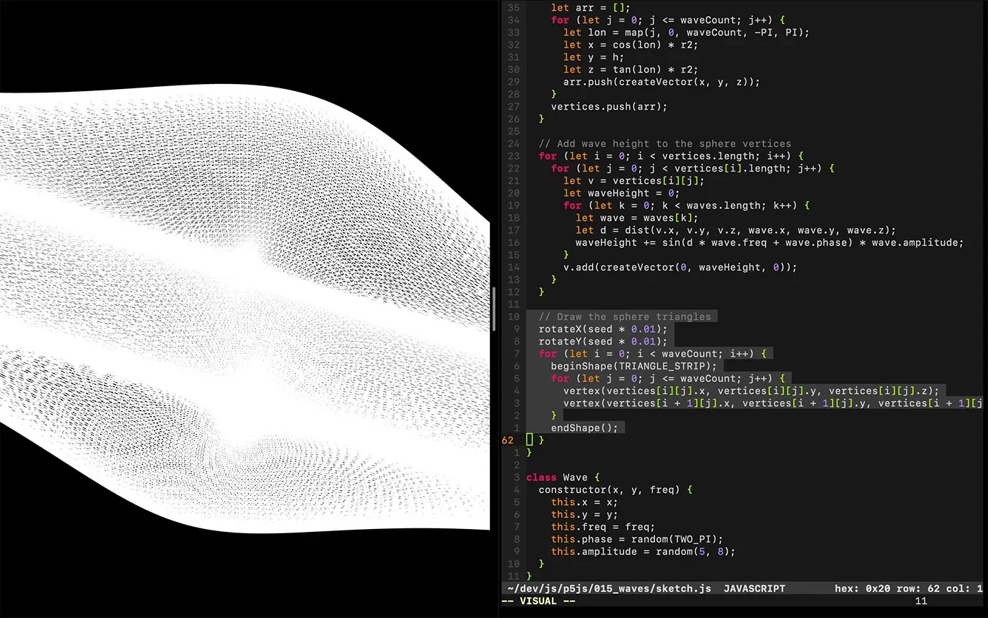
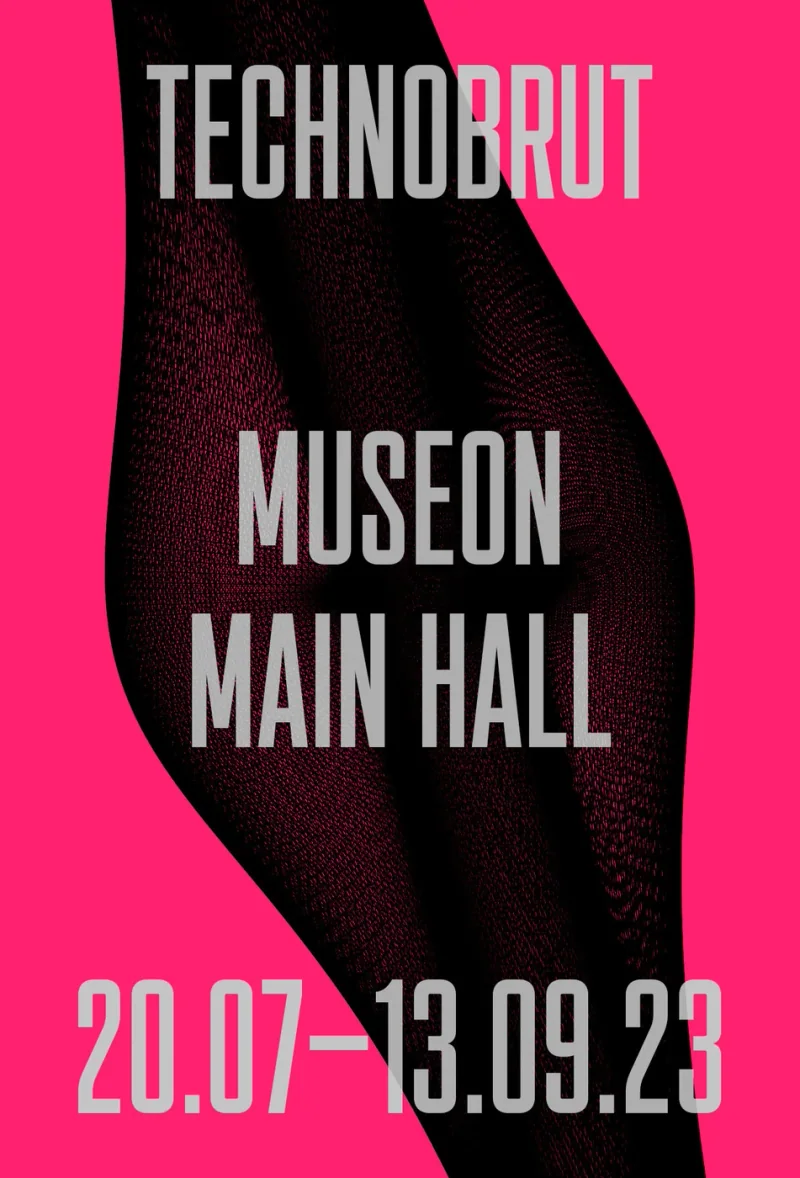
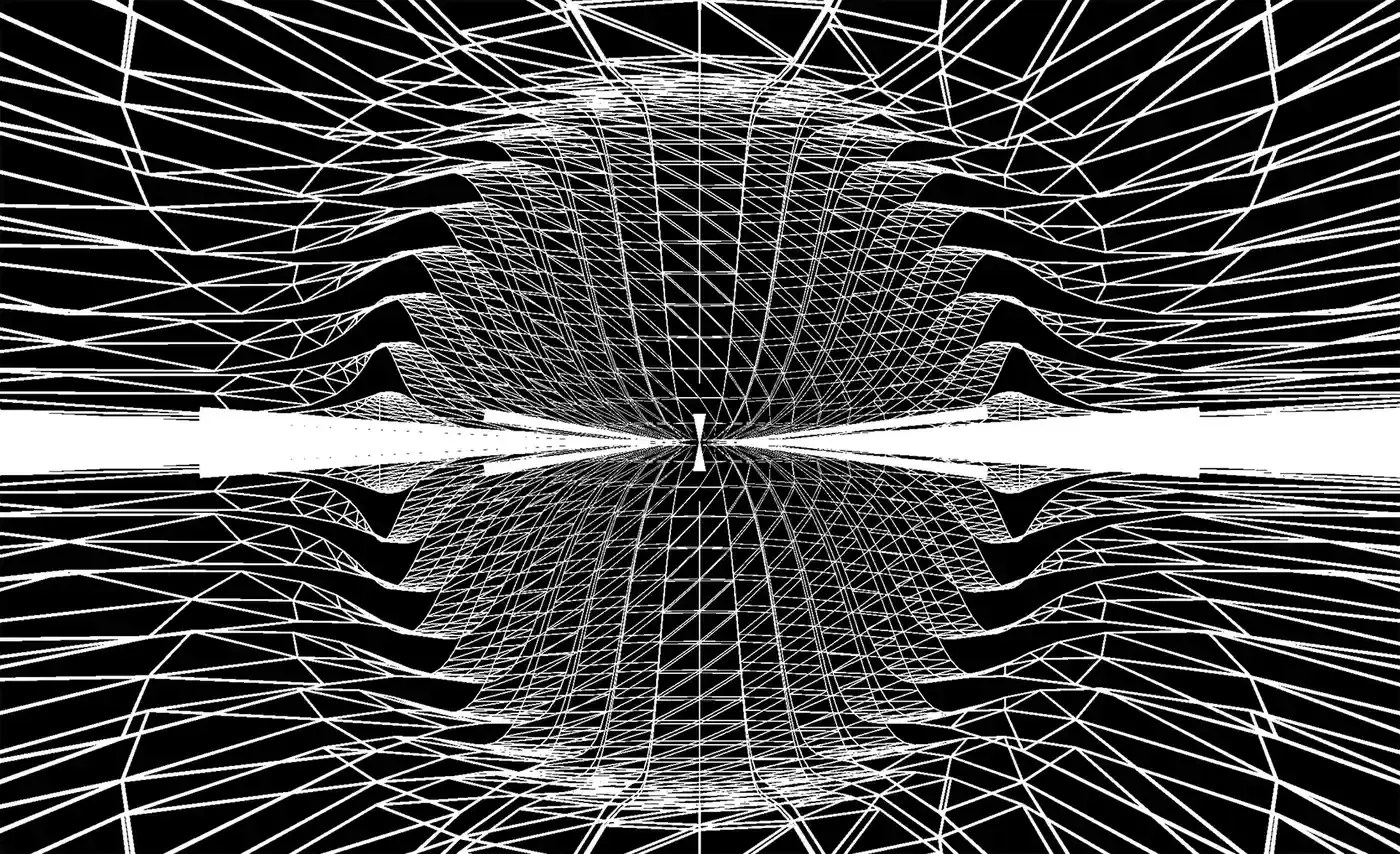
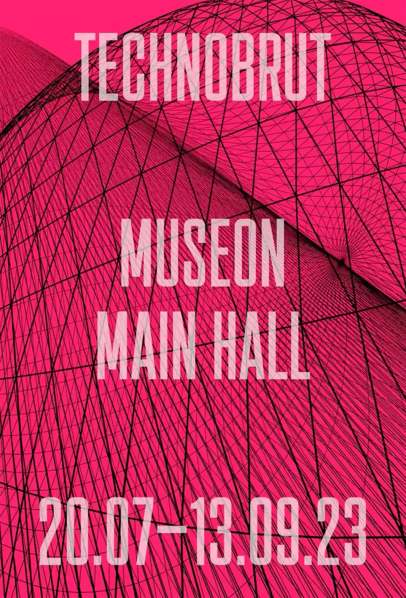
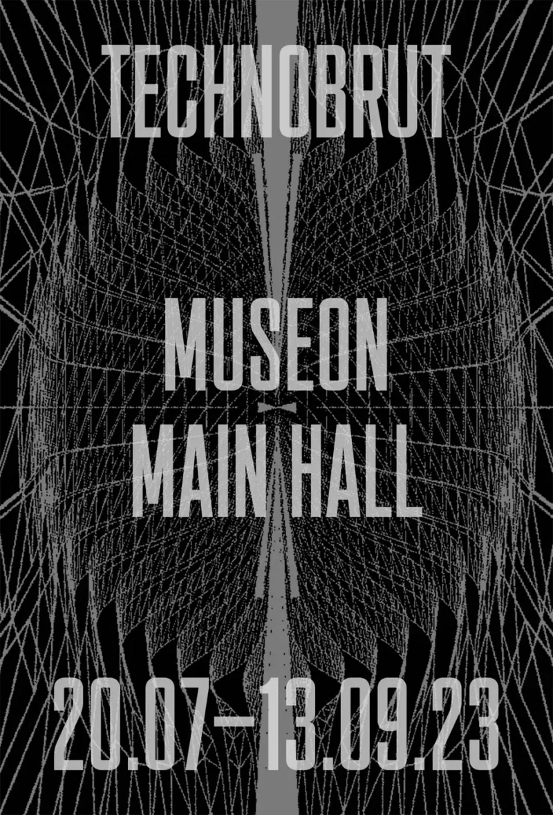
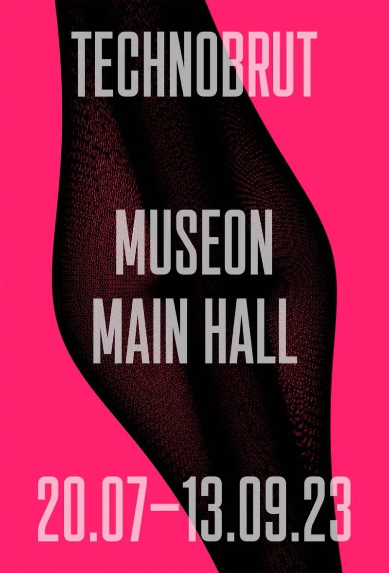
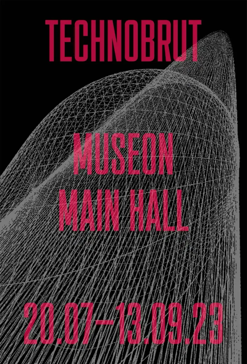
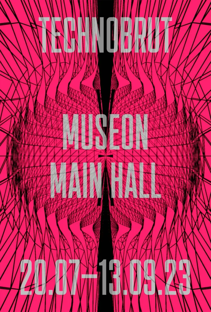
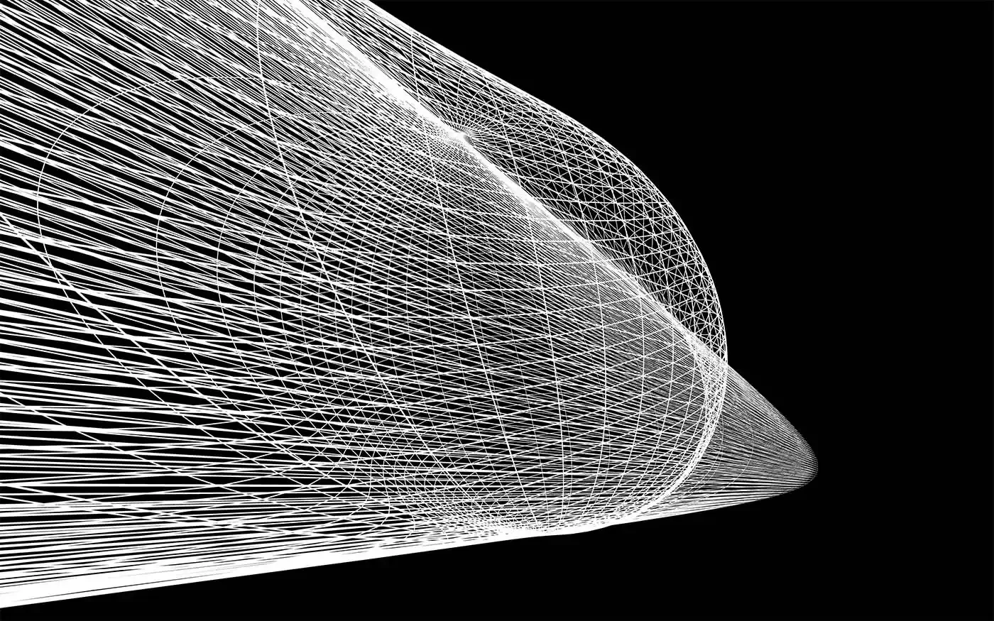
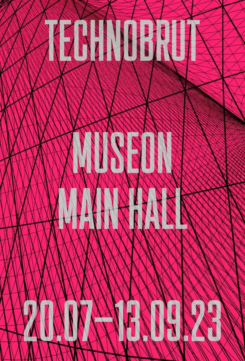
A225 Museon poster 2024 Jun Generative poster seriesThis composition uses a fine mesh of repeated marks to describe a surface that appears to rise and fall. The density of the drawing changes across the image, moving between a delicate grid and areas that almost merge into white. Engineering-drawing references give the work its precise visual vocabulary. The result is an image in which a flat system of marks suggests an ever changing form. The fine surface texture and broad spatial sweep give the image its particular scale, between a technical drawing and a seemingly fluid form poster poster poster poster poster poster poster poster poster poster poster poster poster poster
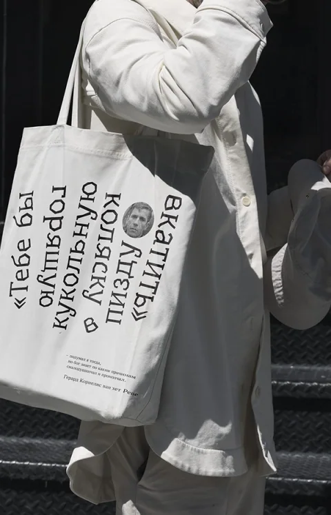
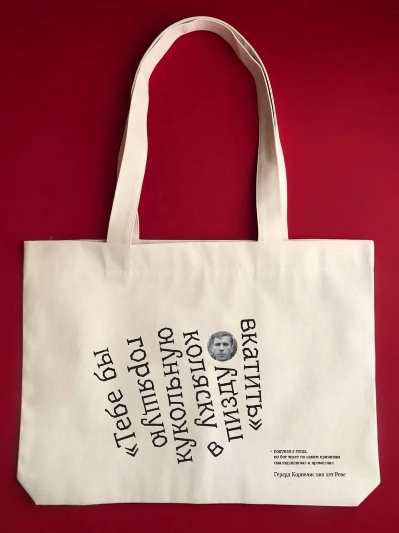
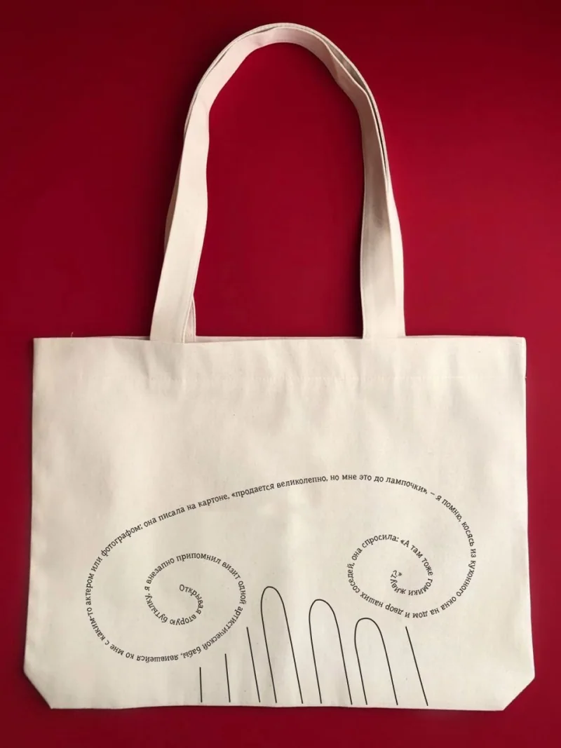
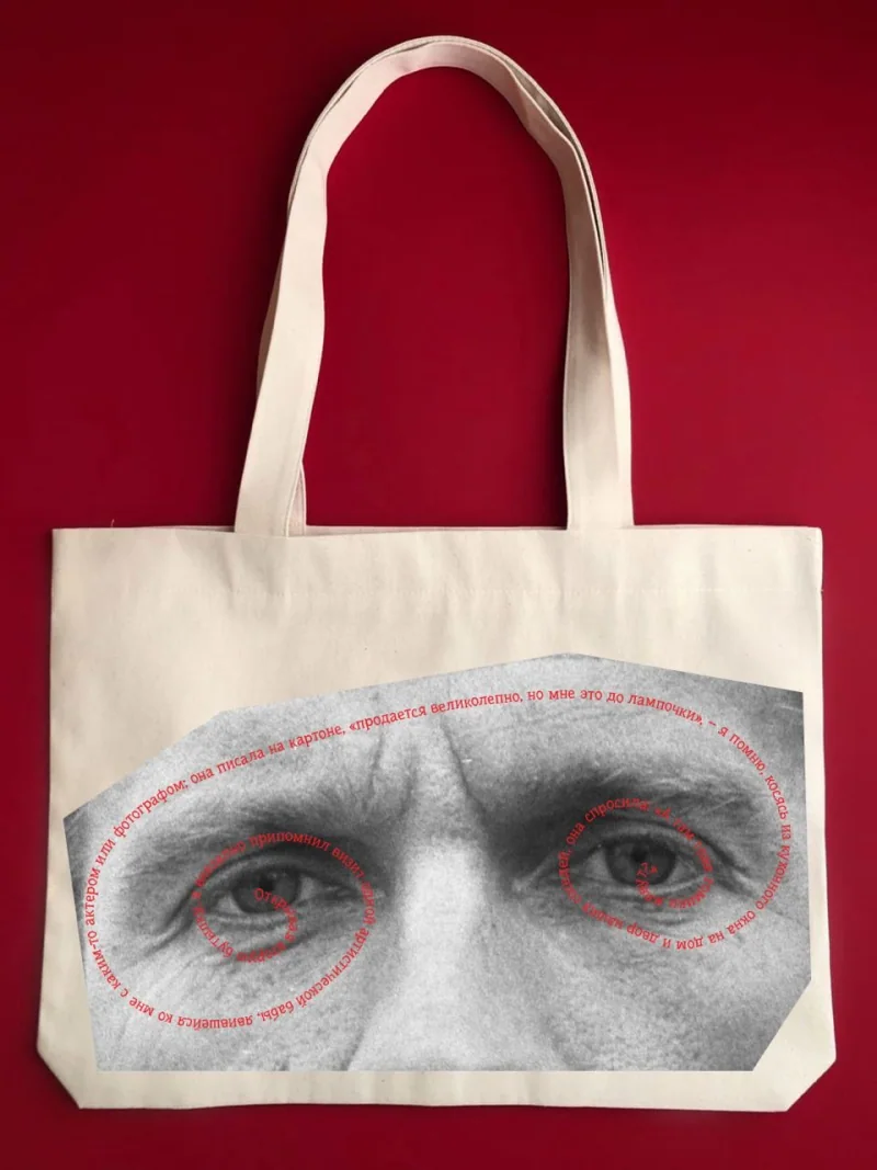
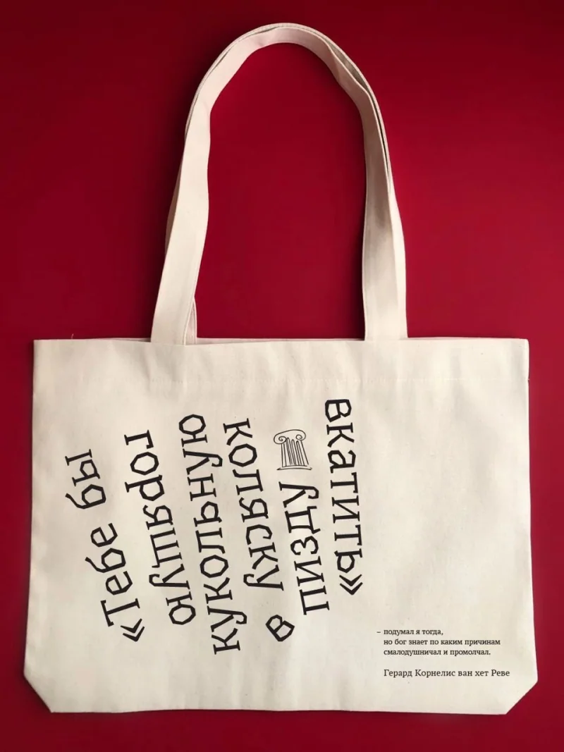
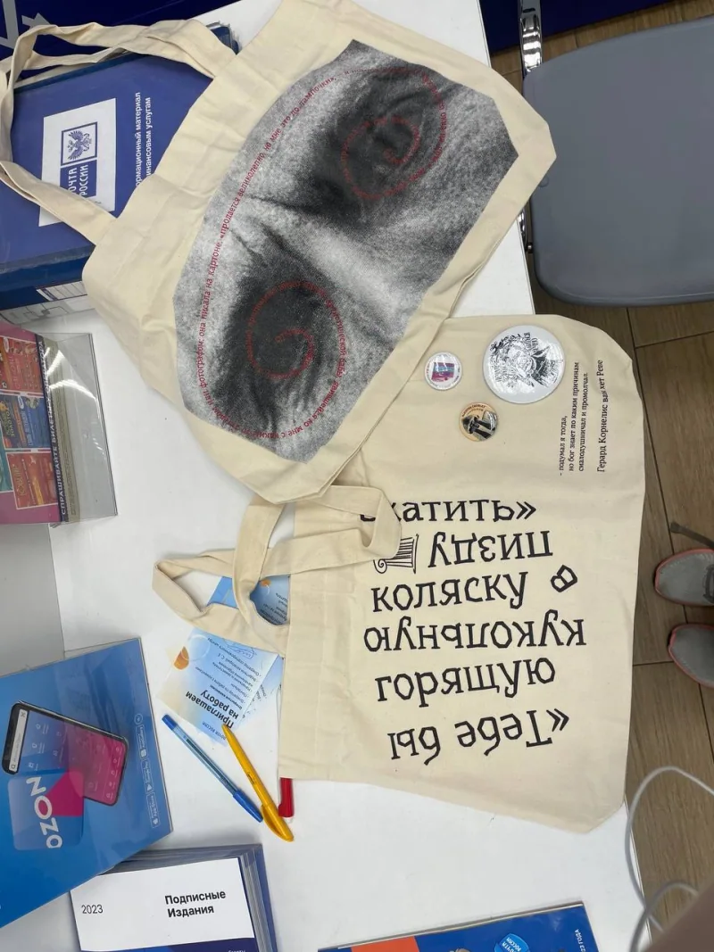
V01 kolonna publications Apparel 2022 Jul A tote bag for a one-of-a-kind publishing houseThe bag carries words by Gerard Reve as part of a design for kolonna publications. The text moves from a literary setting onto an object that can be worn and carried through everyday space. Production became part of the story: it took time to find a printer willing to take the work on. The resulting shopper brings the quotation into use, with typography carrying the statement across its surface. The work connects publishing with an object whose message travels with its owner Apparel Apparel Apparel Apparel Apparel Apparel
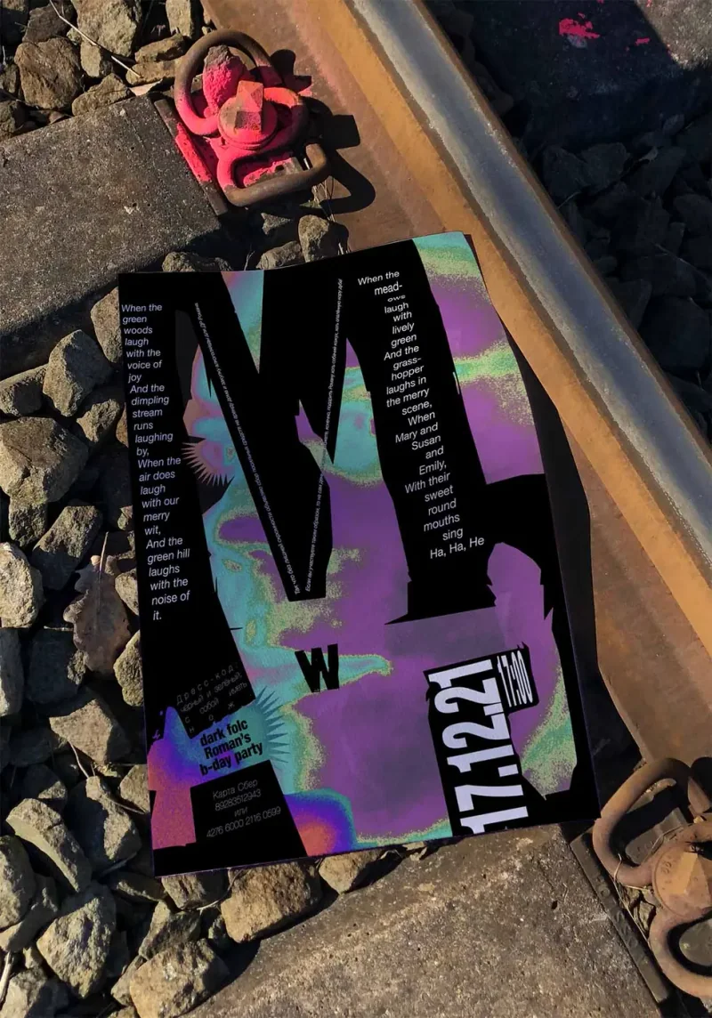
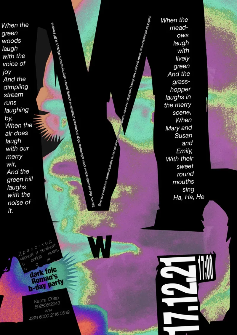
A055 R Poster 2021 Dec Birthday-party invitationThe invitation was made for a birthday party of a friend, combining event information with a bank-account number for people wishing to mark the occasion. Large dark letters cut across a purple-green field, while narrow columns carry text through the composition. The financial detail sits within that same graphic treatment, making it part of the invitation. The work gives a private celebration the form of a poster, using scale, colour and the placement of practical information to set its tone Poster Poster
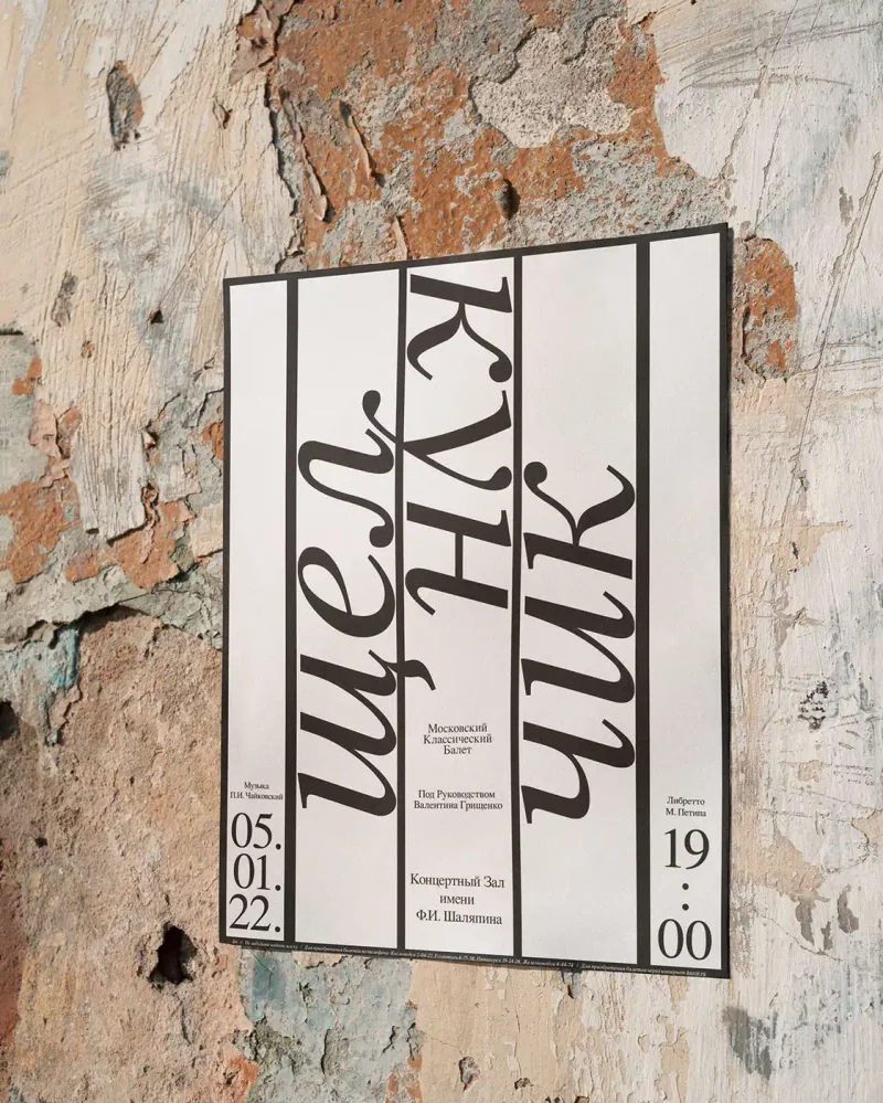
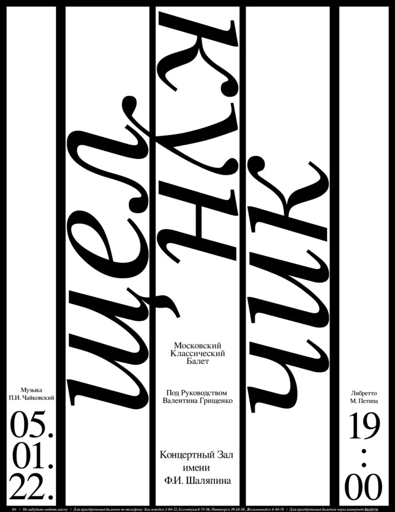
A079 Concert Hall Shalyapin Poster 2022 Jan A Nutcracker poster that invites you to crack your neck while readingThe title is set sideways in tall divisions across the poster, asking the viewer to tilt their head to read it. For this Nutcracker production, that movement became a small joke connecting the reader’s body with the idea of cracking. The theatre liked the device for its older audience. The design keeps the rest of the announcement within the same vertical structure. Its premise is a physical reading action, using the title’s orientation to give the familiar production a specific poster idea Poster Poster
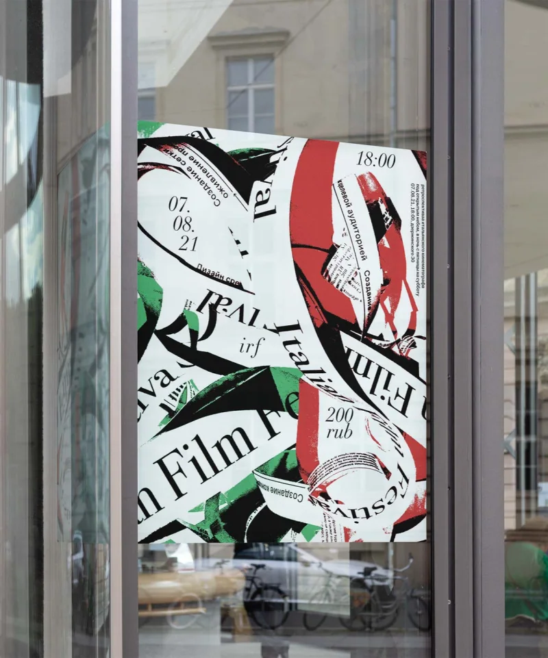
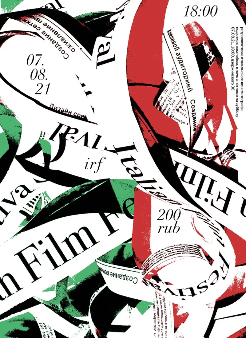
A059 IFR Poster 2021 Sep Poster borrowing the forms of film reels and loose bobbinsThe poster announces an Italian film retrospective through imagery drawn from the physical material of cinema. Lettering bends around loops and folded strips, with red, green and black areas carrying the composition across the page. Titles and event details become part of the same winding structure. The design brings the announcement and the film-reel reference together, using the text itself to suggest a tangle of cinematic material. The result is a poster whose subject is carried through the shape of its typography Poster Poster
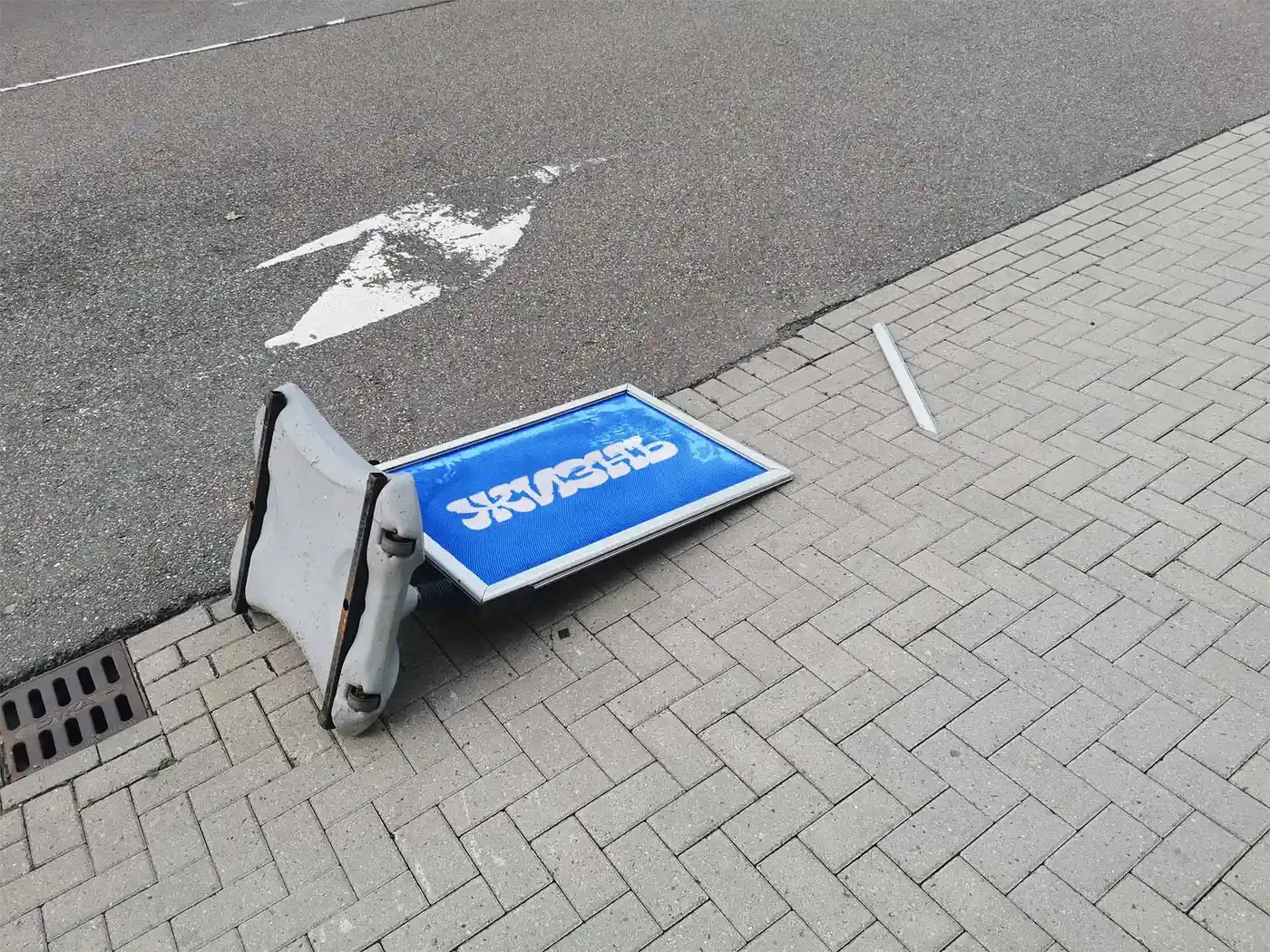
A193 Self Initiated Poster 2023 Sep Felt blue, might delete later Poster
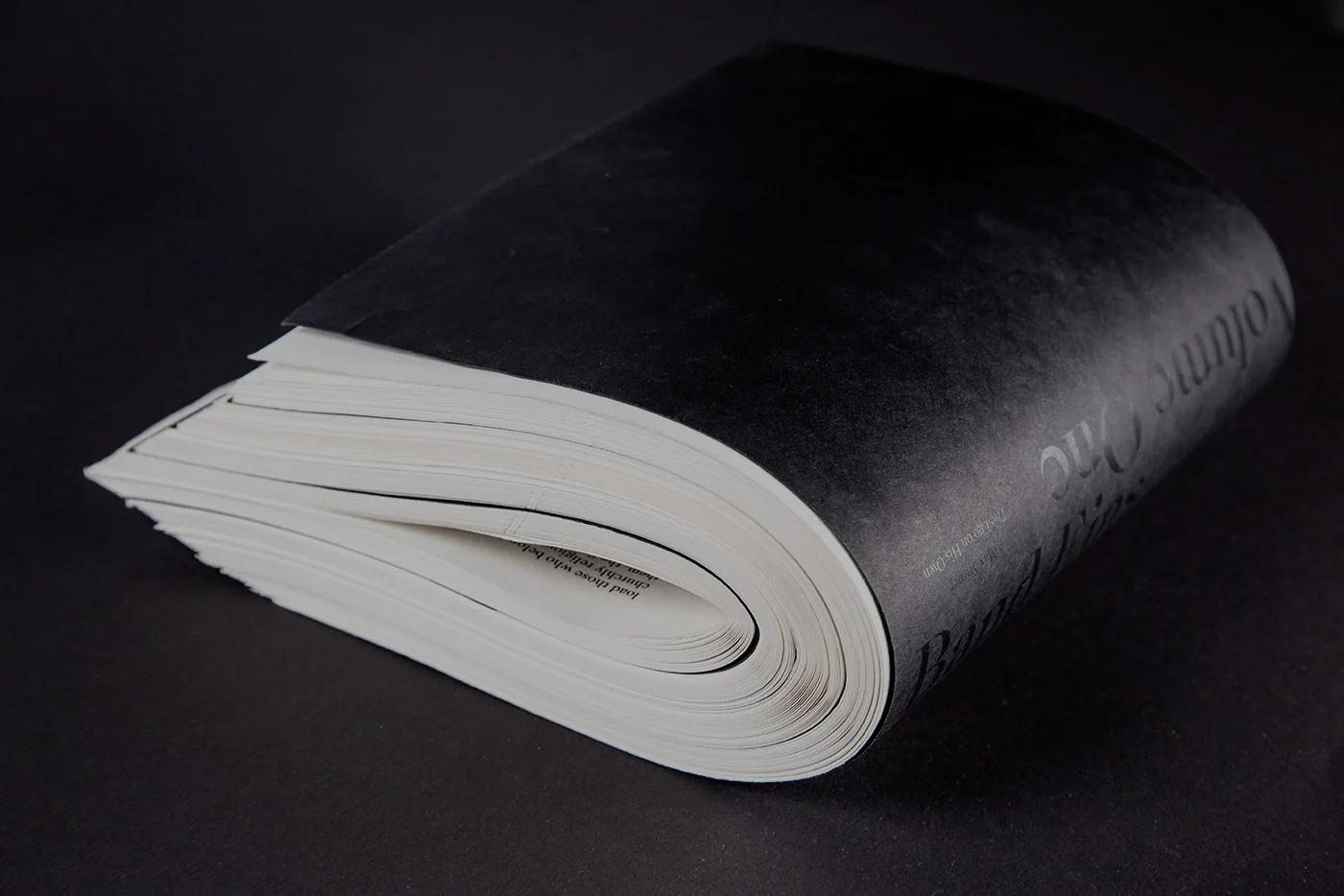
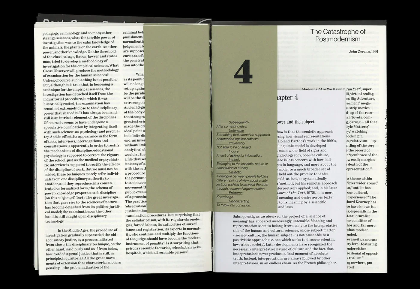
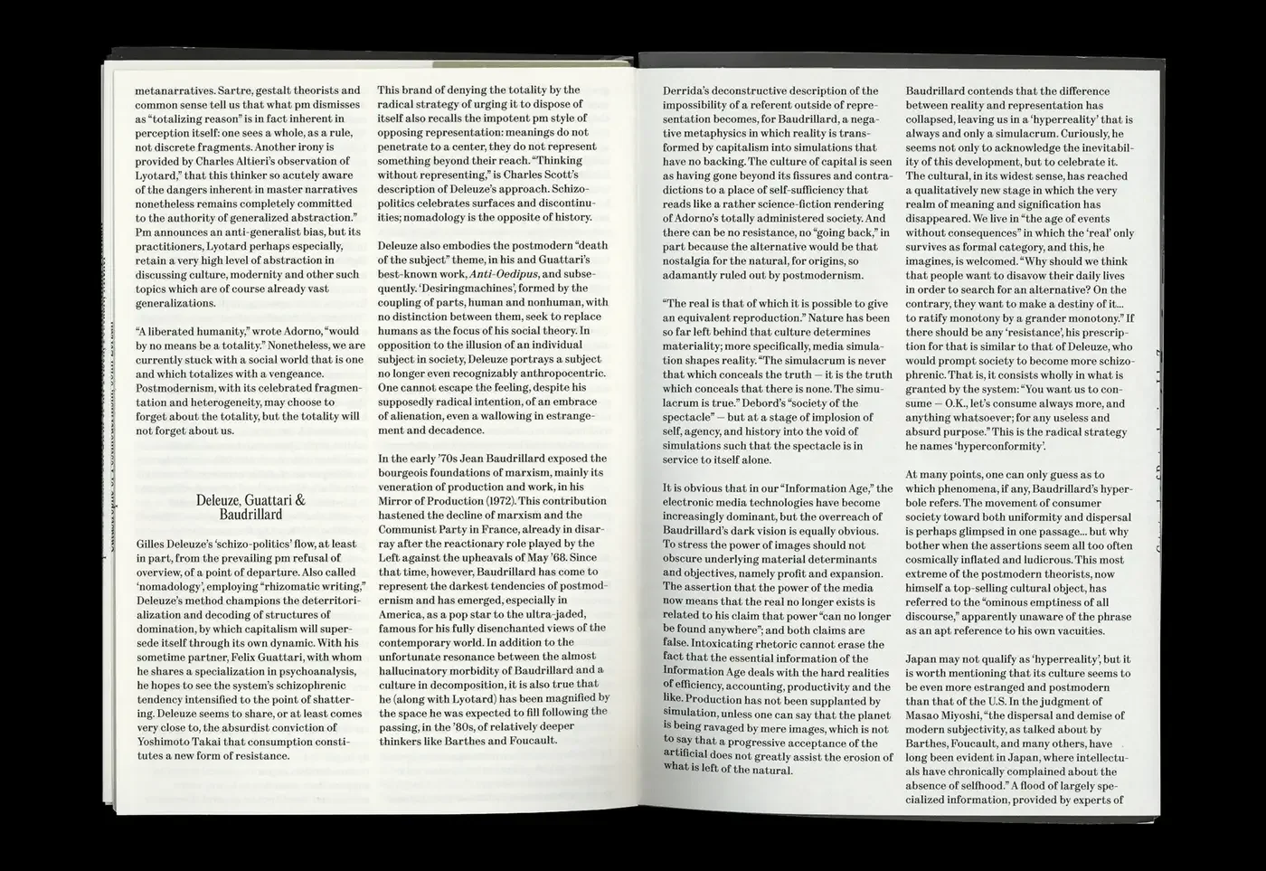
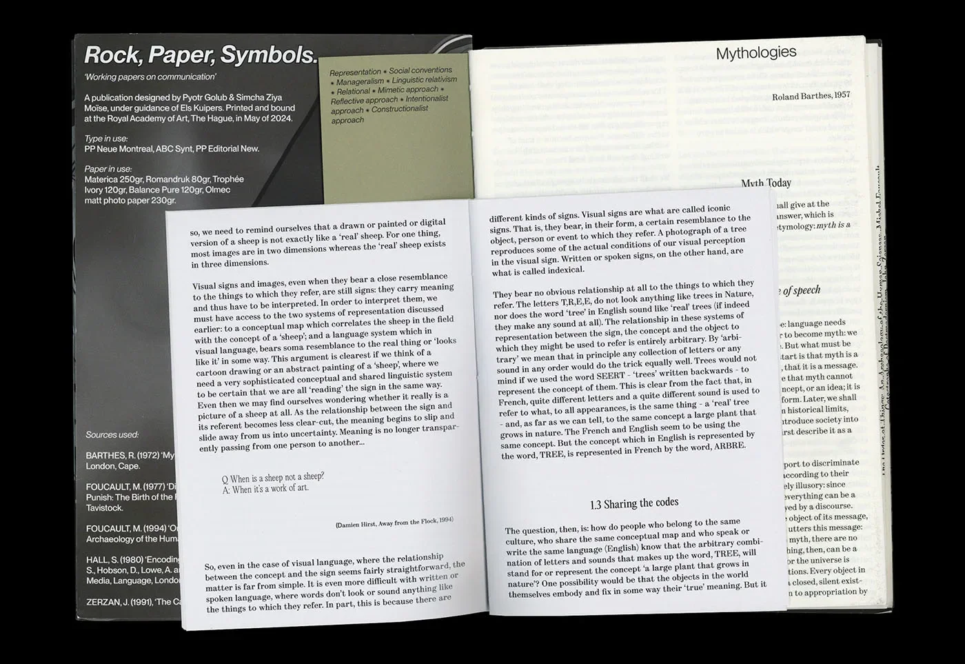
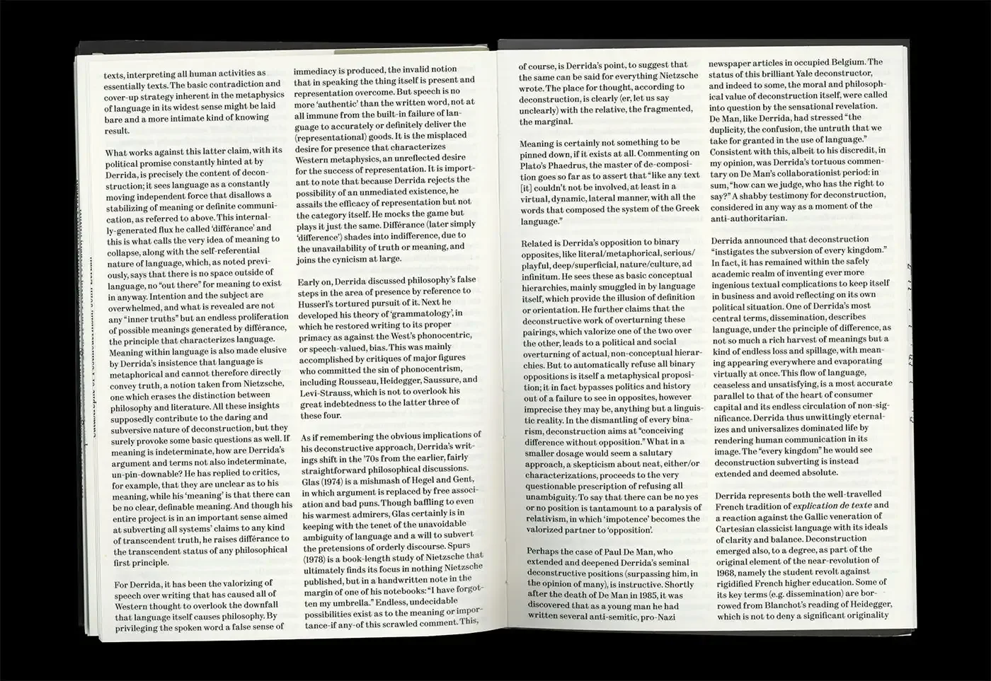
E13 Rock, Paper, Symbols Publication 2024 Jul A periodical that brings critical writing into a layered editorial objectRock, Paper, Symbols gives critical writing a dense reading format through narrow columns of text. Its exposed stitching also makes the construction of the publication visible as an object. The typography holds sustained passages together across the spreads, while the binding shows how those pages are gathered. The work joins a concentrated reading surface with a physical structure that can be inspected. That relationship gives the periodical a material presence alongside the arguments it contains Publication Publication Publication Publication Publication Publication Publication
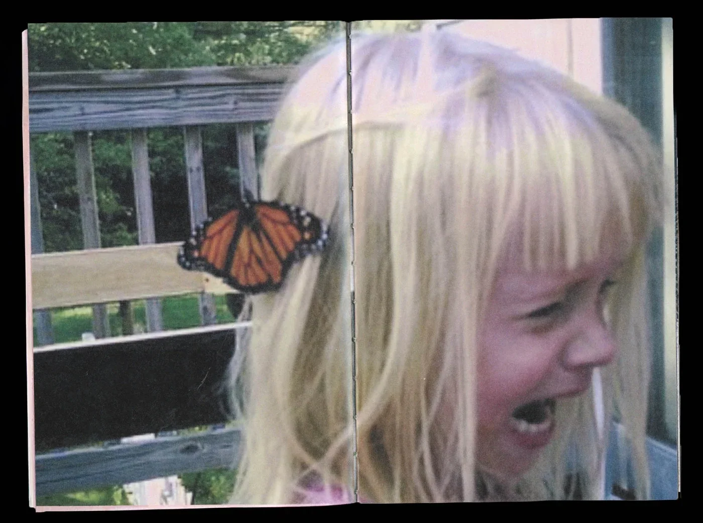
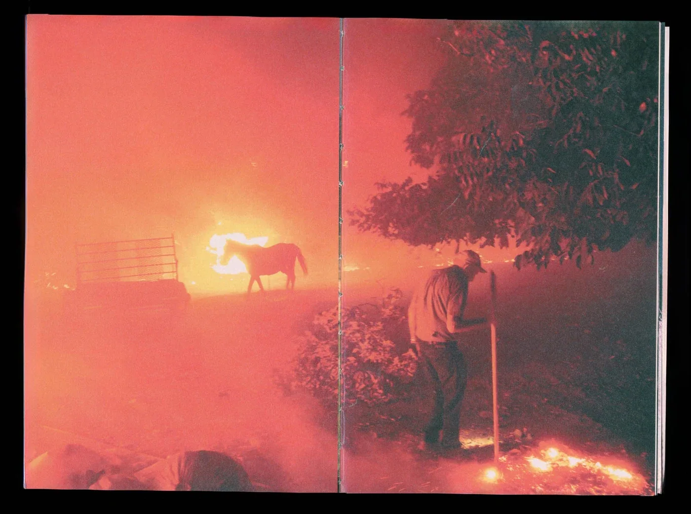
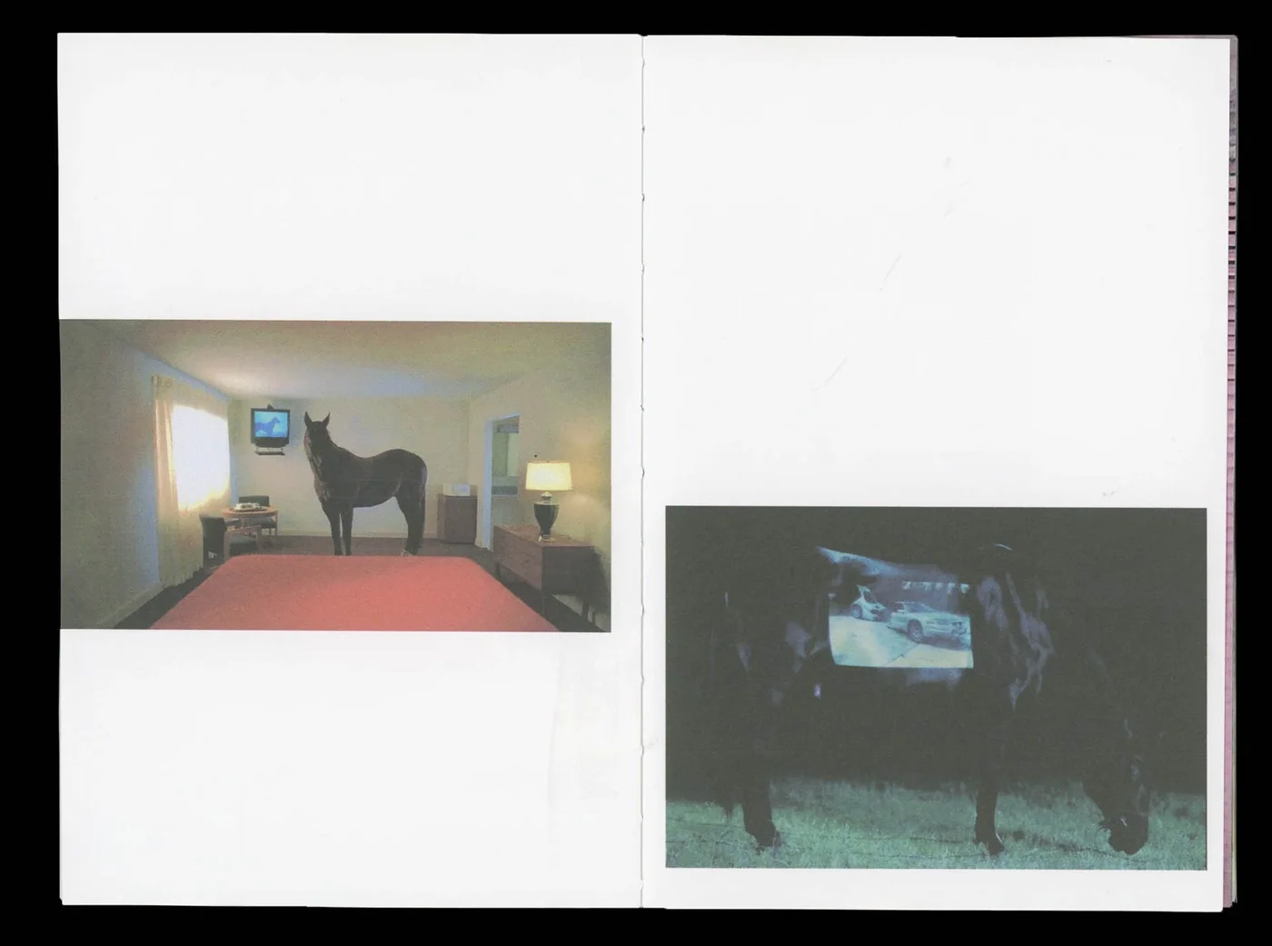
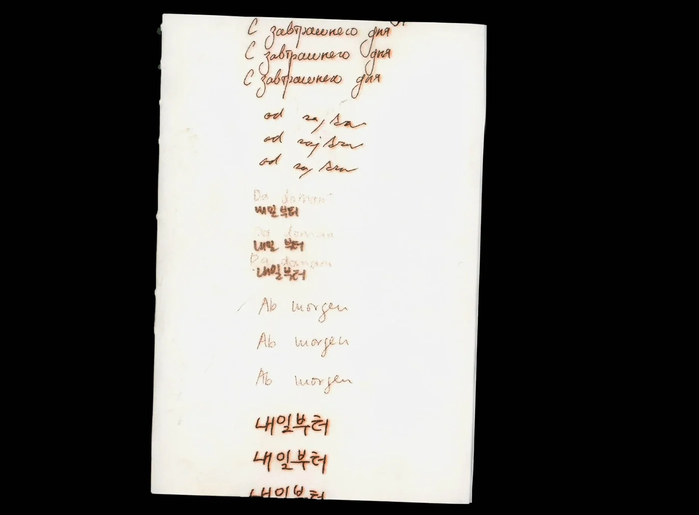
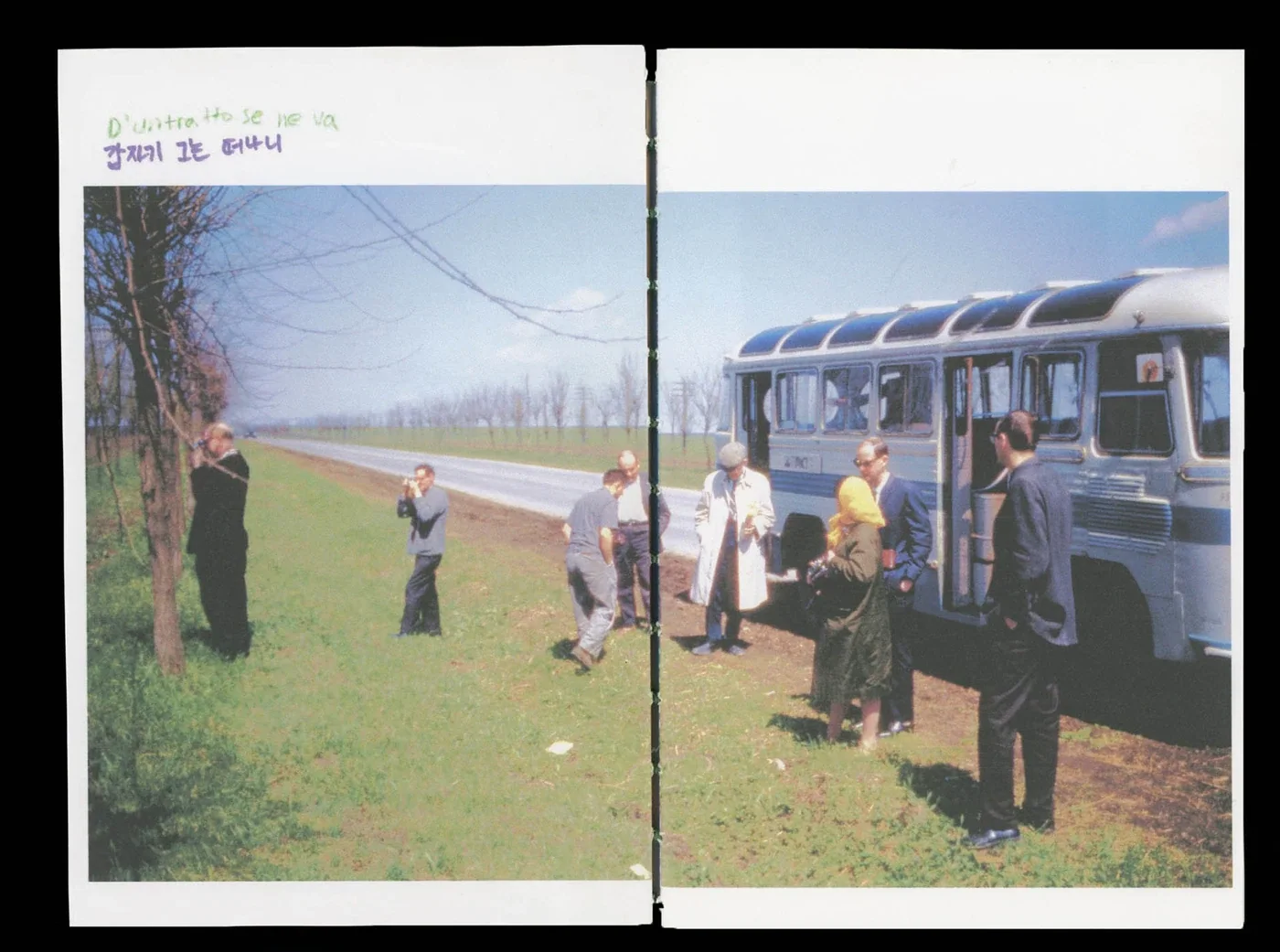
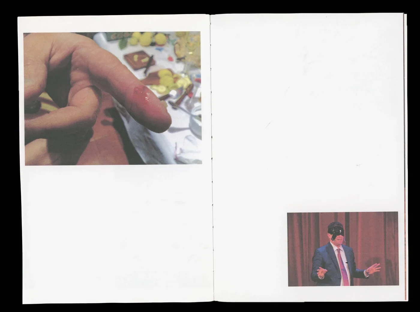
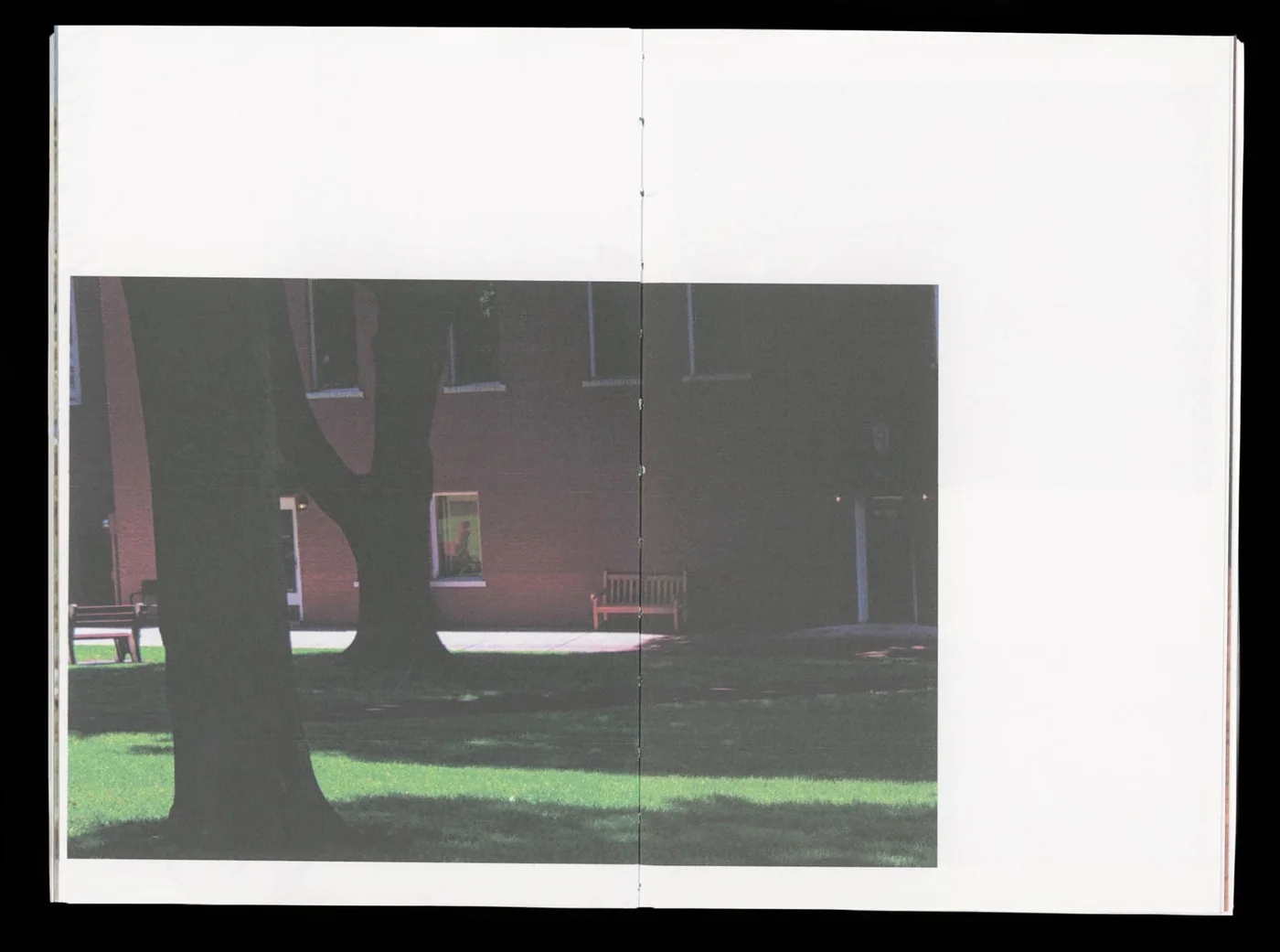
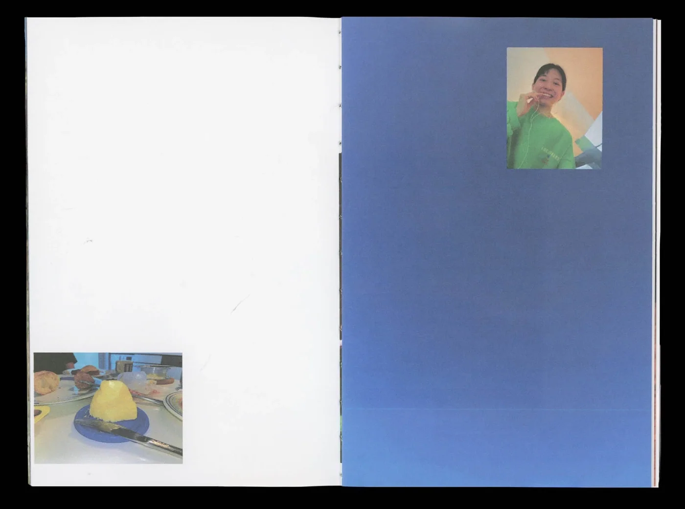
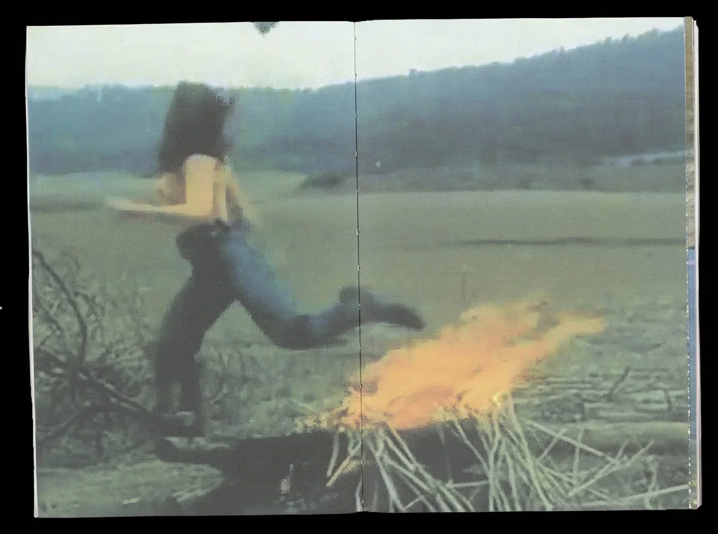
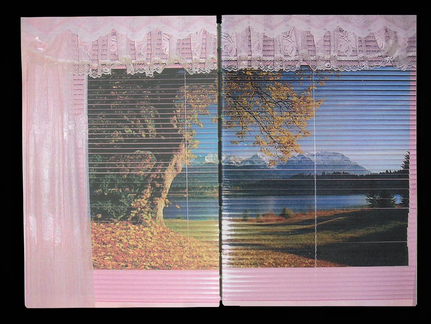
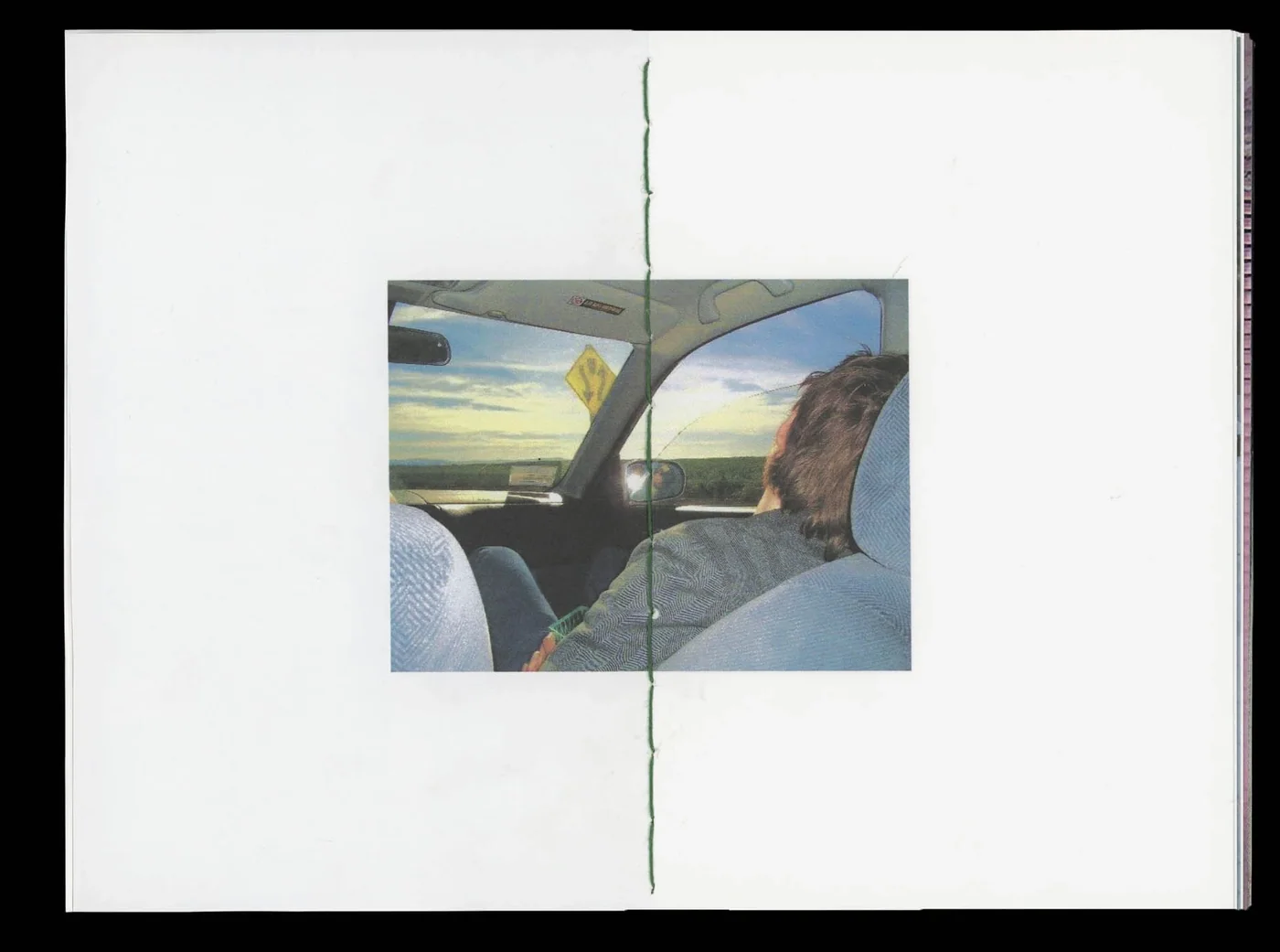
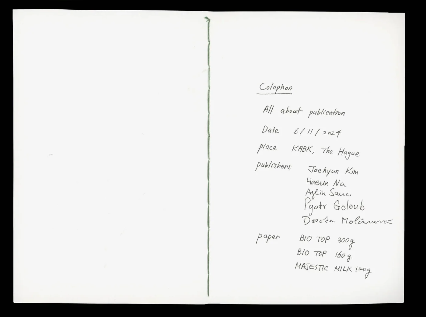
E14 Self Initiated Zine 2024 Oct We turned Andrea Laszlo De Simone’s lyrics into a zineMade at KABK with Jaehyun Kim, Haeun Na, Aylin Sauc and Dorota Molčanová. We used Andrea Laszlo De Simone’s lyrics as a starting point for a story assembled from images found online. The layout moves between full-spread photographs and smaller images placed across otherwise open pages. Changes in scale, position and sequence build relationships between the found images. The zine gives our shared collection a narrative form, with the story carried by the choices made in gathering and arranging it Zine Zine Zine Zine Zine Zine Zine Zine Zine Zine Zine Zine Zine Zine Zine Zine Zine Zine
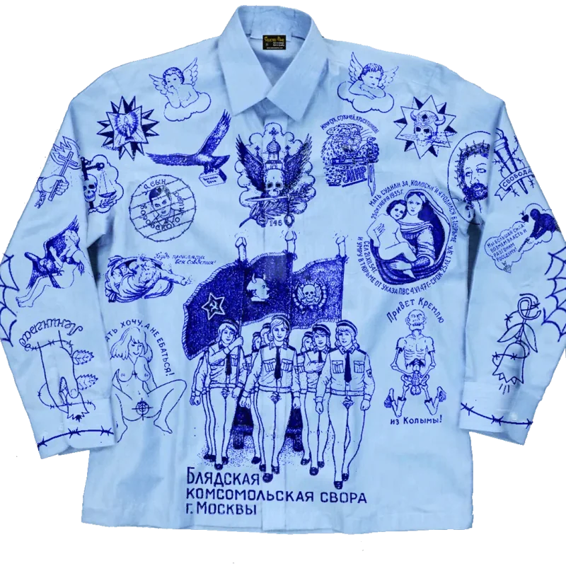
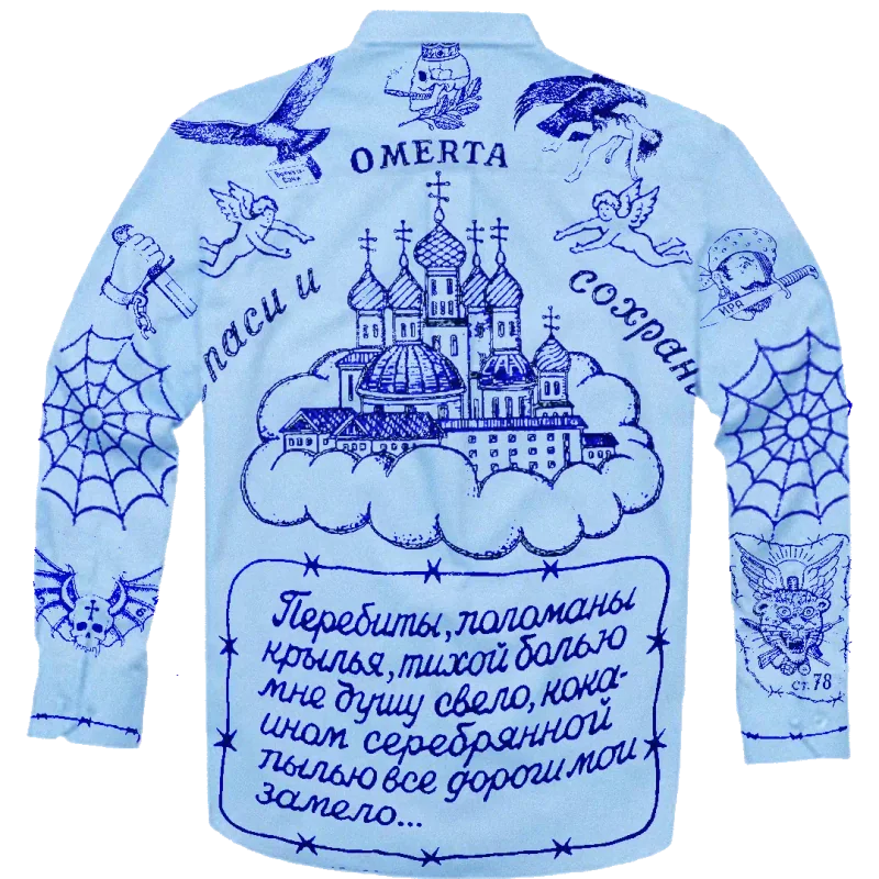
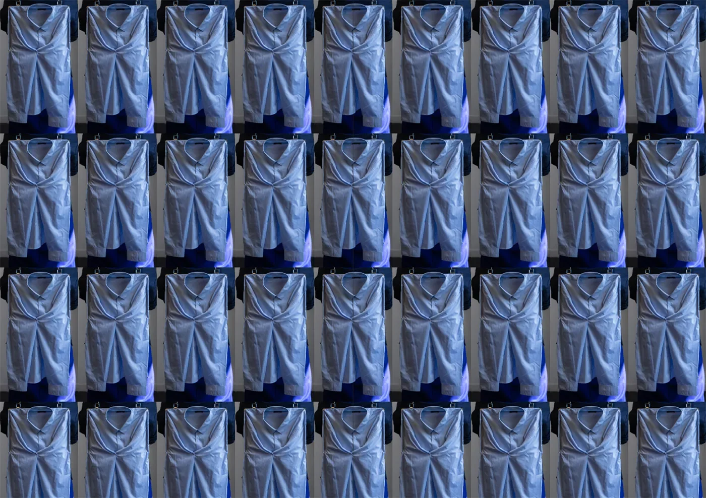
V03 Self Initiated Apparel 2024 Jul Happy hour. May your coffee be sweet. Forward momentum, clarity of purpose. Good luck in business endeavours and skill in decision-making. Strategic moves, optimised processesI combined two visual cultures on one shirt: the office worker’s collared uniform and imagery associated with Russian prisoners’ tattoos. Blue ballpoint-style drawings cover the pale blue fabric, turning its familiar working-day form into the setting for another set of signs. The work follows the kind of visual pairing I associate with Vladimir Tsesler, where bringing two things together can produce a third meaning. The resulting garment carries that collision on the body, with the shirt and its marks remaining recognisable as different sources Apparel Apparel
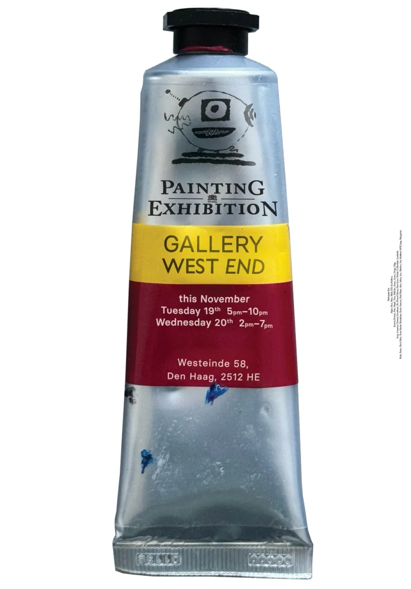
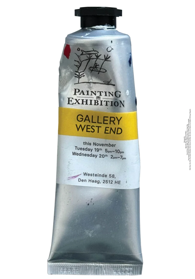
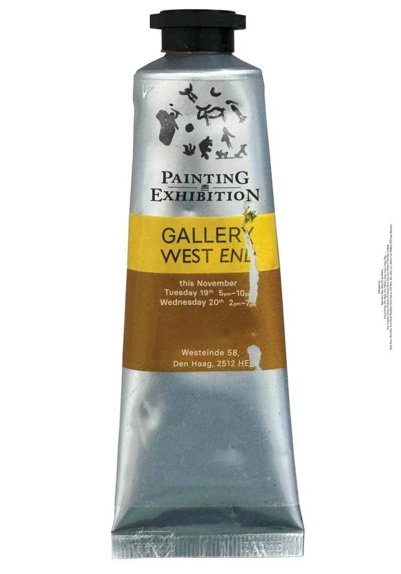
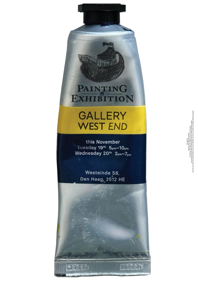
A252 Alper Cekinmez Poster 2024 Nov Painting-exhibition poster seriesThe posters use a paint tube as the setting for the exhibition information. Marks taken from the exhibiting artists’ canvases appear on the tubes, bringing elements of the paintings into the announcement with the artists’ approval. The image links the work on show with the material used to make it. Gallery details sit on the tube’s label, so the exhibition’s practical information becomes part of the same object. The series echoes the central enquiry of the exhibition, where tubes with canvases were given out to strangers on the streets Poster Poster Poster Poster
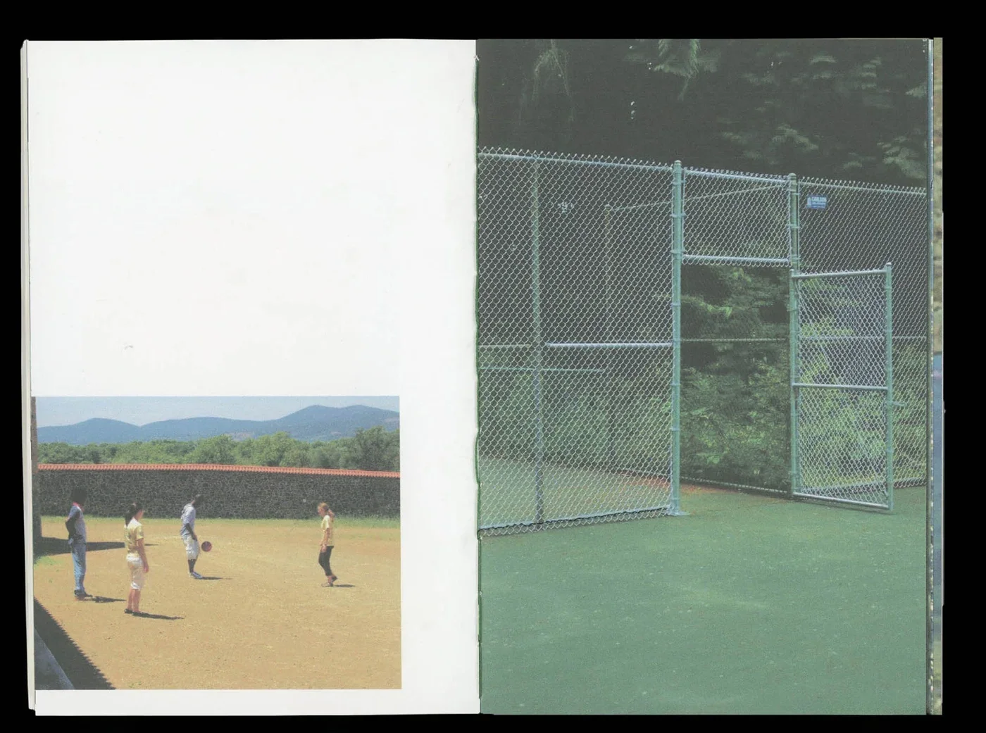
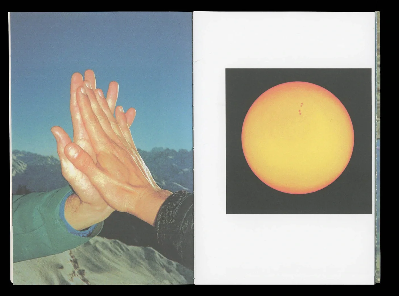
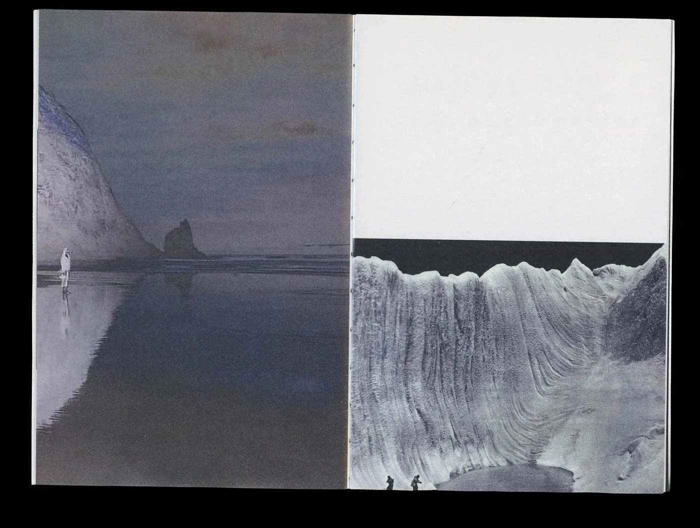
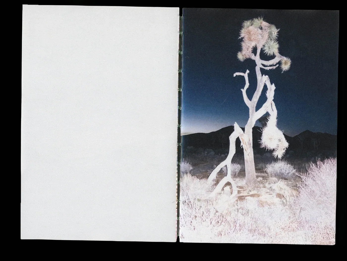
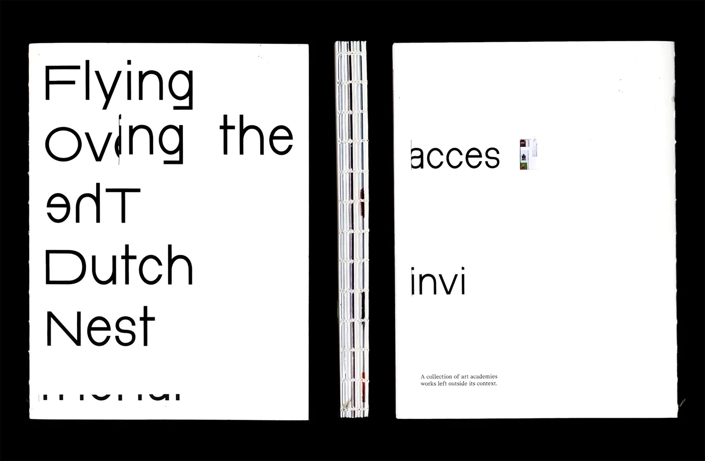
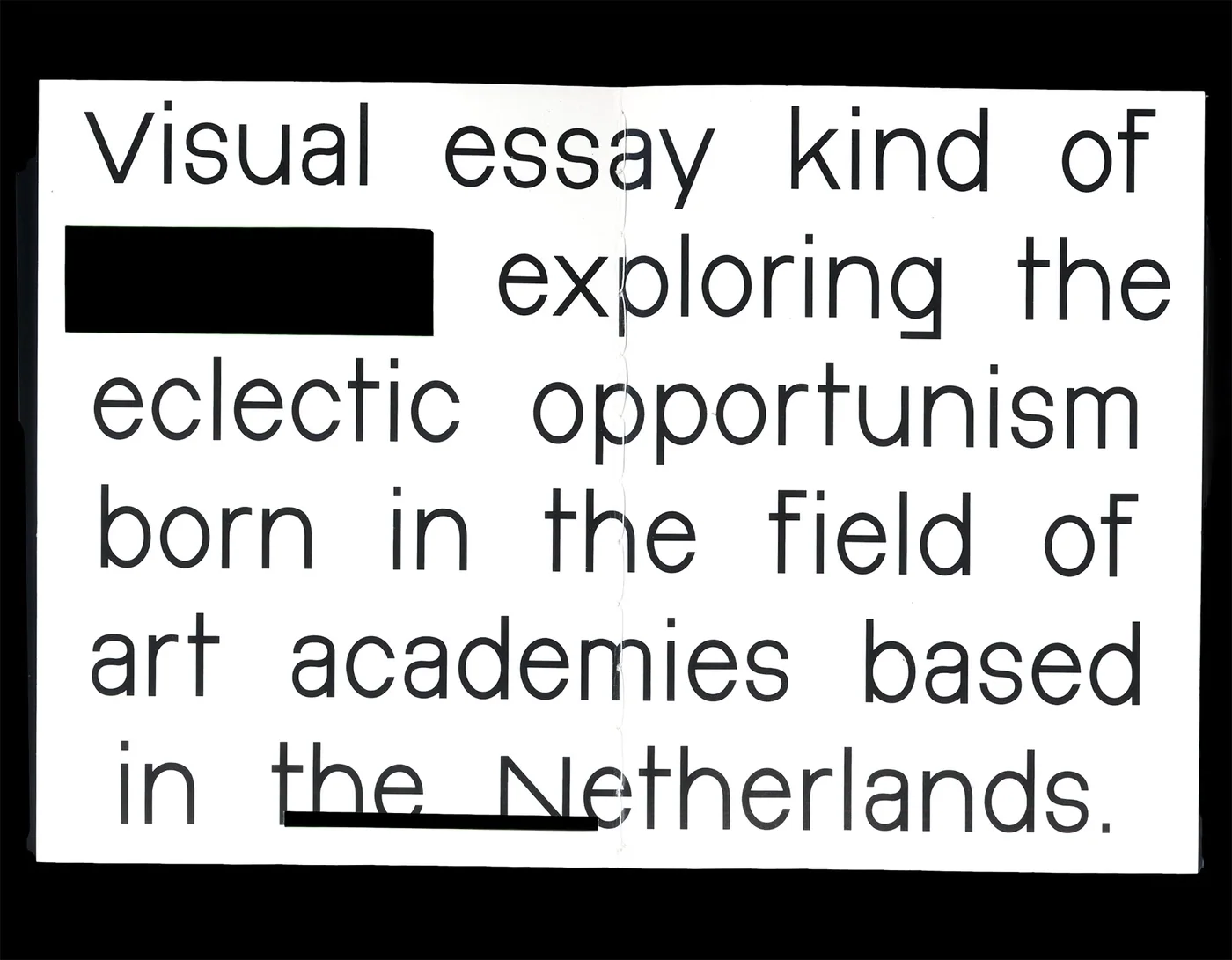
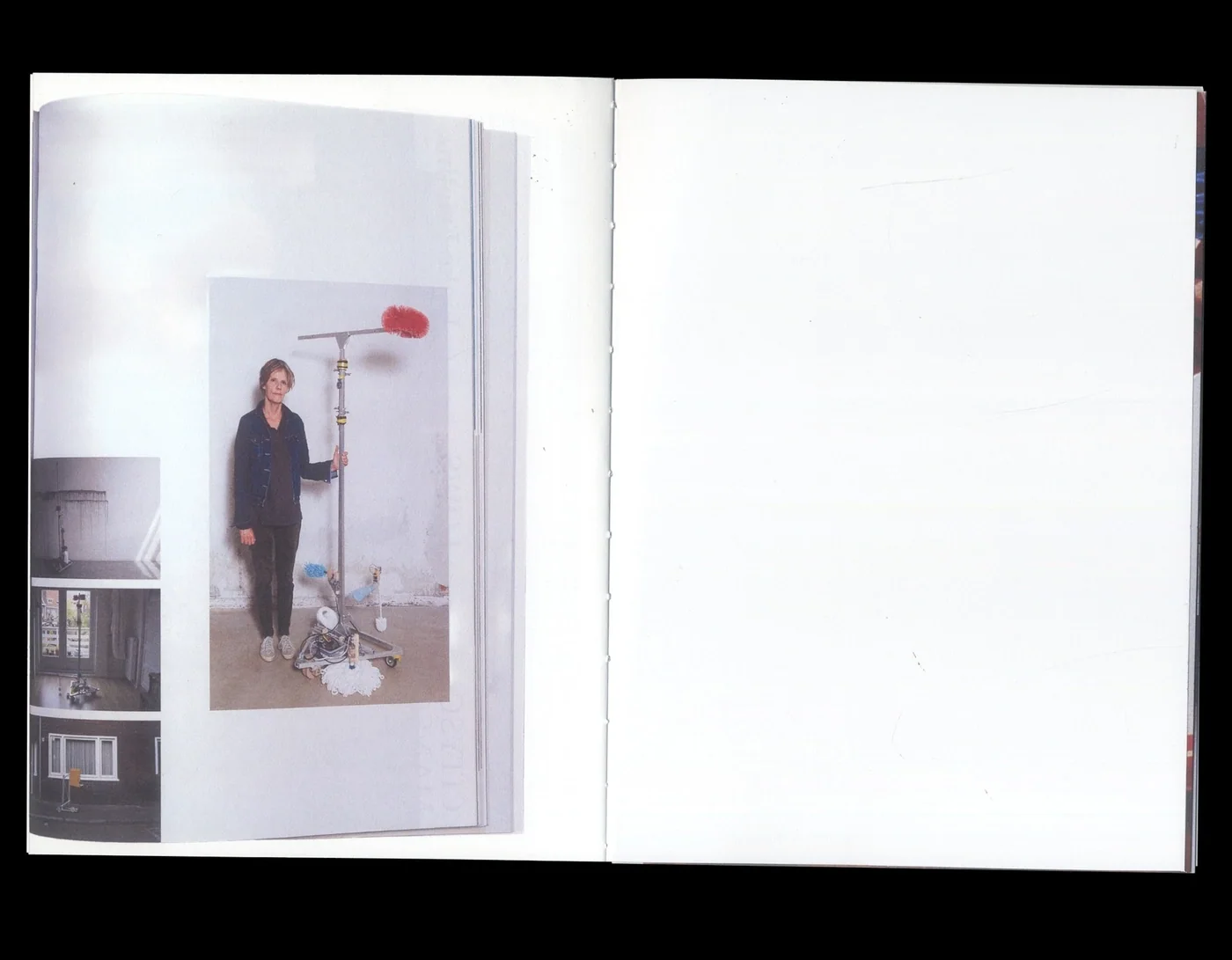
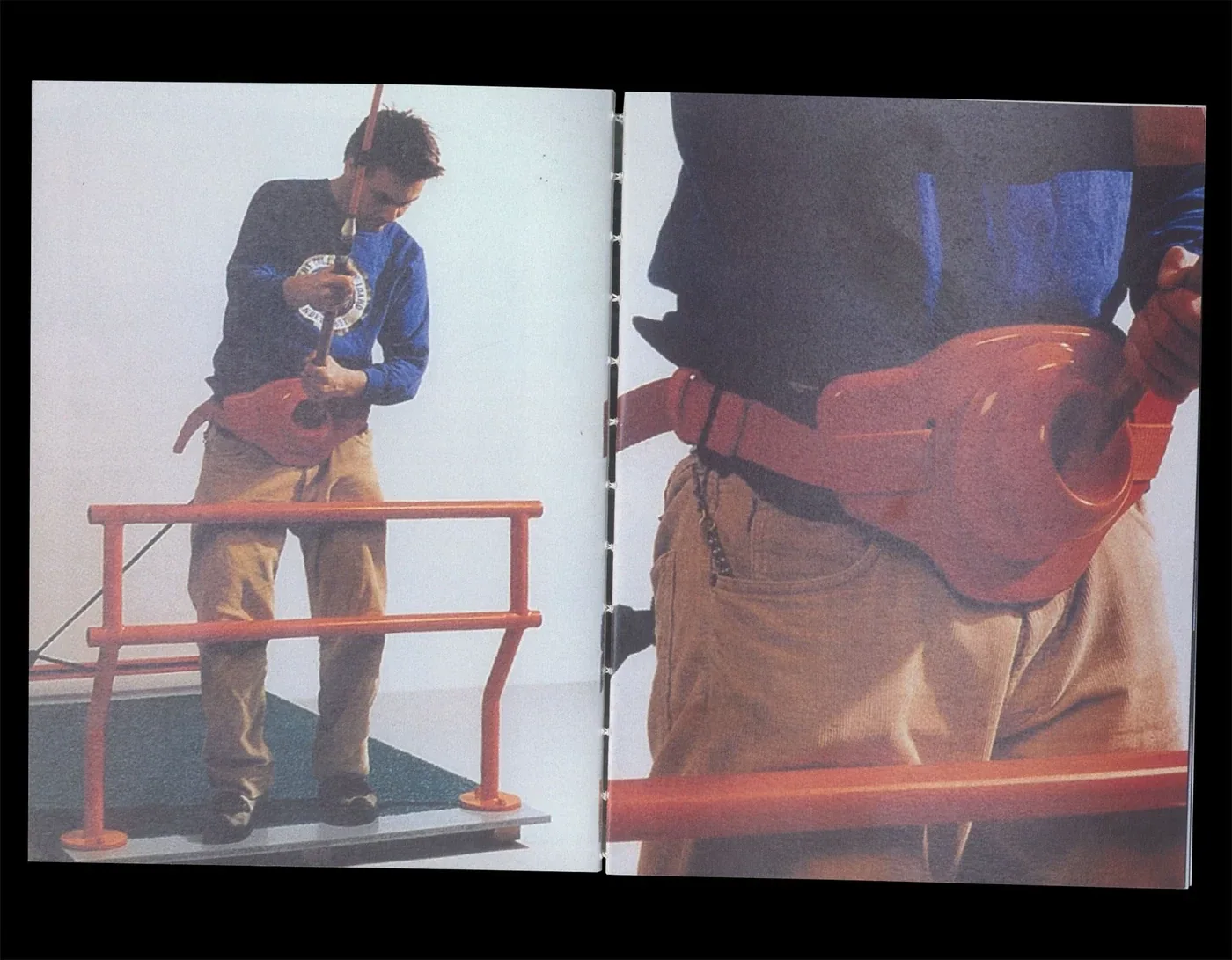
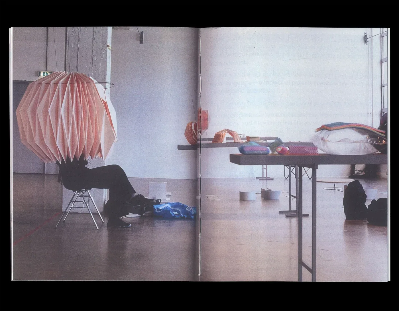
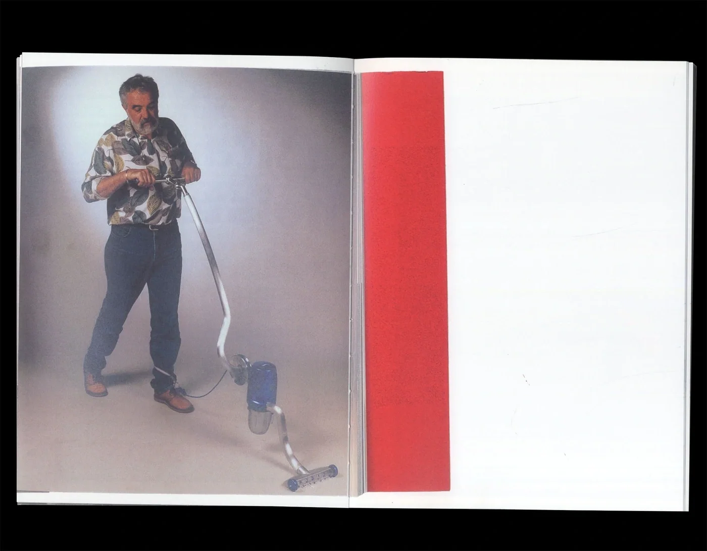
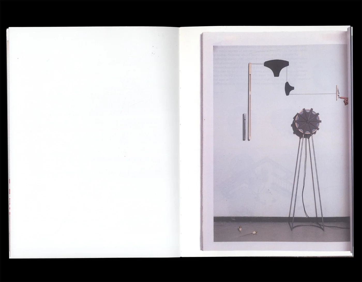
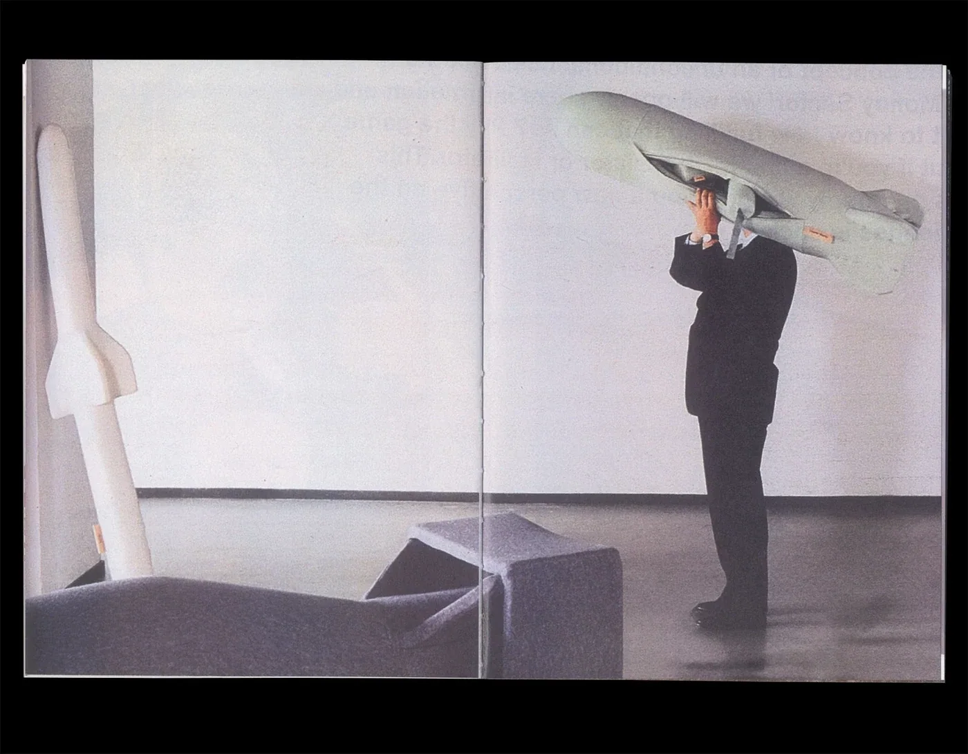
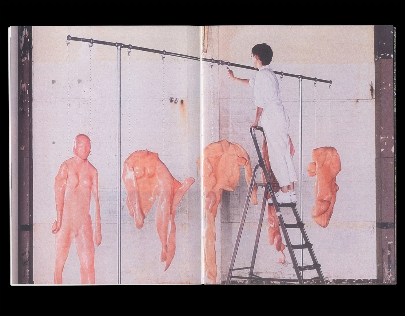
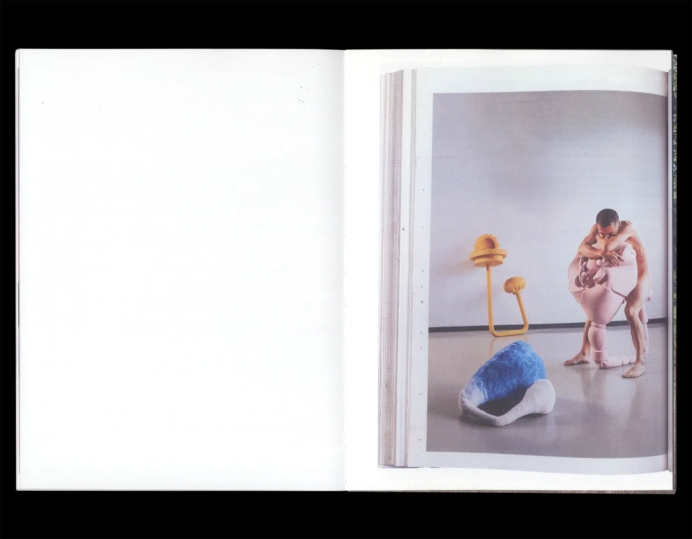
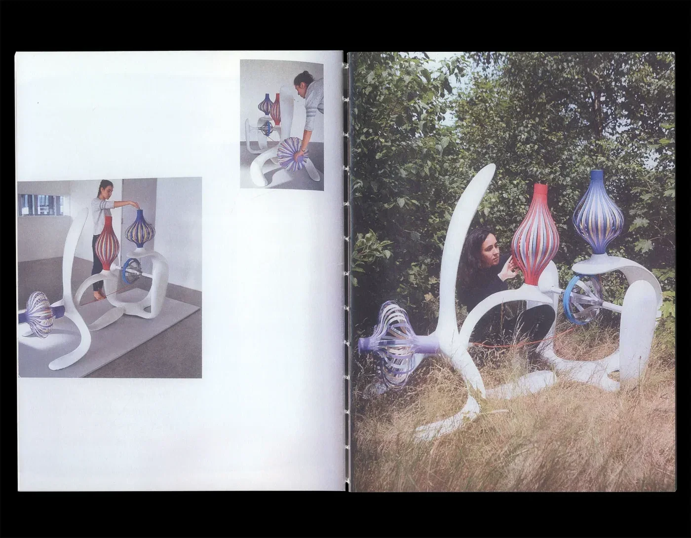
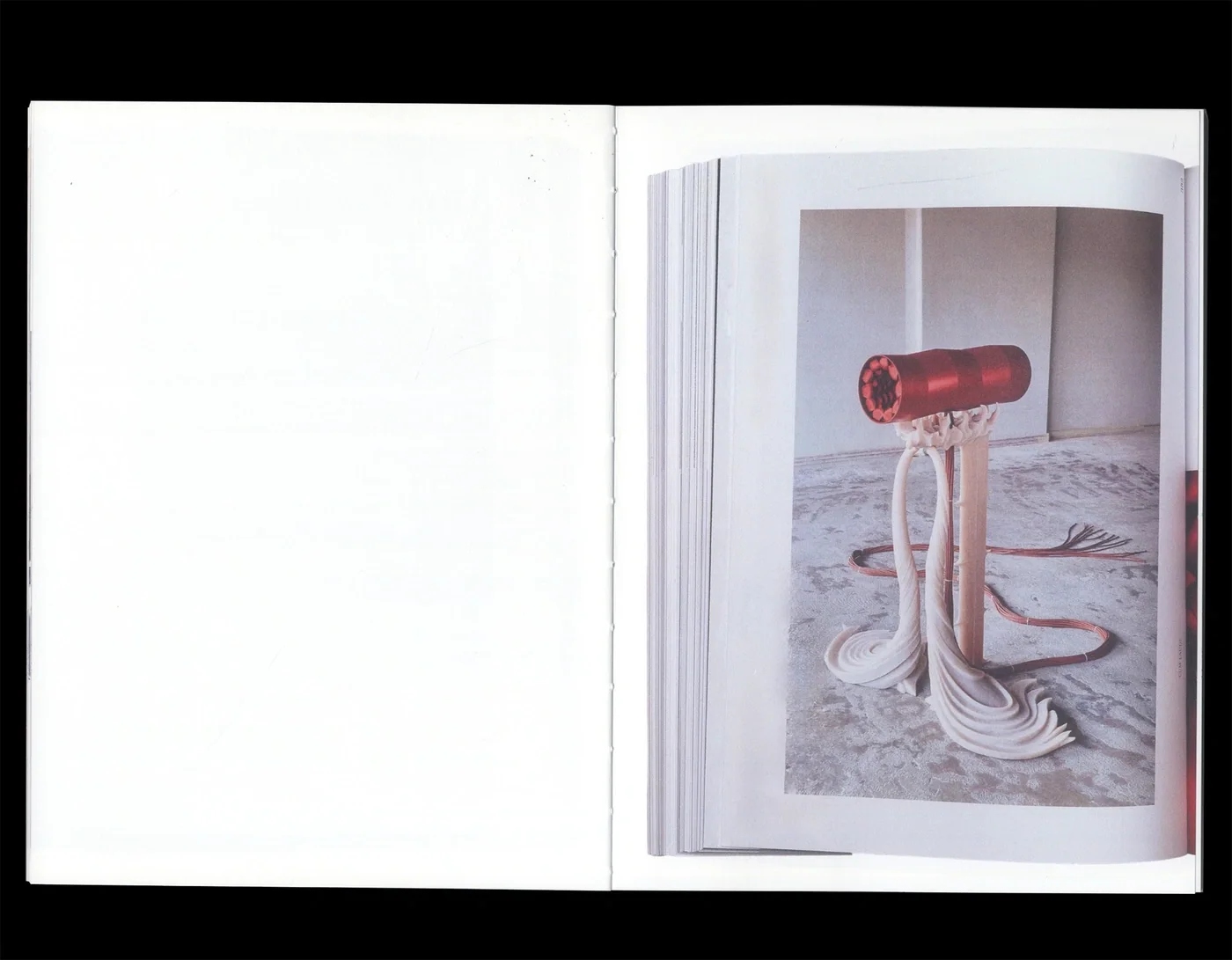
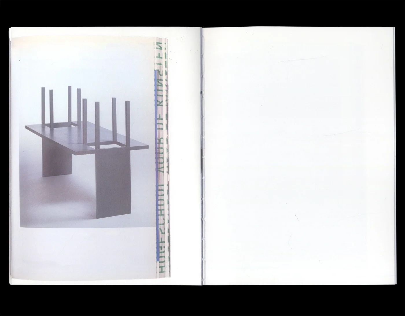
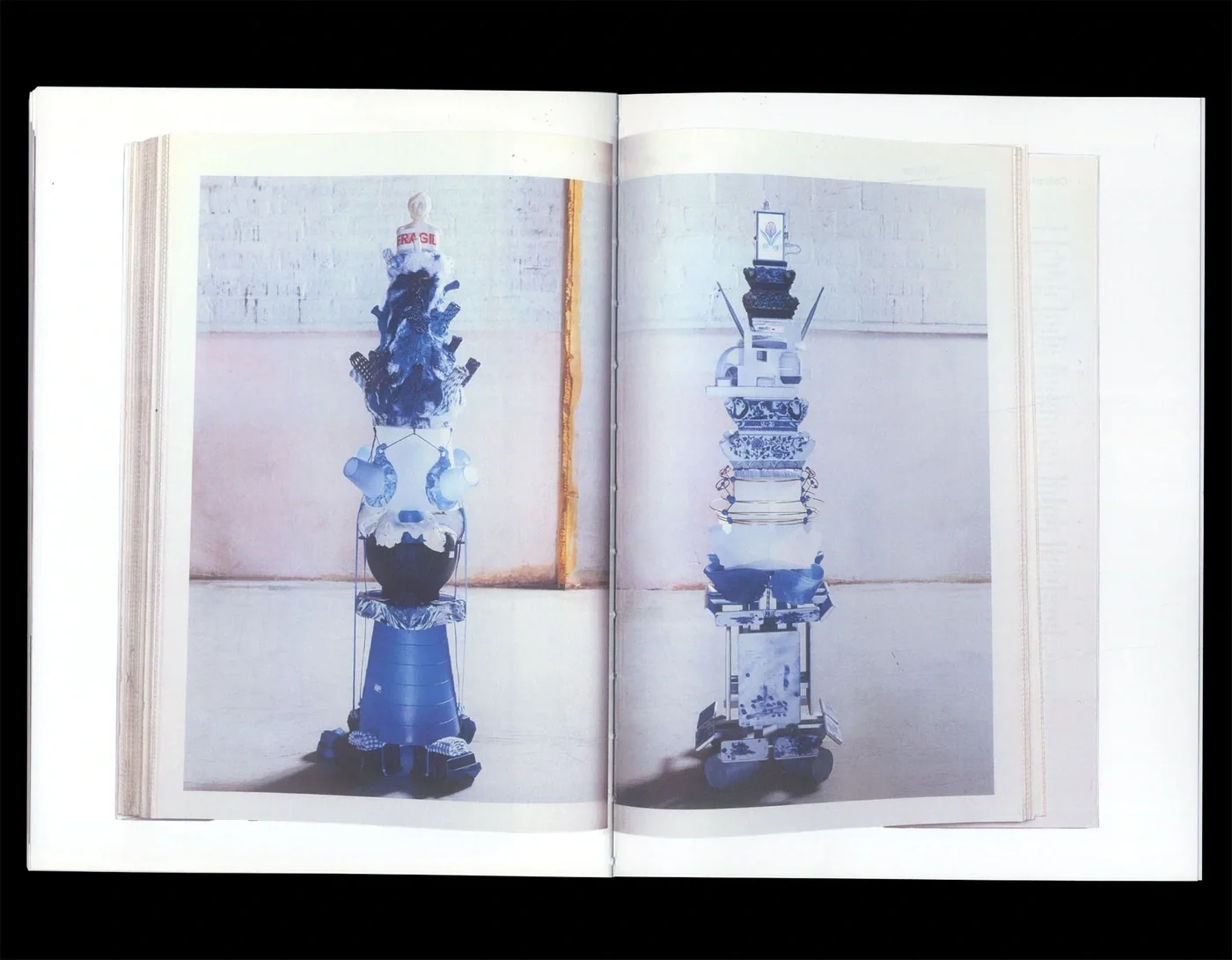
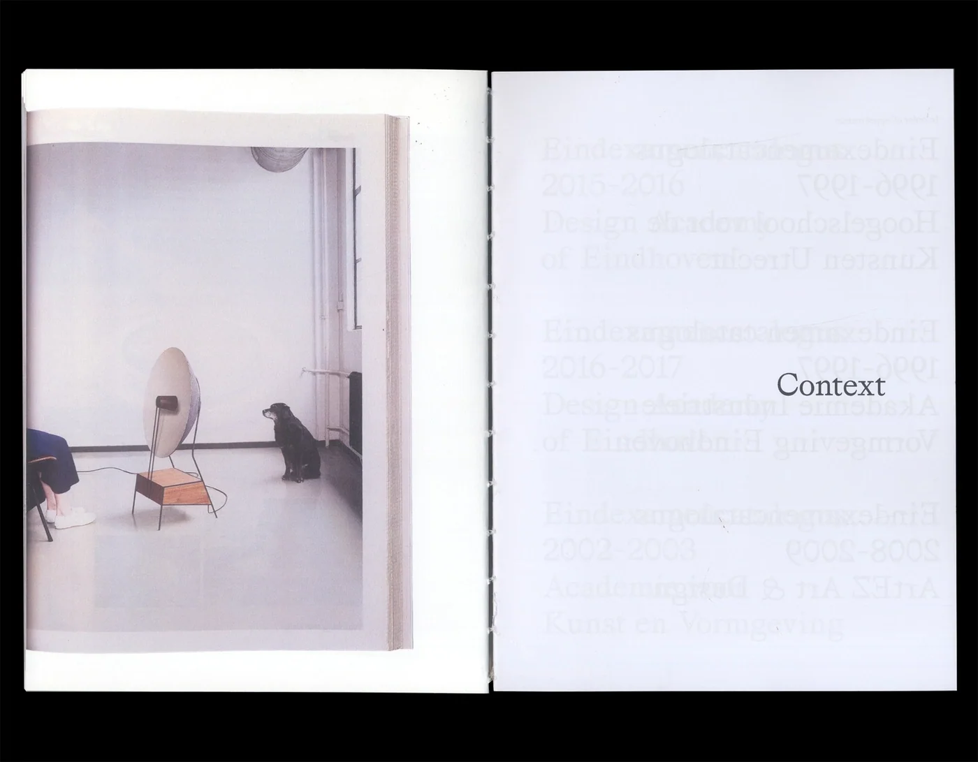
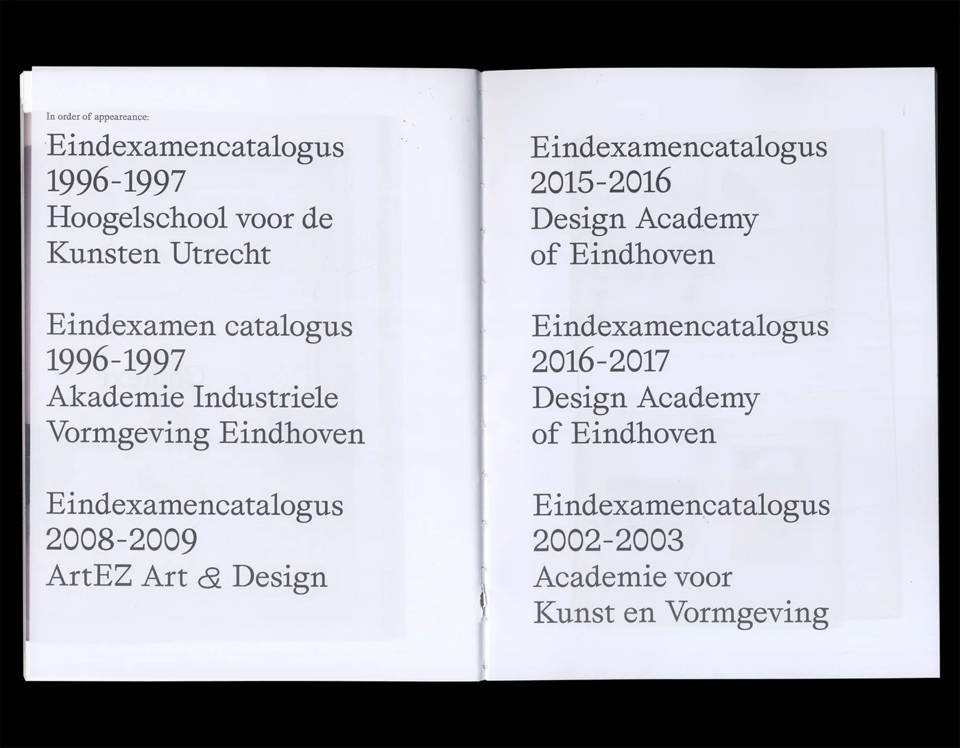
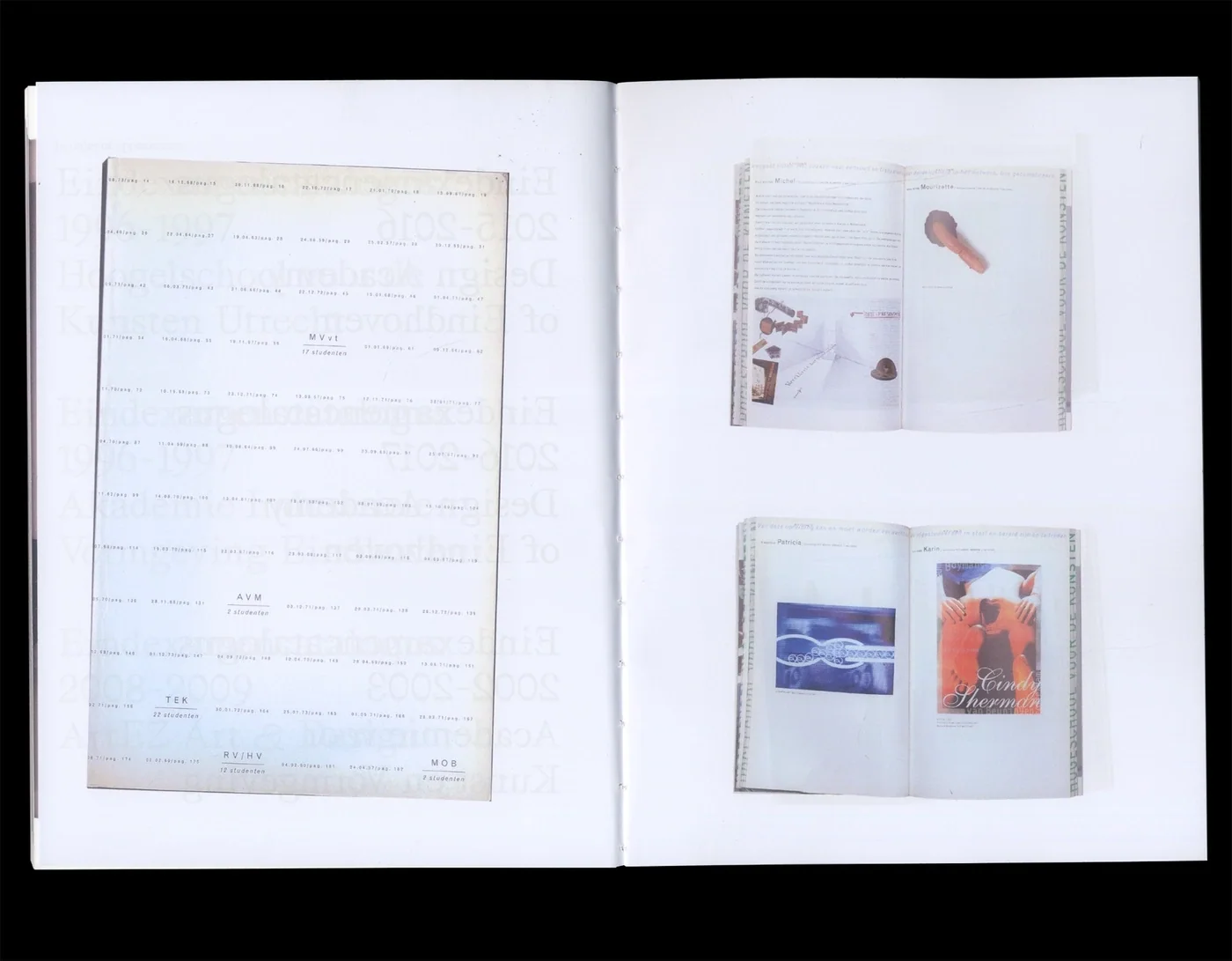
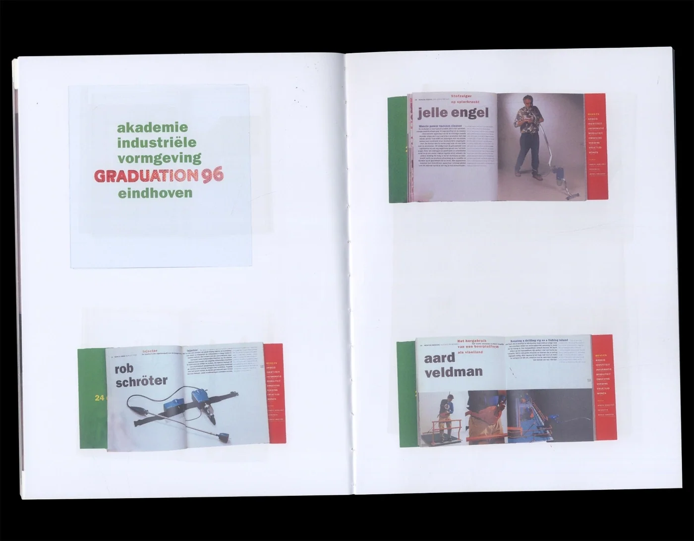
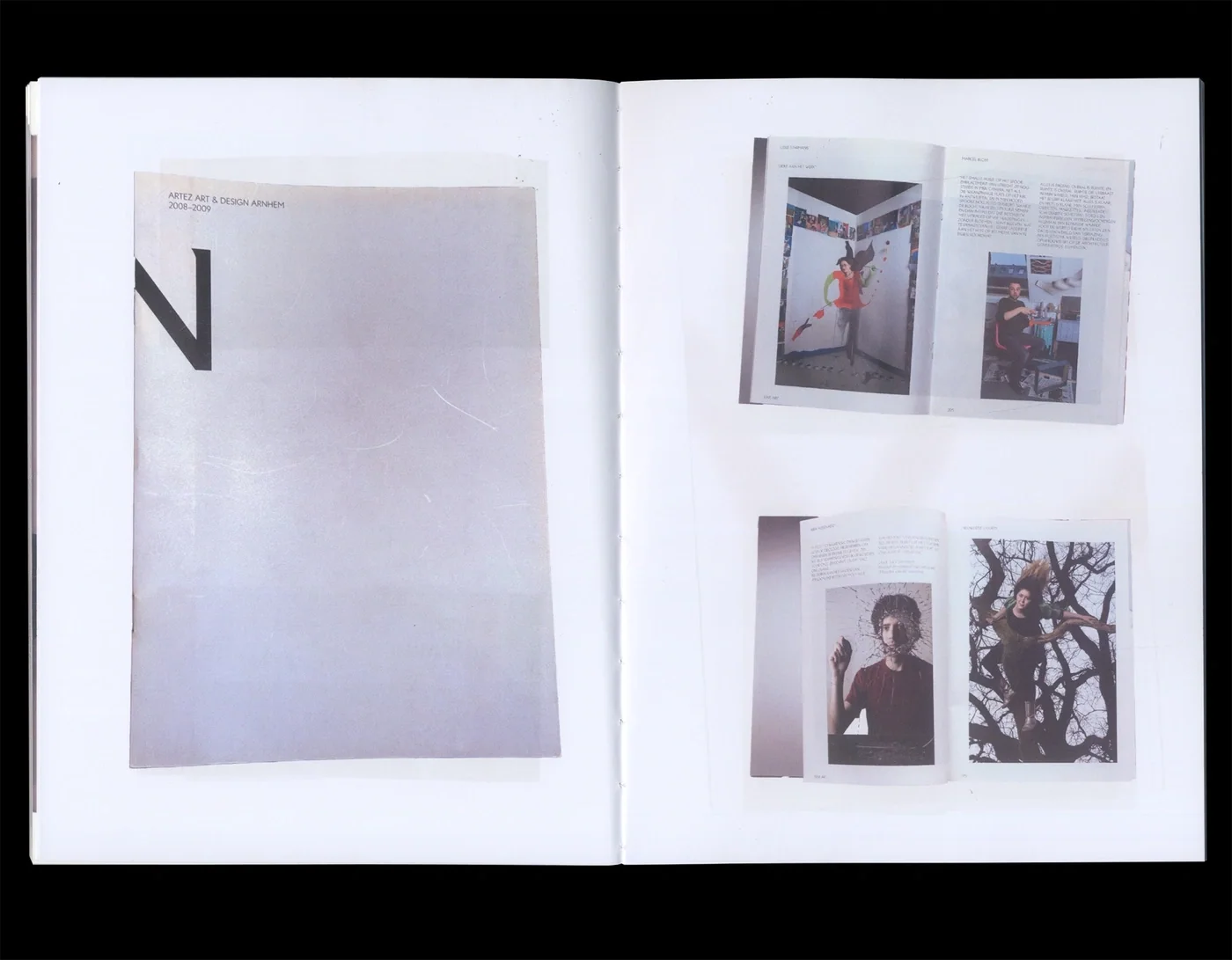
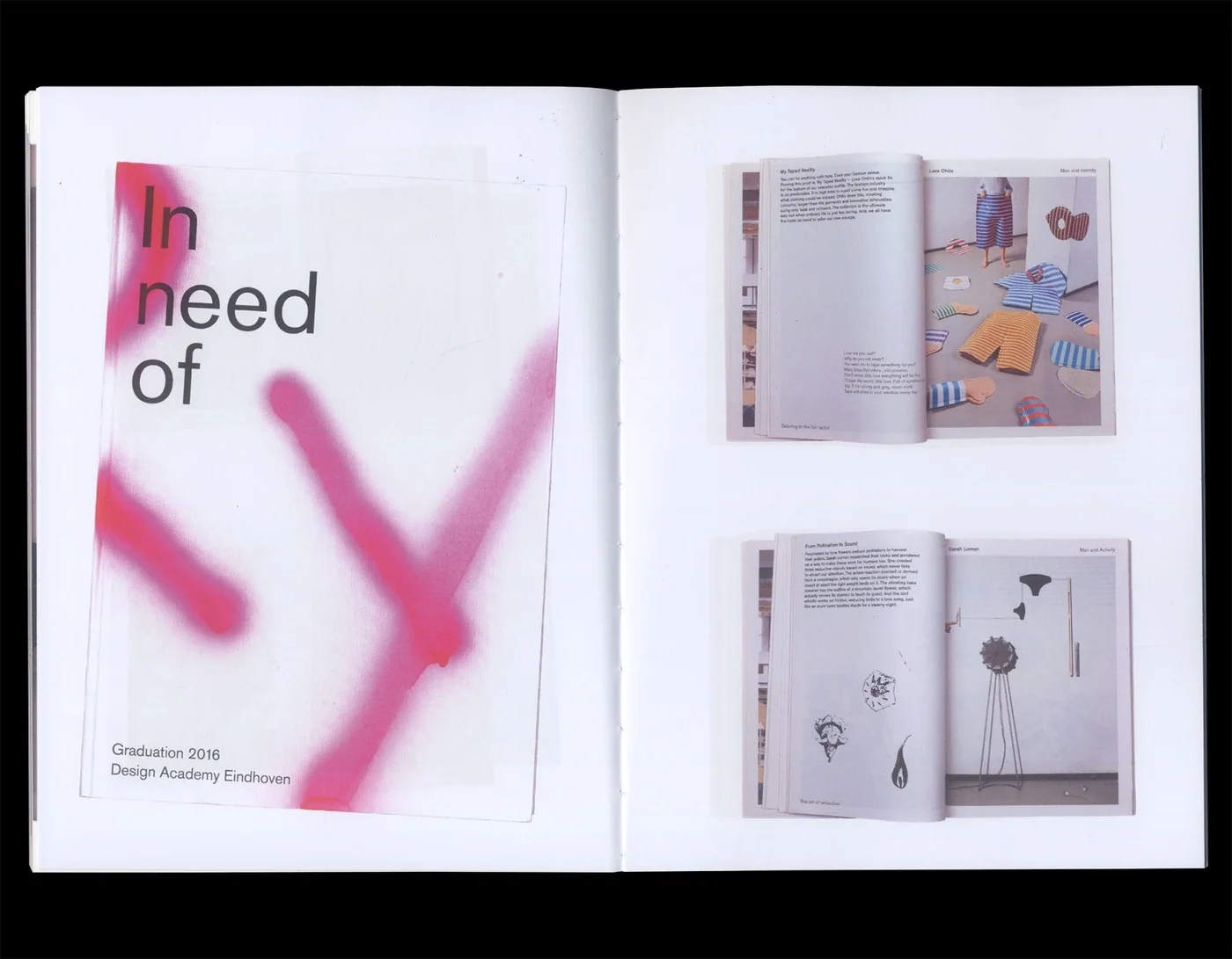
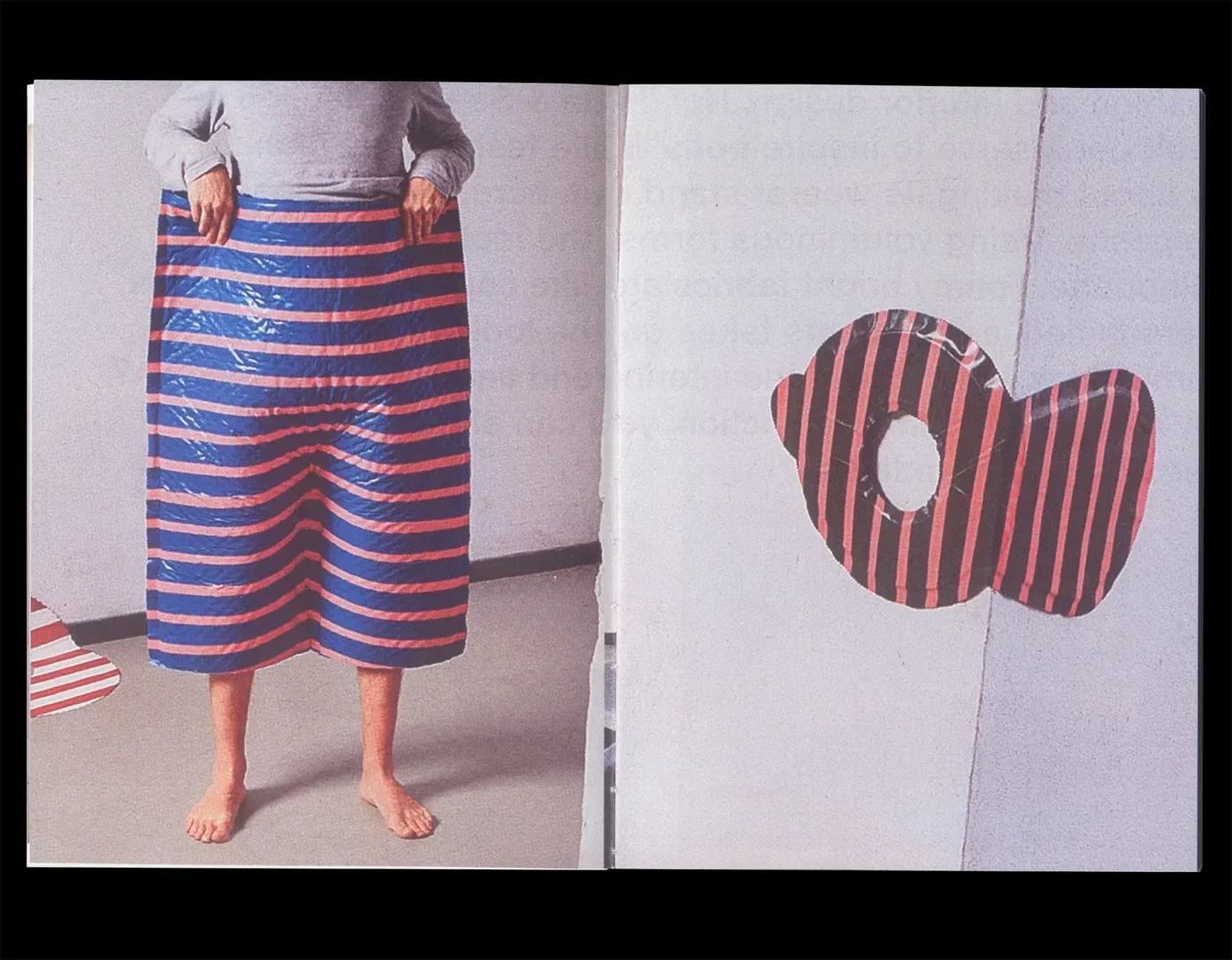
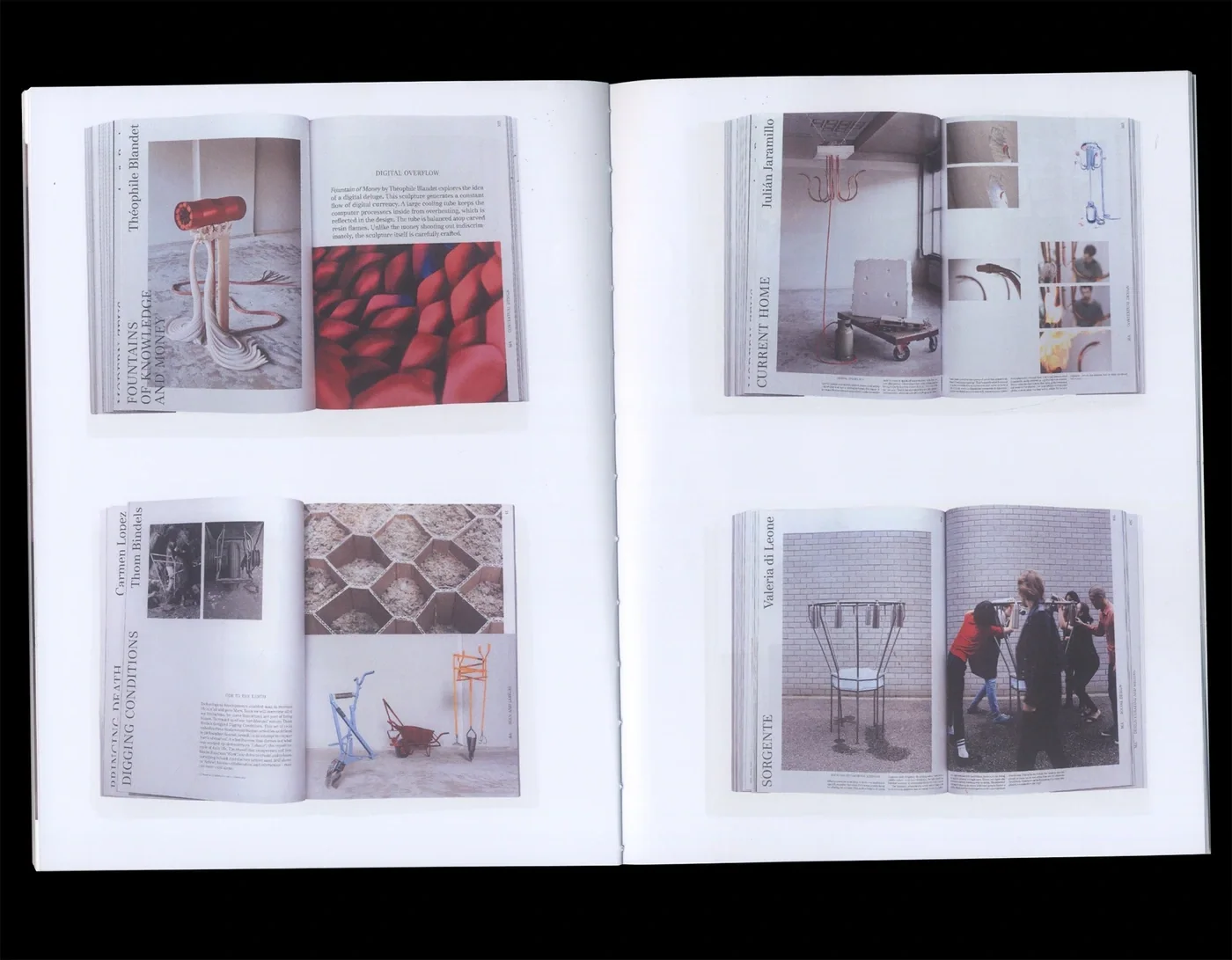
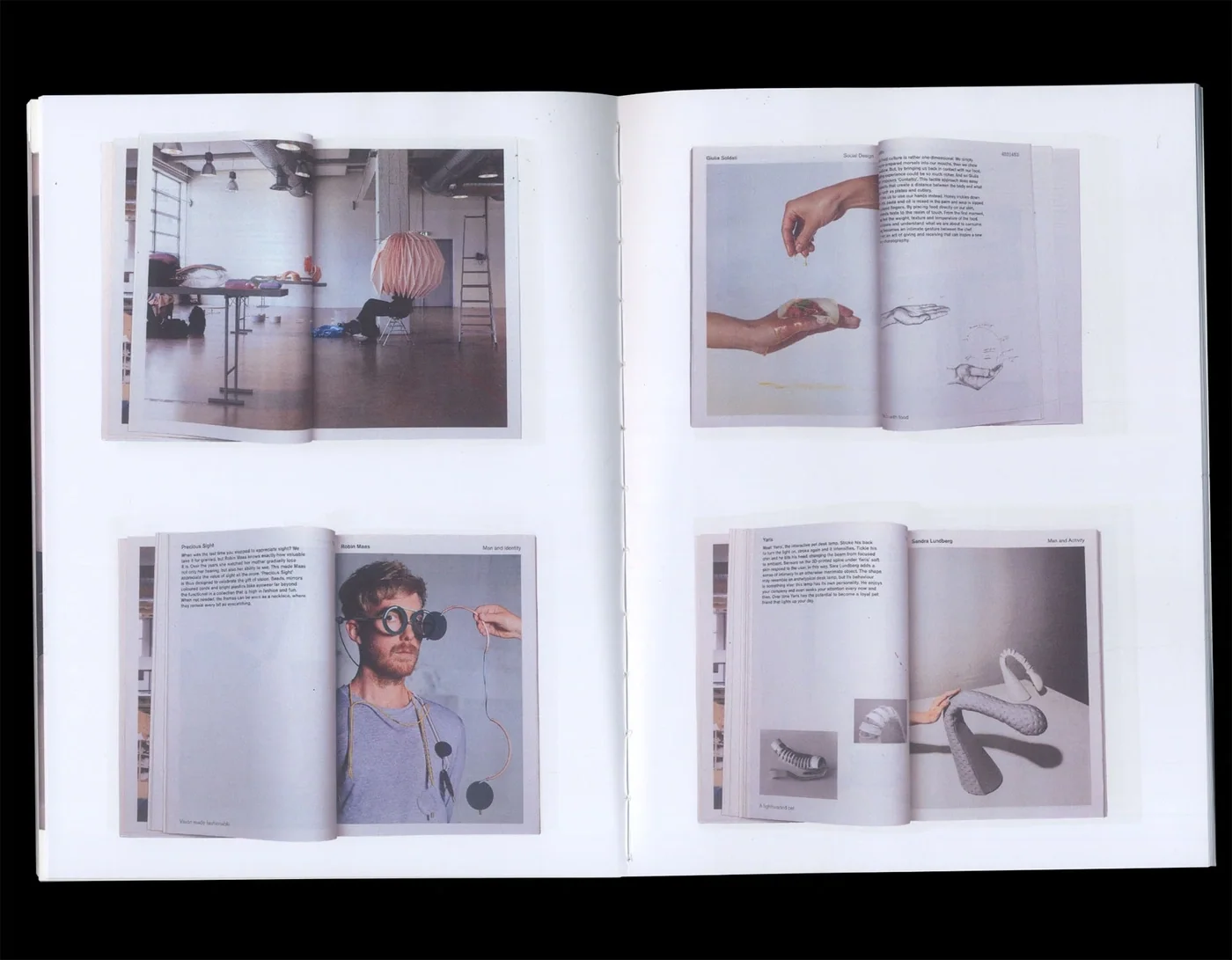
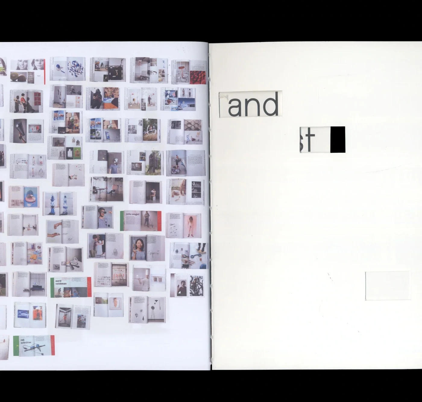
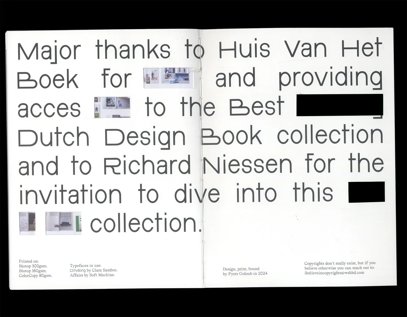
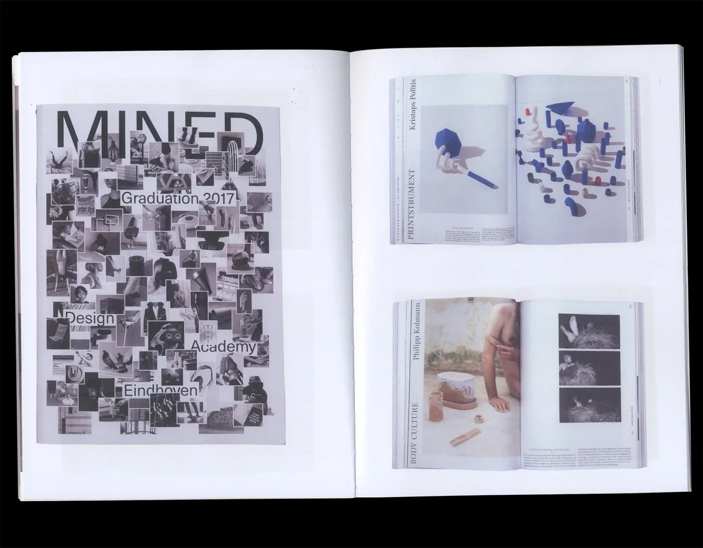
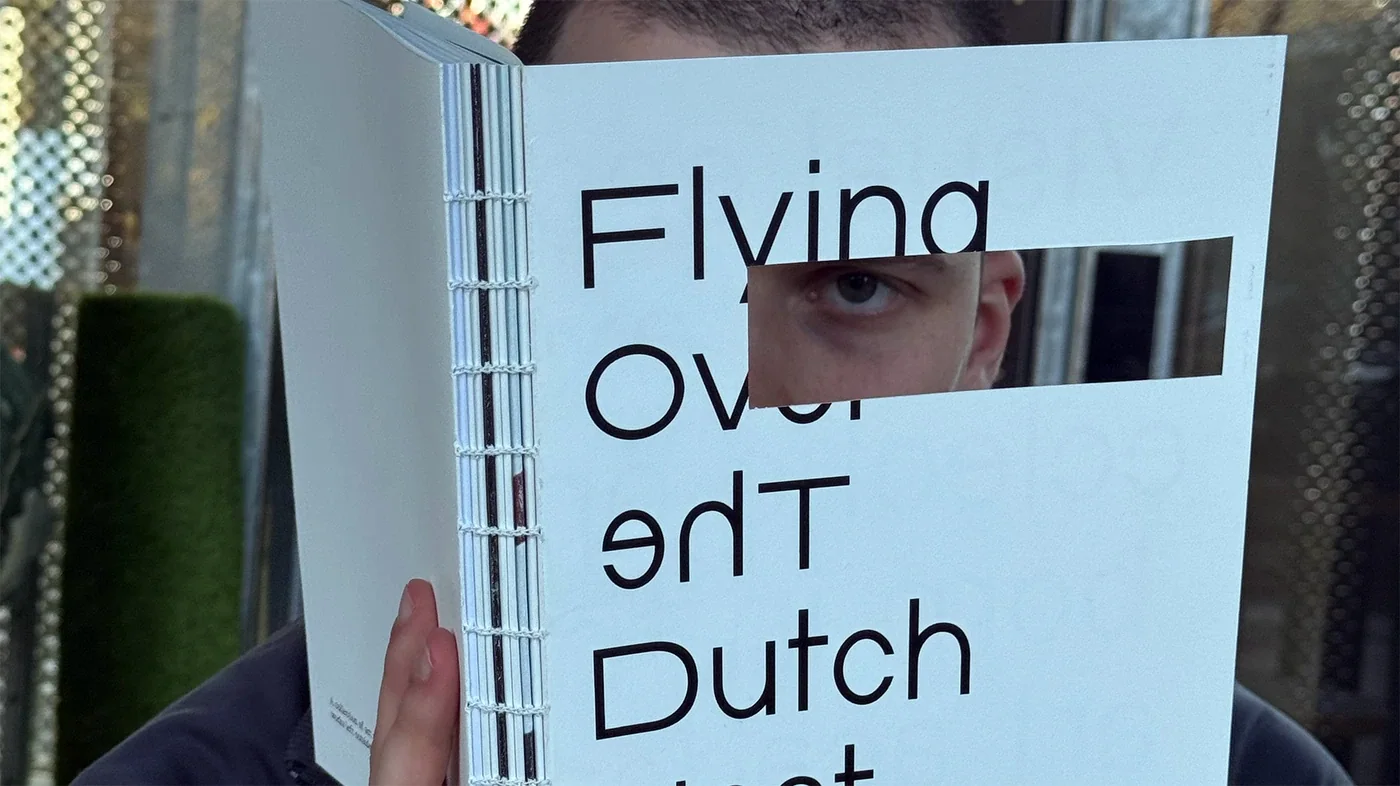
E15 Flying Over The Dutch Nest Book 2024 Nov Visual essay born out of research into the Best Dutch Design Book archive at Museum MeermanoFlying Over The Dutch Nest takes the Best Dutch Design Book collection as a starting point for looking at how ideas and appearances accumulate around art academies. The publication brings that inquiry into a sequence of visual material, leaving the images room to be encountered without explanatory captions. Its cover includes a rectangular opening, making looking through the book part of handling it. The work gives “eclectic opportunism” a visual setting through collection, framing and sequence, while the relationships between its images remain open to the reader Book Book Book Book Book Book Book Book Book Book Book Book Book Book Book Book Book Book Book Book Book Book Book Book Book Book Book Book Book Book Book
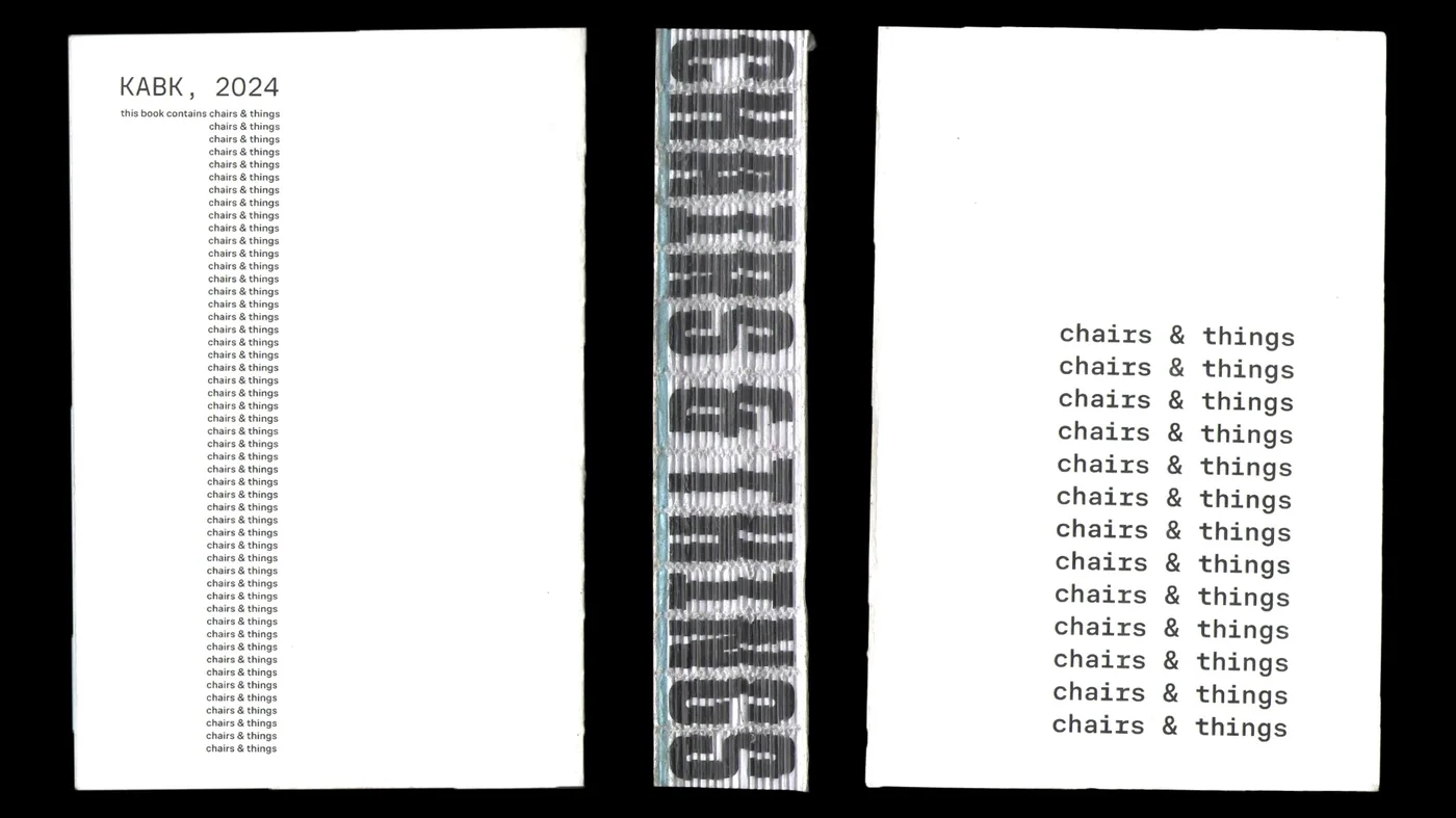
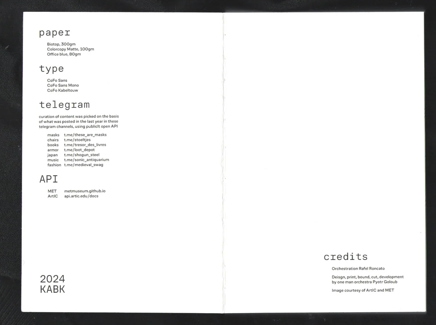
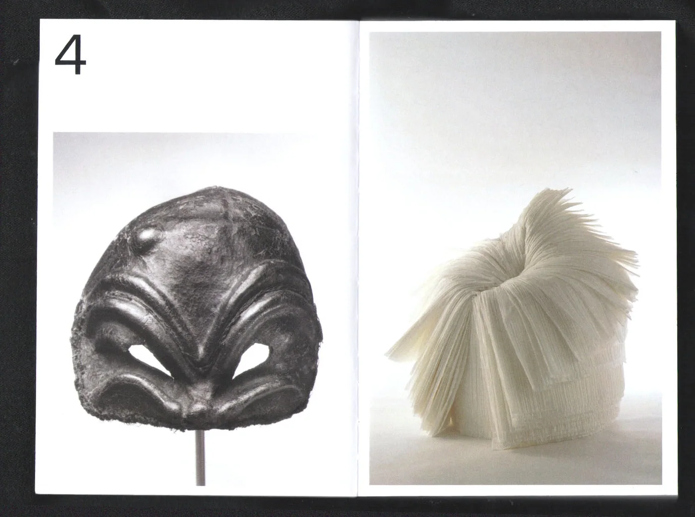
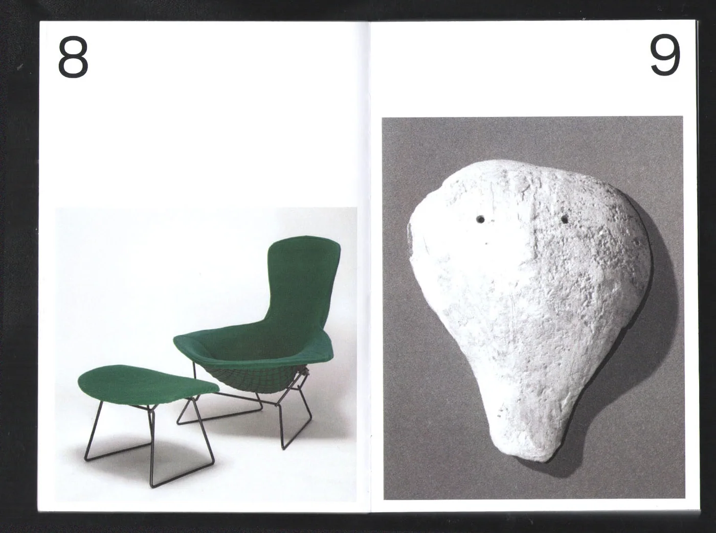
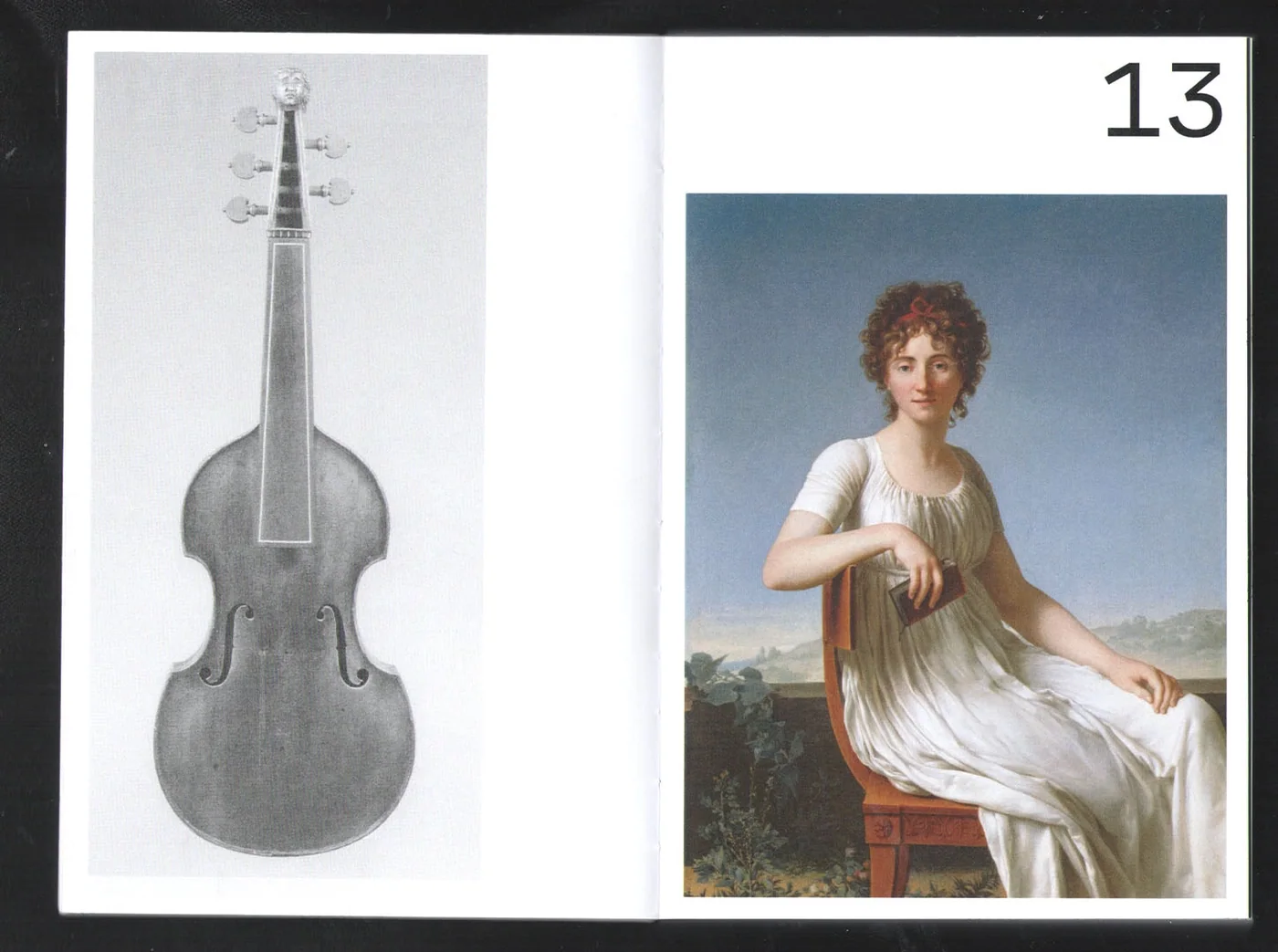
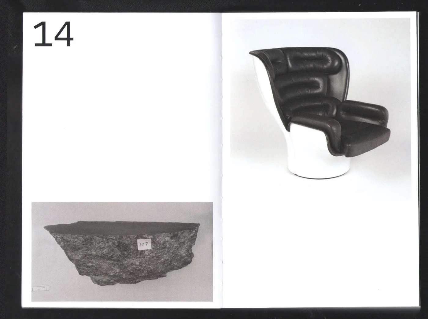
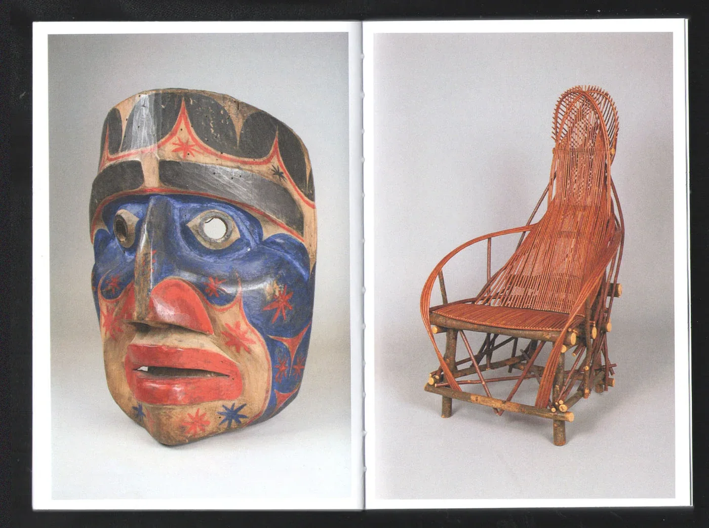
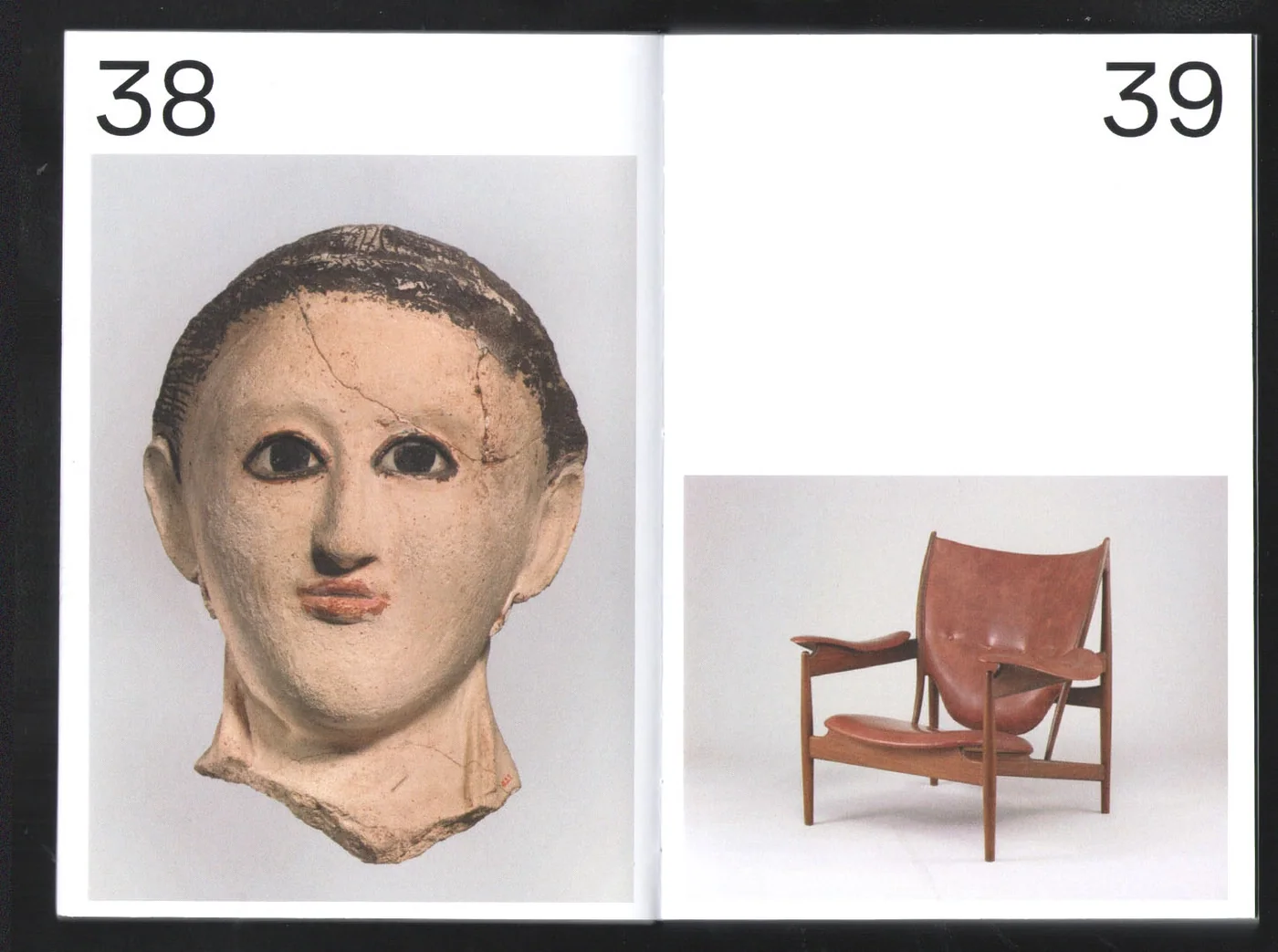
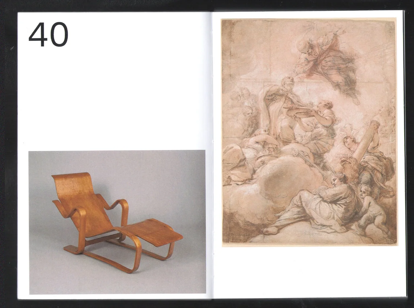
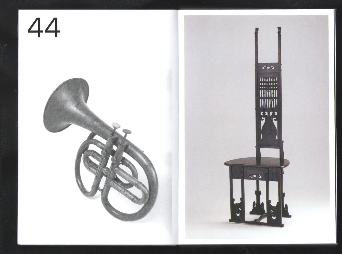
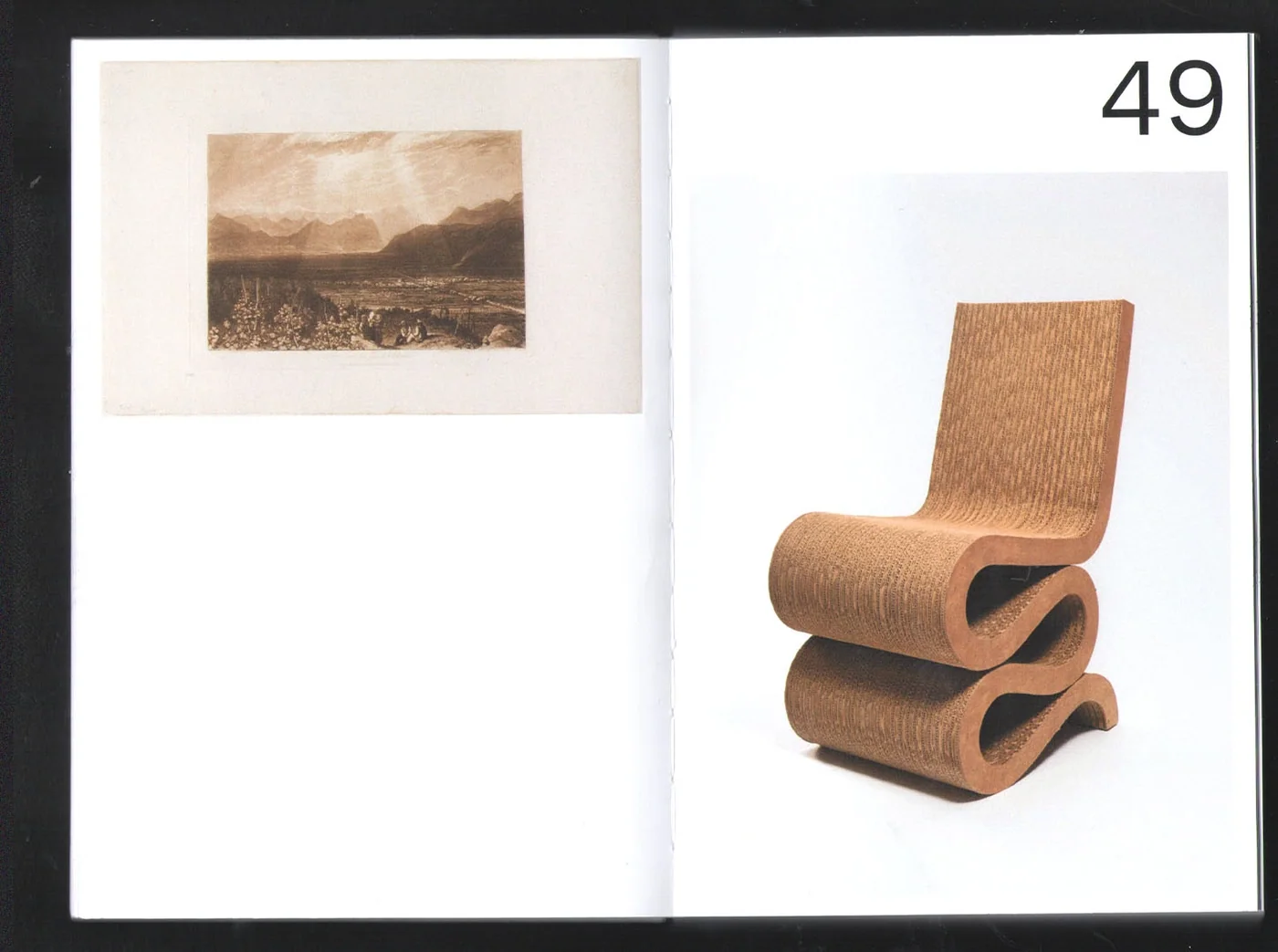
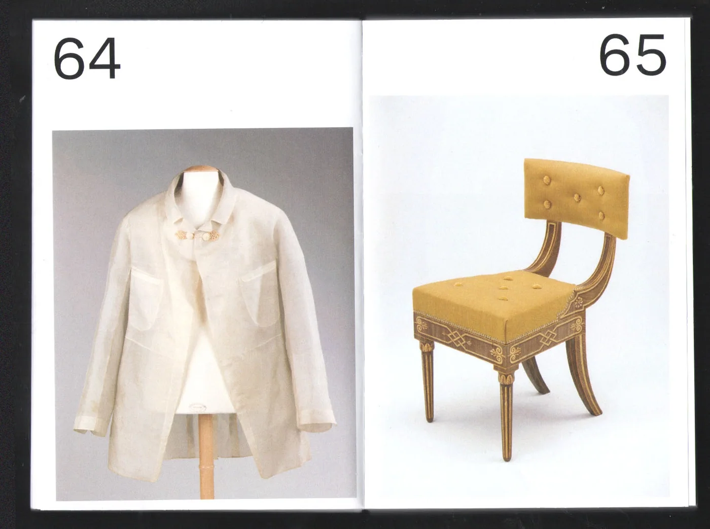
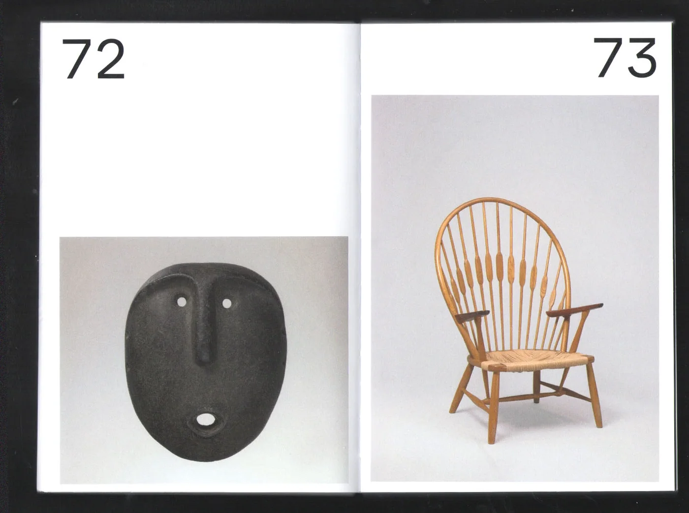
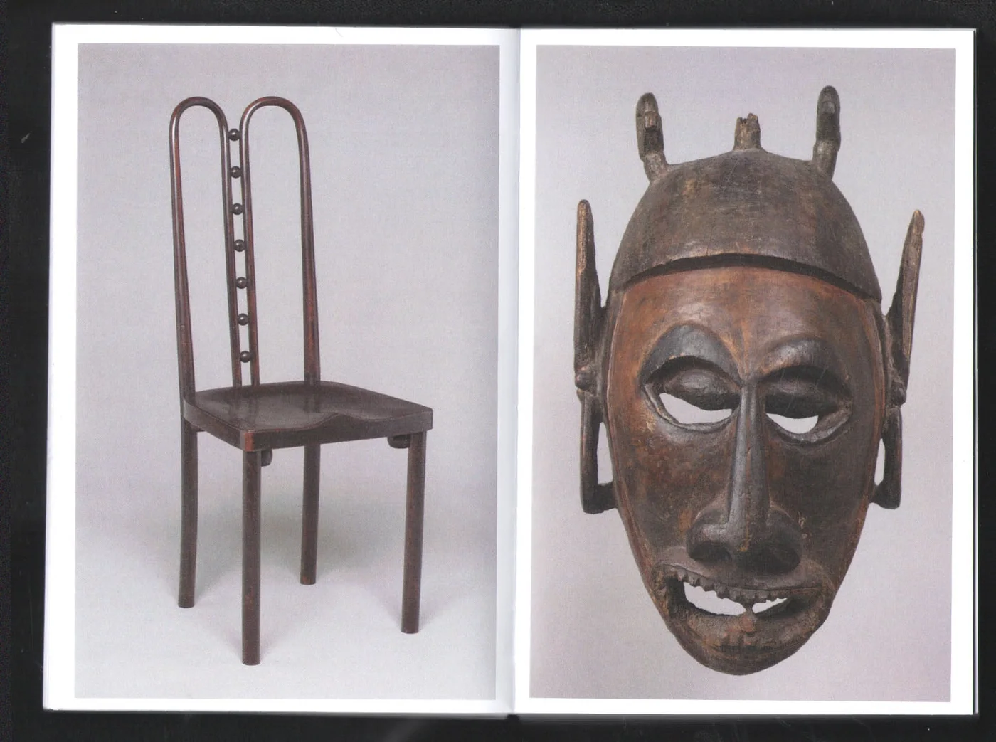
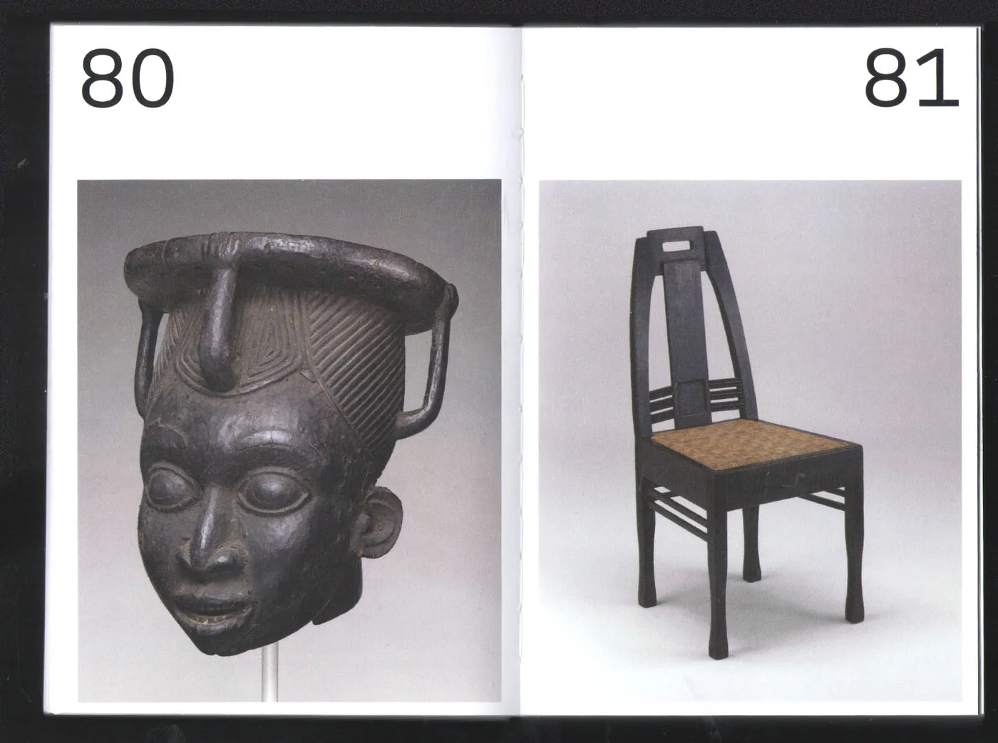
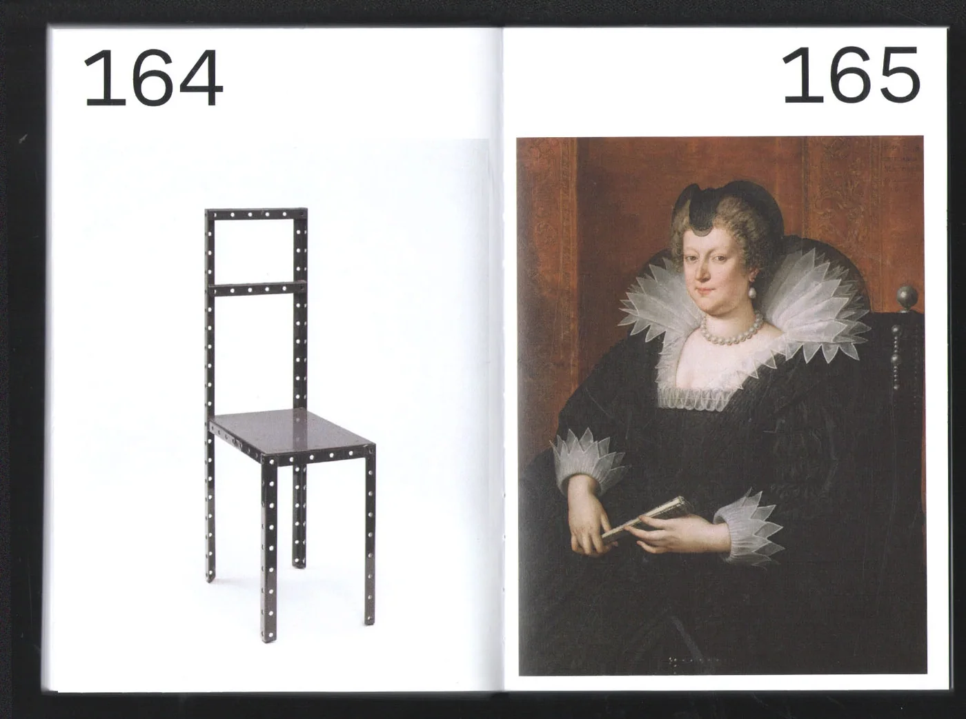
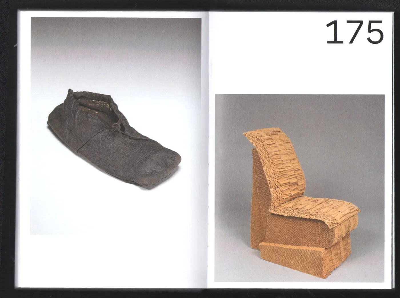
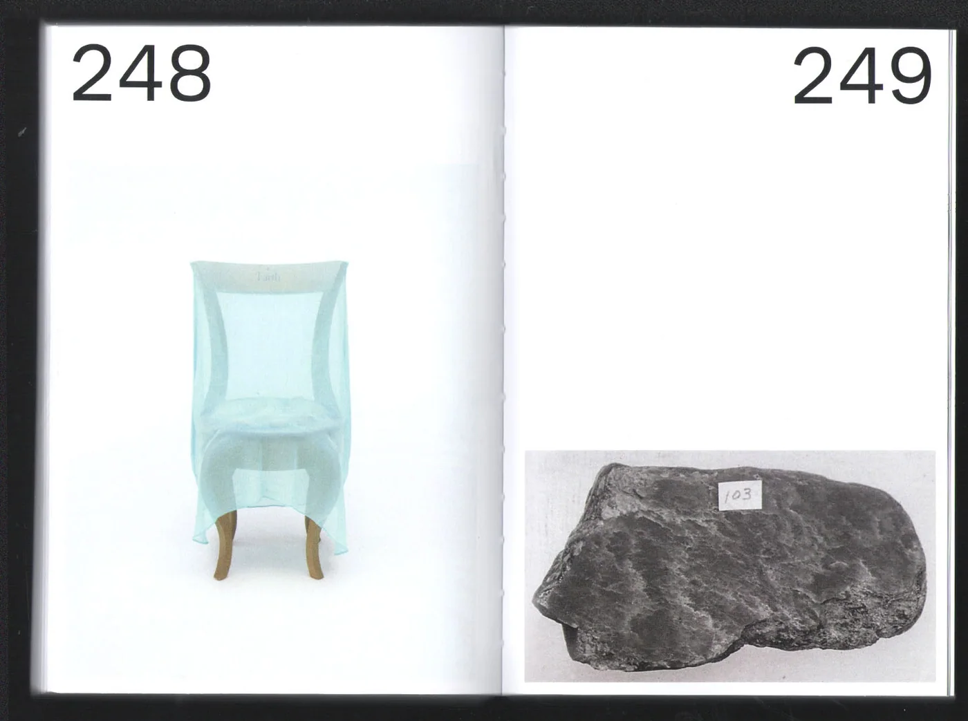
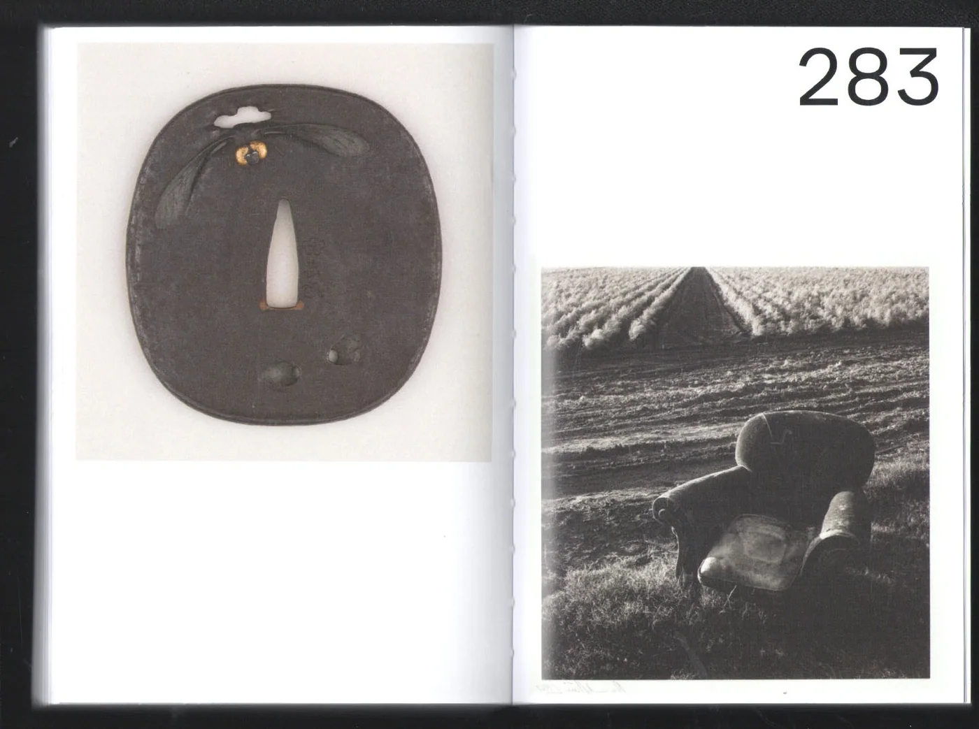
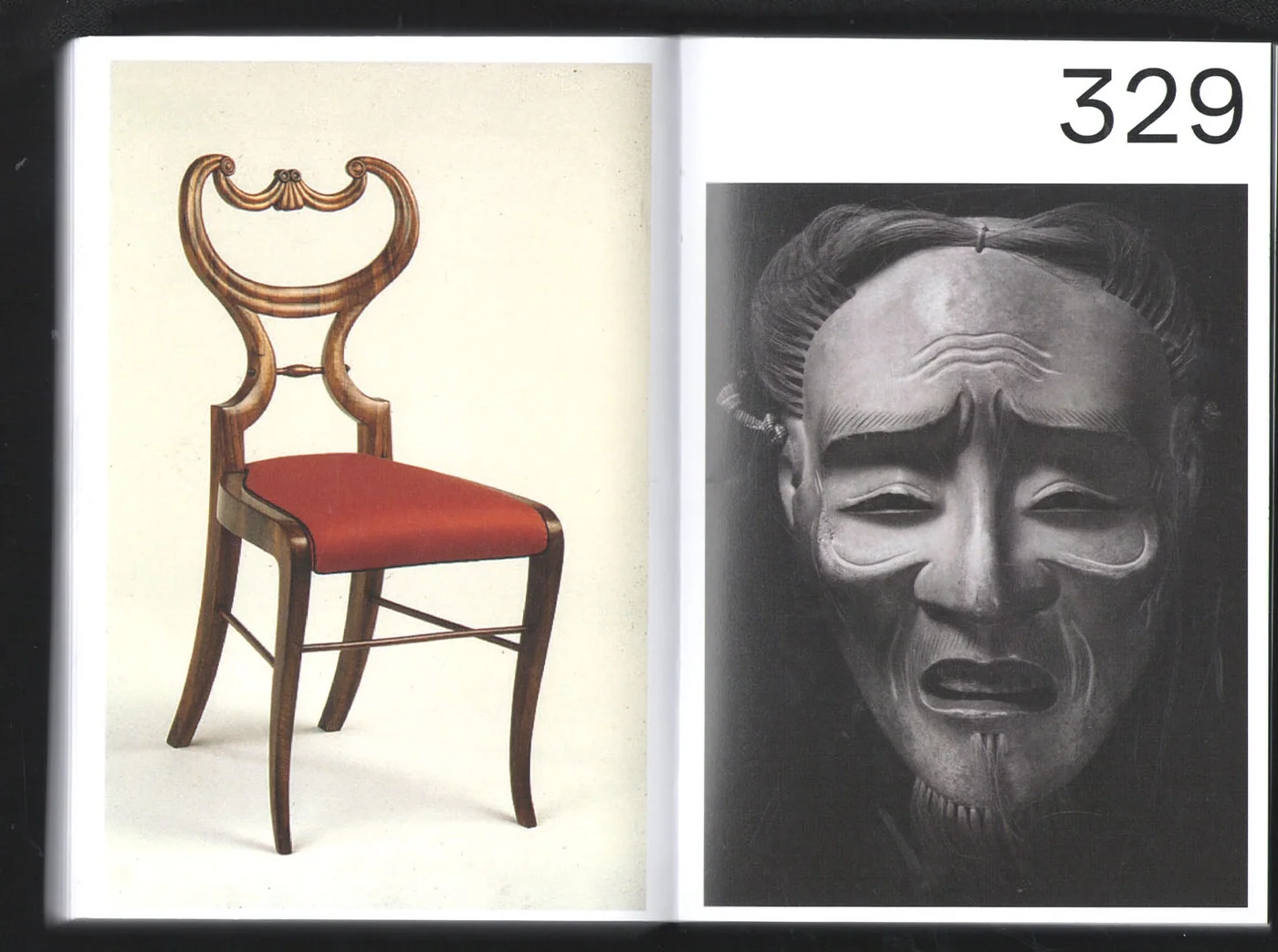
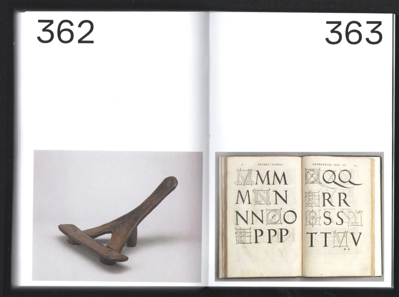
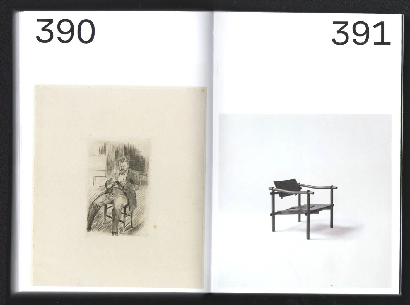
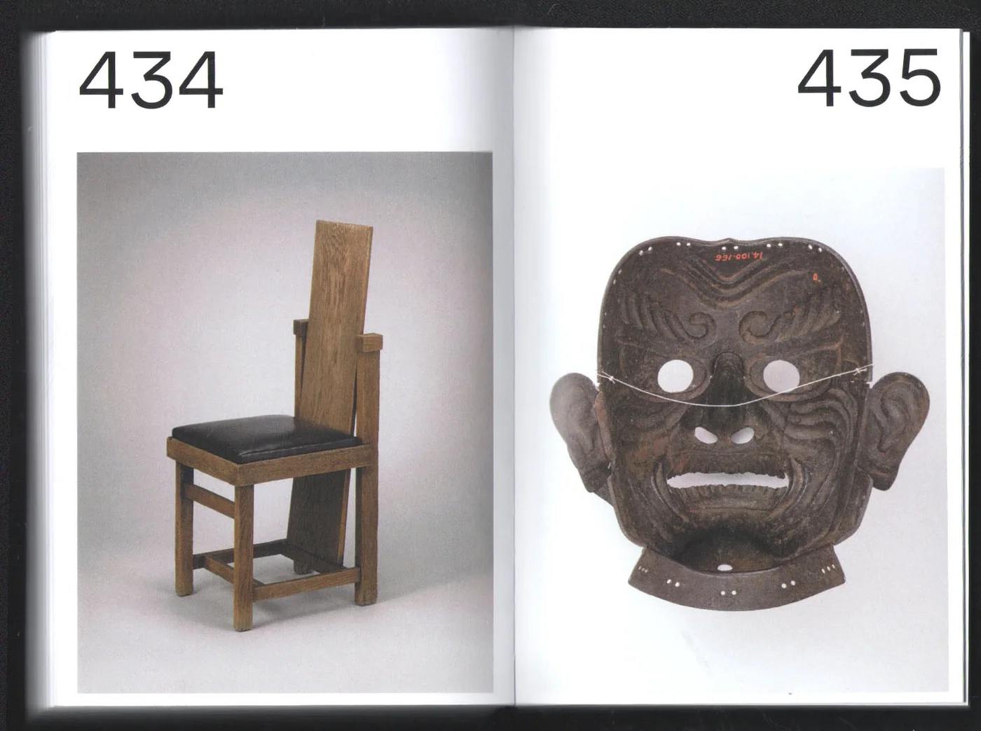
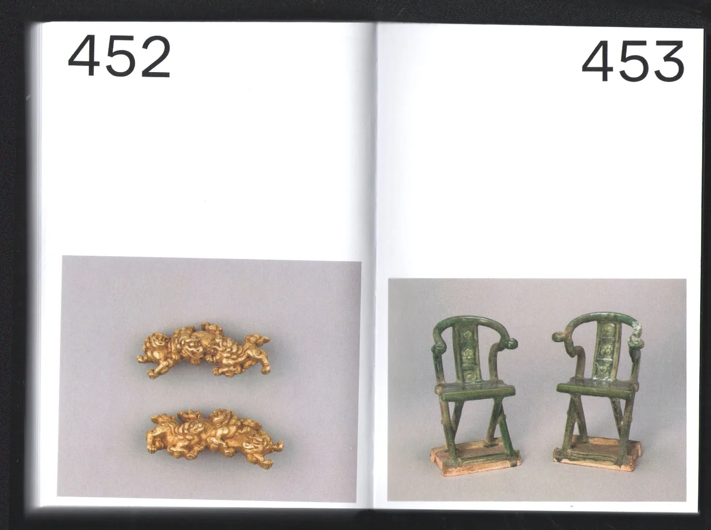
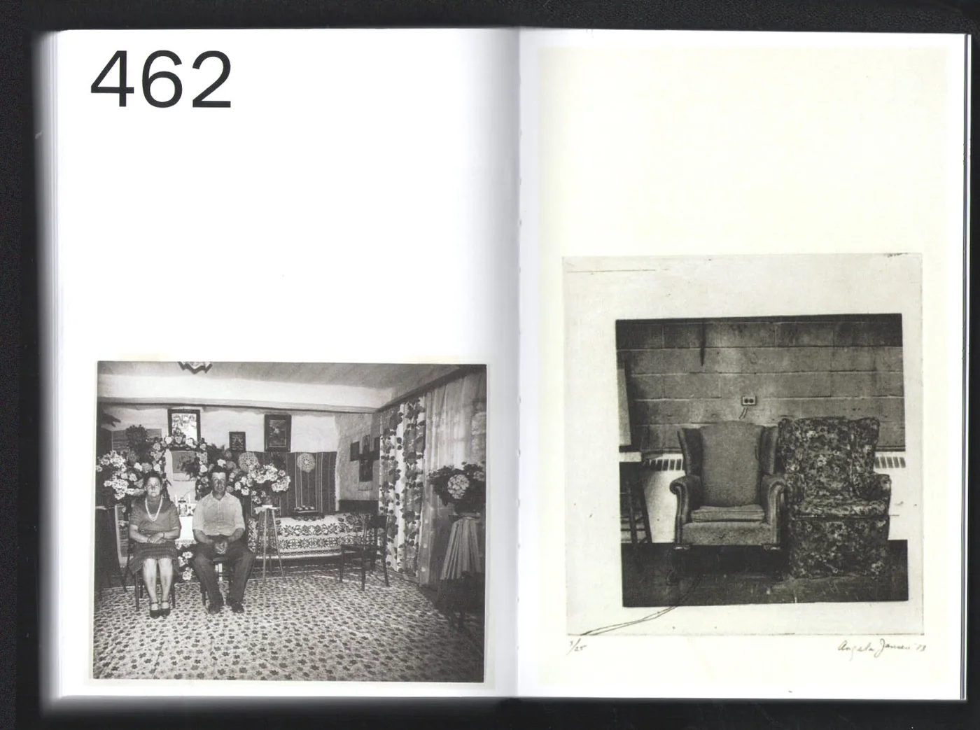
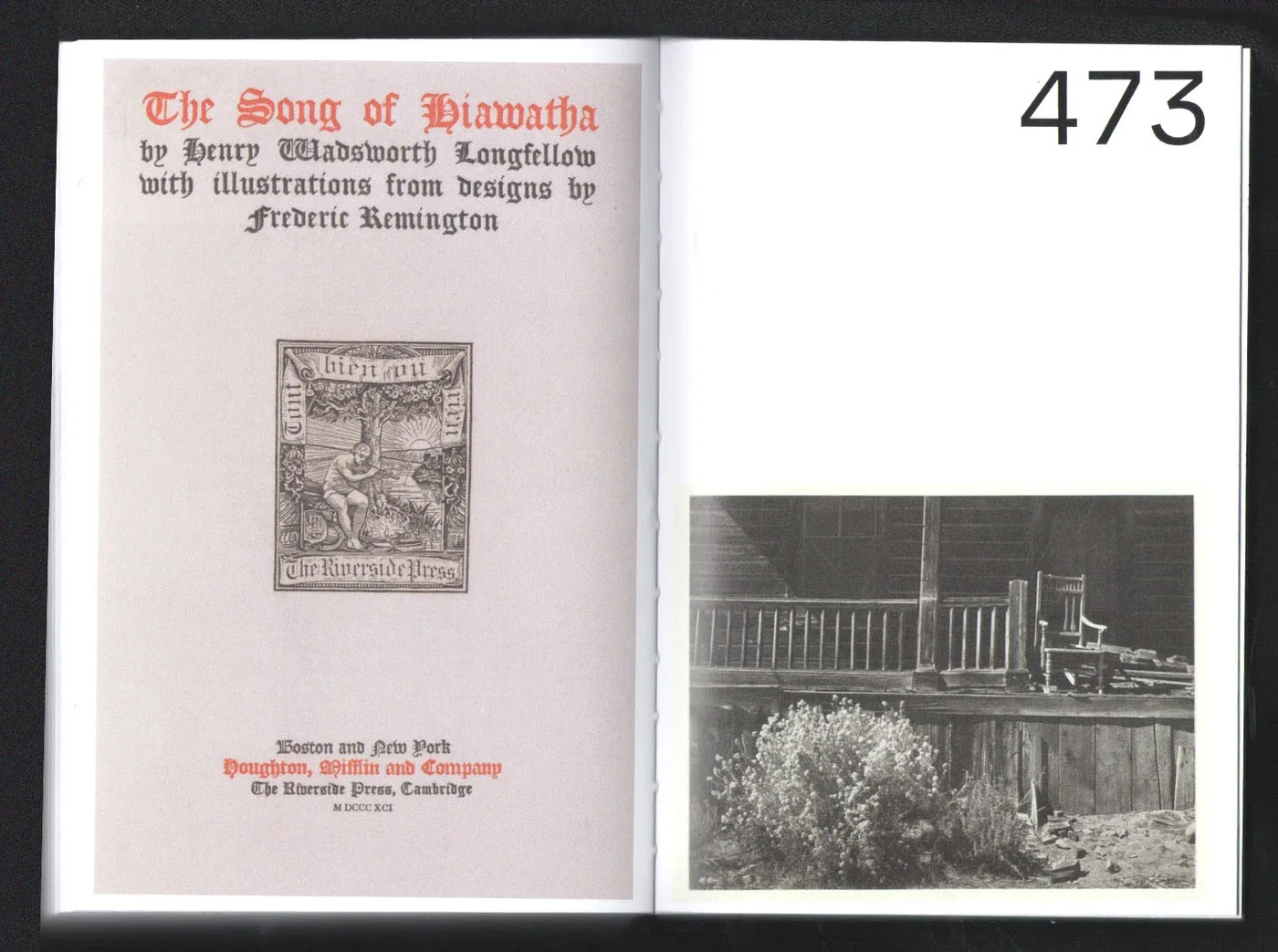
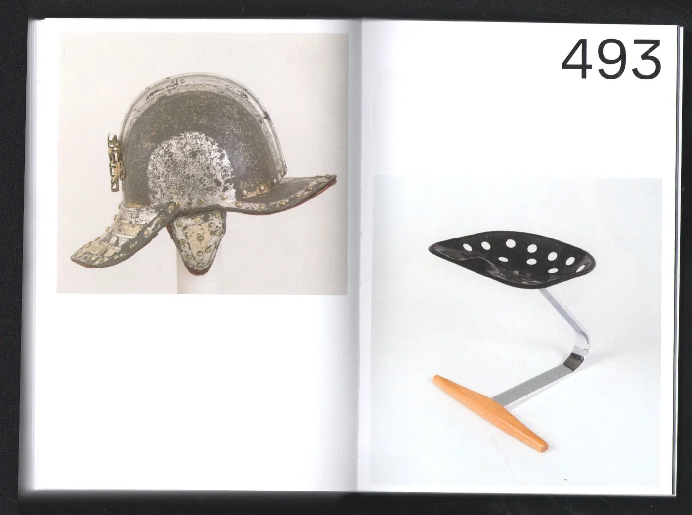
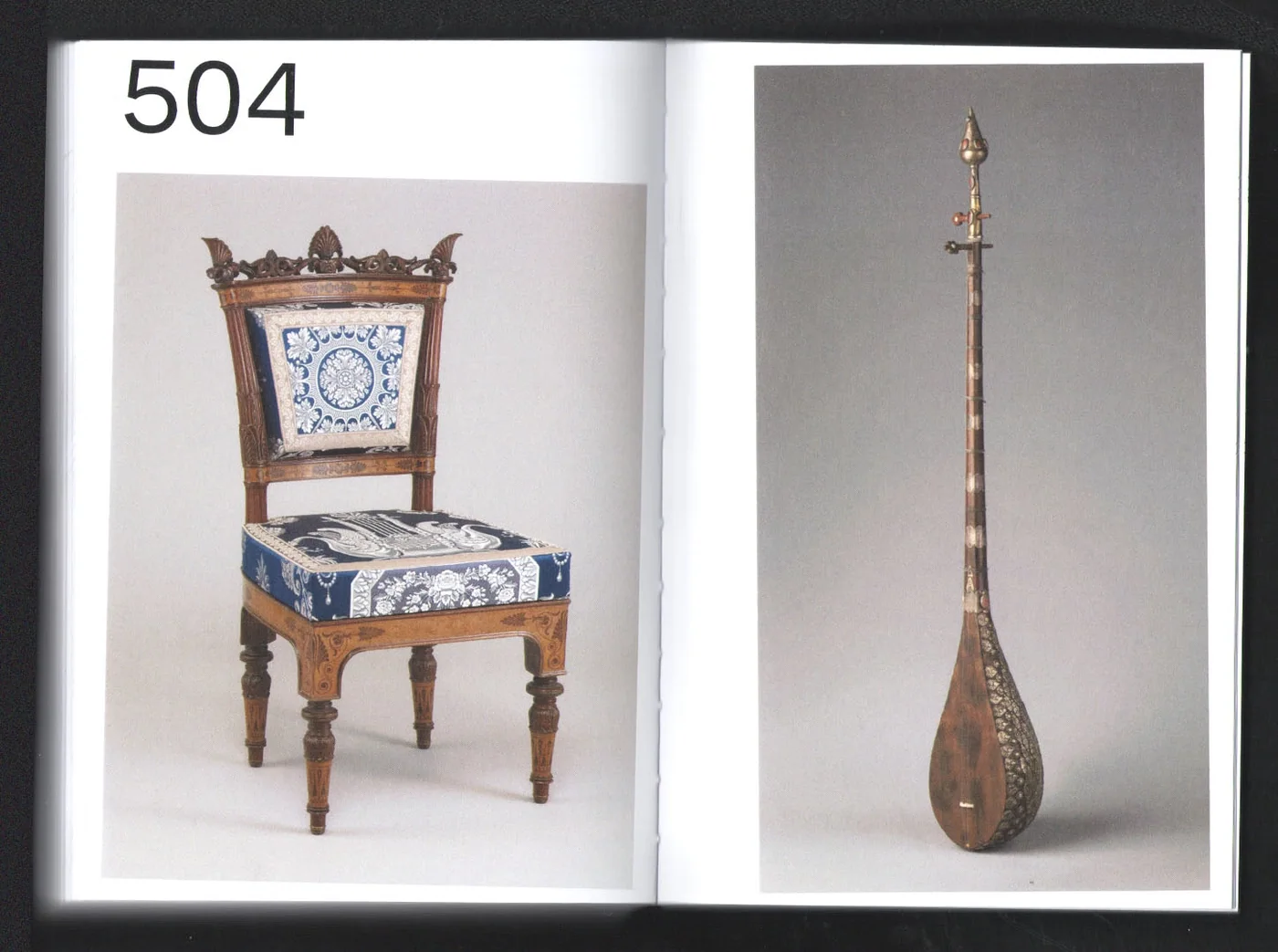
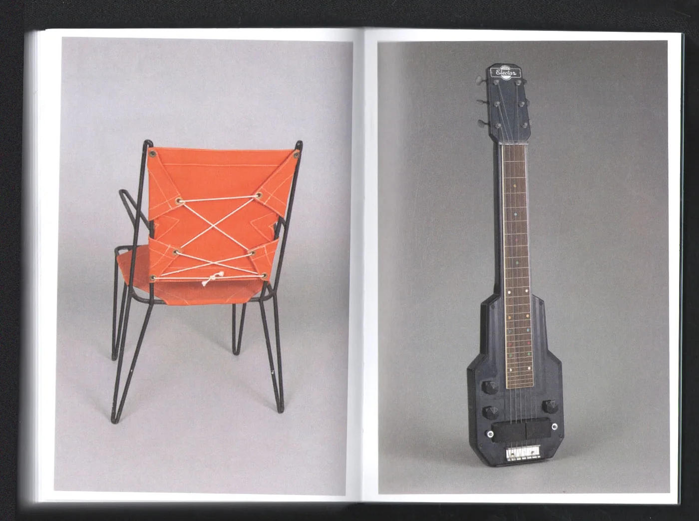
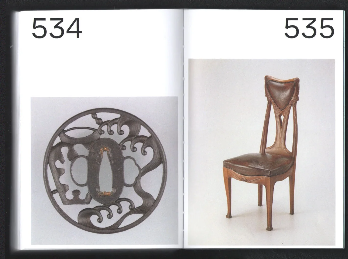
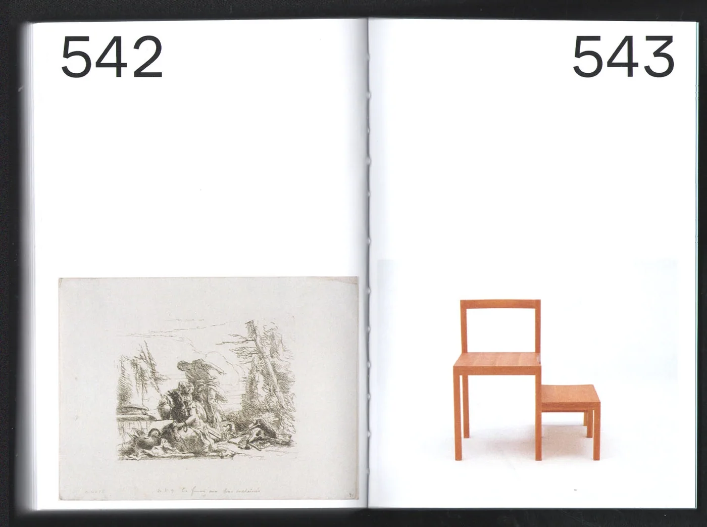
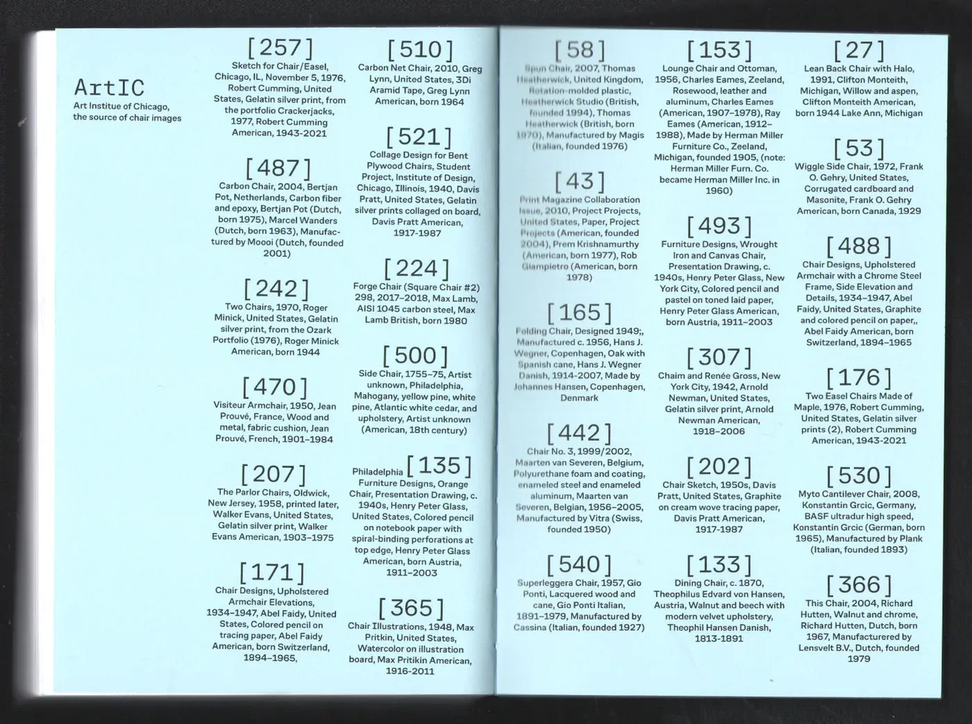
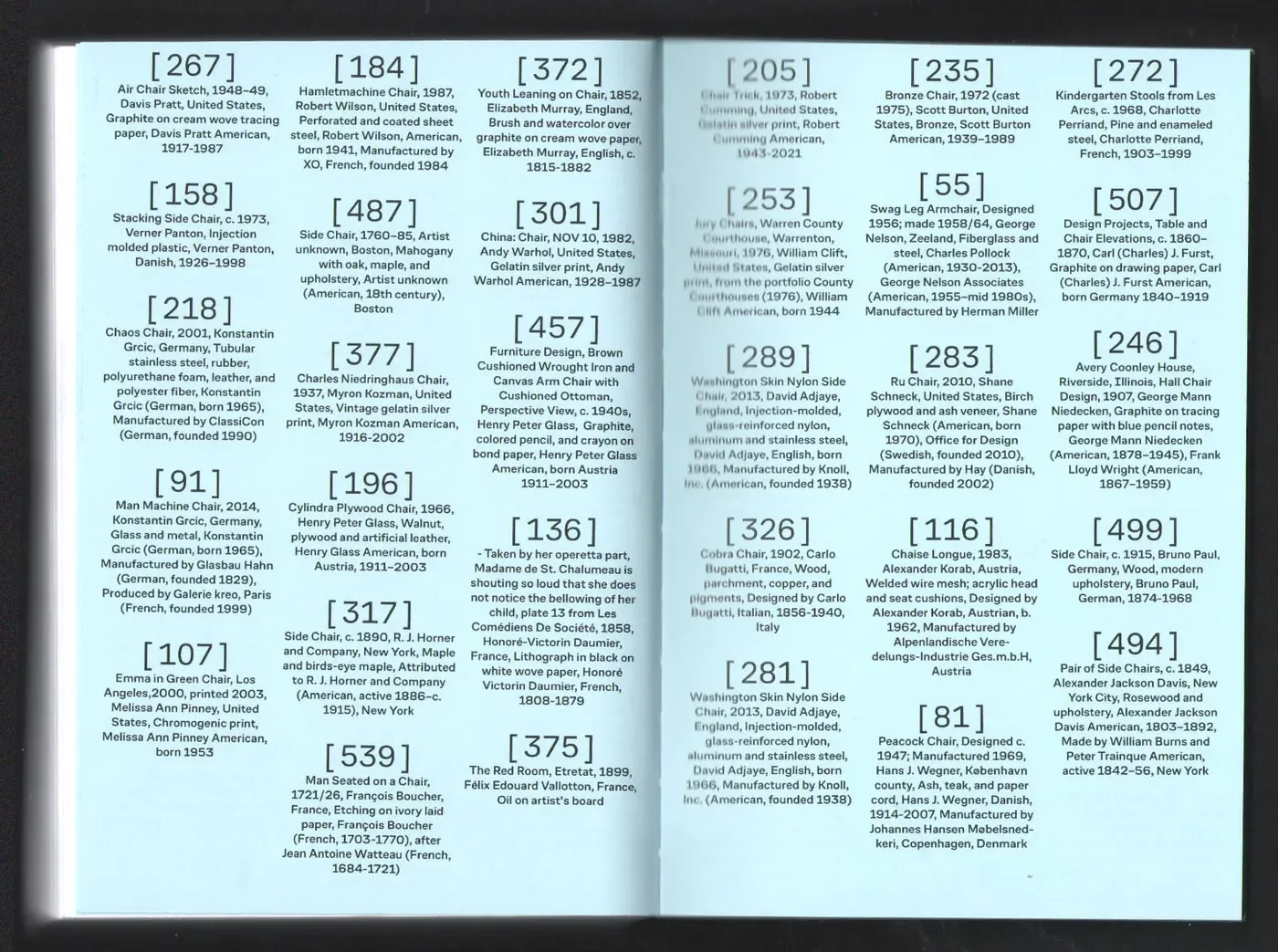
E16 Self Initiated Book 2024 Dec An almost 1,000-page book of things that match the vibe of chairsI used public-domain images from the Art Institute of Chicago and the Metropolitan Museum of Art to make this self-initiated book of 1,500 images. Each spread pairs a chair with another image, asking what meaning can emerge between the two. Code helped streamline many parts of production, including a custom Processing app I made to compare images and choose pairings that looked or felt right together. The tool supported visual judgement, with the book giving those choices a repeated form across its spreads. A second main outcome is bookmaking, a collection of scripts and tools for producing books Book Book Book Book Book Book Book Book Book Book Book Book Book Book Book Book Book Book Book Book Book Book Book Book Book Book Book Book Book Book Book Book Book
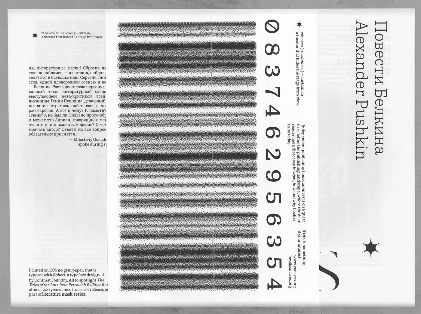
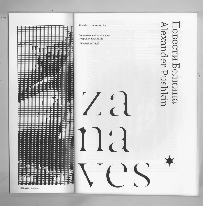
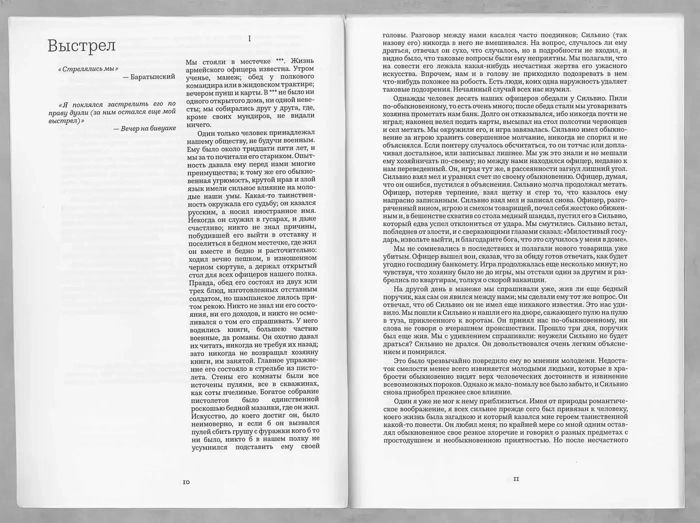
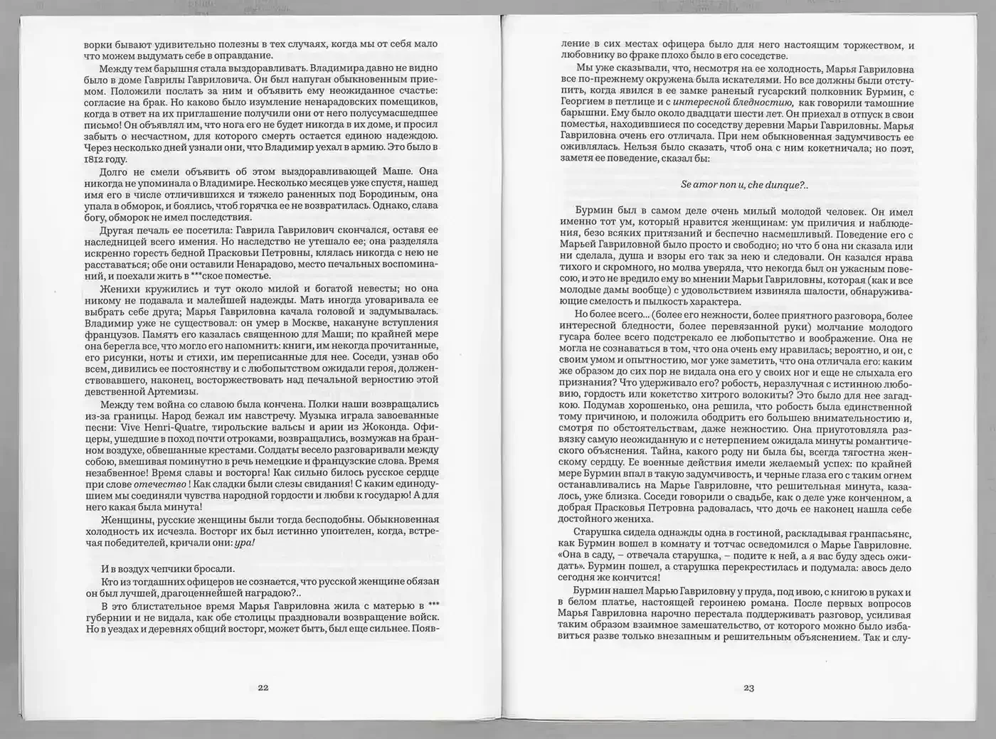
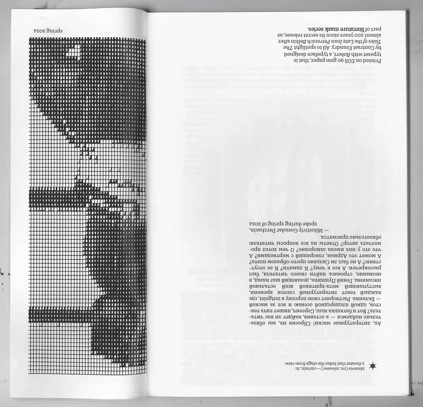
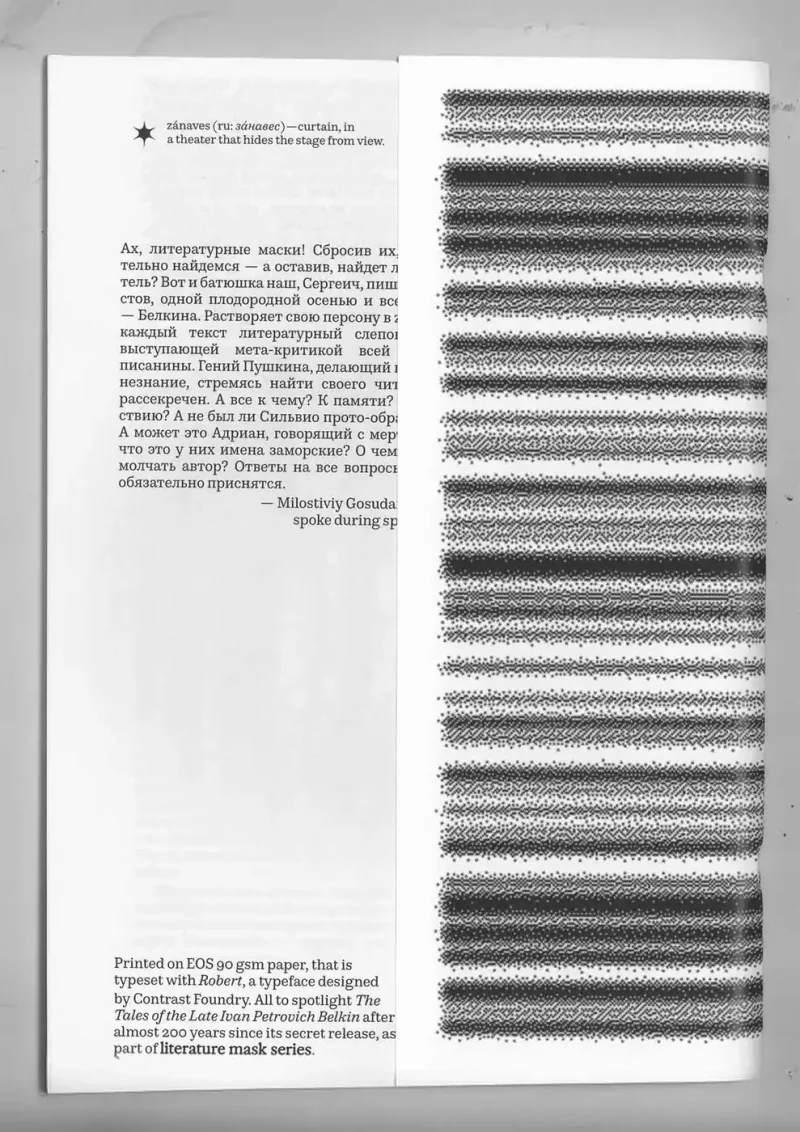
E17 Zanaves Magazine 2025 Jan A pilot literary publication with a cover designed to come off and become a wall posterThe proposal treats a literary publication as something the reader can keep in more than one form. Its cover is designed to detach and be displayed on a wall as a poster. The pilot material presents Pushkin’s Belkin Tales through typography, patterned imagery and a separate printed insert. Reading and collecting therefore meet in the object’s construction: the cover can leave the book while continuing to carry its visual identity. The result is a proposed publication format with a second use built into its exterior Magazine Magazine Magazine Magazine Magazine Magazine Magazine Magazine
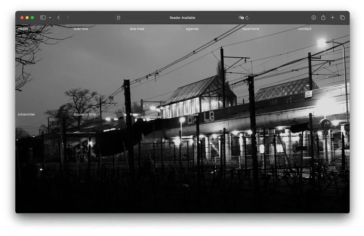
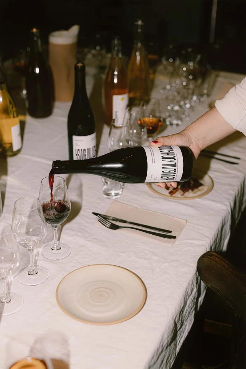
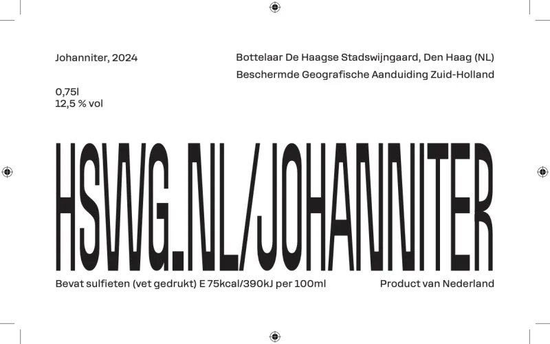
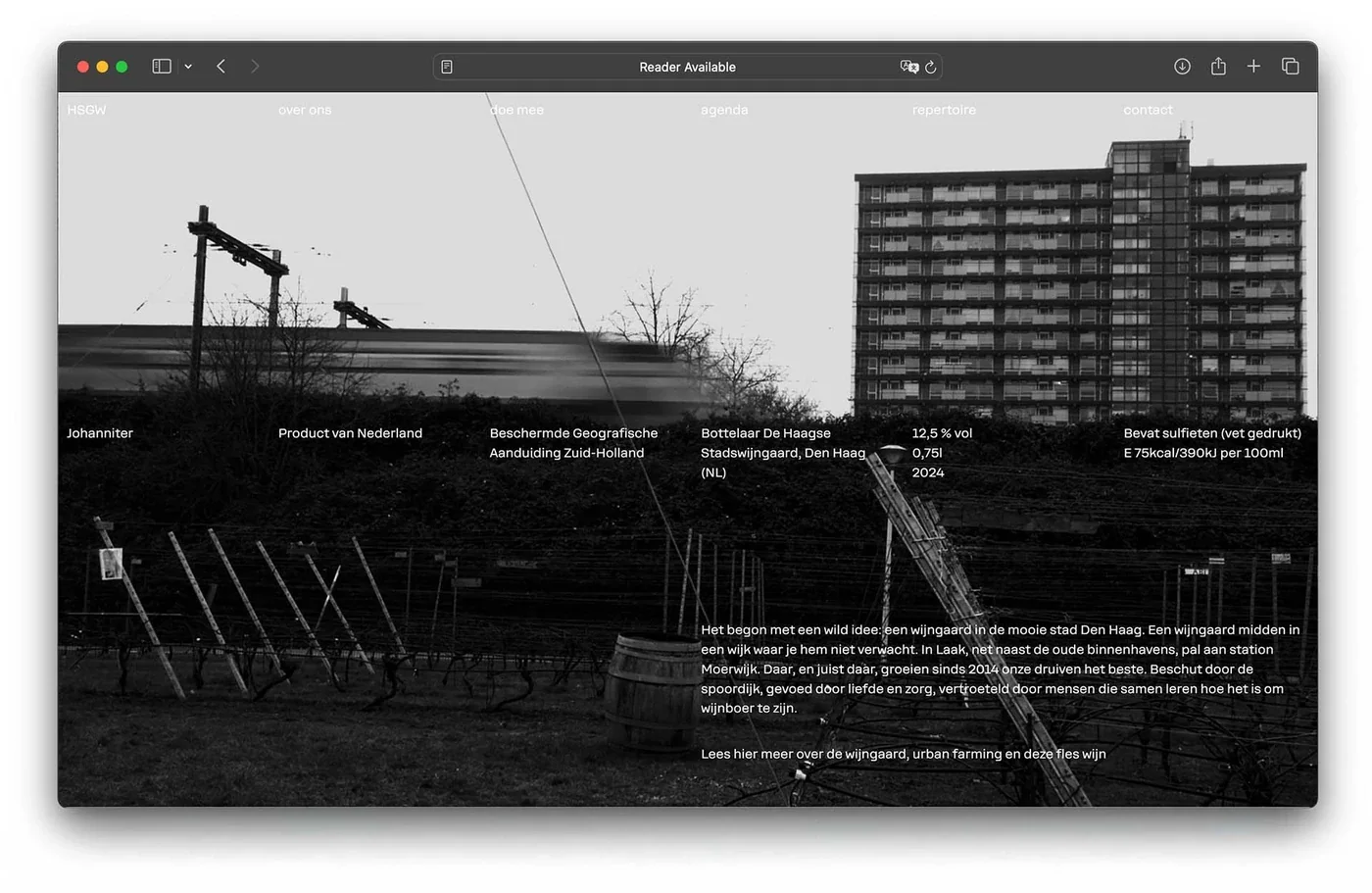
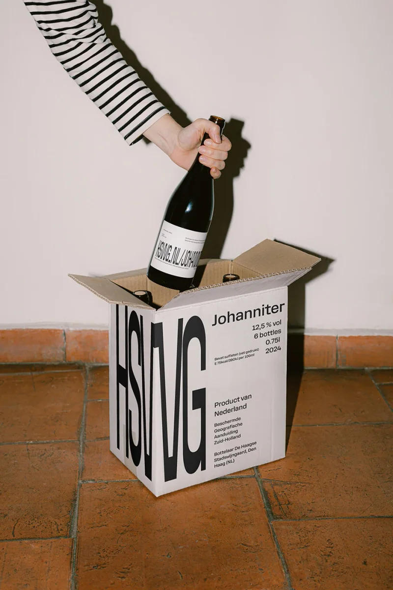
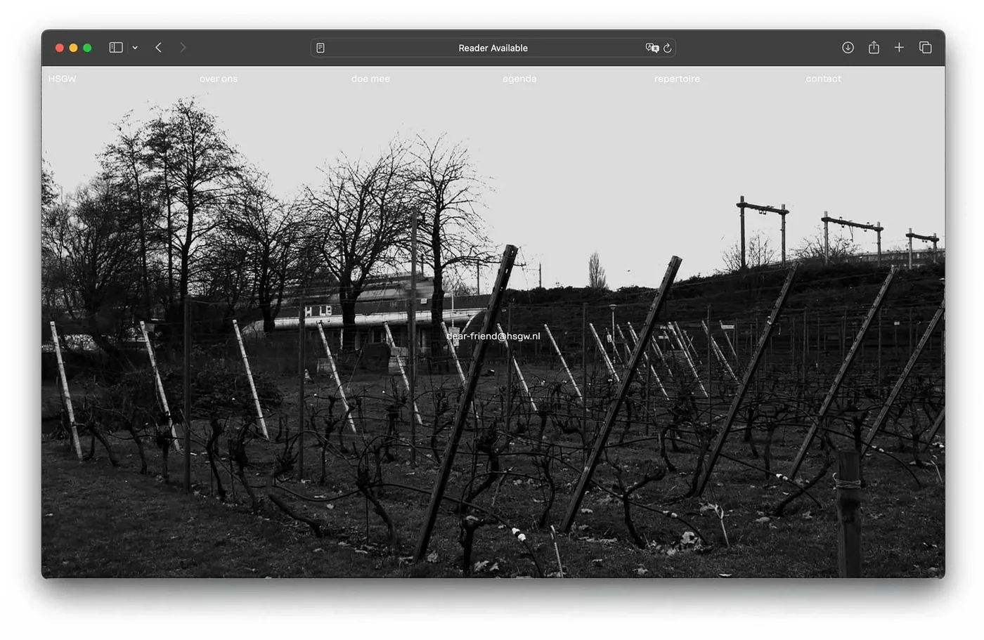
W07 HSWG Visual Identity 2025 Feb Identity and camera work for a vineyard in the middle of the cityDe Haagse Stadswijngaard asked for a new wine label for a batch of 500 bottles. The response grew into a wider identity built around slowness and sincerity. The direction came from the vineyard’s position within the city, surrounded by sirens, railway lines, traffic and construction. The project brought together a visual identity, website, label, wine box and video series. Across these formats, the work presents the vineyard as a place to pause within the city, with its own pace amid the activity around it Visual Identity Visual Identity Visual Identity Visual Identity Visual Identity Visual Identity
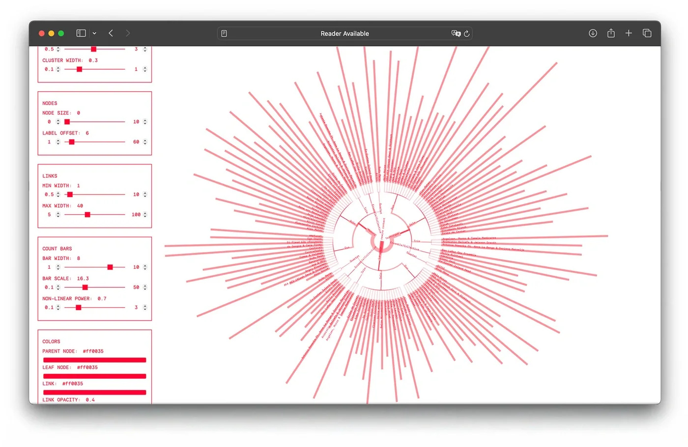
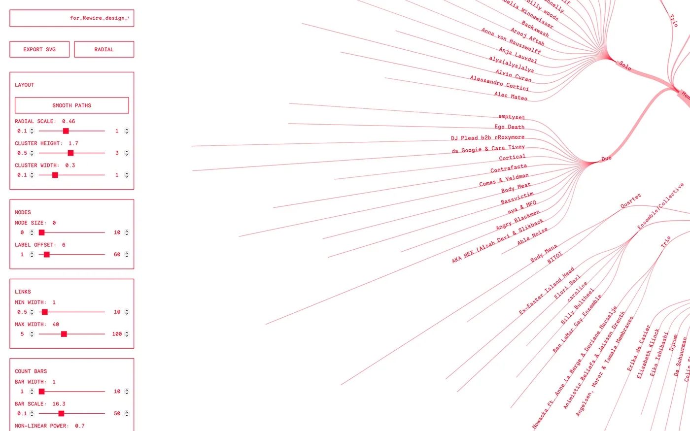
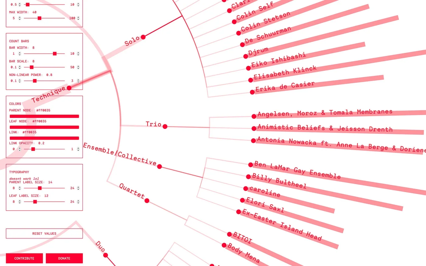
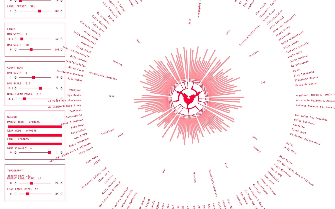
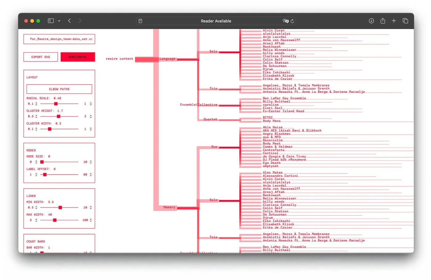
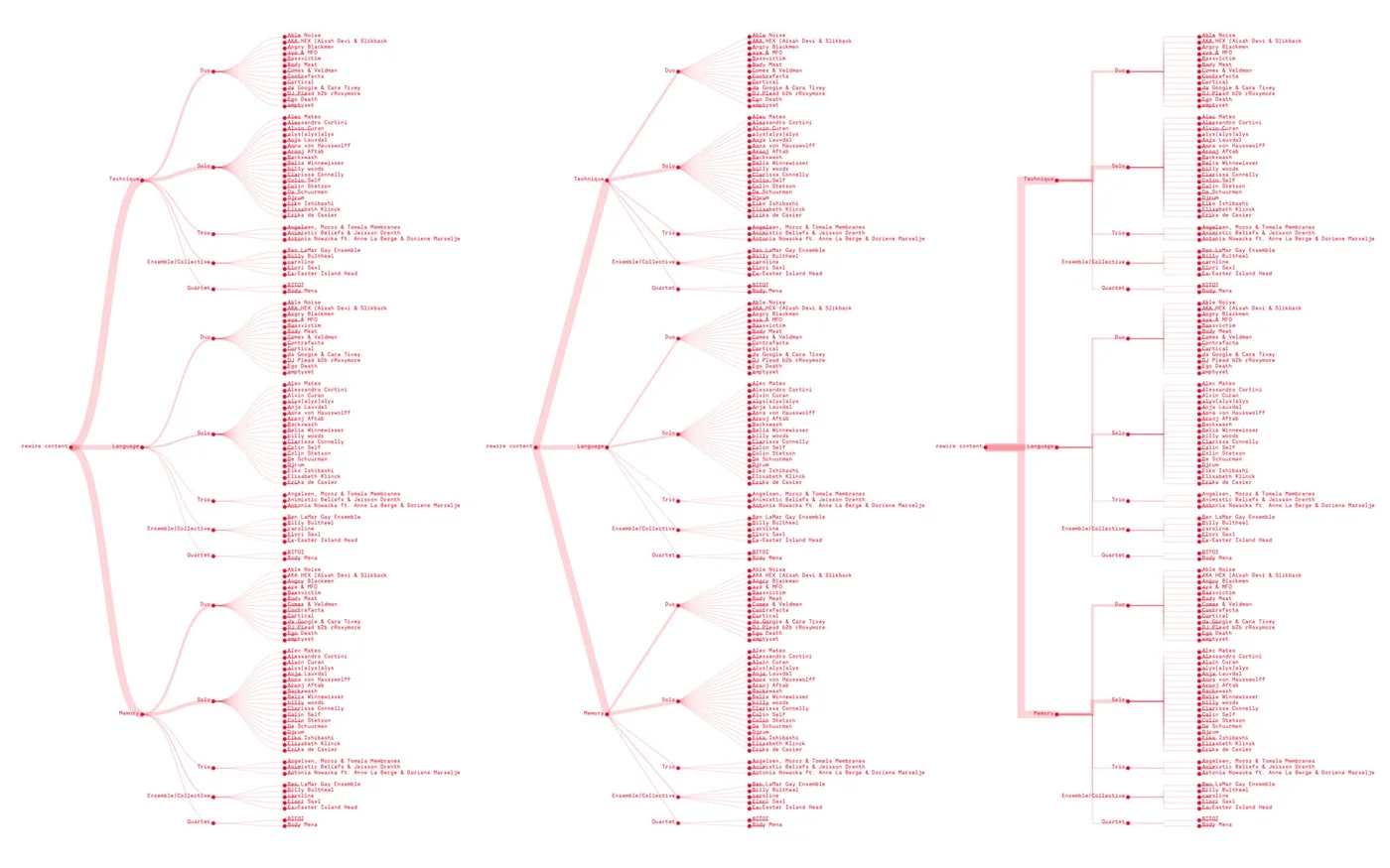
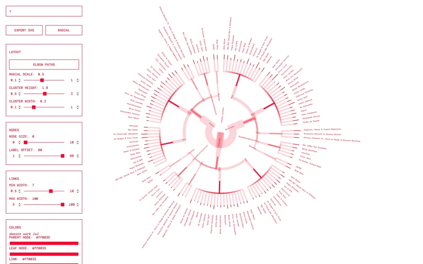
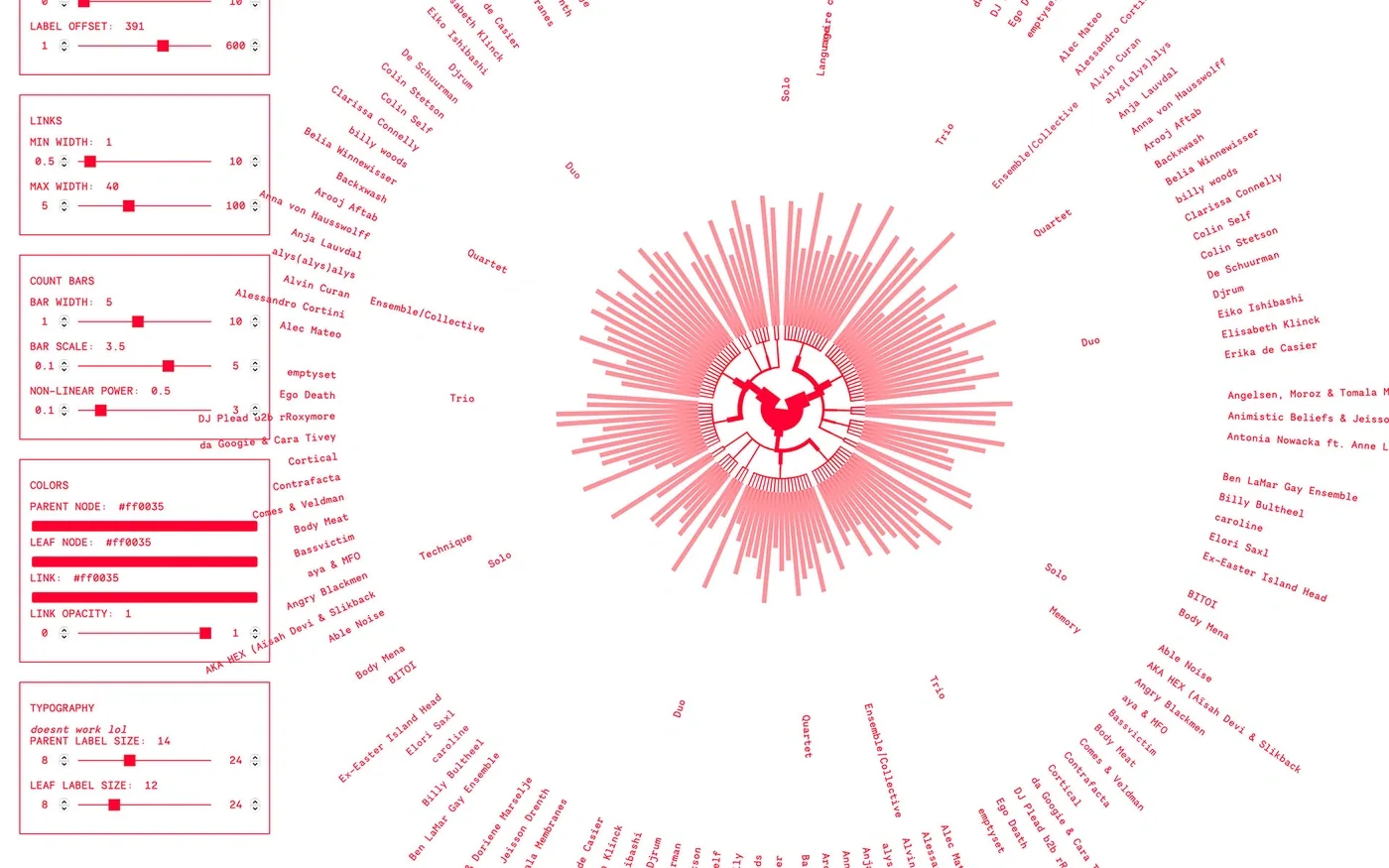
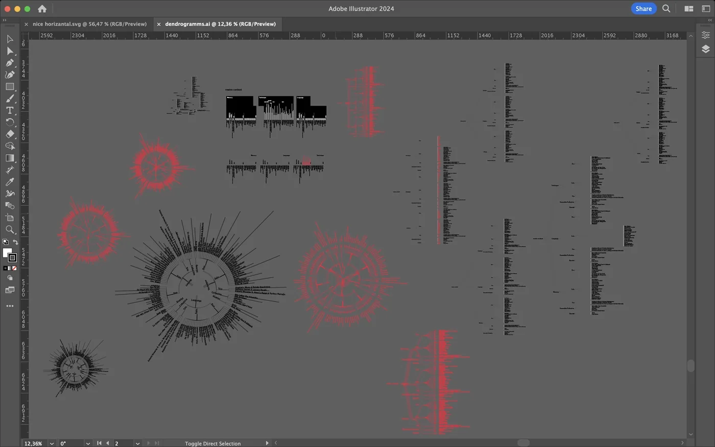
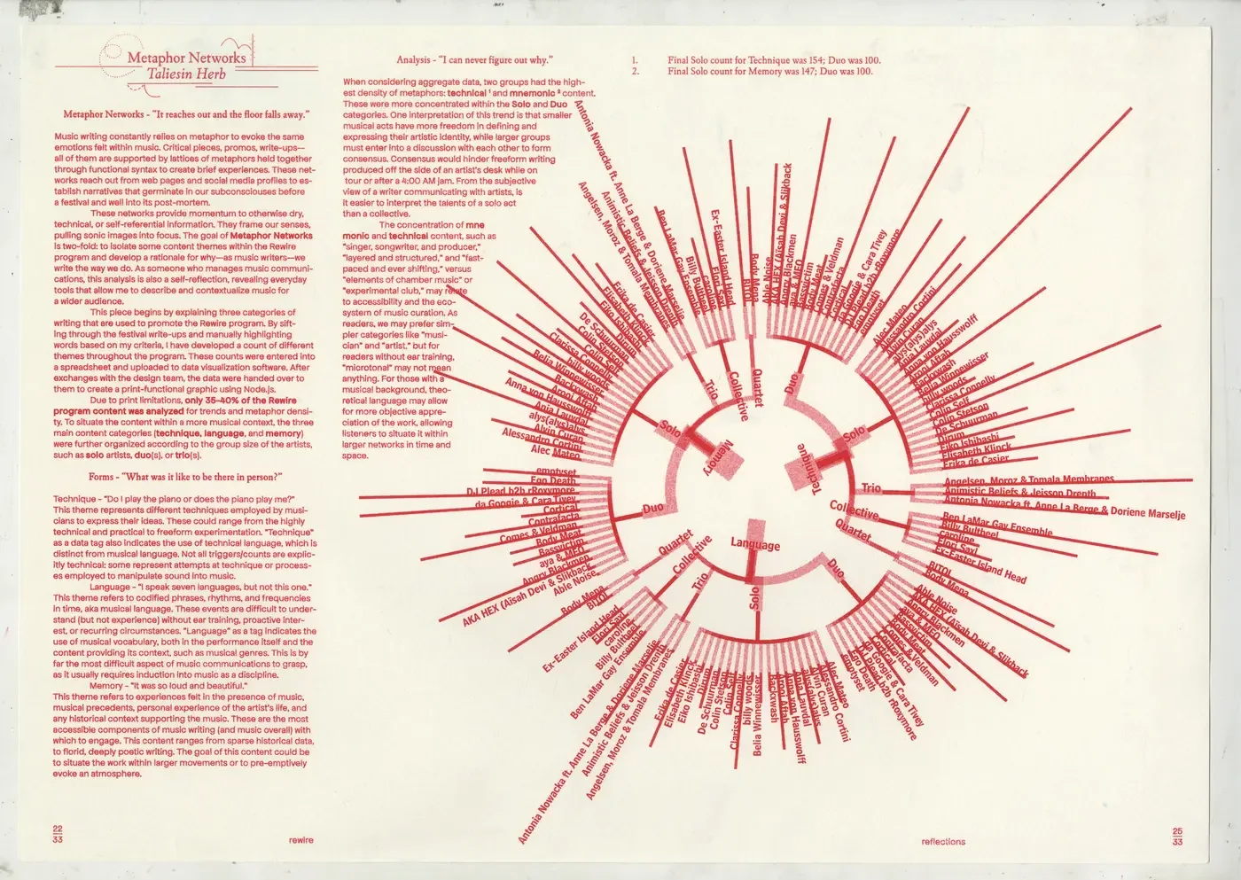
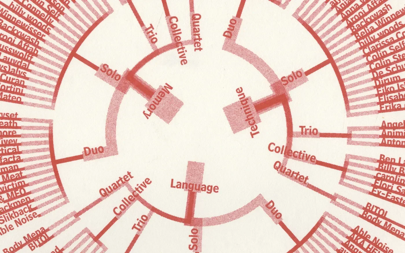
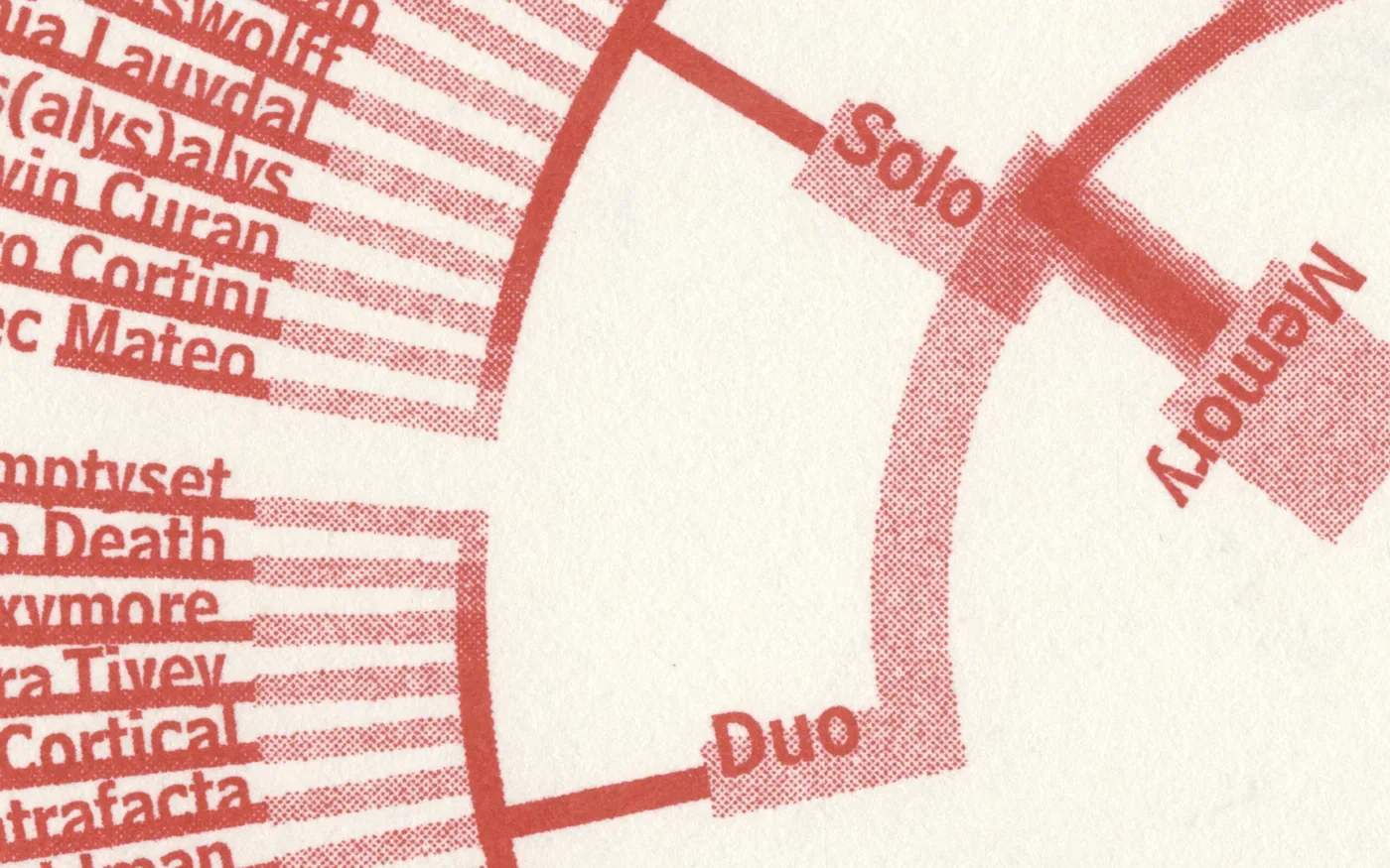
W08 Taliesin Herb Data Visualisation 2025 Apr Web tool for styling dendrogramsAt Rewire 2025, our team was producing a zine for Rewire Reflections when Taliesin Herb, one of the writers, needed a dendrogram to accompany his contribution. The diagram had to fit Rewire’s visual language and work on the printed page. A custom web tool made it possible to adjust nodes, labels, line widths and colours, then export the result as an SVG. It connected Taliesin’s data analysis with the zine’s production, giving the team a way to prepare and style the diagram for publication Data Visualisation Data Visualisation Data Visualisation Data Visualisation Data Visualisation Data Visualisation Data Visualisation Data Visualisation Data Visualisation Data Visualisation Data Visualisation Data Visualisation
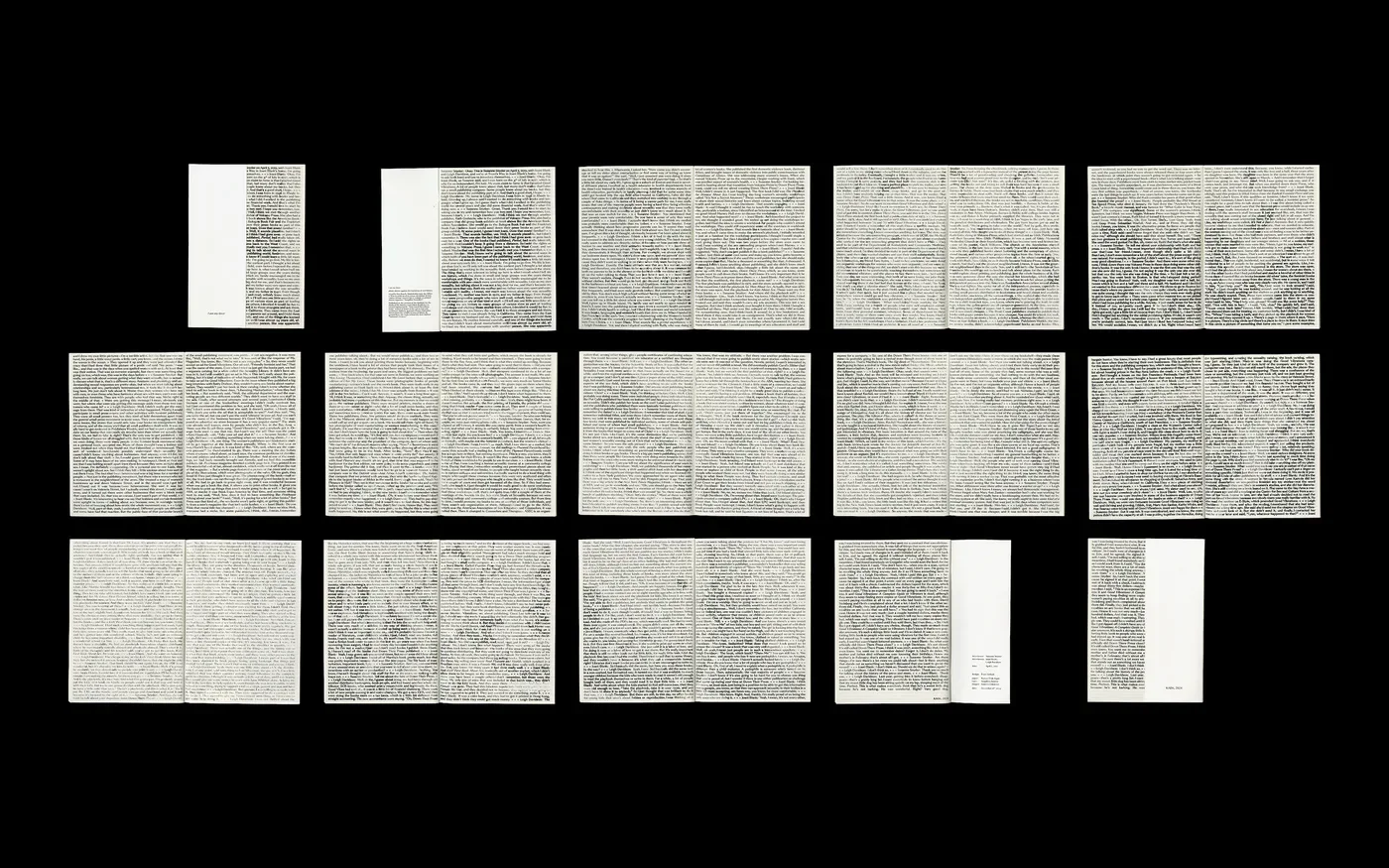
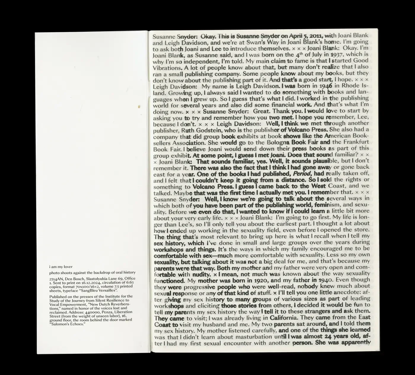
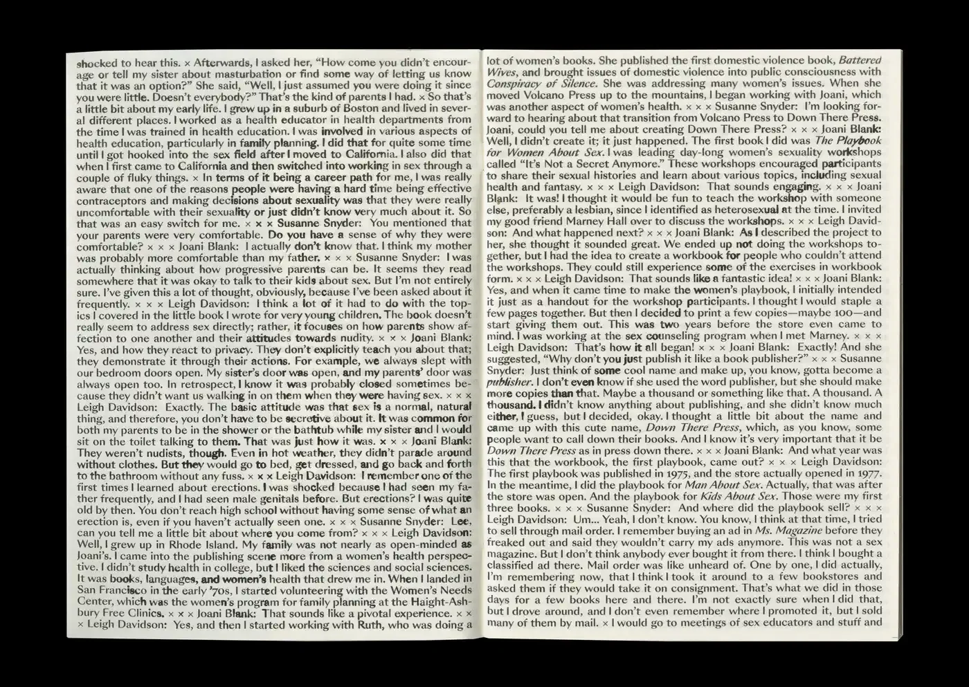
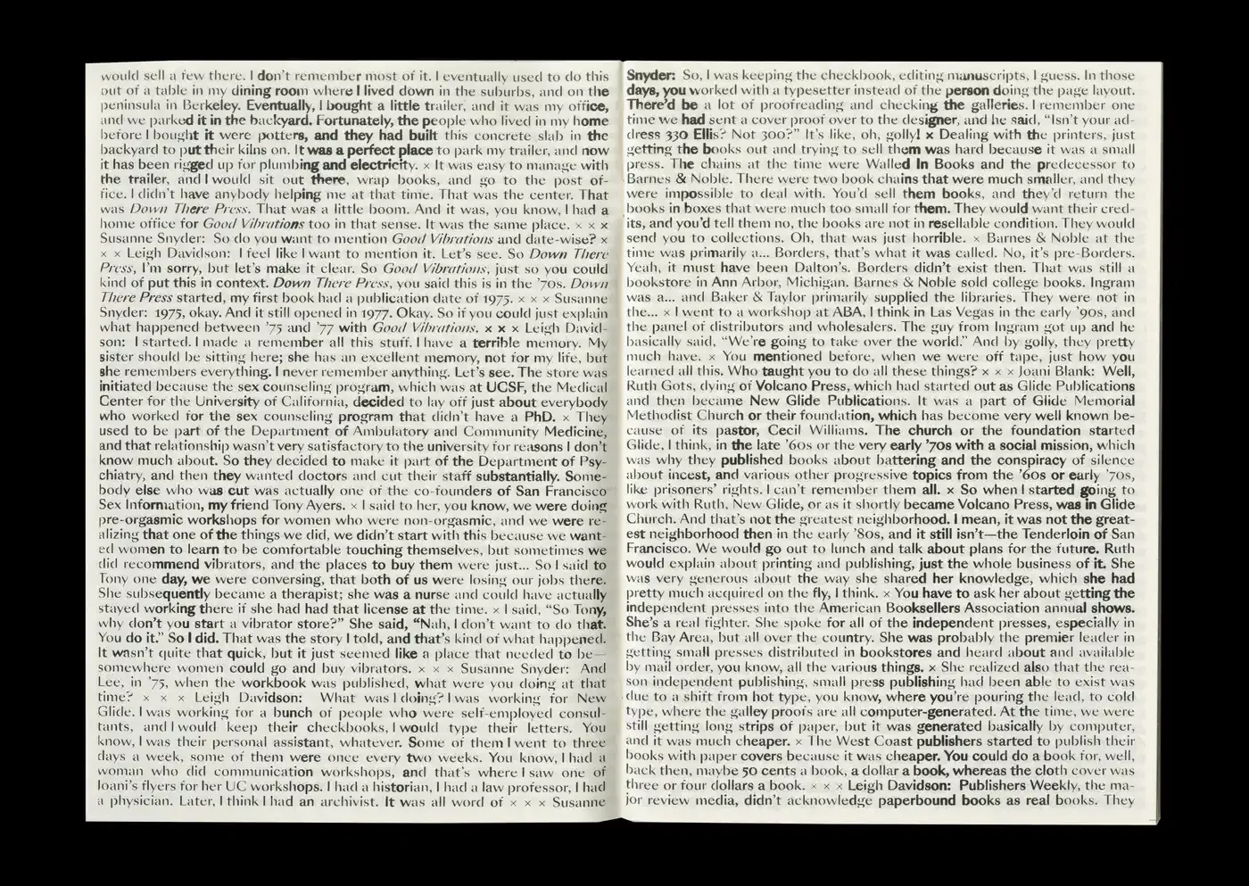
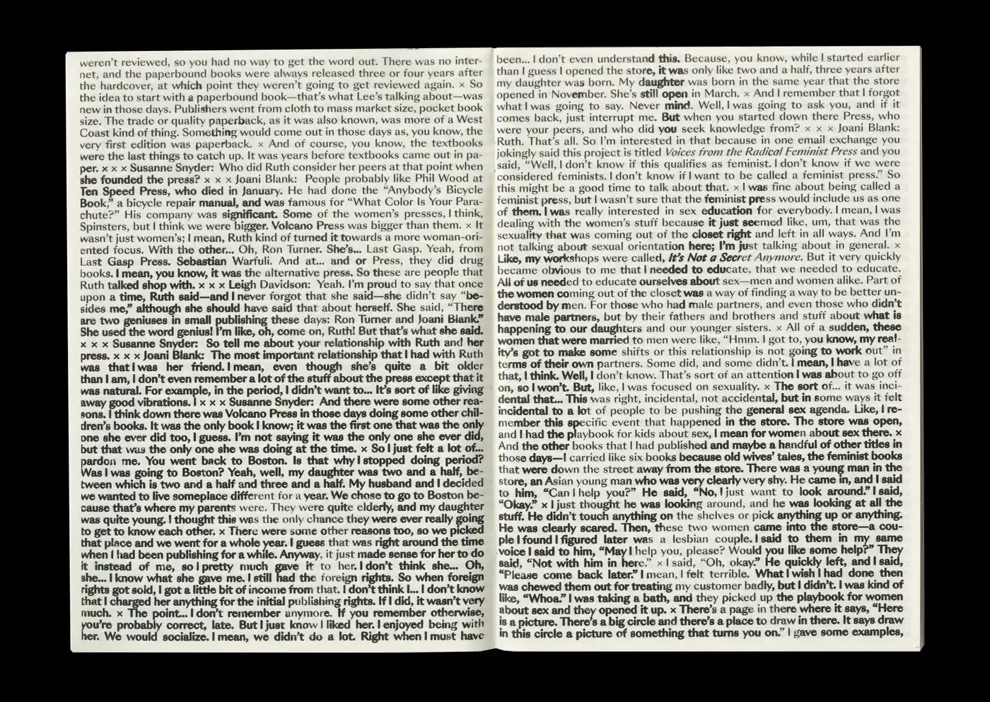
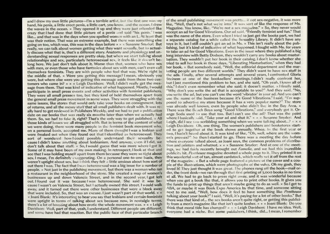
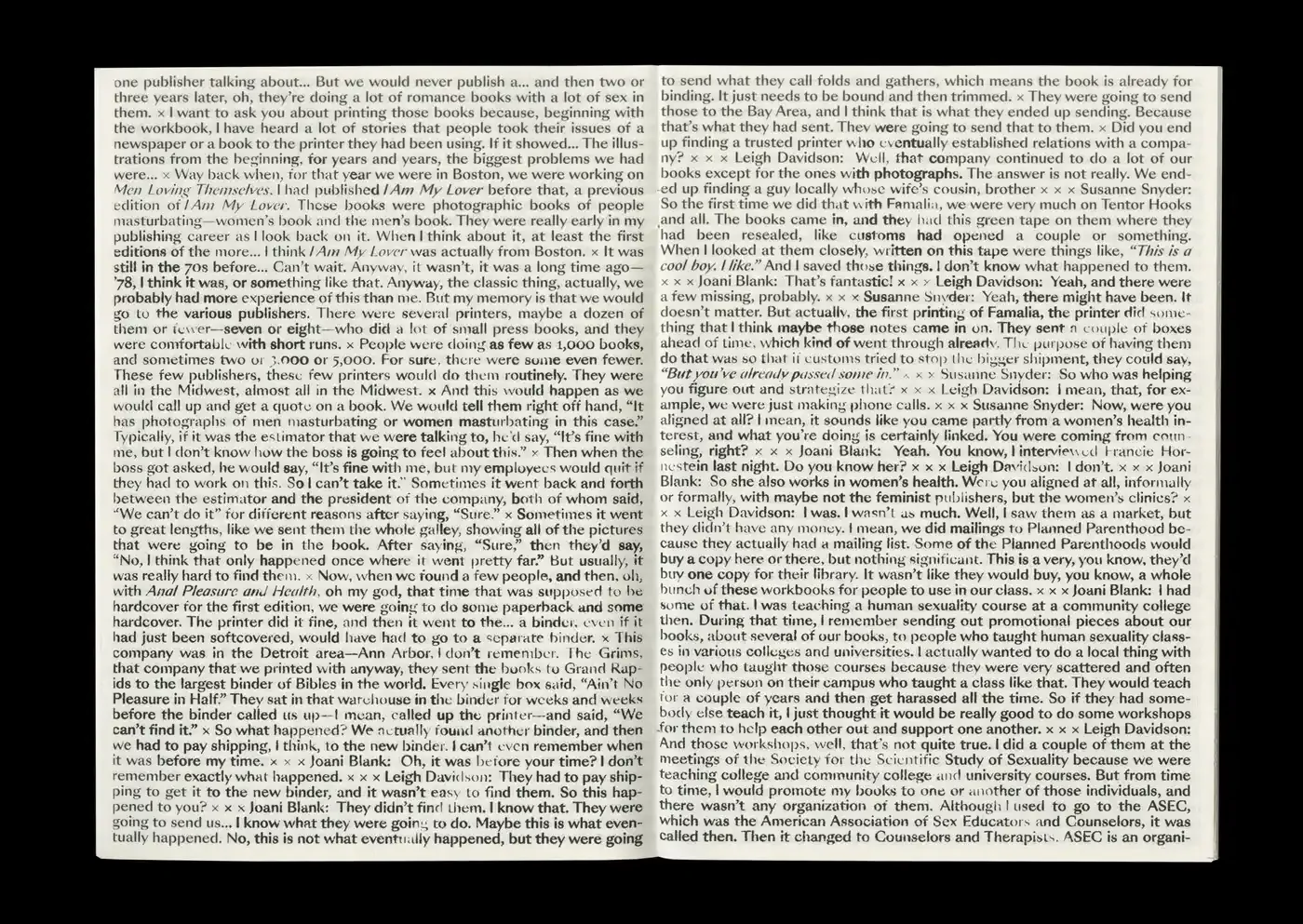
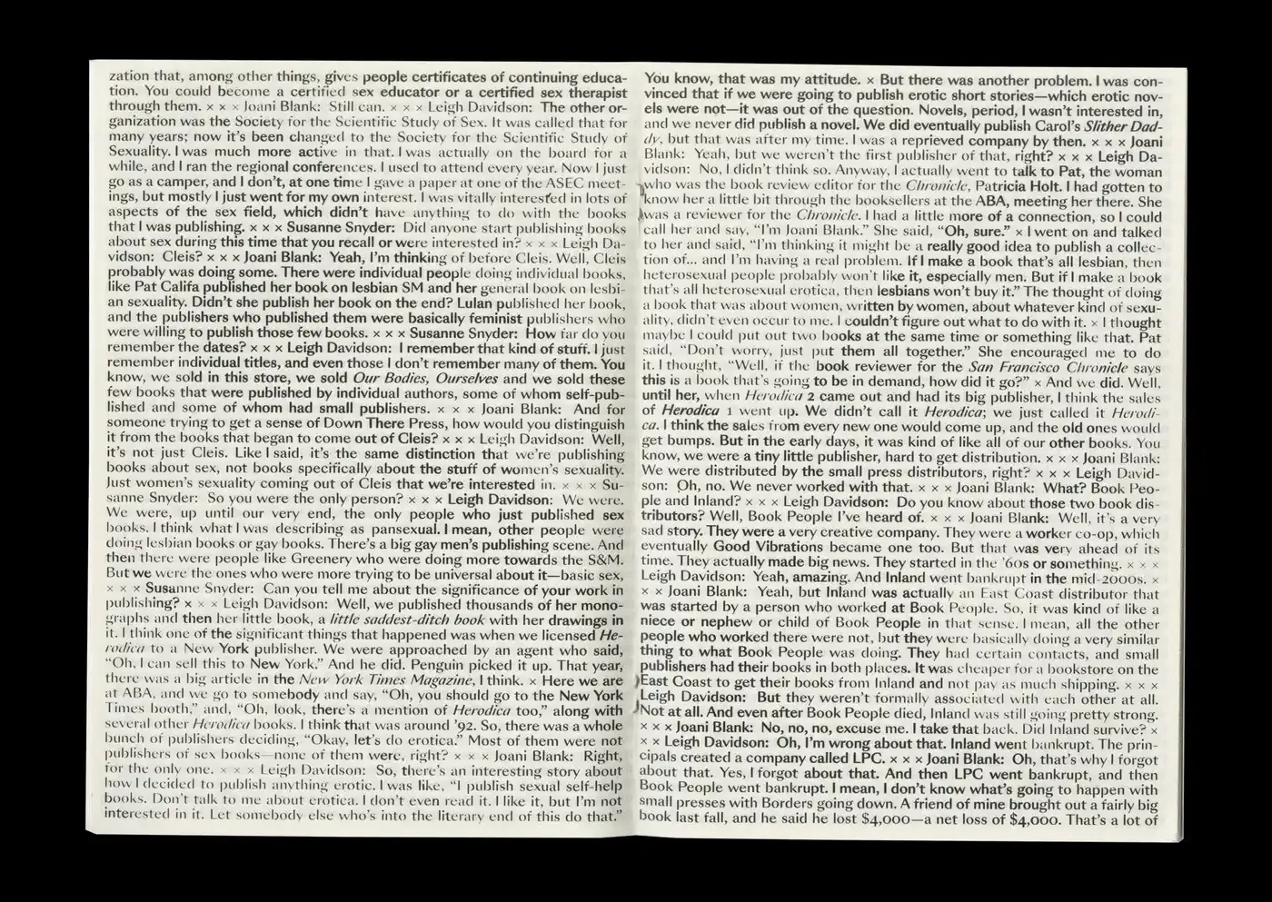
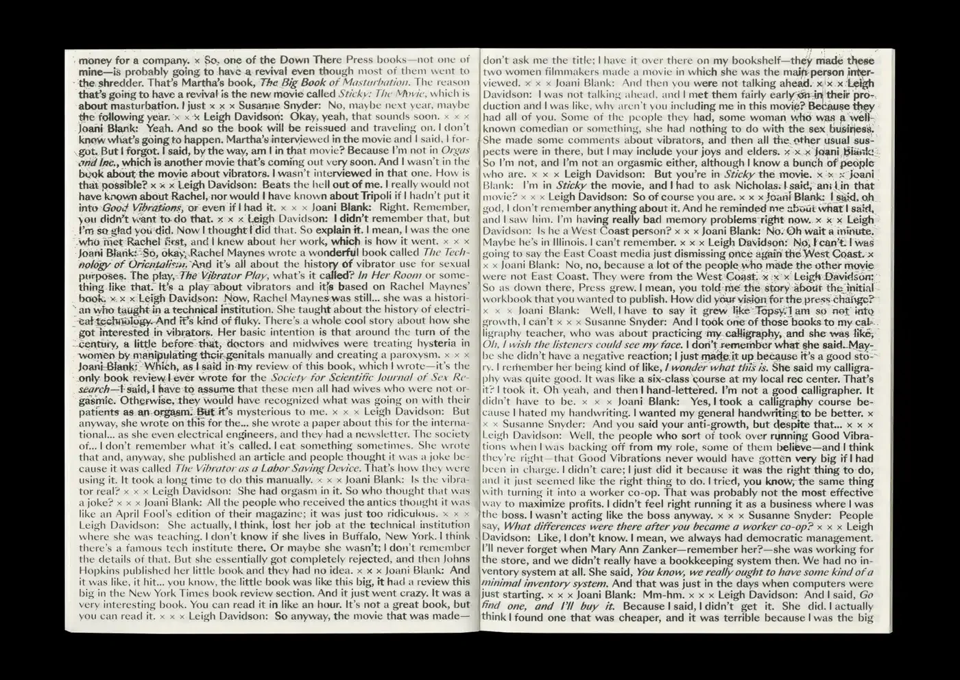
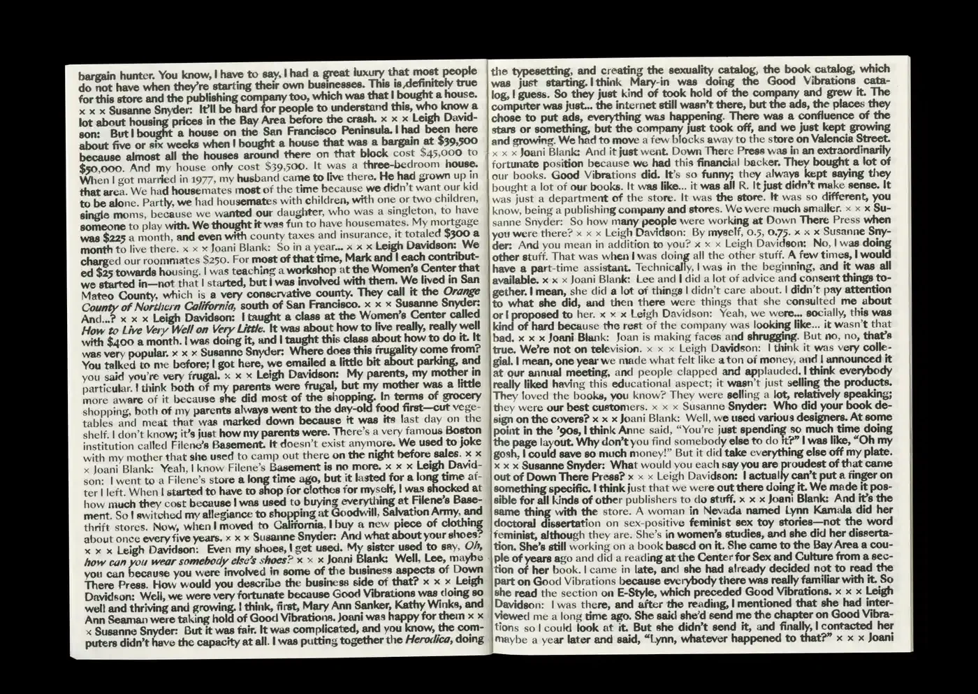
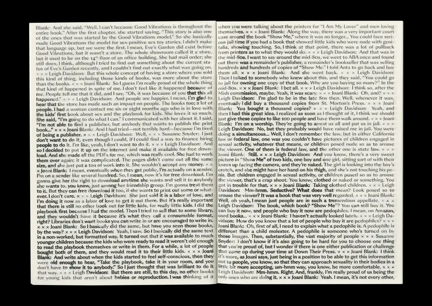
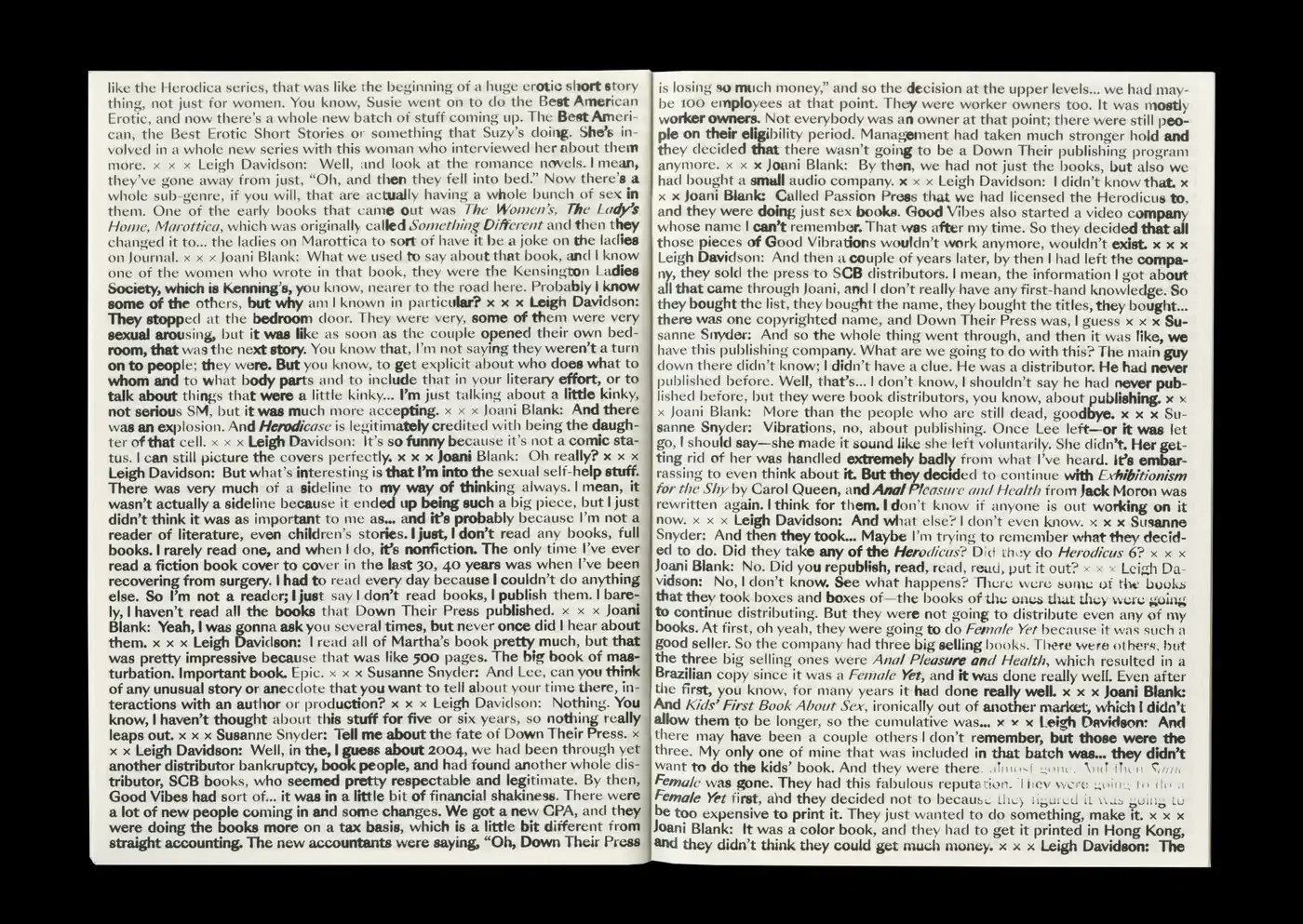
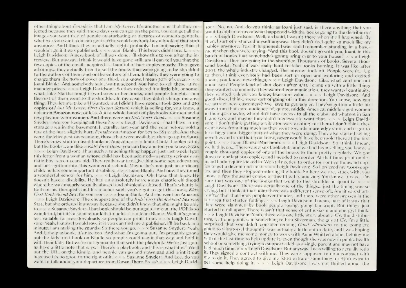
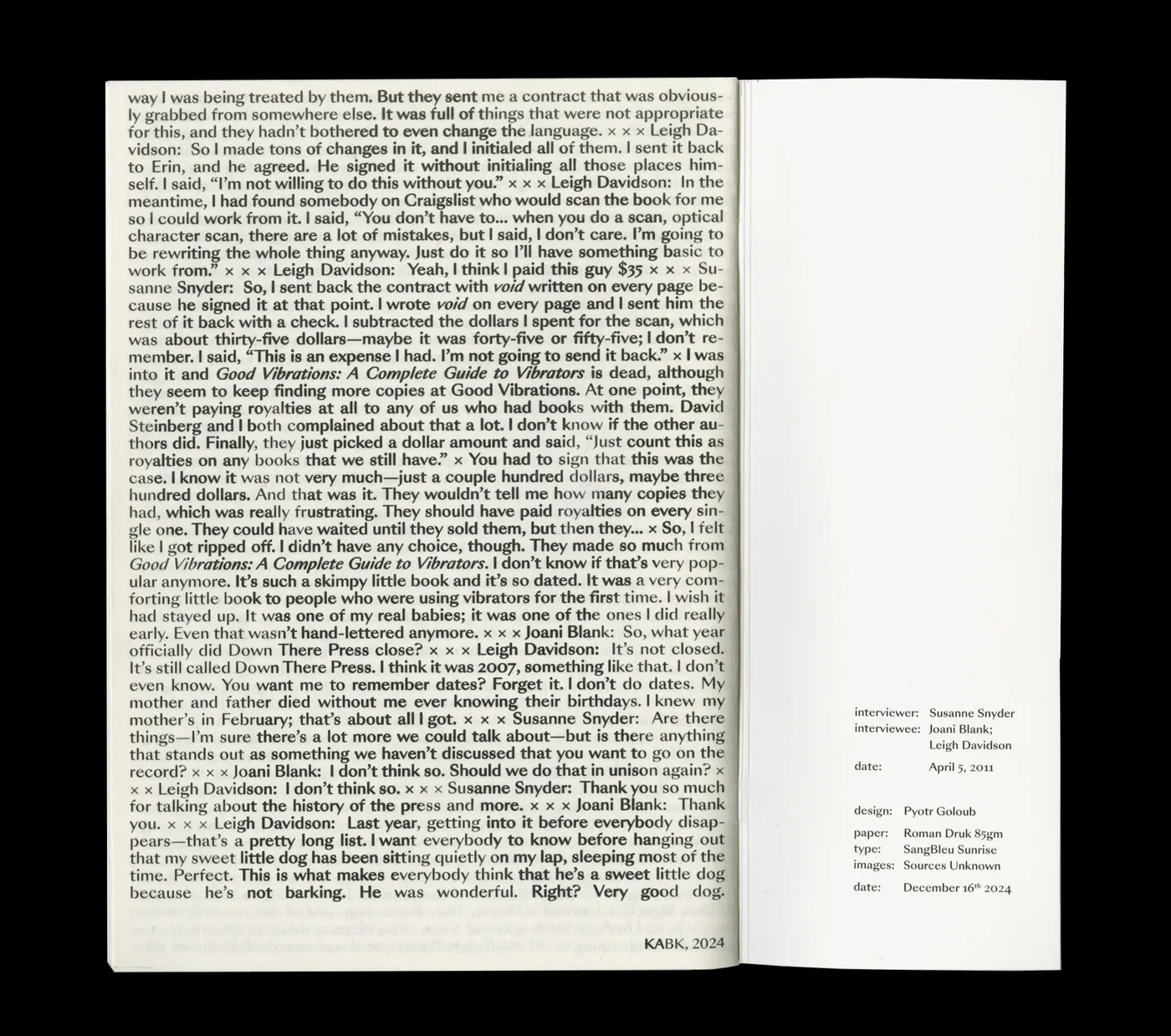
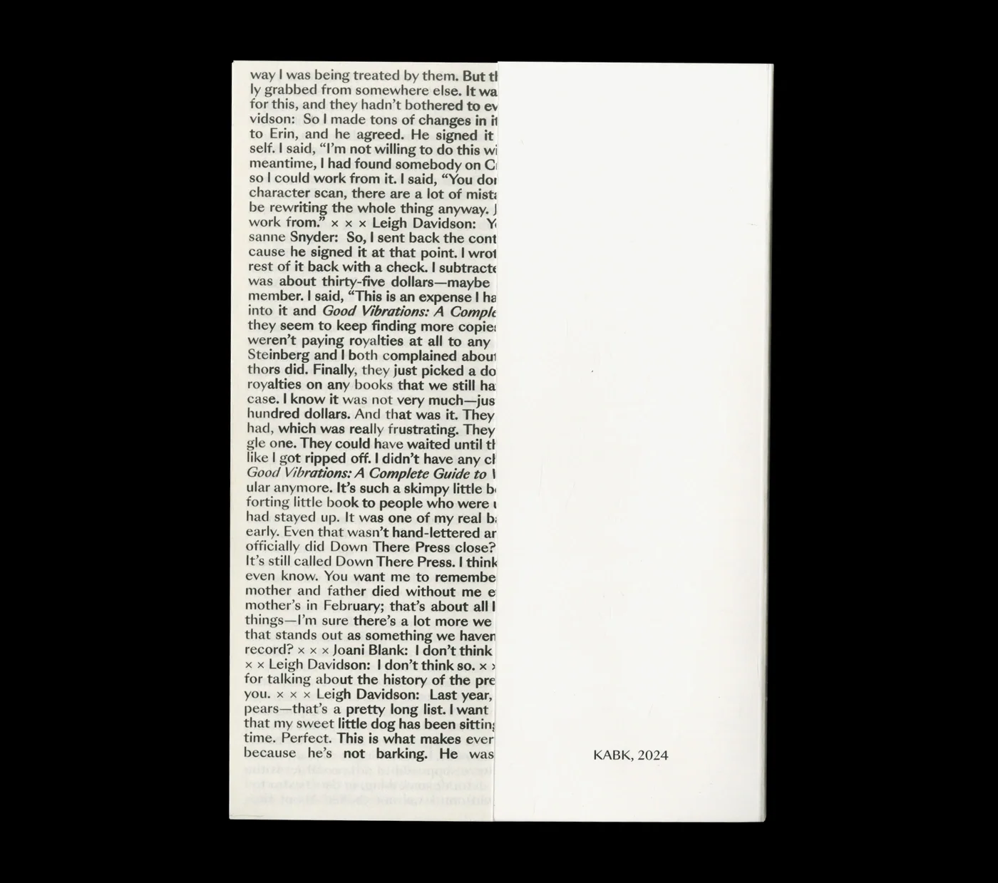
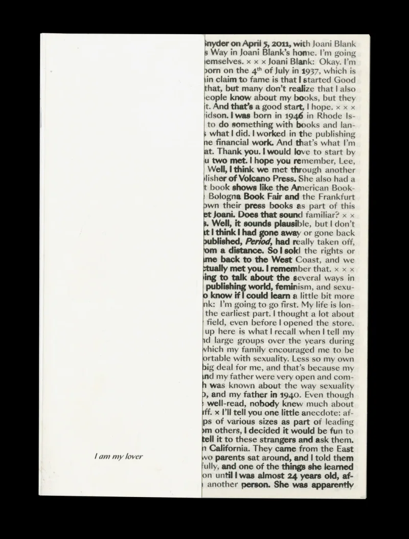
E18 Self Initiated Porn Magazine 2025 Apr A self-initiated magazine that brings feminist publishing history into the form of an erotic publication, pairing an oral-history conversation with photographsI Am My Lover is a self-initiated magazine built around a conversation with Joani Blank and Leigh Davidson about publishing, feminism and sexual liberation. Their account provides a historical context for making and circulating material on their own terms. The magazine places that conversation alongside photographic material, bringing the history into a contemporary editorial object. The work asks how an erotic publication can also carry an account of who gets to publish and represent sexuality. Its form keeps the historical voices present within the reading experience Porn Magazine Porn Magazine Porn Magazine Porn Magazine Porn Magazine Porn Magazine Porn Magazine Porn Magazine Porn Magazine Porn Magazine Porn Magazine Porn Magazine Porn Magazine Porn Magazine Porn Magazine Porn Magazine
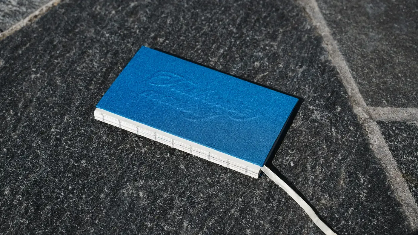
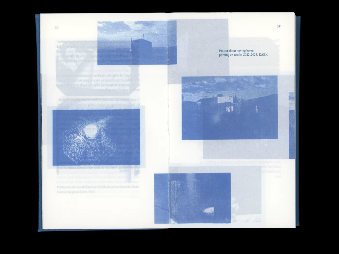
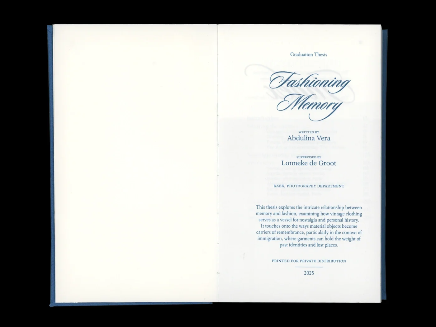
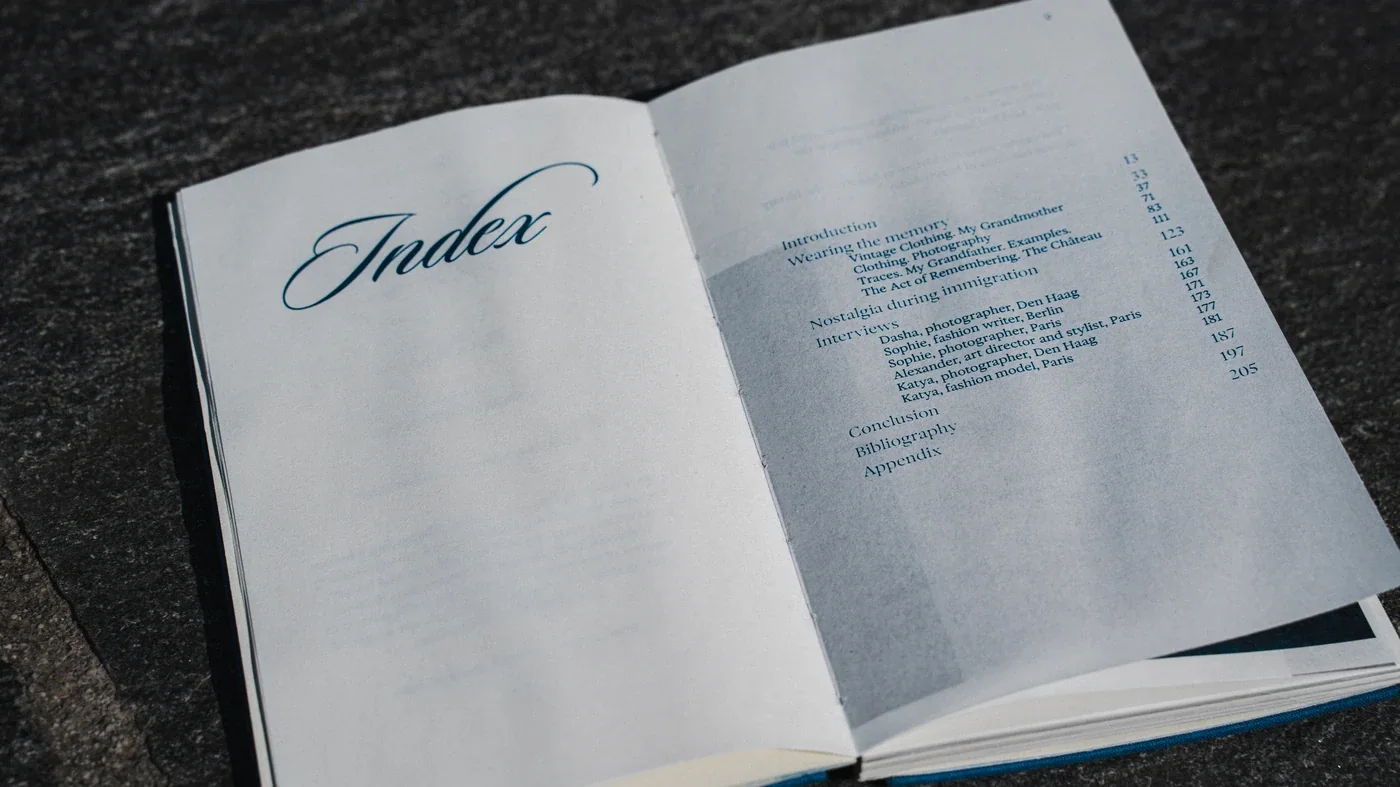
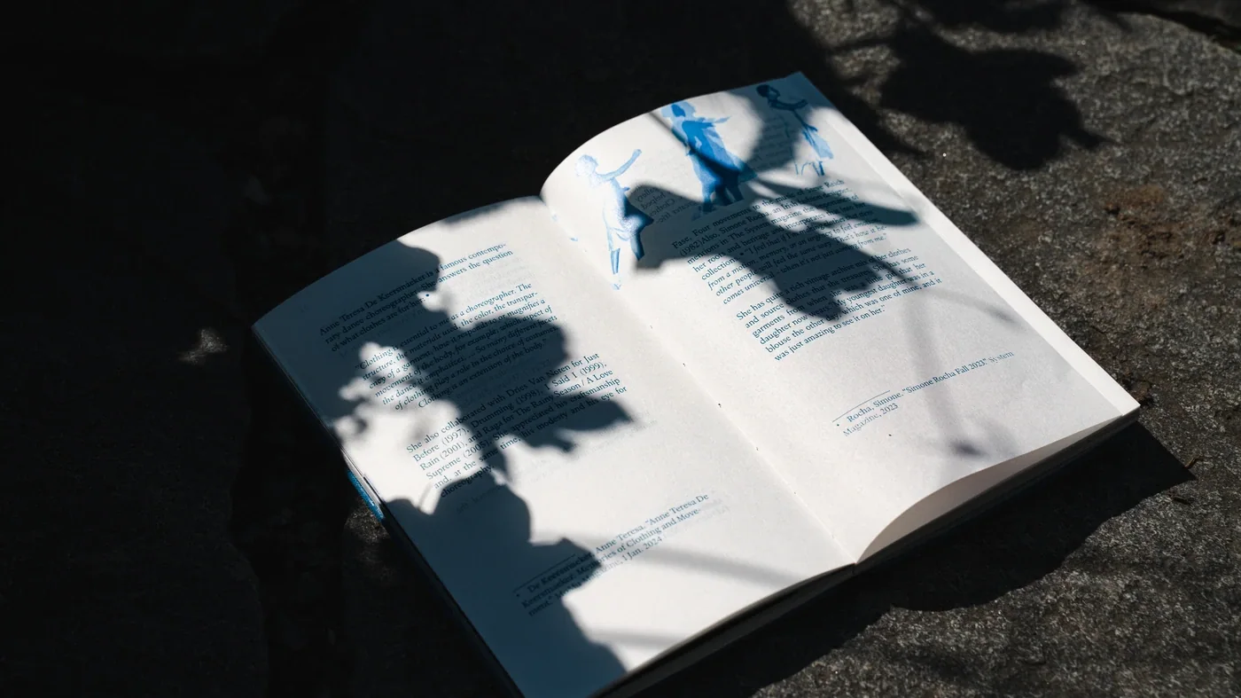
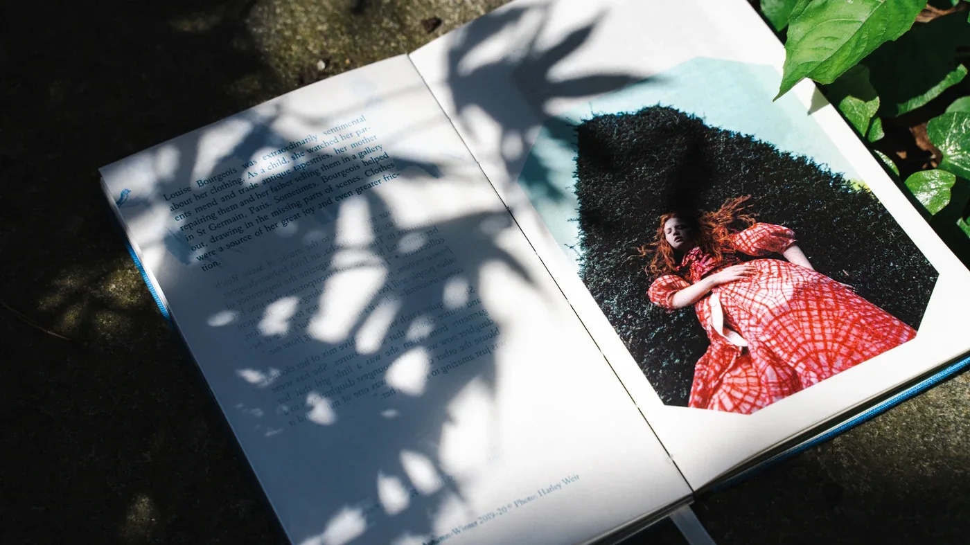
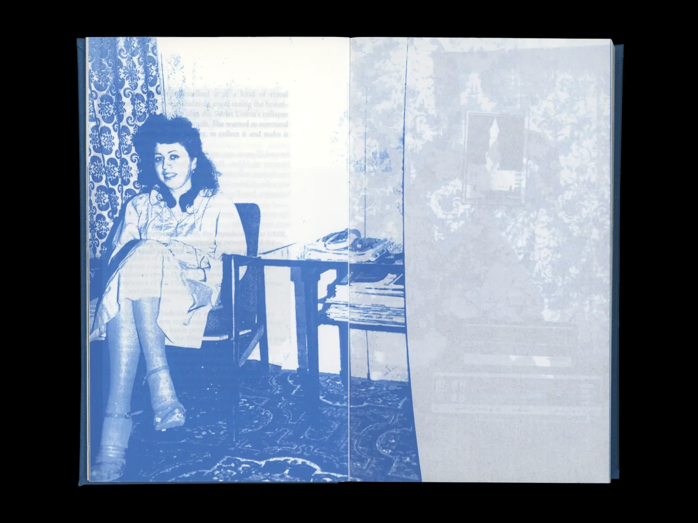
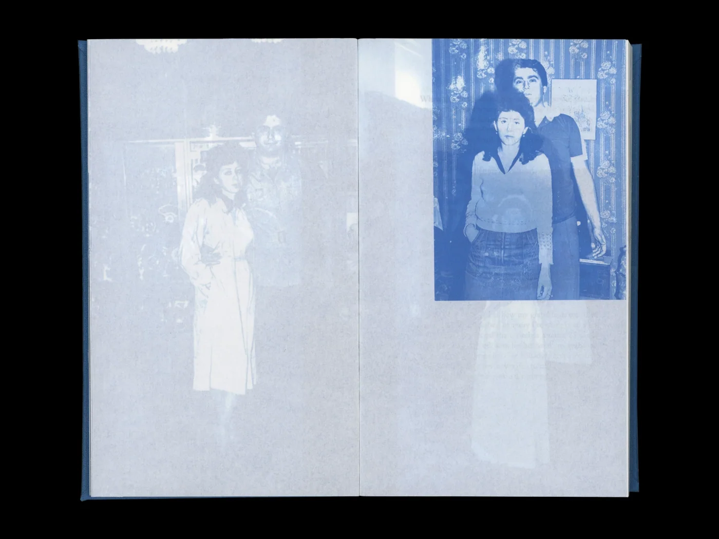
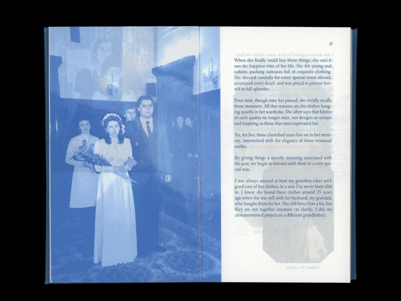
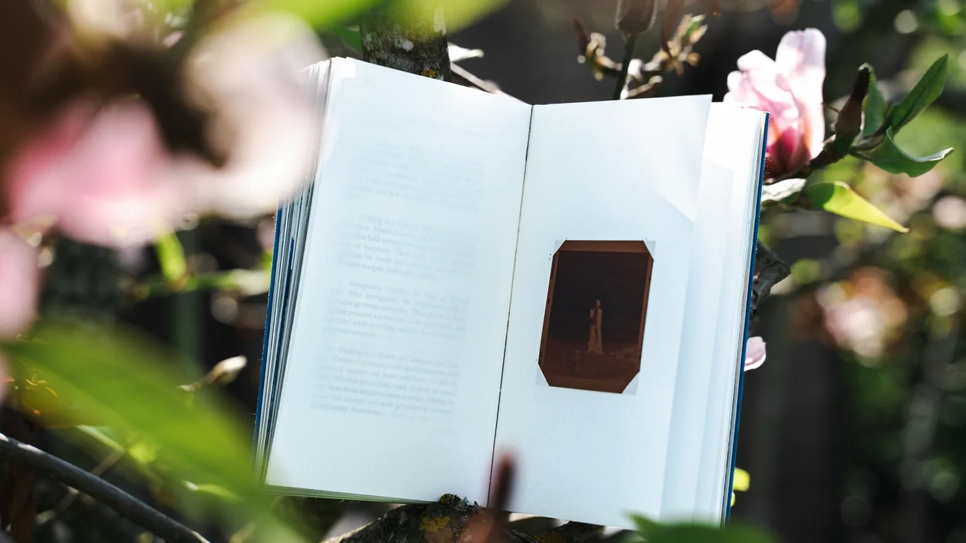
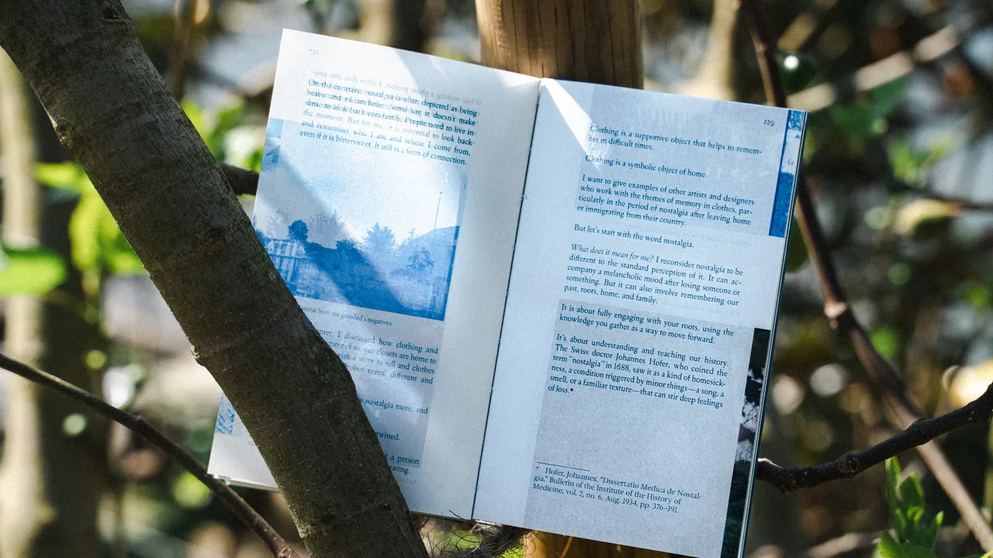
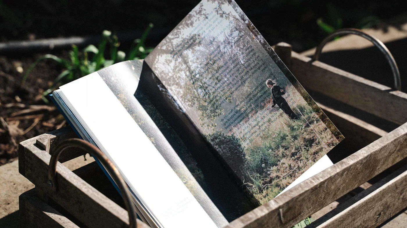
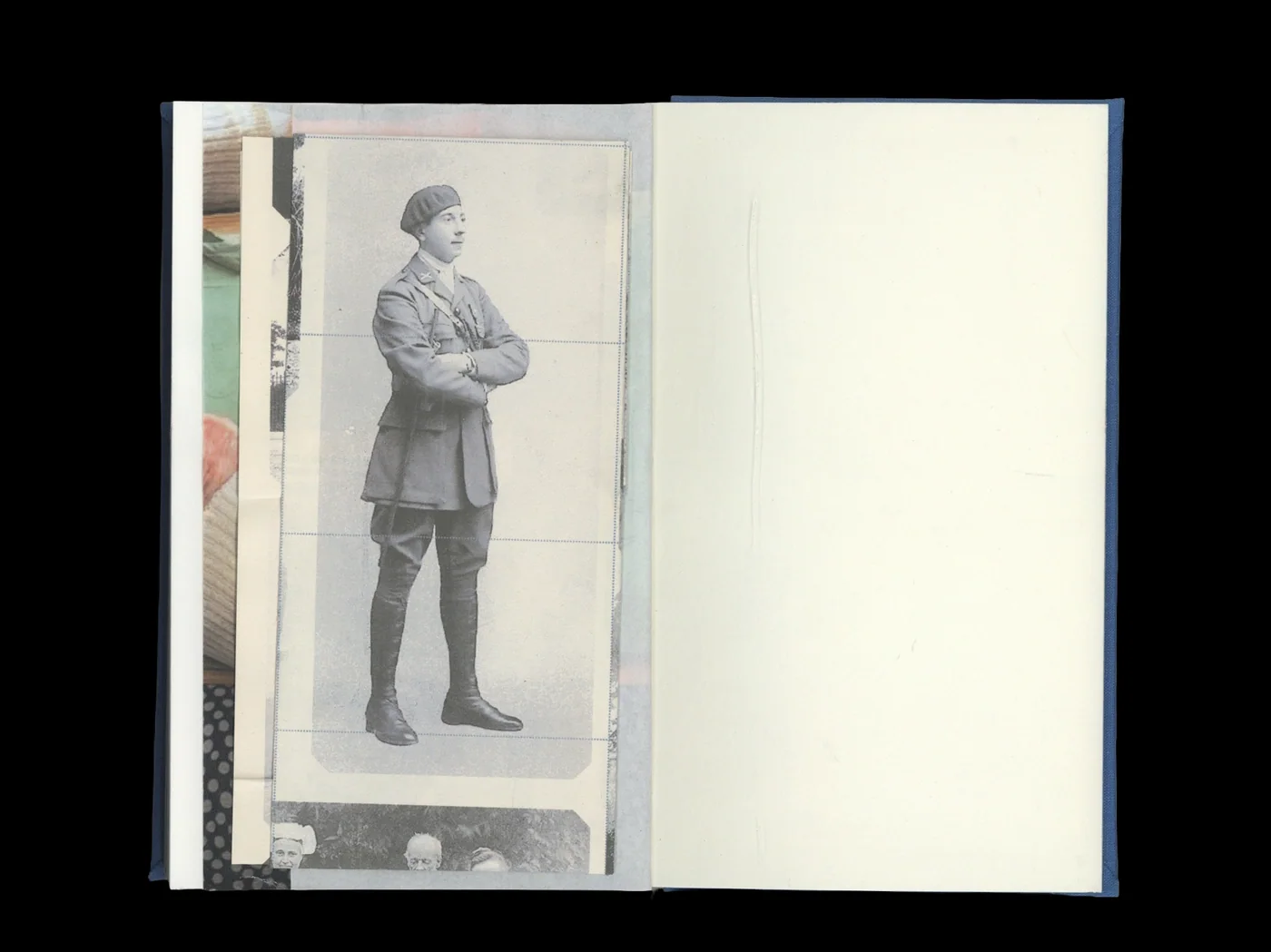
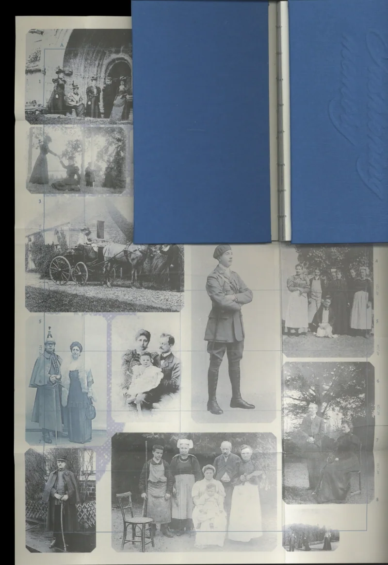
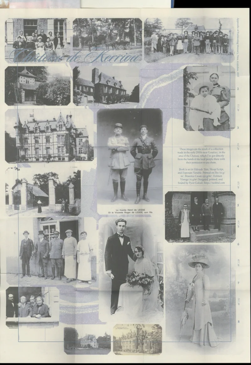
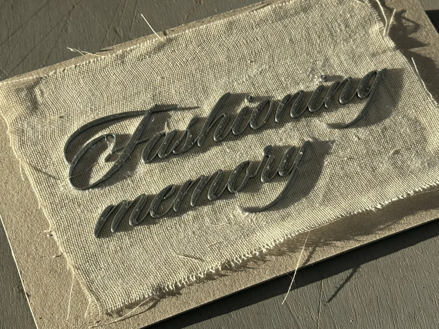
E19 Vera Abdulina Book 2025 Apr Graduation book for Vera Abdulina’s writing on clothing, memory and migrationVera Abdulina’s writing considers how clothing carries memory and identity, particularly through migration. She supplied the content, her photographs and general creative direction. Pyotr then handled production from start to finished dummy, including the book’s design, printing and binding. The resulting prototype brings 3D printed lettering, OG film inserts, the writing and photographs together across several paper stocks, with an expandable map of a photographic appendix Book Book Book Book Book Book Book Book Book Book Book Book Book Book Book Book
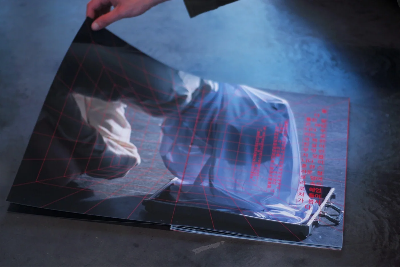
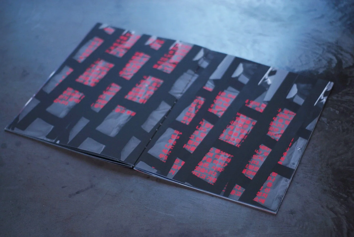
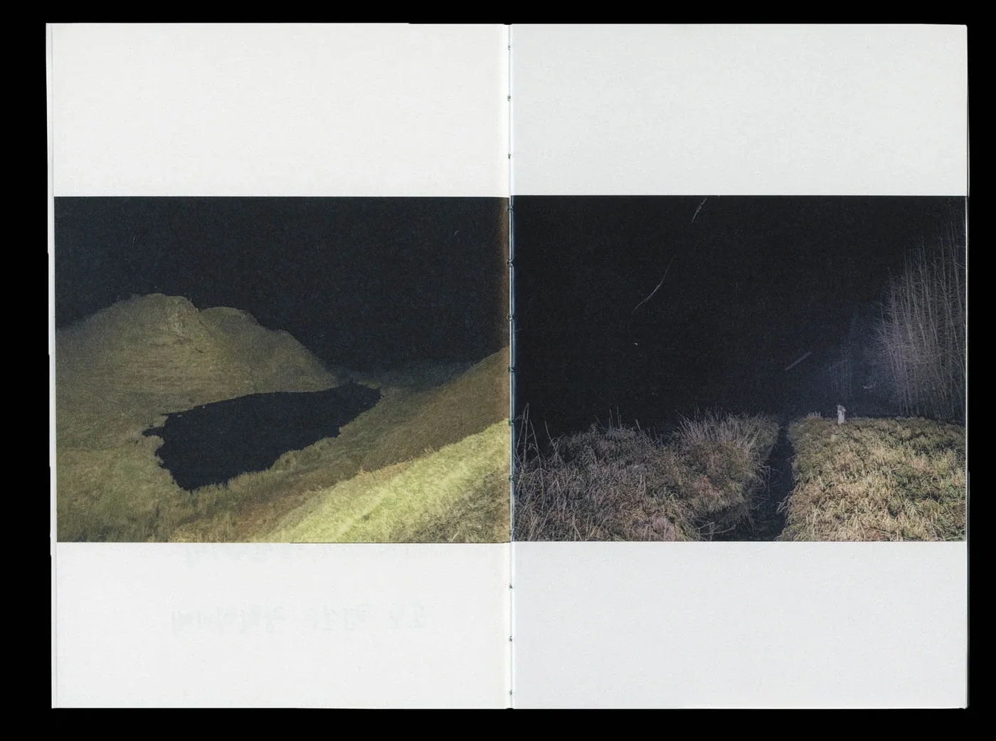
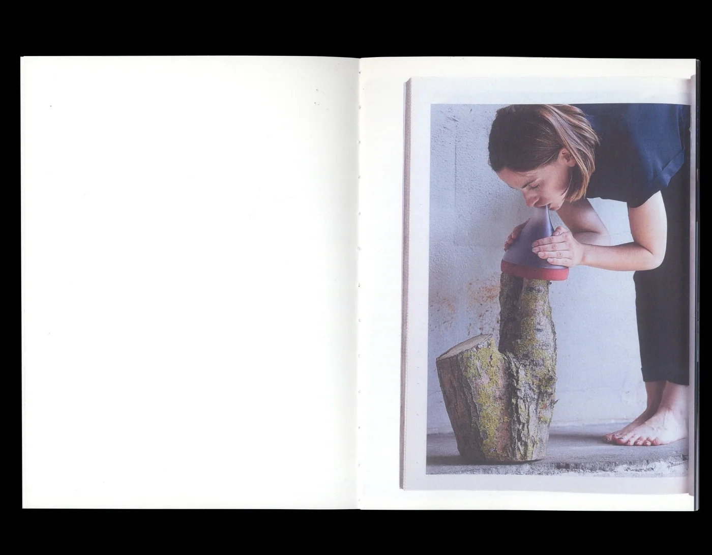
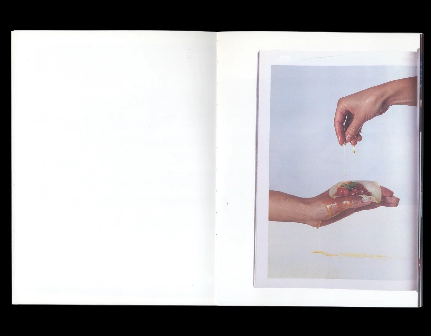
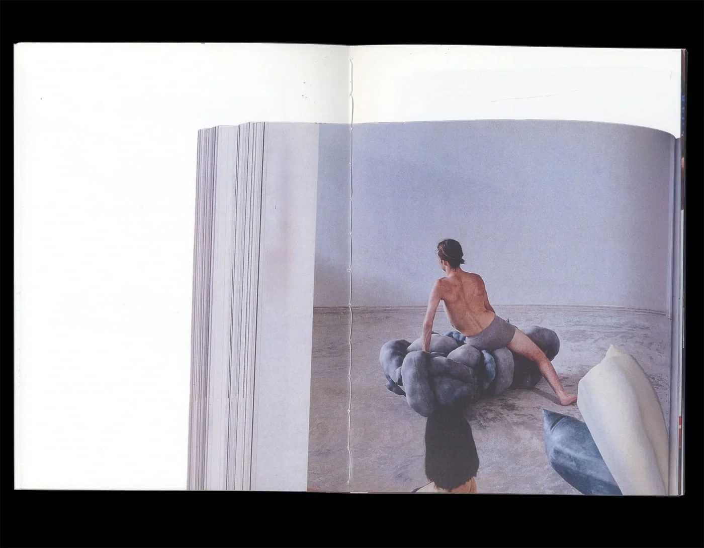
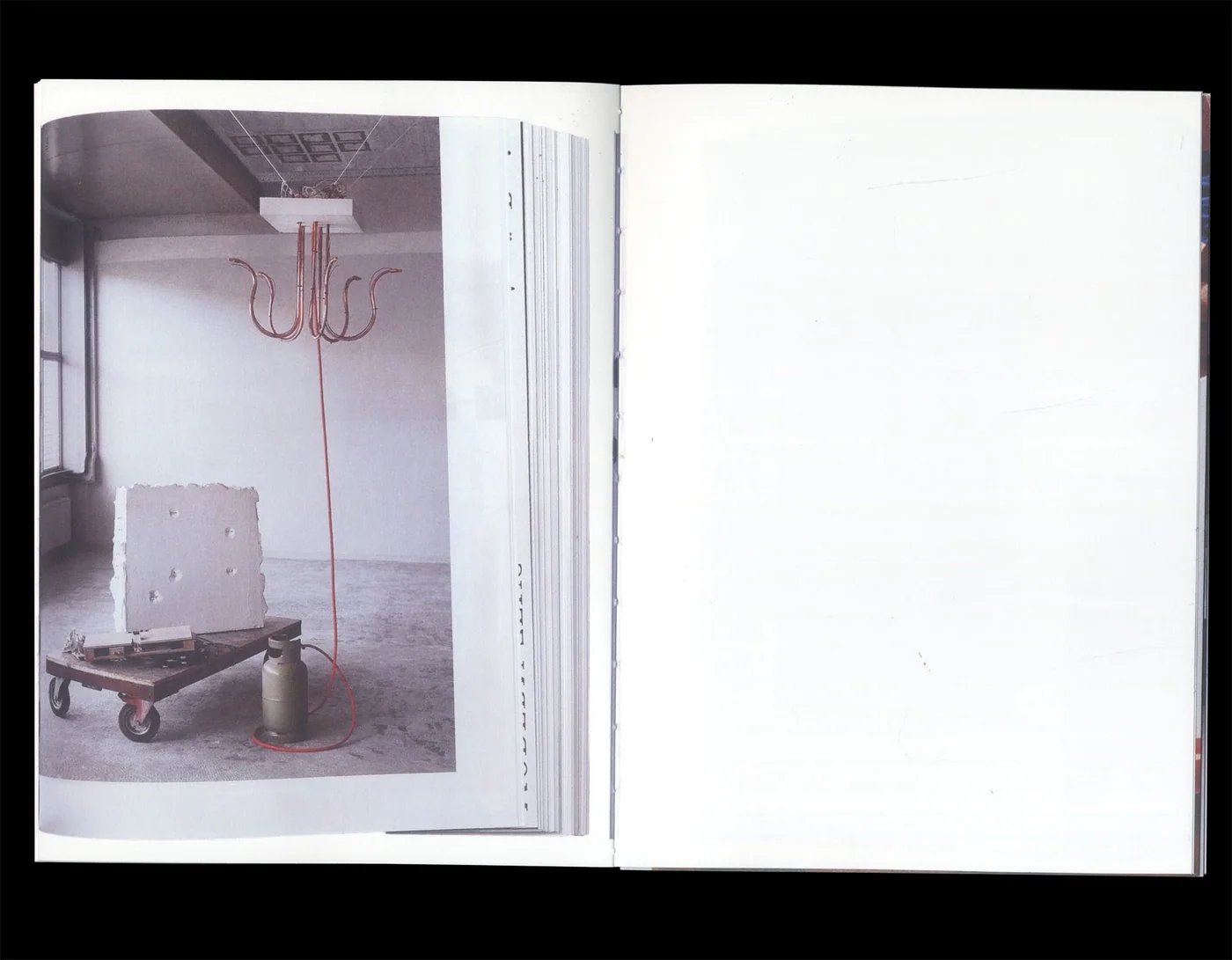
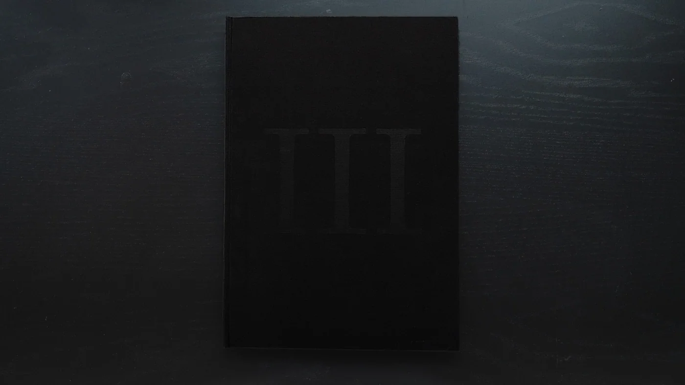
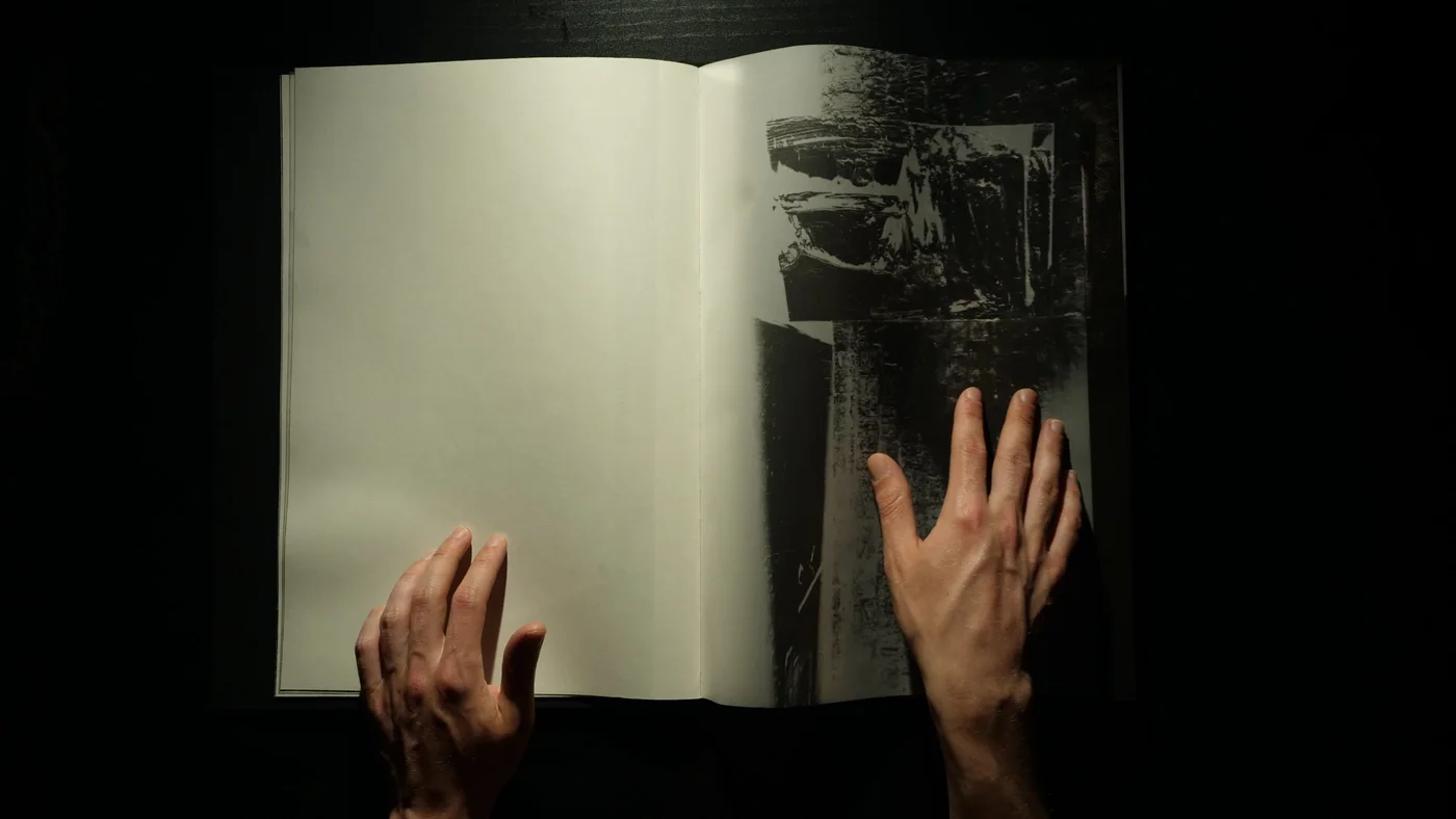
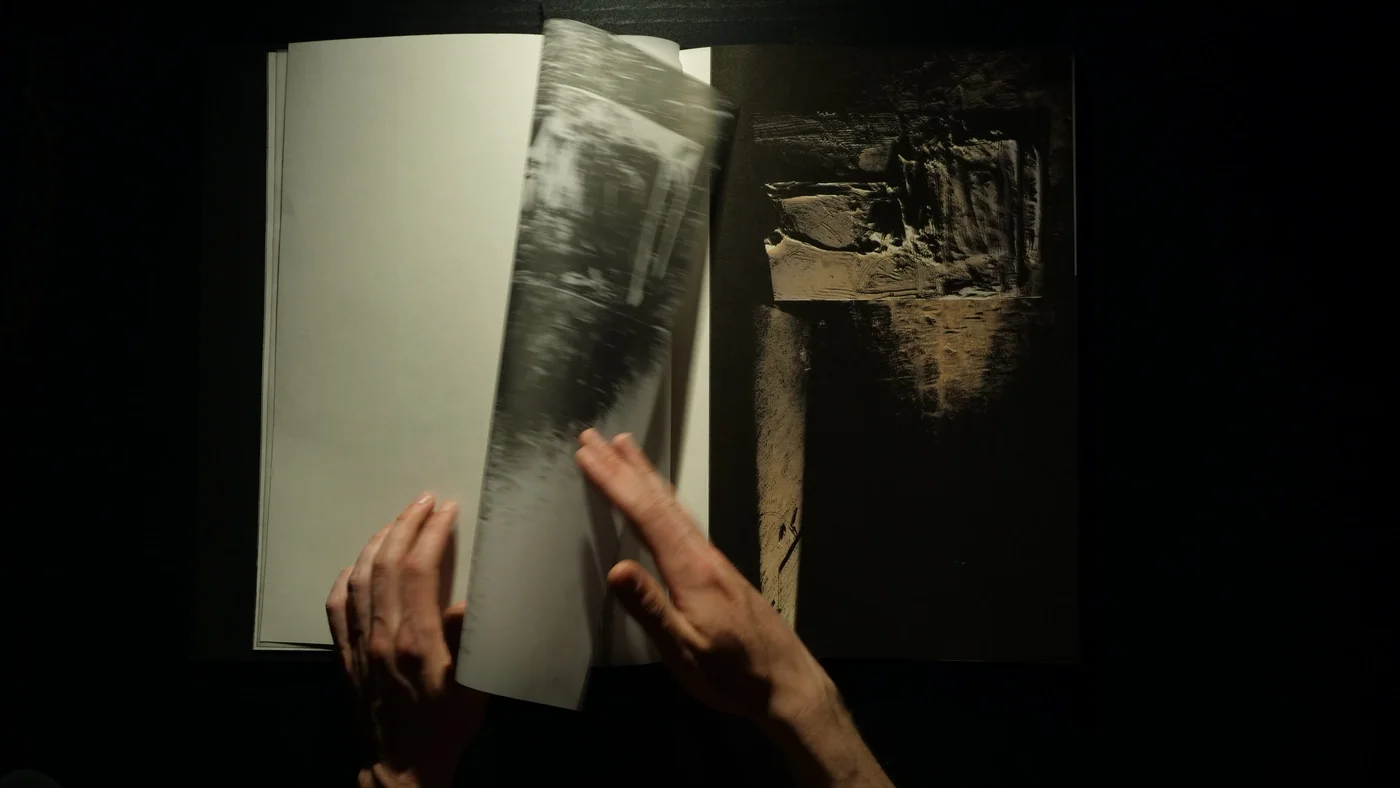
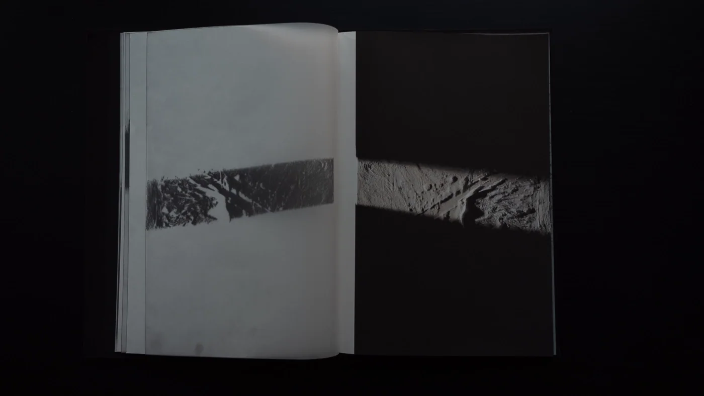
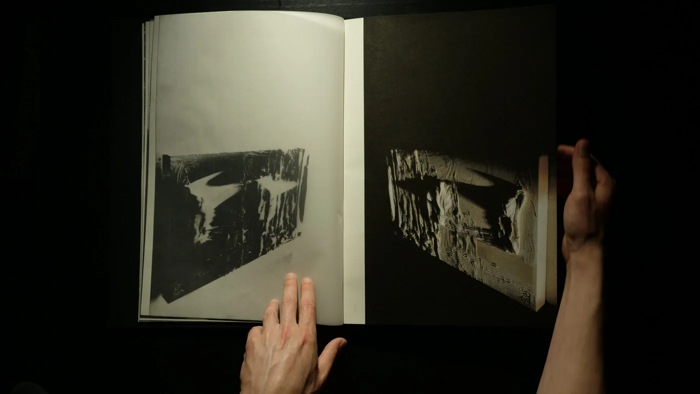
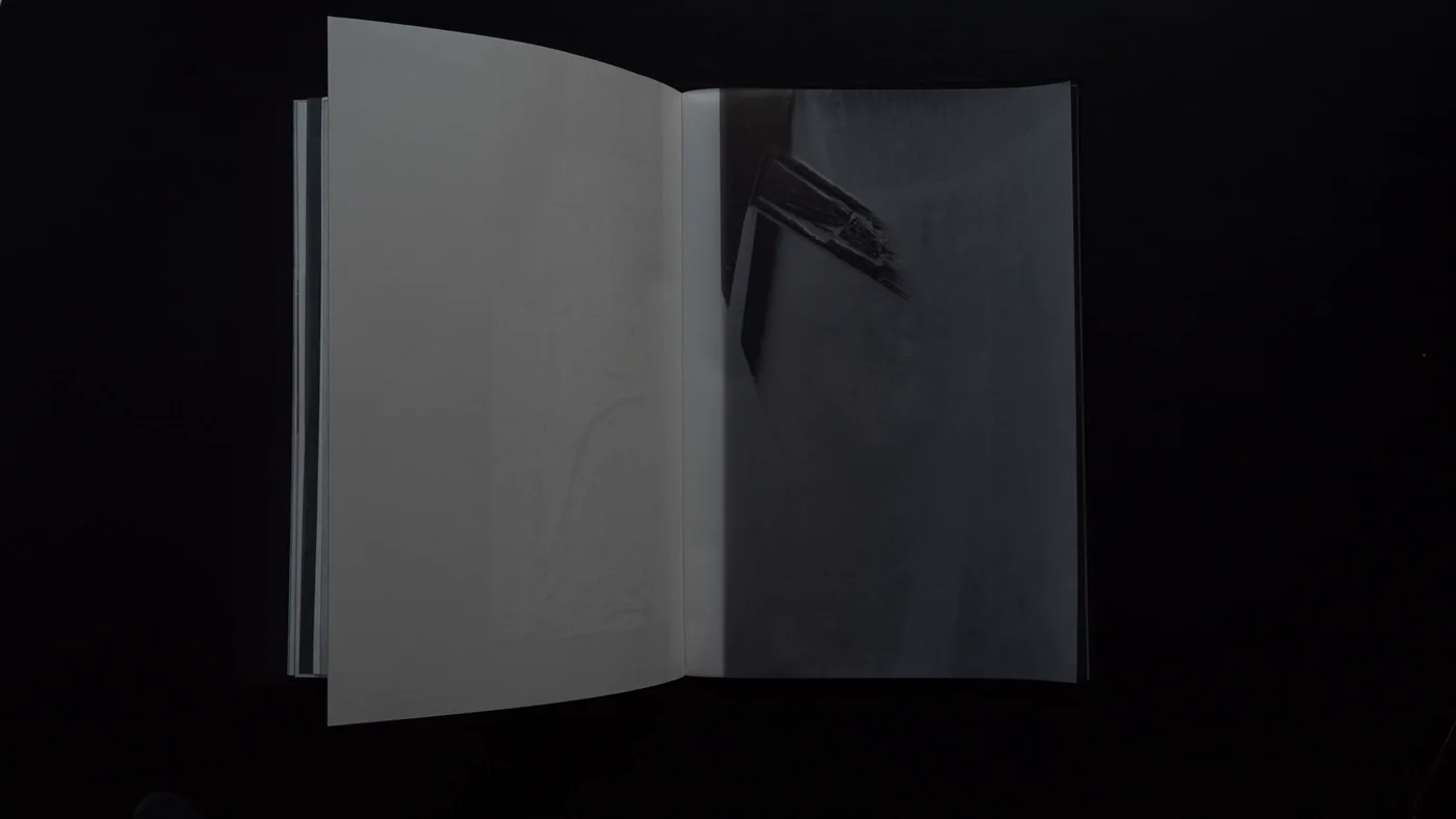
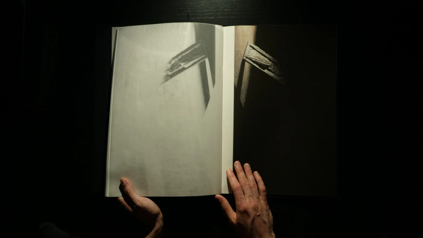
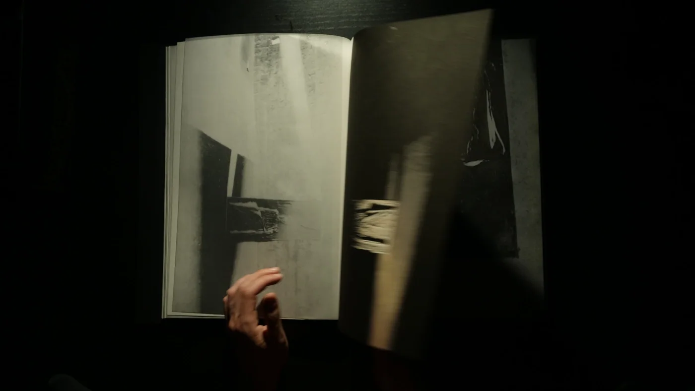
E20 Alexandra Pavlovskaya-Lokchine Book 2025 May Site-specific photobookThe book connects sculpture, photography and the printed spread in a layered sequence. Transparent paper and light connect those layers, allowing an image to be encountered through another surface. The sequence works through the physical act of turning pages, with the composition changing as material is revealed or covered. The design gives this non-linear approach a book form. Its relationship with cinema lies in that unfolding experience, where the image is encountered through movement and time Book Book Book Book Book Book Book Book Book
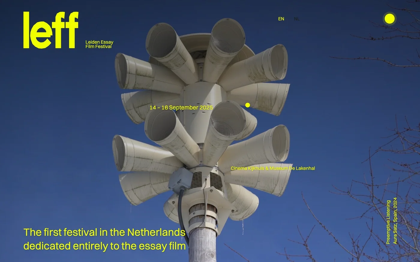
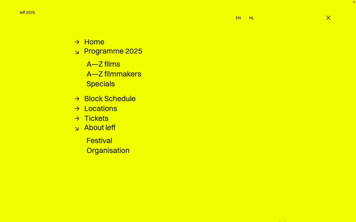
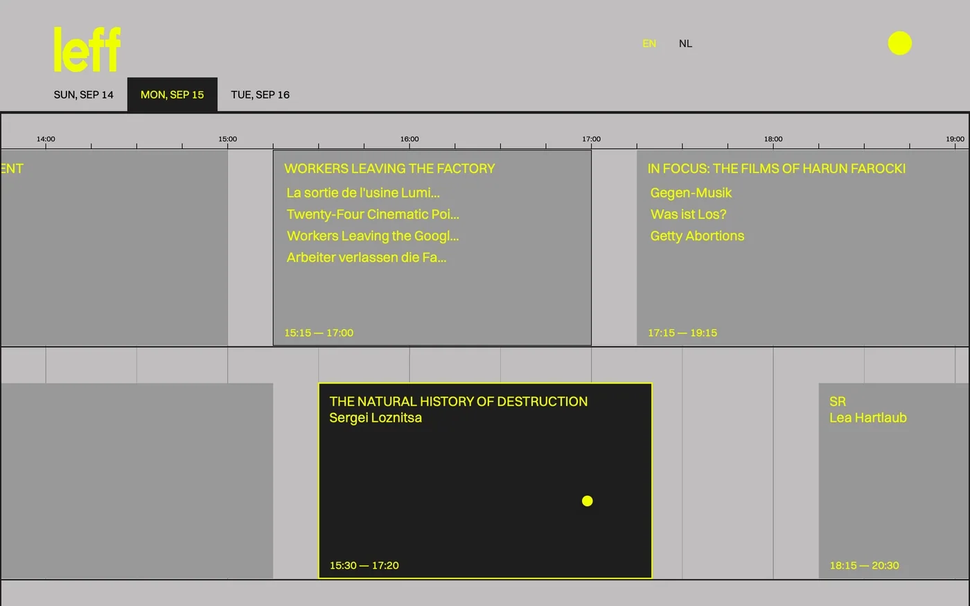
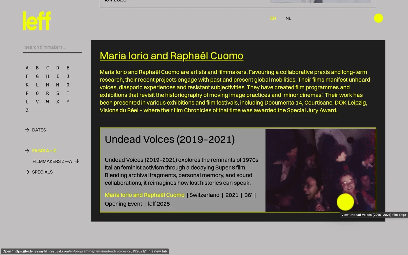
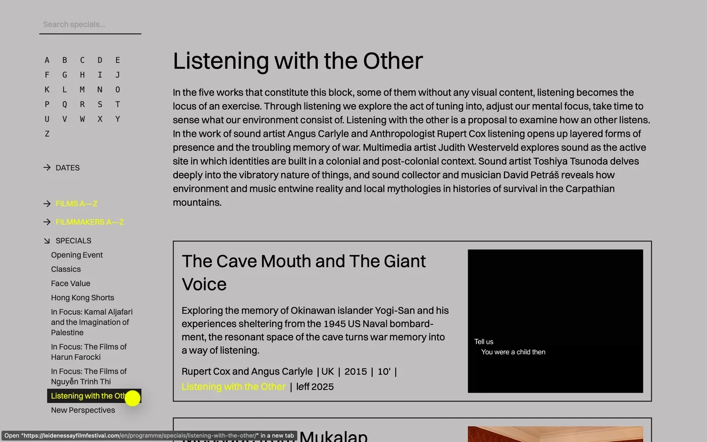
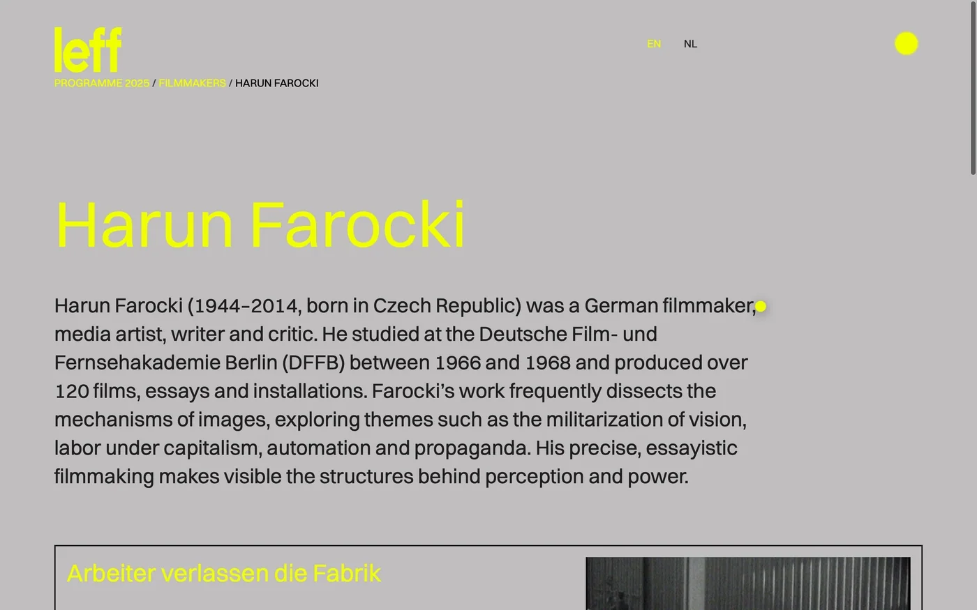
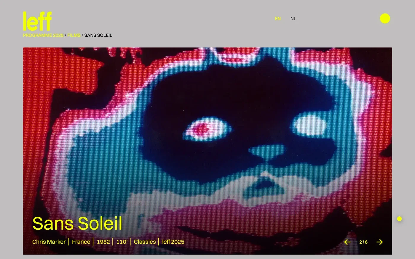
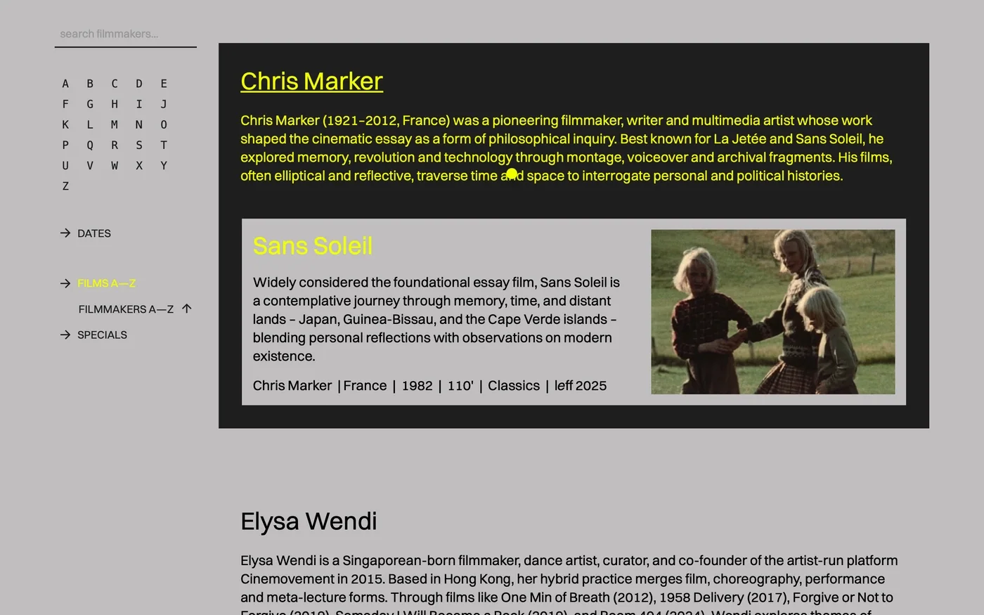
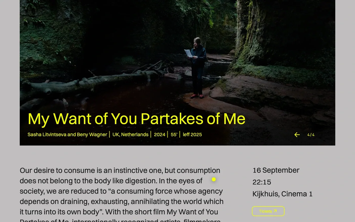
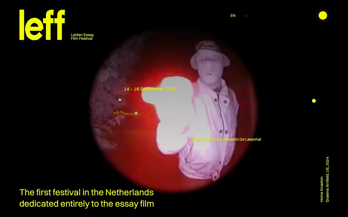
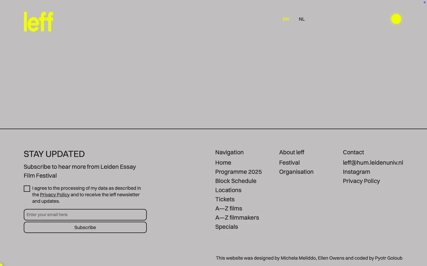
W09 leff '25 Website 2025 Aug A bilingual website for the newborn essay film festivalThe website gives the Leiden Essay Film Festival a bilingual presence across more than 200 static pages. Built with Flask, it uses a restrained technical approach alongside the festival’s industrial visual language. The design and development bring a large body of content into one consistent web setting, carrying the identity across the site. The result connects the festival’s public presentation with a deliberately minimal technical structure. The project is presented at leidenessayfilmfestival.com Website Website Website Website Website Website Website Website Website Website Website
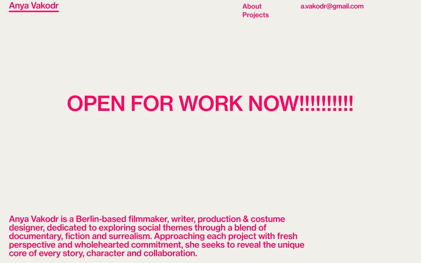
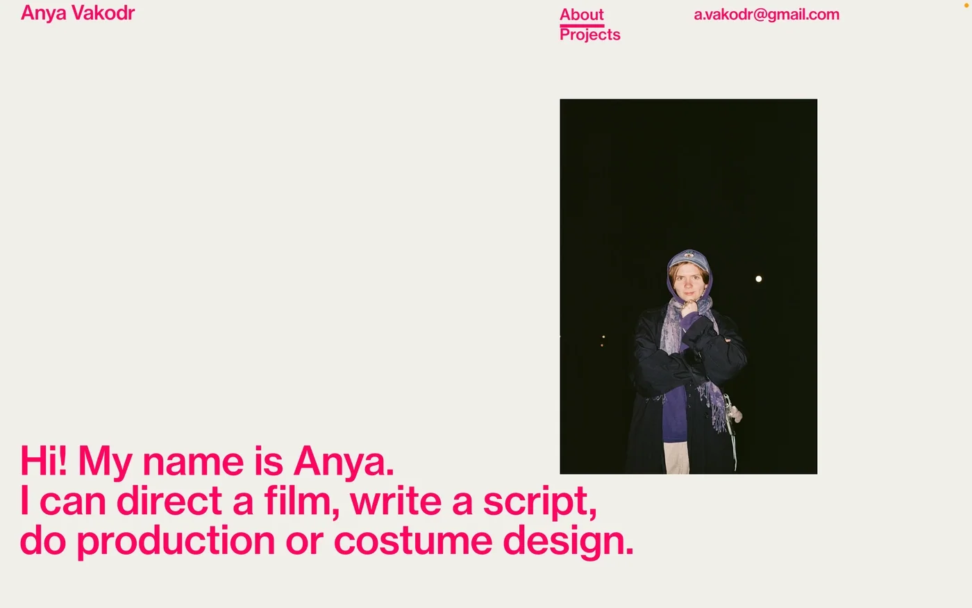
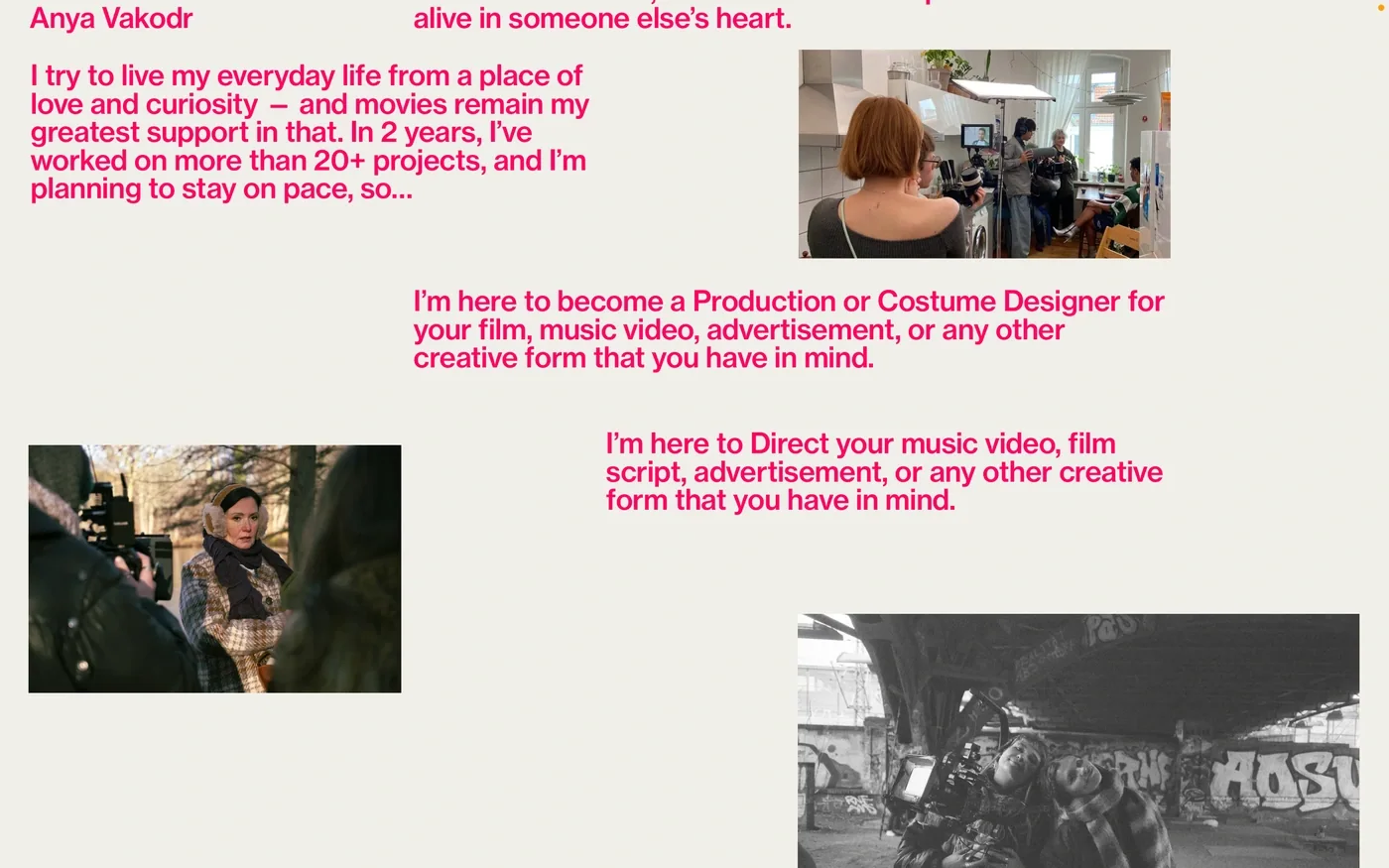
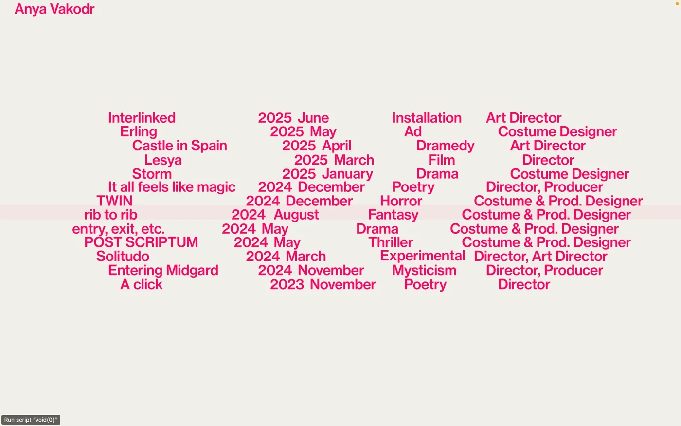
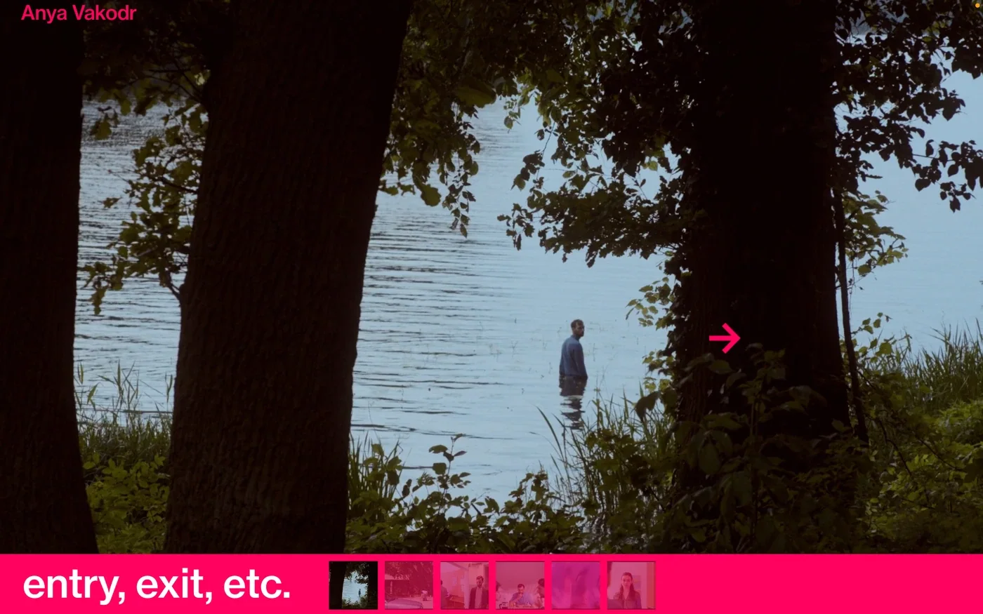
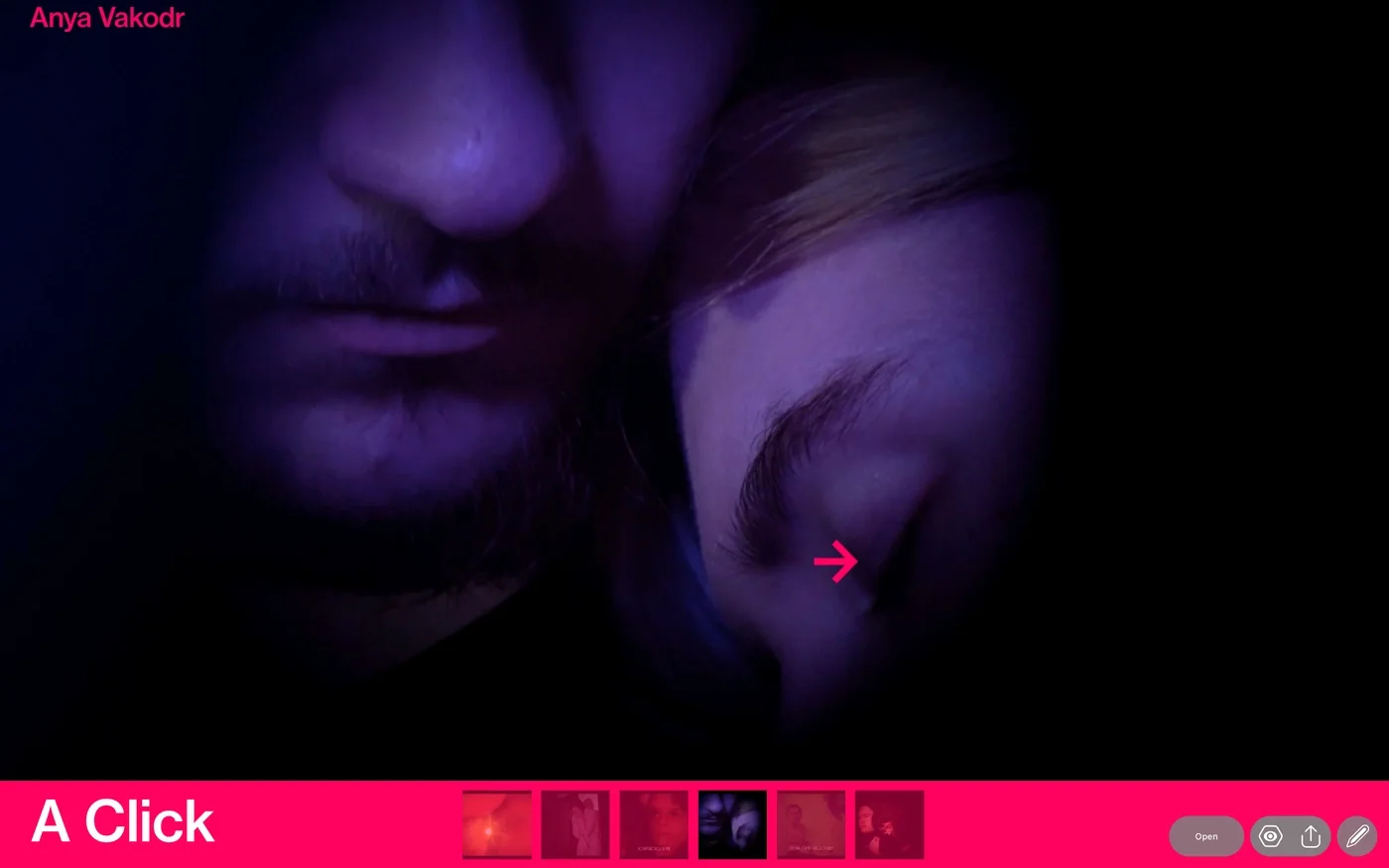
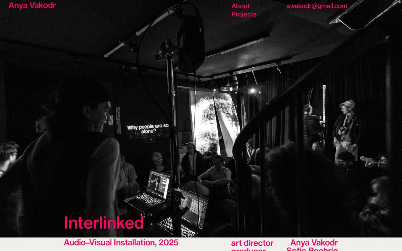
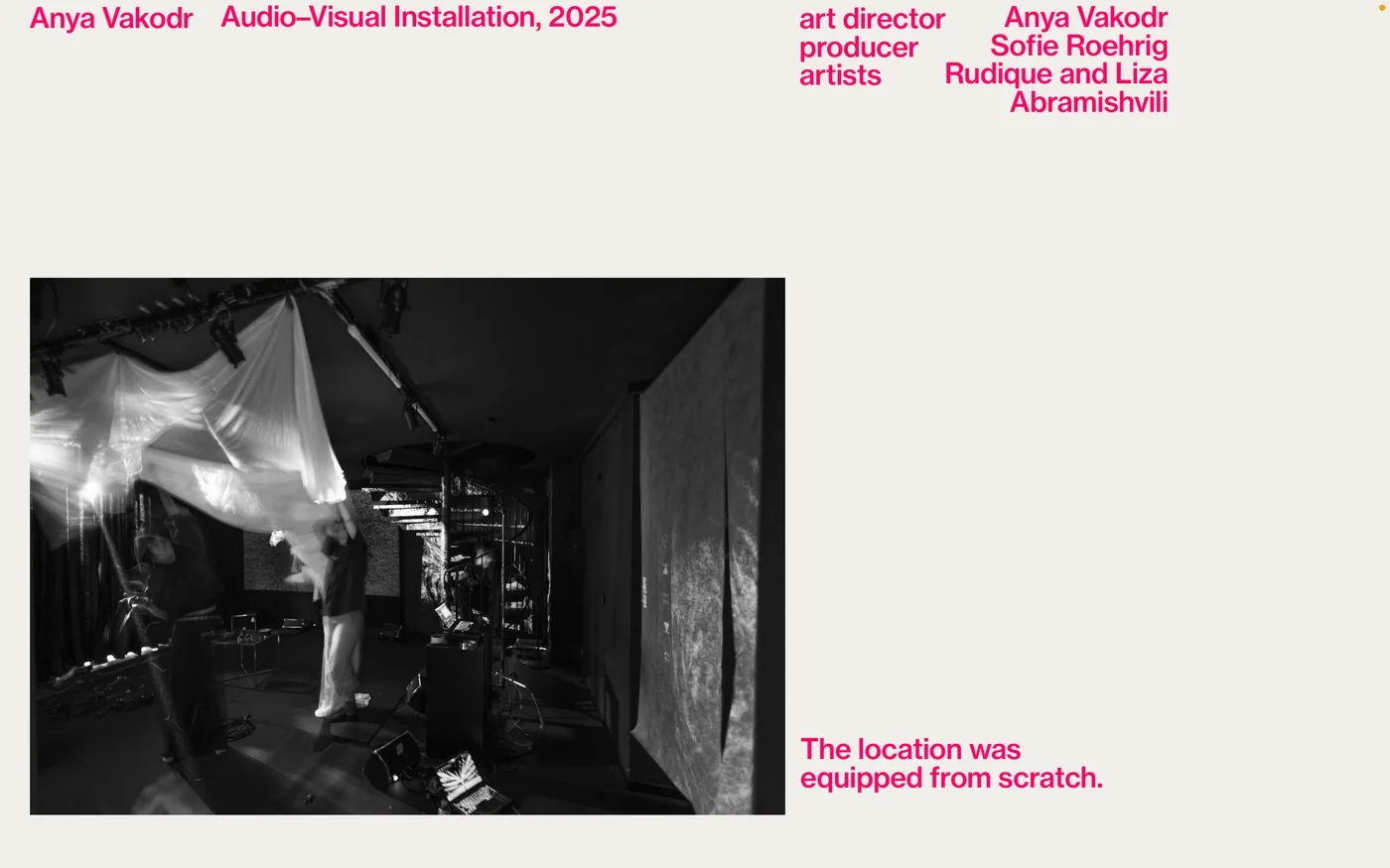
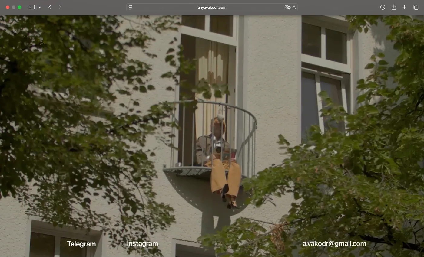
W10 Anya Vakodr Website 2025 Sep Web portfolio for a filmmakerThe project covers the design and launch of Anya Vakodr’s personal website in Readymag. Bright pink typography sits against a light background, with direct routes to her projects and biography. Her name and contact details remain part of the same clear visual structure. The site gives her filmmaking practice a place to introduce its work and make contact, with the graphic treatment carrying a personal voice through the portfolio. The project is presented at anyavakodr.com Website Website Website Website Website Website Website Website Website
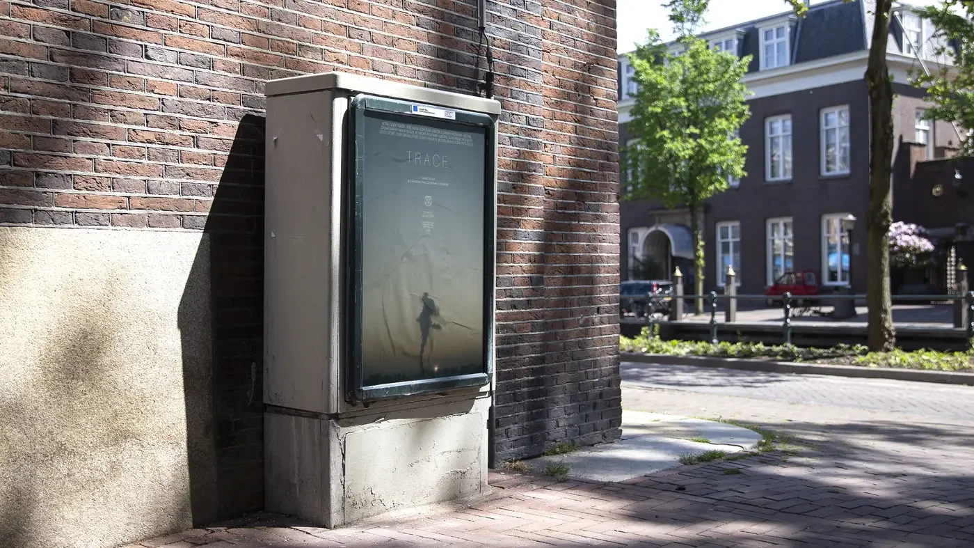
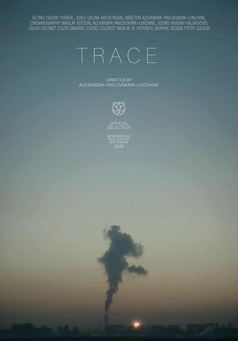
A253 TRACE Film 2025 Sep Film graphic design supportFor Alexandra Pavlovskaya-Lokchine’s TRACE, I worked across the film’s graphic design, including its typographic treatment, opening titles and end credits. The work also covered the poster and the graphic requirements of its installation formats. On the poster, the title and credits sit in the open sky above a distant plume of smoke. Across these applications, the task was to give the film a consistent graphic presence while adapting the material to each format Film Film
W11 Luxor Website 2026 Jan NDA
W12 Studio Kitchen Website 2026 May NDA
A254 Becoming the Warden Film 2026 Jun NDA
M06 newen spaces Generative Graphics 2026 Jun NDA
M05 Industrieverband Büro und Arbeitswelt Generative Graphics 2026 feb NDA
M08 Self Initiated Generative Graphics 2026 jun Generative motion study of a circleI started with a circle and applied non-Euclidean equations to it, looking for bizarre outcomes. The studies turn that starting form into a field of moving letterforms. White characters gather, overlap and shift around dark open centres, with their density changing the shape’s appearance. The work brings a mathematical experiment into typography and motion, using letters as material for a moving image. The resulting sequences make the changing form itself the subject of attention
M09 Somehow Creative Services Generative Graphics 2025 Nov NDA
M09 TAG Hackhathon AD 2026 may NDA
A260 HEIST Album cover 2025 OCT NDA
W13 leff '26 Website 2026 Jun NDA
B12 OpenAI Dev Day 2026 Generative Graphics 2026 Sep NDA
B13 Paradigm Motion 2026 Sep NDA
B13 Frontiers Generative Graphics 2026 Sep NDA
B14 tempo.xyz Motion 2026 Oct NDA
B15 Underline Visual Identity 2026 Oct NDA