Alexandra Pavlovskaya-Lokchine
Book
IMAGE 1 OUT OF 9
2025 May
Site-specific photobook
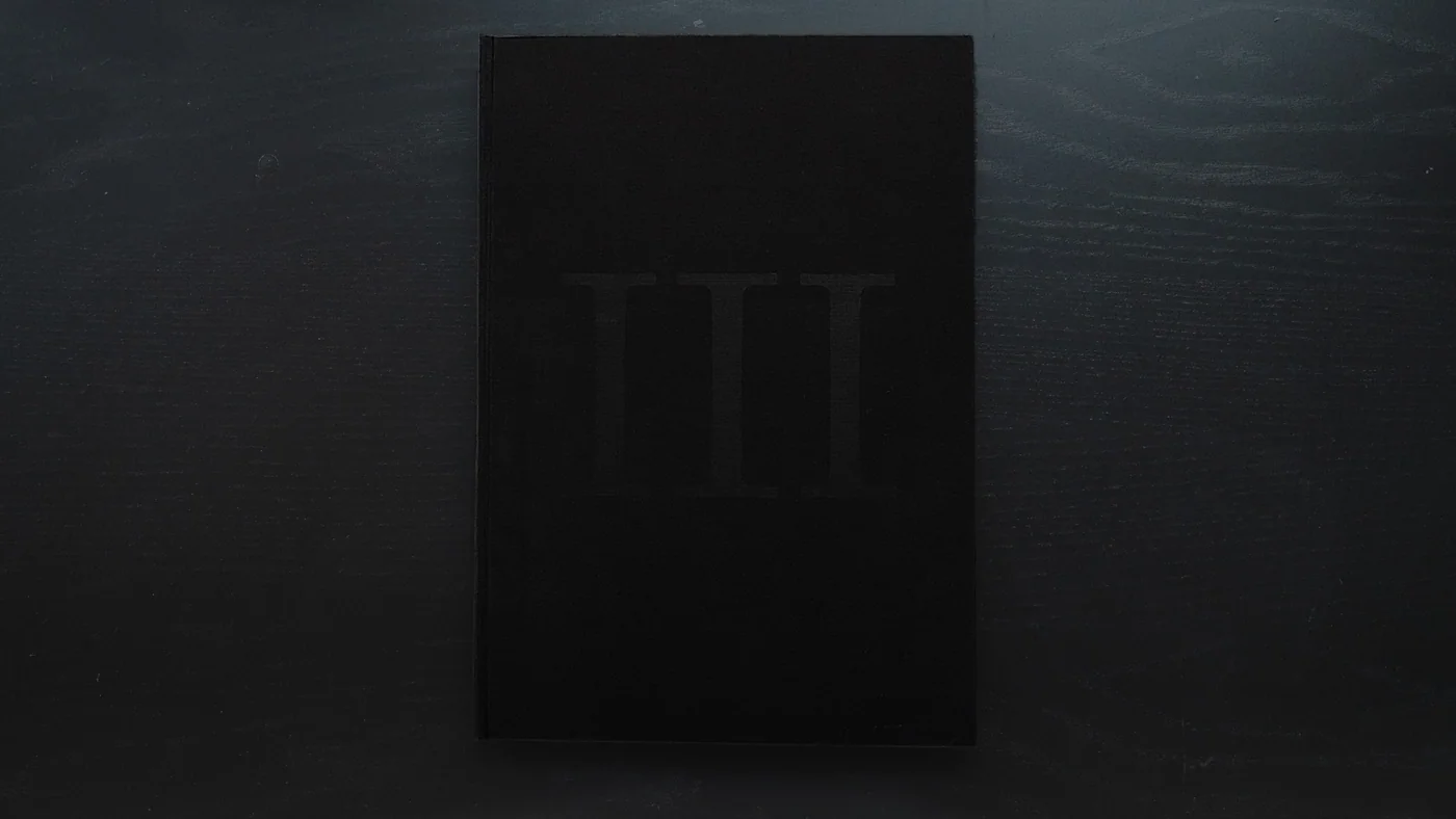
The book connects sculpture, photography and the printed spread in a layered sequence. Transparent paper and light connect those layers, allowing an image to be encountered through another surface. The sequence works through the physical act of turning pages, with the composition changing as material is revealed or covered. The design gives this non-linear approach a book form. Its relationship with cinema lies in that unfolding experience, where the image is encountered through movement and time
Taliesin Herb
Data Visualisation
IMAGE 1 OUT OF 12
2025 Apr
Web tool for styling dendrograms
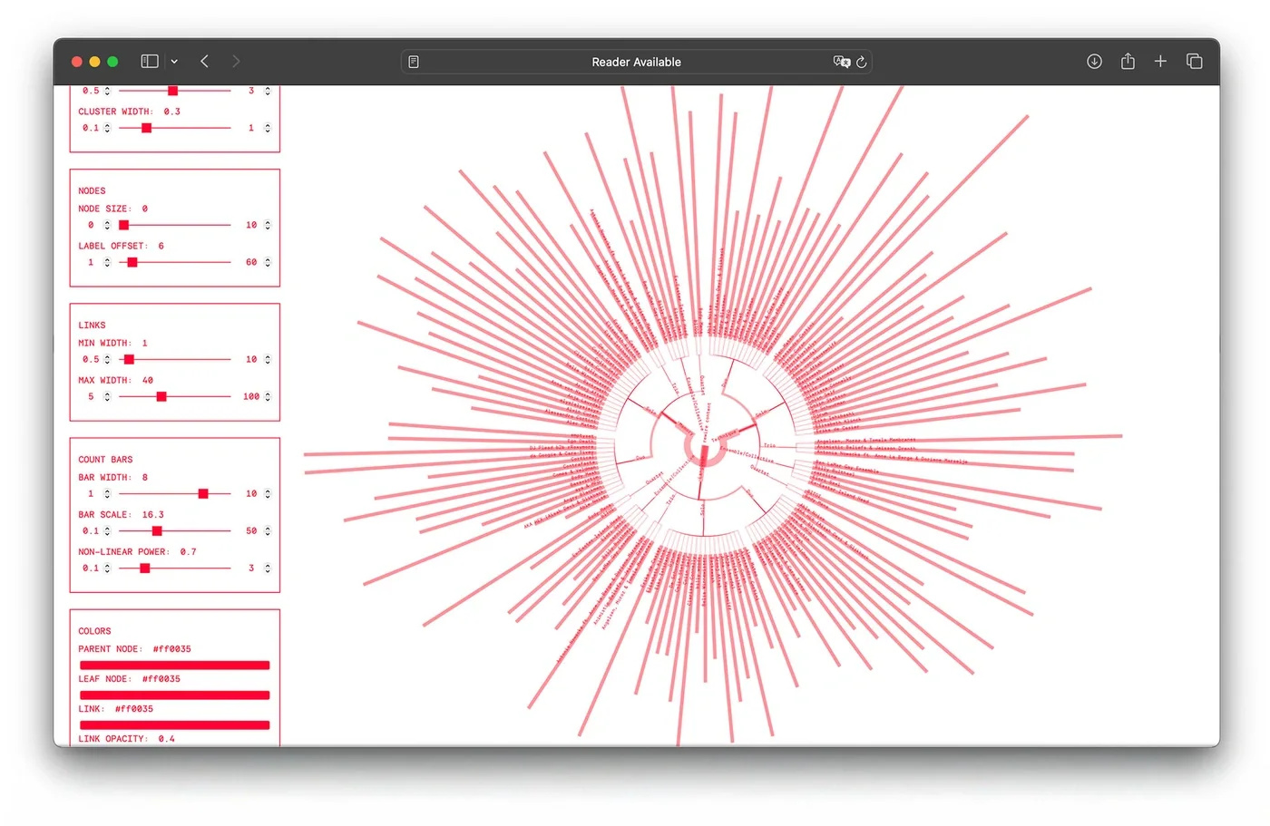
At Rewire 2025, our team was producing a zine for Rewire Reflections when Taliesin Herb, one of the writers, needed a dendrogram to accompany his contribution. The diagram had to fit Rewire’s visual language and work on the printed page. A custom web tool made it possible to adjust nodes, labels, line widths and colours, then export the result as an SVG. It connected Taliesin’s data analysis with the zine’s production, giving the team a way to prepare and style the diagram for publication
HSWG
Visual Identity
IMAGE 1 OUT OF 10
2025 Feb
Identity and camera work for a vineyard in the middle of the city
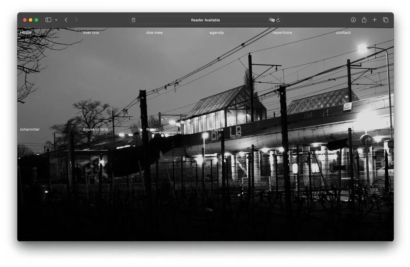
De Haagse Stadswijngaard asked for a new wine label for a batch of 500 bottles. The response grew into a wider identity built around slowness and sincerity. The direction came from the vineyard’s position within the city, surrounded by sirens, railway lines, traffic and construction. The project brought together a visual identity, website, label, wine box and video series. Across these formats, the work presents the vineyard as a place to pause within the city, with its own pace amid the activity around it
Self Initiated
Book
IMAGE 1 OUT OF 33
2024 Dec
An almost 1,000-page book of things that match the vibe of chairs
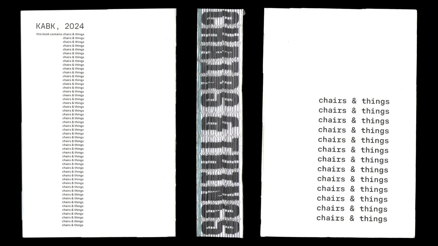
I used public-domain images from the Art Institute of Chicago and the Metropolitan Museum of Art to make this self-initiated book of 1,500 images. Each spread pairs a chair with another image, asking what meaning can emerge between the two. Code helped streamline many parts of production, including a custom Processing app I made to compare images and choose pairings that looked or felt right together. The tool supported visual judgement, with the book giving those choices a repeated form across its spreads. A second main outcome is bookmaking, a collection of scripts and tools for producing books
Flying Over The Dutch Nest
Book
IMAGE 1 OUT OF 31
2024 Nov
Visual essay born out of research into the Best Dutch Design Book archive at Museum Meermano
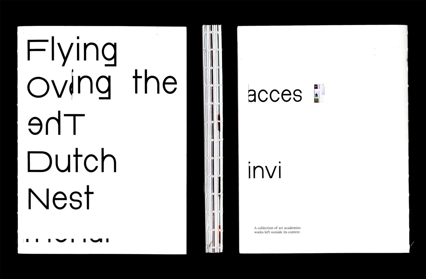
Flying Over The Dutch Nest takes the Best Dutch Design Book collection as a starting point for looking at how ideas and appearances accumulate around art academies. The publication brings that inquiry into a sequence of visual material, leaving the images room to be encountered without explanatory captions. Its cover includes a rectangular opening, making looking through the book part of handling it. The work gives “eclectic opportunism” a visual setting through collection, framing and sequence, while the relationships between its images remain open to the reader
Alper Cekinmez
Poster
IMAGE 1 OUT OF 4
2024 Nov
Painting-exhibition poster series
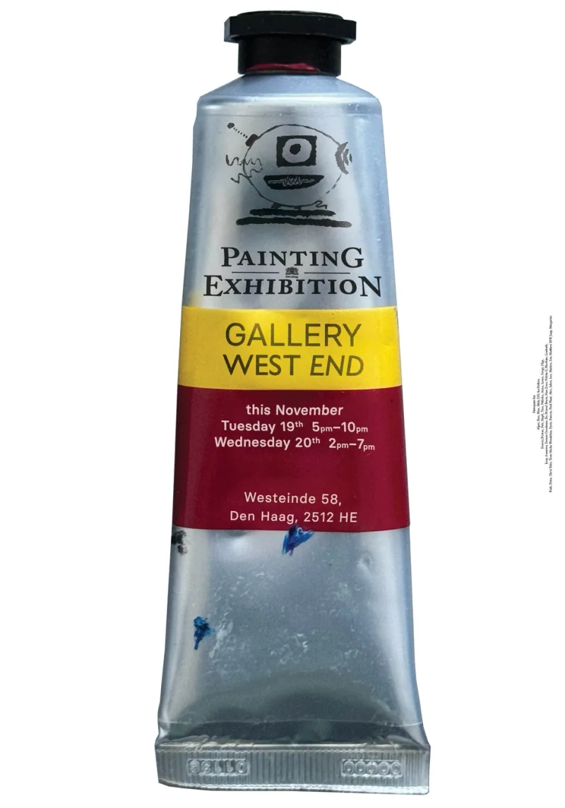
The posters use a paint tube as the setting for the exhibition information. Marks taken from the exhibiting artists’ canvases appear on the tubes, bringing elements of the paintings into the announcement with the artists’ approval. The image links the work on show with the material used to make it. Gallery details sit on the tube’s label, so the exhibition’s practical information becomes part of the same object. The series echoes the central enquiry of the exhibition, where tubes with canvases were given out to strangers on the streets
Self Initiated
Apparel
IMAGE 1 OUT OF 2
2024 Jul
Happy hour. May your coffee be sweet. Forward momentum, clarity of purpose. Good luck in business endeavours and skill in decision-making. Strategic moves, optimised processes
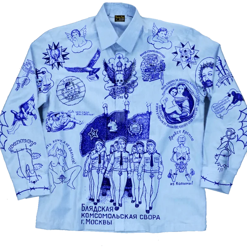
I combined two visual cultures on one shirt: the office worker’s collared uniform and imagery associated with Russian prisoners’ tattoos. Blue ballpoint-style drawings cover the pale blue fabric, turning its familiar working-day form into the setting for another set of signs. The work follows the kind of visual pairing I associate with Vladimir Tsesler, where bringing two things together can produce a third meaning. The resulting garment carries that collision on the body, with the shirt and its marks remaining recognisable as different sources
Lev Tolstoi
Book
IMAGE 1 OUT OF 20
2022 Dec
A context-first edition of “What Is Art?”
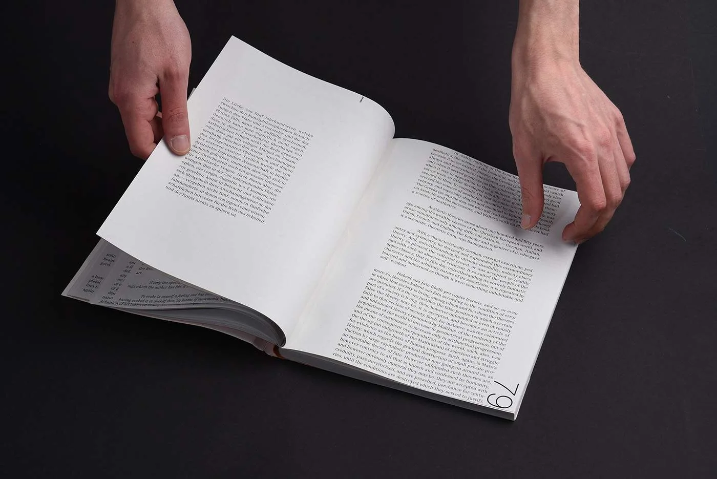
Compact text footnote blocks sit within generous margins, making use of the contrast between dense reading and open space part of the page for taking notes and reflecting on 6 levels of different footnotes accompanying original text. The design works through proportion and placement, giving the argument room while keeping its structure visible. Design treats typography as a way to organise a long text and shape the reader’s movement through it